

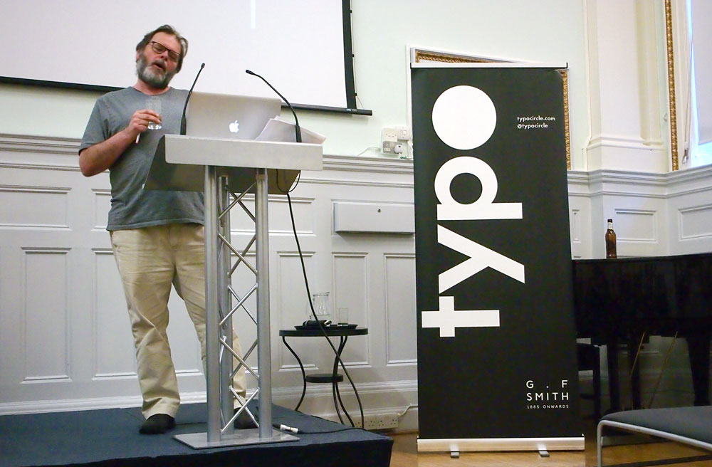
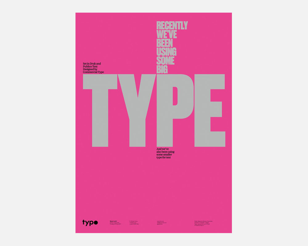
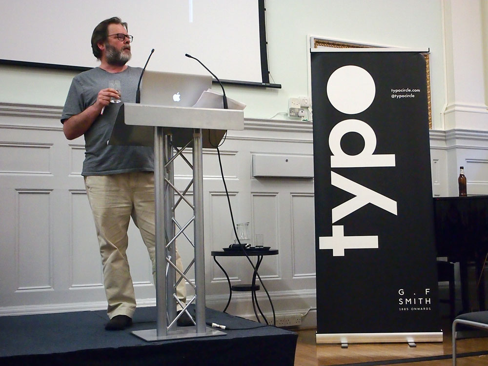
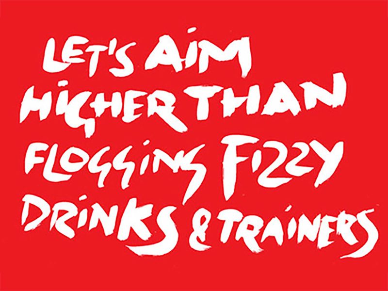
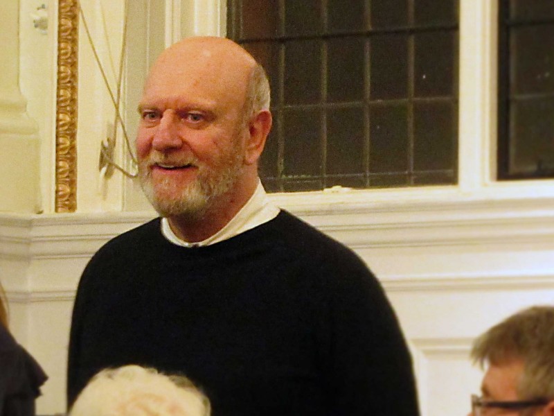
“Recently we’ve been using some big type and we’ve also been using some smaller type for text”. Michael was at St Bride’s for Simon Esterson’s self-deprecating talk for Typographic Circle.
Simon Esterson at Typo Circle
As designers, most of us sit in the shaded overlap of a Venn diagram, somewhere between selfish detail-driven perfectionists and big picture pragmatists.
But Simon Esterson ignores the convention and completely overlaps both of those circles. His work is considerate of every aspect of the brief (often having re-thought the brief to start with) but he pursues each solution with a tenacious eye for detail.
Esterson (with his associates) creates practical, systematic solutions that mean each issue of a publication can be as good as the last. And he invests such tireless attention to detail in establishing those systems that many continue to be brilliantly executed for years after he’s left the project team.
Through his career he has redefined the standards for magazine and newspaper design and he’s done it without flash or ego.
I first remember hearing about Esterson’s work in the mid-nineties. The Guardian had a new editor, Alan Rusbridger, and they’d brought Esterson in, on a six-month secondment, to redesign the publication. Esterson had established his reputation working on architectural journals Blueprint and Domus.
This was a time before the internet, we saw a lot less images of designers than we see now. I can’t remember ever seeing Esterson’s picture in print so I’d imagined an austere, sharp-suited, rake-thin ‘60s draftsman: sleeves rolled up, hair slicked back, commanding the room with cutting remarks and sharp critiques.
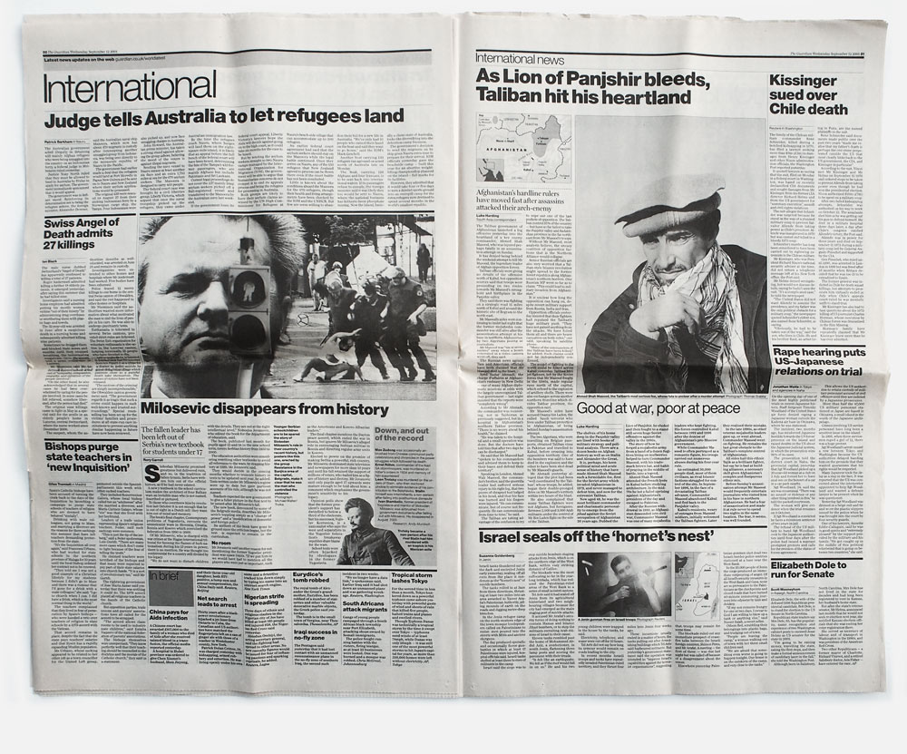
A spread from The Guardian in 2001 (after Esterson’s tenure).
David Hillman had redesigned The Guardian when I was at college in 1988. That work had helped to reposition the paper. It was a revolution.
Esterson’s work was more of an evolution. It wasn’t showy or shouty. He kept what worked and understood what needed to change. But for me that quiet makeover was just as important to The Guardian’s journey.
“We want to make intelligent pages that people want to read. It is nothing more than that”, Esterson is quoted as saying in a piece by Dan Glaister in the paper in 1999.
Since then I’ve noticed Esterson’s work everywhere. I’ve lost track of how many publications I’ve opened, enjoyed and admired before discovering the Esterson Associates name in the credits.
Each time I saw their name, I still pictured that suave, chisel-jawed ‘60s icon leading the team.
In 2013, I spotted his name on the panel of a break-out session at AGI Open. It was a chaotic affair and I missed the introductions. Gradually, as I figured out who was who I realised Simon Esterson wasn’t how I’d imagined him at all, he was the bearded, avuncular chap, hunched over the microphone in a scruffy t-shirt, talking about practicalities each time a fellow panelist went off on a flight of fancy. I liked him all the more.
Four years later and I’m sitting in the wonderful St Bride Institute with dozens of other admirers of his work, many of whom were born after that redesign of The Guardian happened.
For this talk, organised by the Typographic Circle, Esterson began by explaining that this was his second such talk. In 2011 he’d done a kind of career retrospective so he didn’t think it was worth doing that again.
Tonight he was here to talk about Esterson Associates recent work. Work where “recently we’ve been using some big type and we’ve also been using some smaller type for text”.
We want to make intelligent pages that people want to read. It is nothing more than that.
He explained that the Associates part of his company name is hugely important. He name-checked the team, the designers, his collaborators and business partners, and clients. Many of them were in the room giving support.
Esterson Associates has been the starting point for number of brilliant careers. He seems to have a knack of finding brilliant people who want to stay for a long time before launching their own agencies (or maybe it’s not a knack).
He talked at length about the recent redesign for The Sunday Times.
You have to be practical, newspapers are driven by advertising nowadays. “The best way to get fired from a job is to suggest changing the ad sizes” he told us. So his starting point was to create a grid that could accommodate those existing sizes.
Then he looked at the hierarchy and grammar of the pages. “The headlines should go, well it’s in the name, at the head”.
He didn’t even commission new typefaces because there wasn’t time within the original timetable. They used off-the-shelf Commercial Type fonts with some small concessions for the titles of each of the numerous supplements.
It’s common sense, practical stuff done thoughtfully and beautifully, with a consistently considered overview and an incredible level of detail. All, presumably, whilst negotiating and selling-in the designs at every stage.
It did make me chuckle that he’d prepared all The Sunday Times slides as hi-res PDFs to display their quality, but actually the slides looked terrible. I’ve been to other talks where the designer would have abandoned things rather than carry on with poorly reproduced work. Simon apologised, was a bit self-deprecating and just got on with it.
He went on to talk about Eye magazine, the excellent design journal that he and editor John Walters bought from publishers, Haymarket, in 2008.
He talked about needing deadlines, about his decision to use a guest typeface for each issue, about the joy of working with great editorial, and about the partnership with the repro people at Dawkins Colour, and the printers at Pureprint. He loves the press-pass, taking the job from 95% good and pushing it to be better.
Perhaps my favourite moment of the evening was when he showed a slide of the title page for a Vanity Fair article. He told us how they’d approached the studio, via email, with an open brief. They had a reasonable budget, perhaps the best per-page rate the studio had worked to.
But he froze and, instead of giving them what they probably wanted (an Esterson Studio looking design), he blew the budget on dozens of ideas. Eventually, with the client politely asking for layouts, they sent across a few ideas, including a ‘big-type’ one quickly put together by designer Holly Catford.
Of course they chose that one.
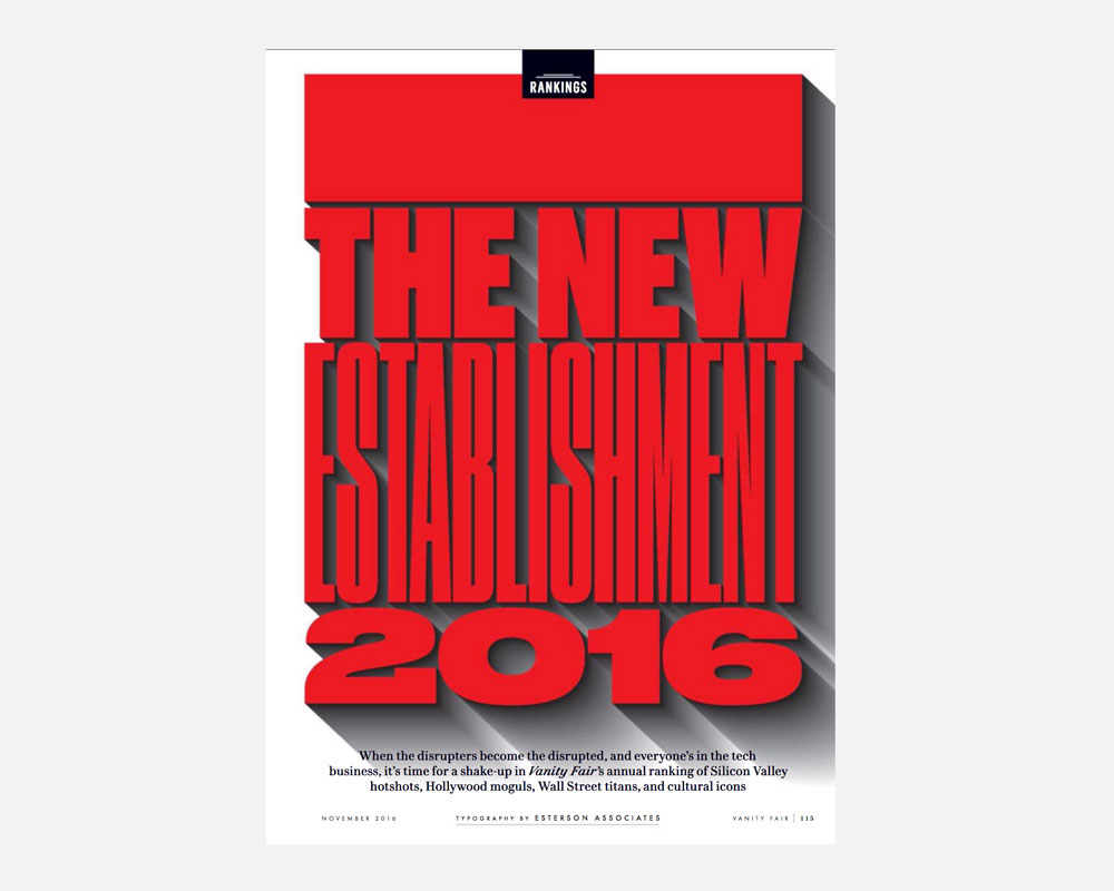
It’s a great reminder that we all get intimidated by the big projects, even for someone at the top of their game, the lack of a brief, a clear question to answer, can be overwhelming.
And, as if to reinforce his earlier message about teamwork, he commended designer Jay Prynne for figuring out how to do the shadows. The PDF of this work is apparently a wonder to behold, it renders like a 15 minute layered animation.
Throughout his talk Simon spoke with warmth about other designers and other publications. He has a passion for his subject and genuine enthusiasm for seeing others thrive. Whilst many have long-since predicted the death of print, Esterson sees a world awash with ‘non-news-newspapers’ and small-run magazines. The success of those publications is at least partly because so many designers have been inspired by the work of Simon Esterson.
Related
Bruno Maag at Typo Circle
For his Typographic Circle talk, the outspoken typeface designer, Bruno Maag raced through a history of screen-based type design. Michael...
Michael Johnson at Typo Circle
In his Typographic Circle talk, Michael Johnson argued that Design Can Make a Difference. Our Michael was there to listen...
Hamish Muir at Typo Circle
The Typographic Circle, a volunteer-led organisation that brings together anyone with an interest in design and typography, host monthly lectures...
What was the point of the AGI Open?
Each year, a self-proclaimed, elitist club of designers descend on a major world city. This year it was London and...
24 September ’13
Michael and Ross are at a Typographic Circle talk by Vince Frost. They met up with Joe Weaver (a recent...
28 January ’16
Michael and Becca are at St Bride's for the Typo Circle talk by Ben Casey from The Chase.
Carter Wong at Typo Circle
As a small design studio, Carter Wong have punched above their weight for three decades. In a talk, titled 60...
Daren Cook at Typo Circle
Talks about branding can sometimes be an unprepared monologue through the speaker’s portfolio. Thankfully, we were taken on a well-thought-out...
3 April ’18
Jack’s at the REcreative editorial board meeting at South London Gallery to chat about websites and how they want to...
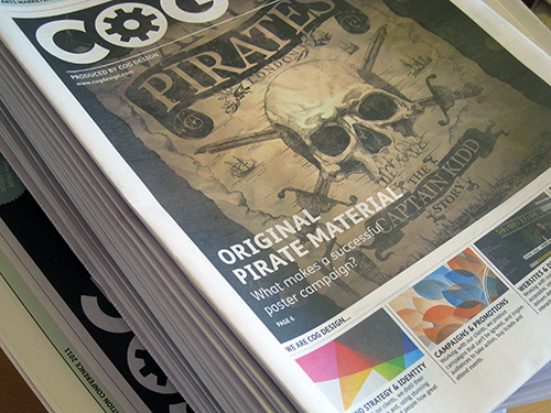
Self-promotional papers for AMA 2011
For the Arts Marketing Association conference in Glasgow, we made a newspaper to give to delegates.
11 February ’13
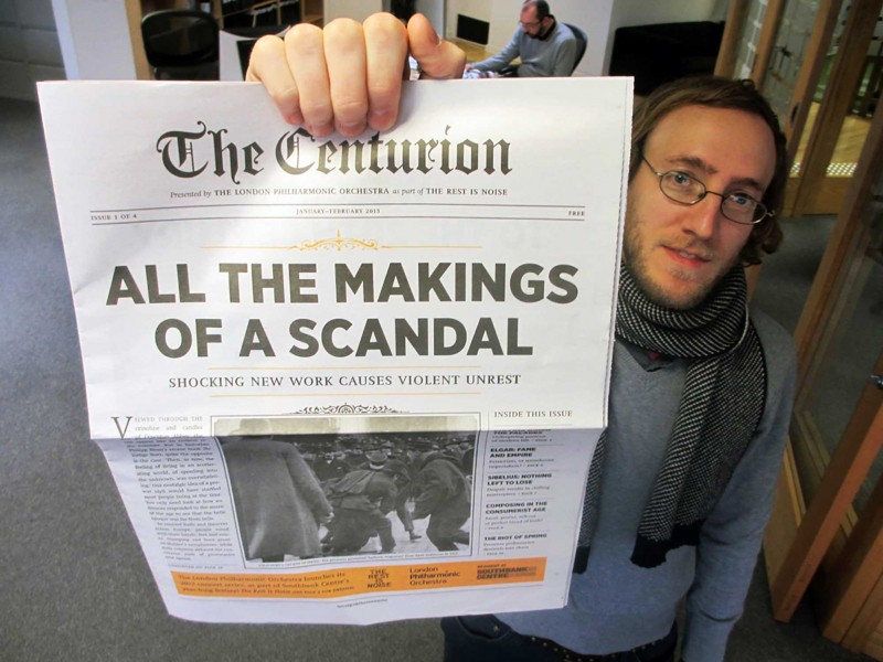
Just taken delivery of issue 2 of our London Philharmonic ‘The Rest Is Noise’ newspapers, which are being distributed around...
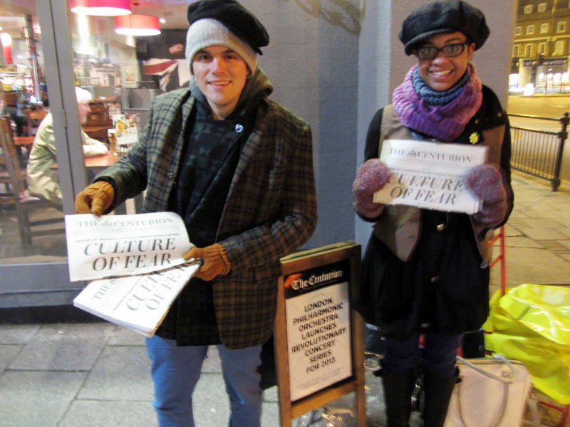
13 February ’13
Great to see our second London Philharmonic newspaper being given out at Greenwich Station yesterday. Good take-up, despite sub-zero conditions.
4 January ’13
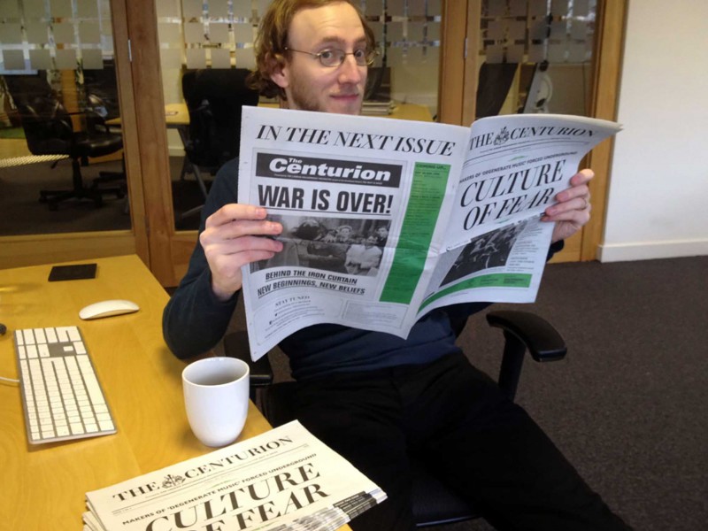
Extra! Extra! We’ve got our hands on the first edition of The Centurion, the newspaper we designed for the London...