As designers we claim to be expert communicators. But has the referendum shown that all we’re really doing is talking to ourselves?
Did smart-arse design lose us the referendum?
On 24th June we woke up to a new UK, a nation that I don’t recognise and don’t understand. And I write ‘we’ deliberately because I’m guessing that if you’re reading this, you also voted Remain in the EU referendum. You are, after all, the sort of person who reads journal entries on design agency websites.
Currently, instead of trying to get our point across in different ways, we designers just shout louder, on posters, in capital letters.
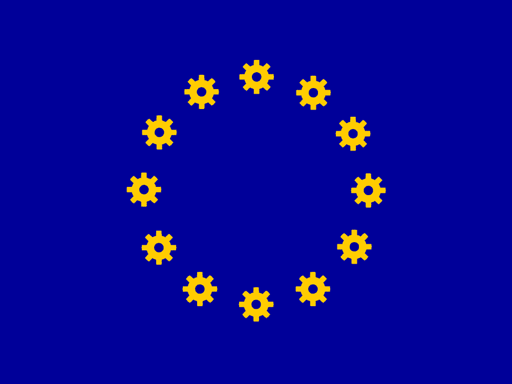
As designers we live in a bubble. Our bubble is full of aesthetes and the kind of people who think that ‘aesthete’ if a normal word to throw into conversation. It’s a bubble we share with other creative types: 96% of members of the Creative Industries Federation said they backed Remain.
We may laugh at ourselves as we update our ironic hipster blog, on our MacBooks, in the cycle workshop/cafe but there’s one thing we take very seriously – good design. We all believe that ‘good’ design makes the world nicer.
We persuade people to our way (the right way, obviously) of viewing the world through great images, clear type, considered balance of space, and most of all (particularly in the UK) we love puns and clever word play.
We are liberals, egalitarians, tolerant of difference, fiercely pro-equality. We protest about stuff, we buy ethically, we shop considerately and we know we are right because everyone we know thinks the same as us – just look how much our Twitter stream reflects back at us.
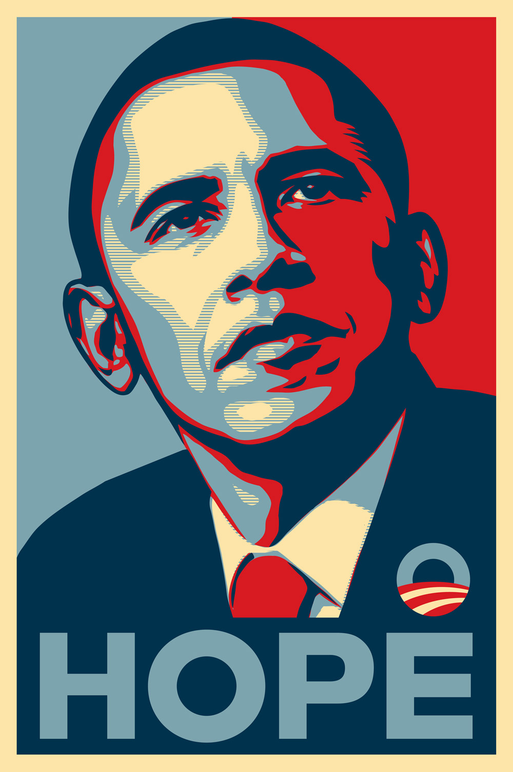
We were all so proud (or maybe jealous) of the 2008 Obama election campaign. They had a great typeface (Gotham) and a colour palette and some clever slogans. Our time had come. Can designers change the world? Yes we can.
British political parties aren’t as switched-on as Obama. They are notoriously disinterested in design. I’ve written elsewhere in this journal about the bizarre ways that our main parties ‘designed’ their logos. But the EU referendum was different, it was cross-party and united behind clear antagonisms.
Throughout the campaign, the message we all kept hearing, from ‘the public’ (mostly people outside our bubble), was: “we just want the facts; we just want simple answers to our questions; we’re fed up of politicians and so-called experts, we just want plain speaking”.
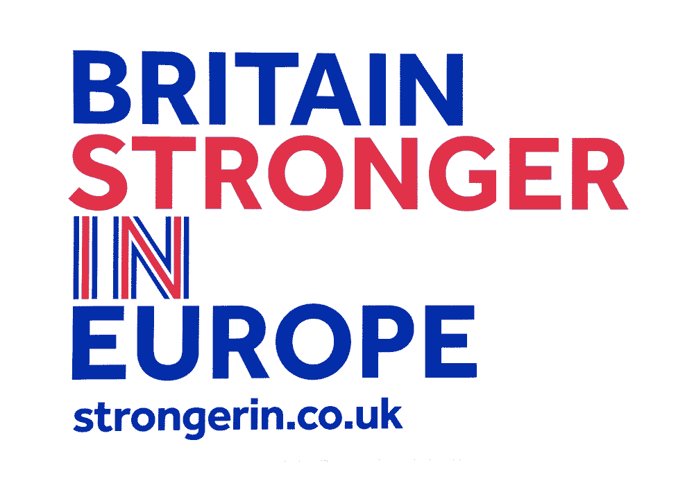
The designers over at Britain Stronger In must have rubbed their hands with glee – at last a chance for good typography to triumph over ugly rhetoric.
But it wasn’t so clear cut, was it? The arguments for why we should remain can’t easily be whittled down into easy, meaningful headlines because they are multifaceted, complex and nuanced. The Remain messages are about maintaining a framework that affords us more rights and freedoms; about a platform for cross-country agreements that are all but impossible to achieve unilaterally; about being stronger as a united force than as fractious nations; about an infrastructure that allows easy movement of people, ideas, money and goods; and yes, about health and safety rules that make us less likely to kill or maim ourselves and others.
And, many of the Remainers are deeply unhappy with how the EU works. They know it is better than the alternative but lots struggle to even bring themselves to campaign for an institution whose bloated bureaucracy and globalisation agenda is anathema to their political credo; Jeremy Corbyn, I mean you.
Can the slogan ‘Britain Stronger in Europe’ do enough to summarise that complexity?
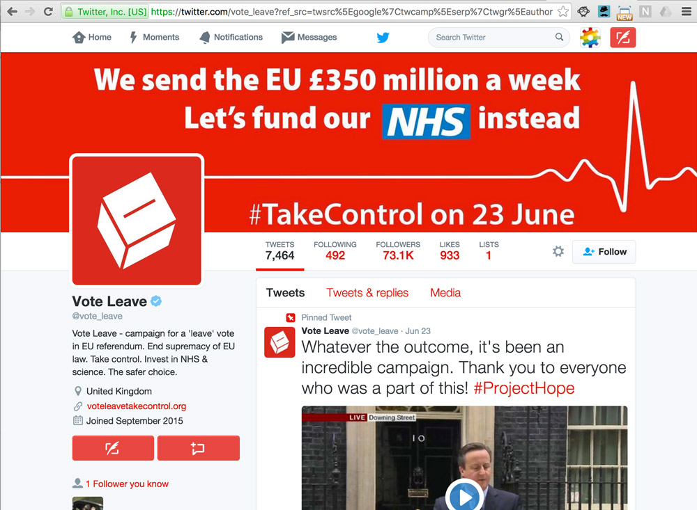
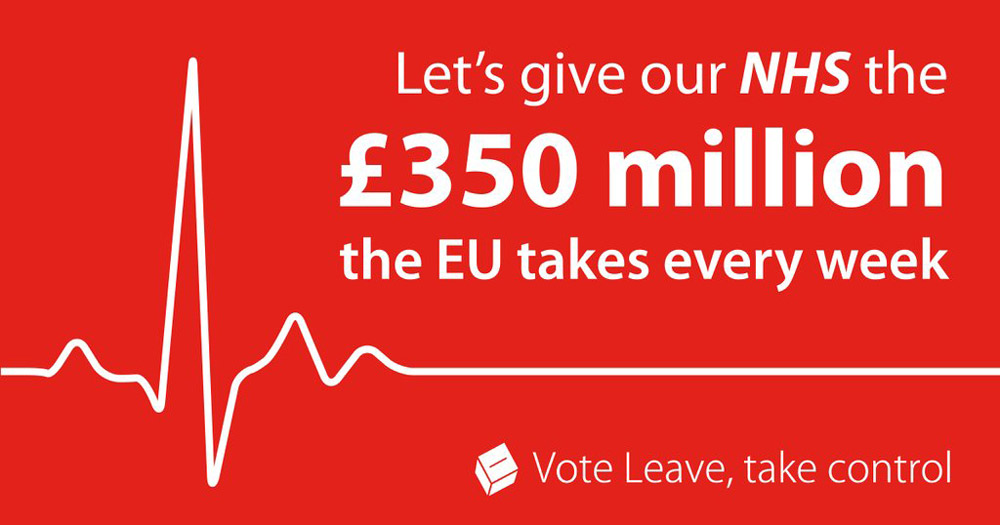
The Brexiters avoided the need for subtle arguments by just lying. Their messages were simple and ideal for slogans – we will take the £350m a week that we currently waste on the EU and spend it on our NHS. That was an unequivocal lie. If you’re prepared to spin the truth off its axis then you’re a difficult opponent to argue with, especially if you shout simplistic platitudes so loudly and so often that you drown out reasoned debate.
I’m writing this a few days after the result, and those same Brexiters are already distancing themselves and explaining that they didn’t pledge £350m to the NHS. Yes, they mollified the language later in the campaign (see their Twitter banner above) but this was their unambiguous poster, below…
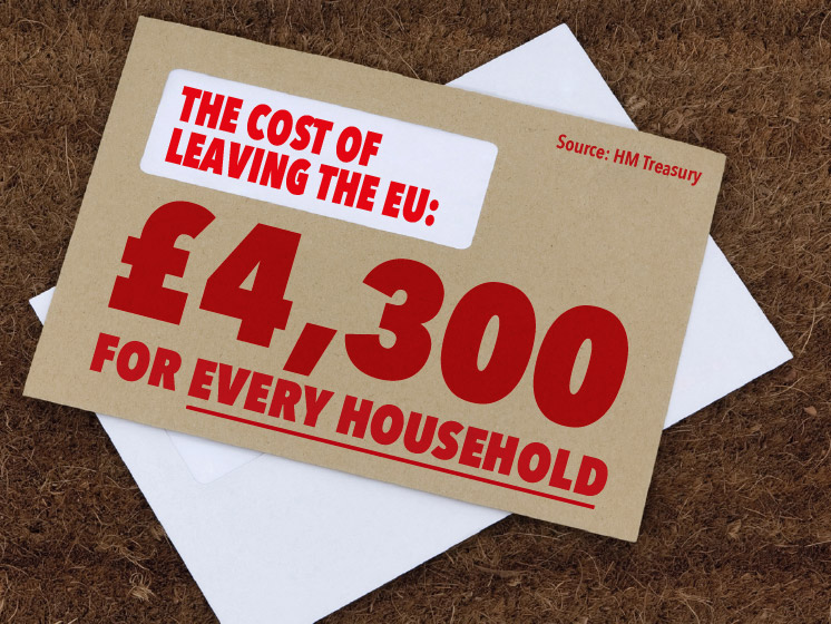
So, while, the Brexiters were travelling the country in a painted bus of lies, what were the Remain team doing to win our approval?
Well, they began by trying to win the argument with complicated formulae about the cost of leaving. But no one believed the figures and the press pulled them apart (quite rightly) because no one can tell what the future will hold.
As the campaign progressed, us designers all felt more reassured: the messages were starting to be consistently crafted, with a clear colour palette and the adoption of Dalton Maag’s Effra font. How could the arguments fail to be effective with such elegant type?
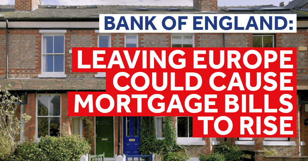
Well, they failed because the content of the messages was meaningless: mortgages could go up, or they might go down, or millions of ‘other’ people could all move here tomorrow and make us turn houses into fortified castles.
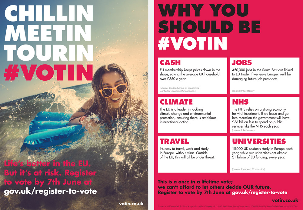
Meanwhile, the yoof were targeted from a different angle and a different visual palette (you type lovers will realise that Futura is the font of all youth). I’m guessing that the idea (designed by agency, VentureThree) was to create a separate approach from the boring grown-ups’ messages. How many non-designers do you think would notice the difference between Futura and Effra? How many would care?
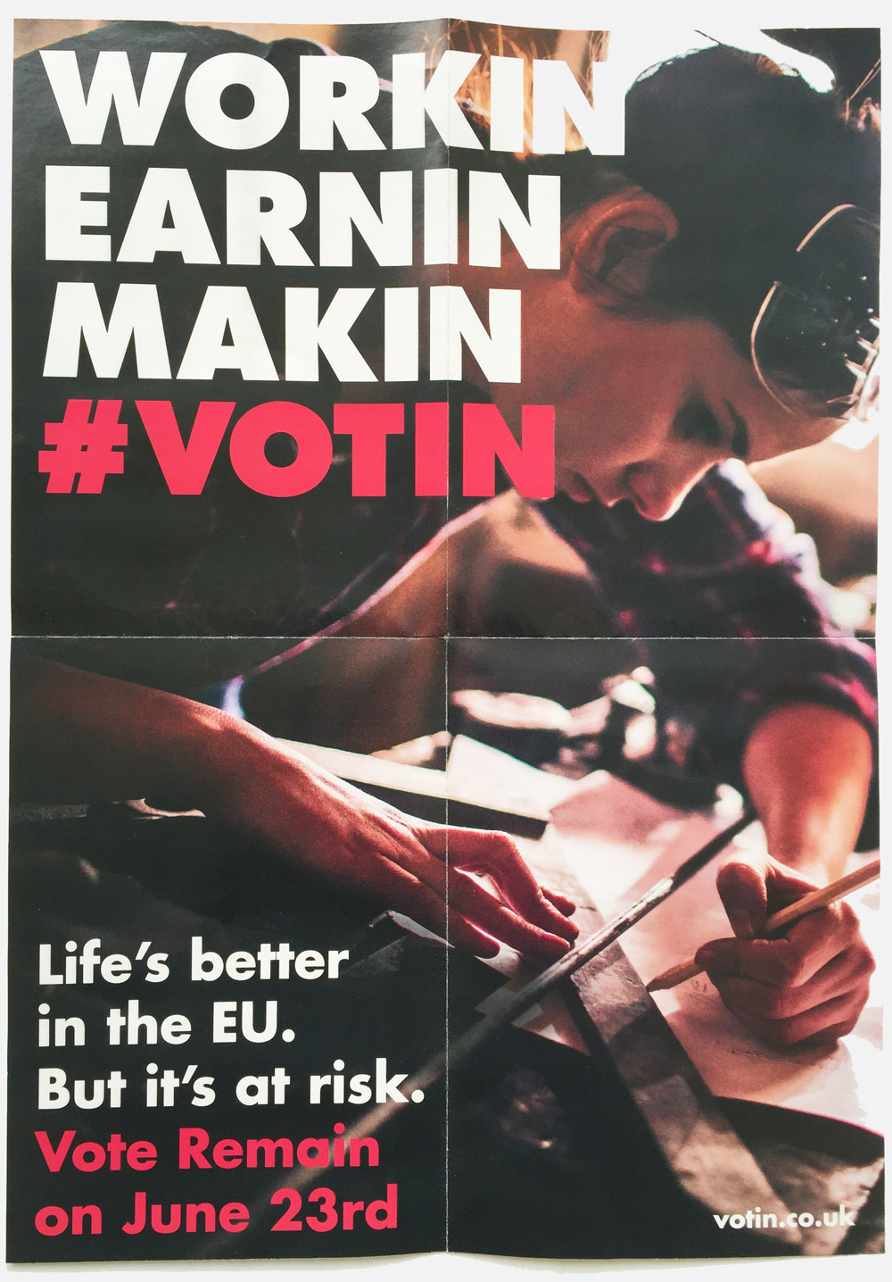
Above is the clever, clever poster of dropped Gs. You can imagine the decision making process behind it. There’s also a remarkable website and a video with ‘ravin’ and ‘taggin’ and ‘snoggin’ (yes, I made the last two up) and jumpin’ out of a plane. I hope it’s still up long enough for you to see it…
I am obviously not the target audience and I couldn’t imagine it was met with anything but derision. But maybe I’m wrong, maybe it was effective and I am as guilty as I am accusing others of being, in my lack of understanding of the language of choice for this demographic. Indeed, a vast majority of young people voted Remain. So this could well be the most effective design of the referendum.
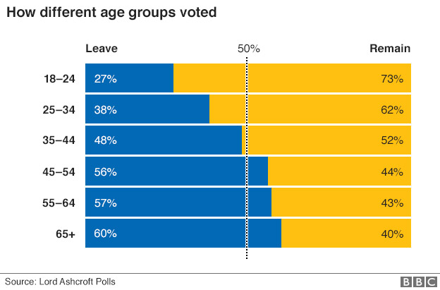
Perhaps if David Cameron had agreed to calls to lower the voting age for the referendum, the result would have been much more positive for those who will be most affected by the result. We could all be Chilin right now.
One of the problems for the Remain team is that ‘remaining’ is not a very sexy proposition. It’s much easier to invoke passion and anger when your messages are about overthrow and kicking against the pricks. ‘Out’ is a much more active sentiment than ‘Remain’.
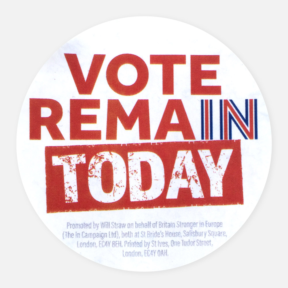
But Remain was the word on the ballot. It’s legitimate to think that voters might be confused by ‘In’ messages so the Remain team began to hedge their bets. Their URL was StrongerIn.co.uk but their posters emphasised Remain.
Somebody (and it probably was a designer, wasn’t it?) spotted the word within a word – RemaIN – clever, eh?
They also wanted to emphasise Britishness by including the red, white and blue. The result was a cock-up of compromise, in my opinion. The misplaced contrast places visual emphasis in entirely the wrong place.
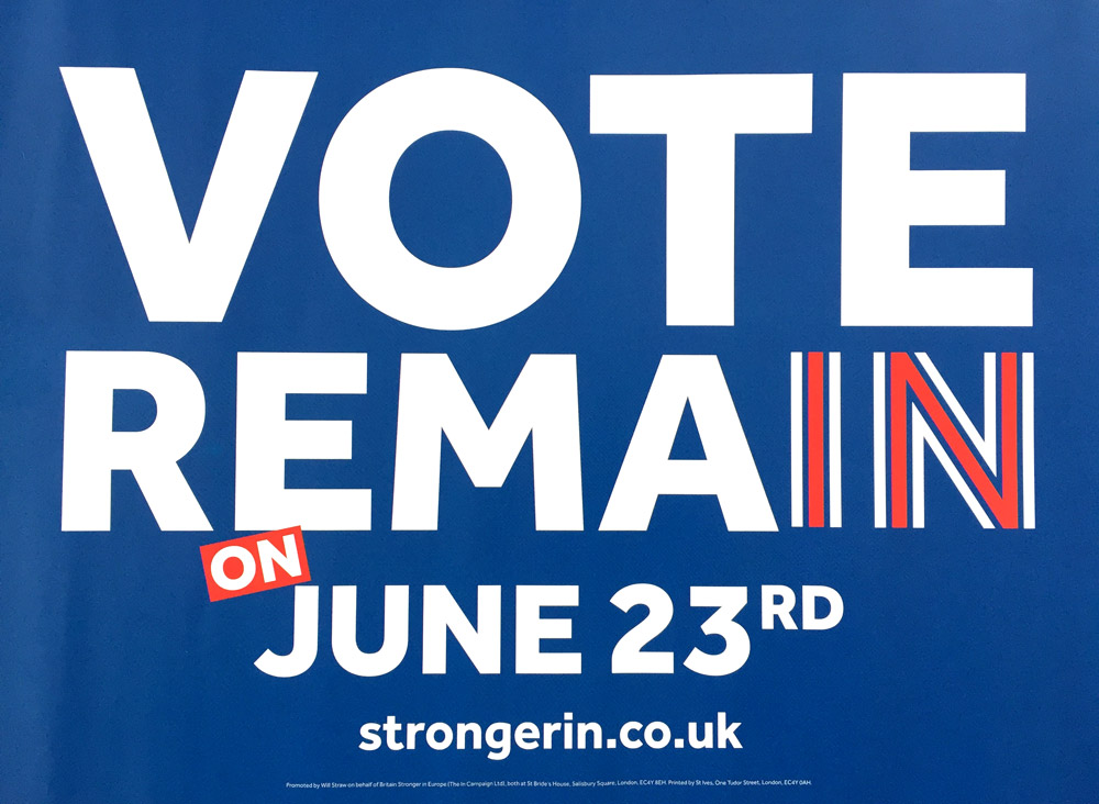
I can remember driving home and seeing that my partner had put a Vote Rema sign on our front lawn. You can recreate the effect by squinting your eyes or taking a few steps back from your screen.
And whilst the Remain team were busy with clever ways of making the simple more complex, the Brexiters were using the visual language of officialdom to spread their thinly disguised messages of fear about immigration.
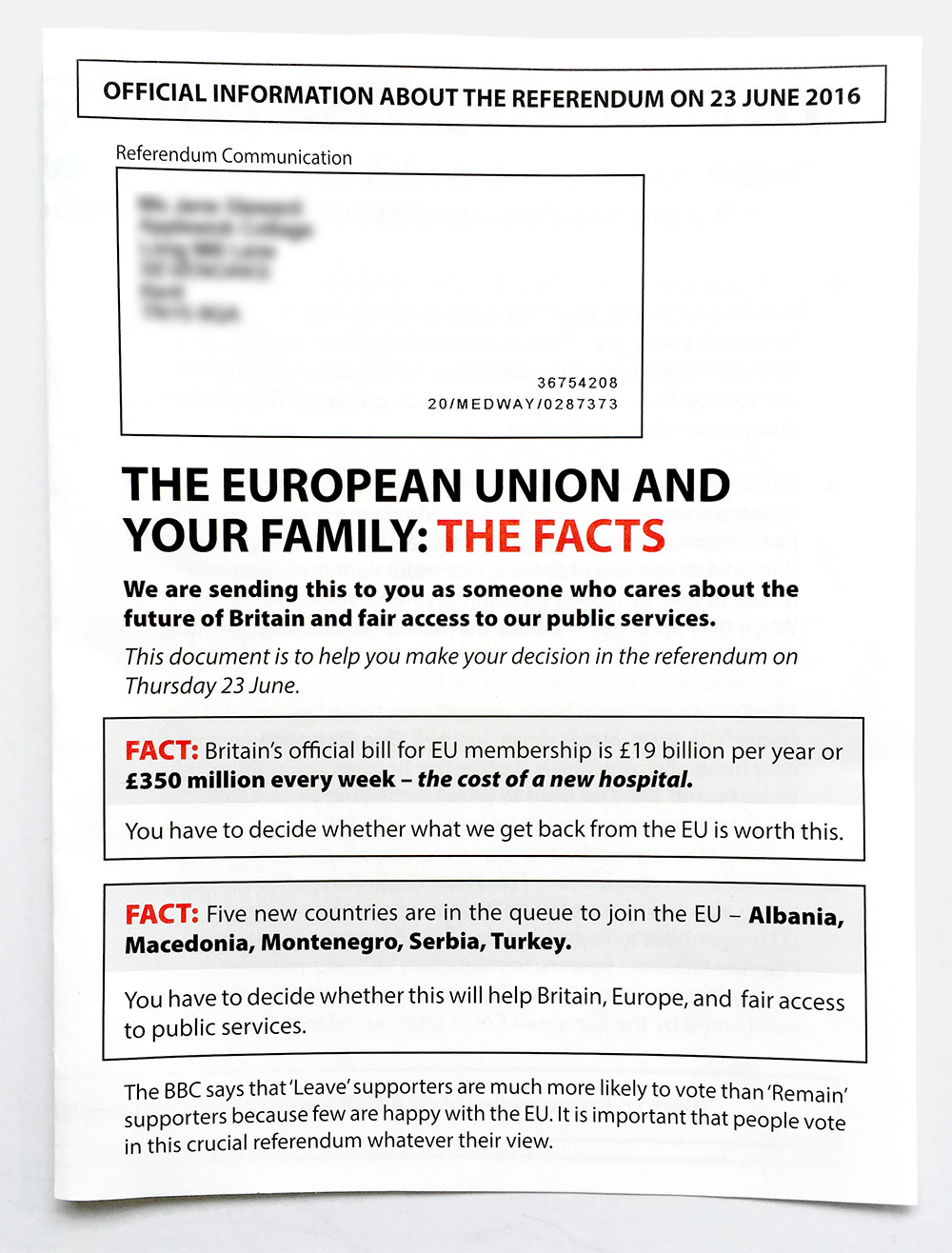
Their leaflet looks like a dispassionate, ‘un-designed’ piece of government information, they even quote the BBC in a paragraph that looks like a call for impartiality – “it is important that people vote in this crucial referendum whatever their view”.
But it’s far from impartial. On the back is one of the most incendiary propagandist maps I’ve seen from a mainstream political force in the UK.
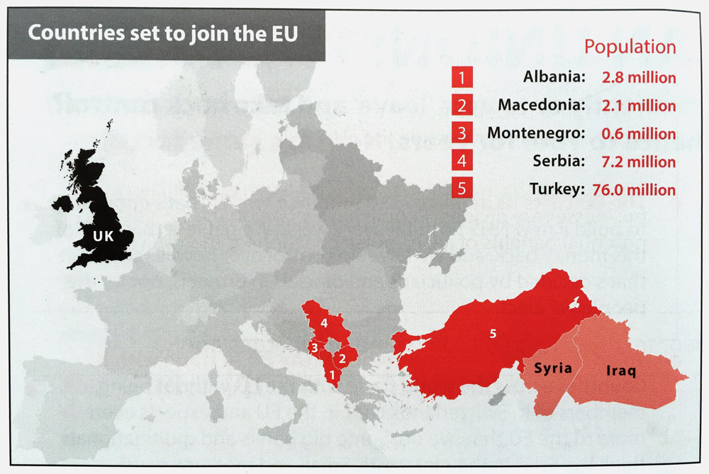
The message is clear – vote Leave or millions of the ‘other’ will swamp our homeland. The Remain camp might have countered with “isn’t Turkey’s geographical, religious and political position vital on the world stage? Let’s find the best way to safely embrace them into our peaceful union rather than making them feel isolated and vulnerable.” But our island nation is too hysterical to listen to that point of view at the moment.
As the referendum date approached, the Brexiters upped the anti-ante, with Farage grinning in front of that Breaking Point poster (that is so abhorrent that I don’t want to include a picture).
And what were the Remain team doing…
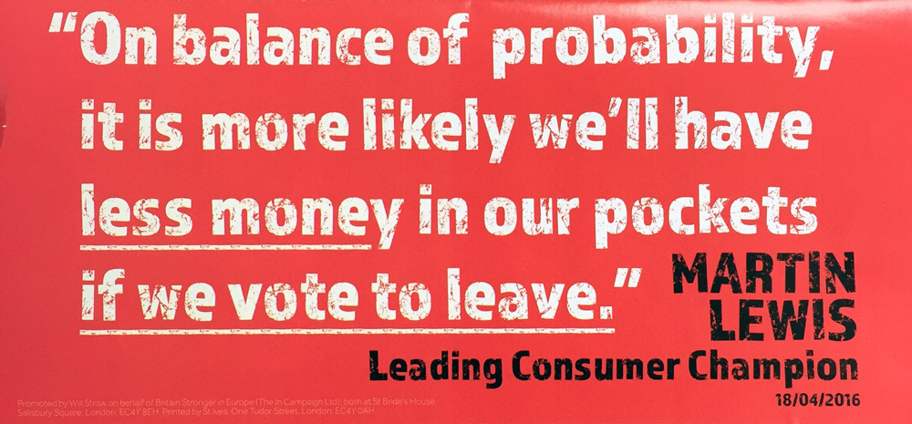
They added a new typeface with a printerly texture to make it feel more urgent. But they were still trying to make complex, balanced arguments through big type.
Now the dust has whipped up into a cloud that feels like it may never settle, do I really think that smart-arse graphic designers led to a Brexit win? No, of course not; this campaign was won and lost because one side was prepared to incite fear and hatred with simplistic lies about an unknowable future, and the other was condemned to having to defend the complicated, uncomfortable truths about the messy present.
My point is that there are many places where clear, consistent design can be a useful part of the mix. But we must not forget that our job is communication, and sometimes (perhaps most of the time), clever posters with elegant type, witty copy and consistent colours are not the way to do that.
I am advocating an approach where we burst our bubble and allow ourselves the freedom to talk in different design languages
To communicate clearly, we need to speak in the language spoken by those we wish to talk to. All too often it feels like we are just frustrated that others aren’t prepared to learn our aesthetically beautiful language.
If we’re flogging stuff then maybe miscommunication matters less. But in a national debate, pitting tolerance against fear, the ability to communicate effectively is very important indeed.
Currently, instead of trying to get our point across in different ways, we designers just shout louder, on posters, in capital letters. Isn’t that the sort of behaviour that we so readily ridicule in people outside our bubble?
I am absolutely not suggesting that we stoop to conquer through lies of our own. Instead I am advocating an approach where we burst our bubble and allow ourselves the freedom to talk in different design languages, to learn lessons from the multi-national, cross-cultural experiment in peace that the EU has been a cornerstone in achieving.
Related
Who would win a branding ballot?
To lighten the mood in this serious election, Design Week asked a handful of designers what they think of the...
The Bacc is back. We need to stop it.
The Government has announced its intention to introduce the EBacc, a performance measure for schools that will not include creative...
Advocating for culture
For the first time in our lifetimes we have a fixed date for the general election – 7th May. Arts...
Michael Johnson at Typo Circle
In his Typographic Circle talk, Michael Johnson argued that Design Can Make a Difference. Our Michael was there to listen...
23 June ’16
It's the day of the Euro referendum... The Cog team are voting IN.
10 July ’15
Michael's at a secret session where a panel of girls are voting for who should win the inaugural With and...