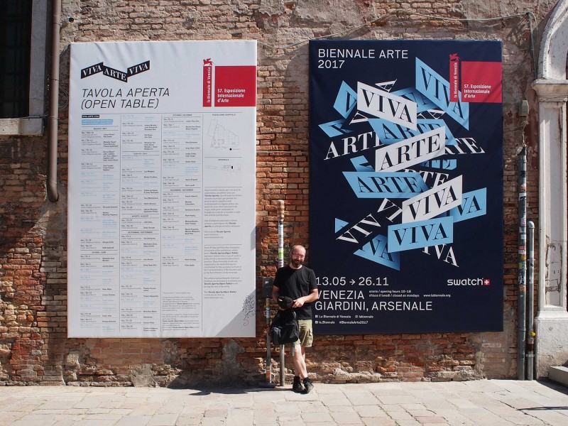
Opinions on the curated parts of the Venice Biennale, titled Viva Arte Viva.
Venice Biennale ’17 – Viva Arte Viva
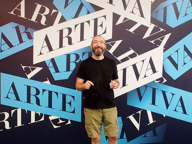
The bulk of the Biennale is national pavilions. But at its hub, the Biennale revolves around two areas ‘programmed’ by its curator, currently Christine Macel: the Central Pavilion in the Giardini (amongst the ‘main’ pavilions) and most of the Arsenale which is loosely divided into very broad themes (surrounded by a few smaller national exhibitions).
I visited the Arsenale first. I’ve subsequently found out that was the ‘wrong’ starting point. In the Biennale brochure, Macel writes ‘the journey unfolds over the course of nine chapters, beginning with two introductory realms… followed by another seven across the Arsenale’.
Oh well, she also writes ‘these nine episodes tell a story that is often discursive and at times paradoxical with detours that mirror the world’s complexities’. So I reckon you can probably start wherever you like.
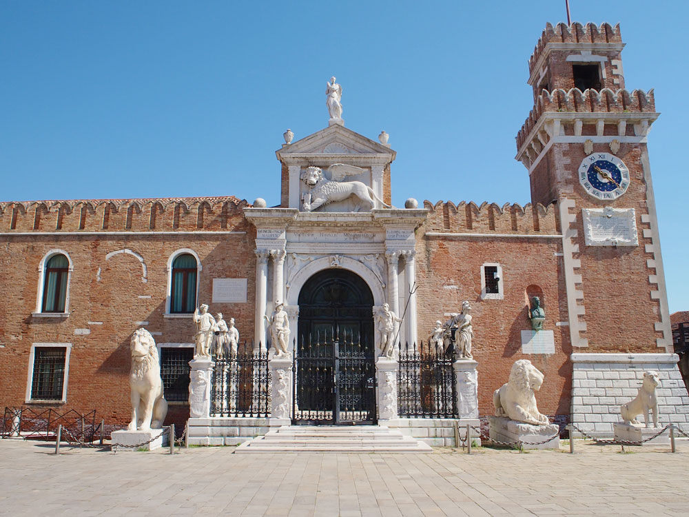
The Arsenale was the shipbuilding centre of this, one of the world’s most powerful city states. According to the Biennale website, it is the largest pre-industrial production centre of the world. At its heyday, this vast site would have occupied 2000 workers. Today there are a few hundred art-enthusiasts wandering from warehouse to warehouse.
Christine Marcel has chosen to divide the space into very loosely themed areas where artists presumably respond to the theme or were chosen because of it. She’s chosen to also call these areas ‘pavilions’ which is confusing because the national themed areas and the separate buildings also use that name.
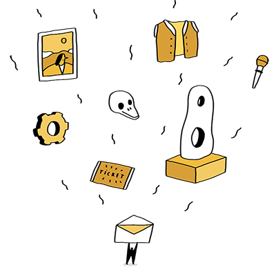
Each ‘pavilion’ contains works by several artists. I’ve chosen one or two of my favourites from each…
3. Pavilion of the Common
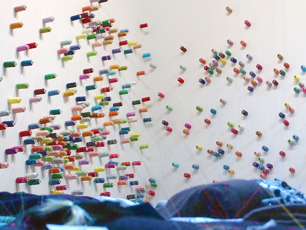
The Mending Project, Lee Mingwei
The Mending Project is a performance piece that runs throughout the exhibition. Visitors are invited to bring a piece of clothing in need of repair. Artist Lee Mingwei takes a spool of coloured thread and makes the repair, by hand, facing the person whose clothing he is repairing. The item is then carefully folded, added to a pile and the still attached spool is placed on the wall to form what looked (at the time of my visit) like a kind of world map. People can apparently come to collect their repaired items at the closing of the Biennale.
It’s a beautiful project that will evolve throughout the Biennale, the pile growing and the threads of colour becoming more entwined and meshed.
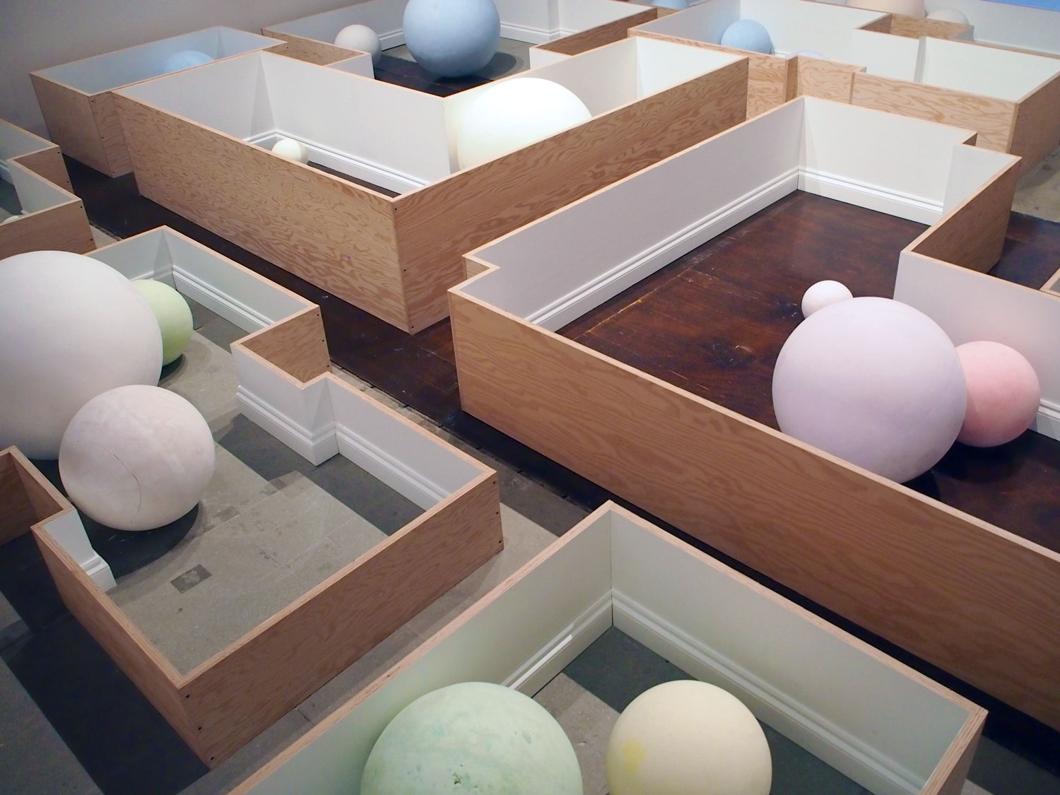
Common Places, Martín Cordiano
There’s something compelling about Argentinian artist, Martín Cordiano’s piece. Balls of coloured chalk feel trapped in what could be boxes. But the addition of skirting boards is enough of a cue to turn boxes into rooms, given extra resonance by the floors they are placed on. There is no movement but somehow there’s a melancholy created by the implied scale of these spheres, unable to roll free of their confines. Or maybe I’m reading far too much into it all.
4. Earth Pavilion
Chai, Charles Atlas
American video artist Charles Atlas was a long time collaborator with the legendary Merce Cunningham. Following the death of the choreographer, in 2009, Atlas has turned to more abstract art pieces.
For the Biennale, he has produced two works. The Tyranny of Consciousness shows a wall filled with multiple, coordinated sunsets, coupled with the audio (and video), of the drag star Lady Bunny, delivering a tirade about corruption, authoritarianism and sexual politics. It was grand and stunningly executed.
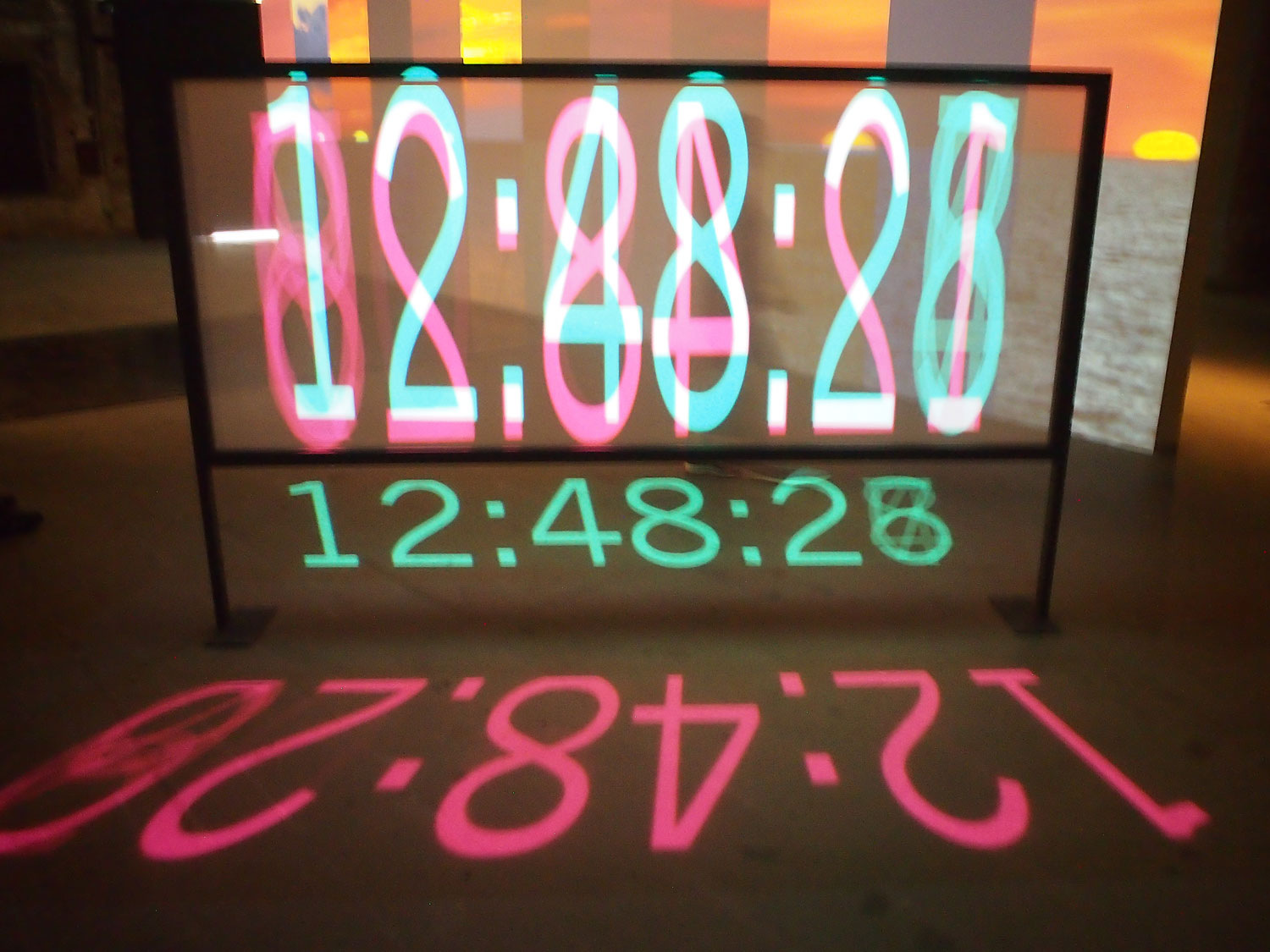
But my favourite piece was to the side of that. Chai is a simple digital clock with two overlaid, reversed projections, counting down from 18 minutes, the length of an average sunset. But rather than being uplifted by the beauty of the gradually setting sun, we are filled with tension, watching the time race away from us.
Oldest and newest tools, Shimabuko
Japanese artist Shimabuko referenced his 2015 exhibition, Exchange A Mobile Phone For A Stone Tool at Wilkinson Gallery in London. In a two-minute video, Sharpening a MacBook Air he uses a grinding stone to turn his computer into an axe to cut through an actual apple.
Beside that, in a museum-style cabinet he had placed different models of iPhones next to found stones.
It’s a piece about built-in obsolescence and waste. And, at some level, it’s about the very real possibility that these powerful computing devices are quickly reduced to little more that raw materials, shipped to poorer parts of the world and scavenged for more utilitarian purposes.
5. Pavilion of Traditions
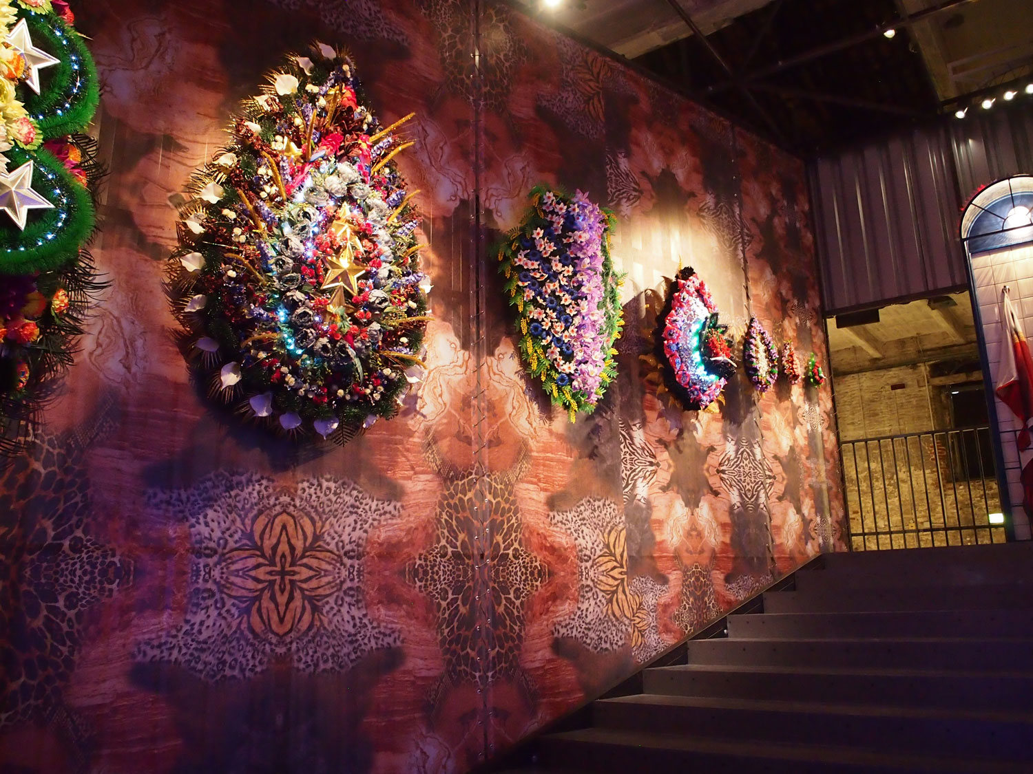
Good Intentions, Irina Korina
I’m not sure I have any idea what Irina Korina’s intentions were but it was compelling. Within an industrial container, which had to be entered via a staircase, flickering LEDs illuminate stunning floral wreaths, beside ceremonial flags. According to her site, the floral arrangements are reminiscent of the growing cult of recognising Russia’s fallen soldiers.
She has some fun with perspective which makes things disconcerting. The whole experience smacks of opulence but only as a layer of facade, hung on an industrial backdrop.
6. Pavilion of Shamans
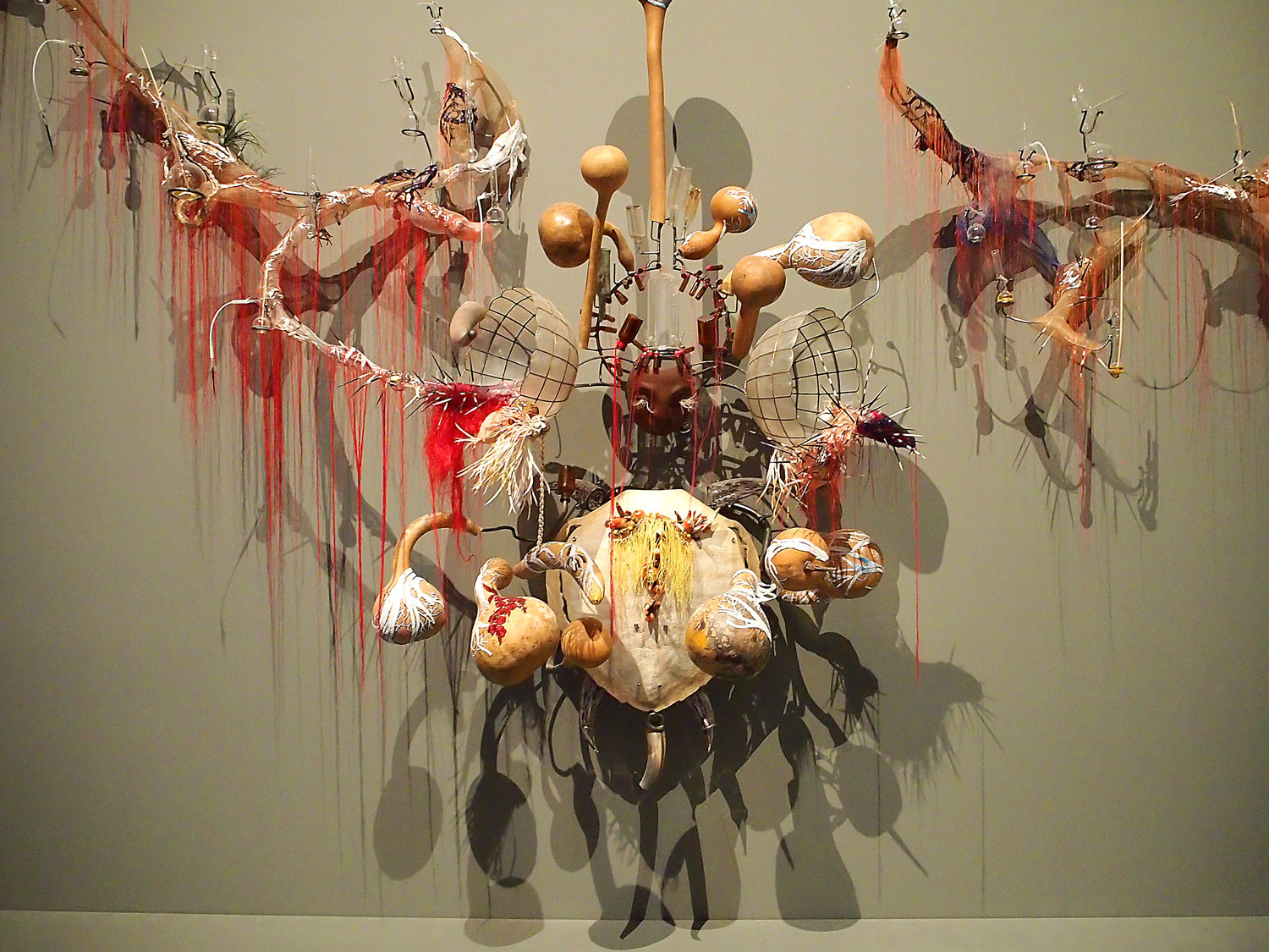
When signs of origins fade…, Rina Banerjee
Originally from India, the New York based artist Rina Banerjee creates chimeric sculptures that feel like they should have their origins in some kind of mystical tradition. She gives you the cues of animal shells, bones, feathers and dried seed-pods. But she mixes them with synthetics, metals and glass to create new shamanistic totems.
She says of herself, “I like toying with it (language), making it bend, stretch, reach…I work my titles to do somersaults, acrobatic feats and create a space that is imprecise.
The full title of the piece is: When signs of origins fade, fall out, if washed away, trickle into separations, precipitate when boiled or filtered to reveal all doubleness as wickedness. Vanishing act that migration, mixation like mothers who hid paternity who could name move me slowly reveal only me slowly reveal me only when my maker stands straight.
7. Dionysian Pavilion
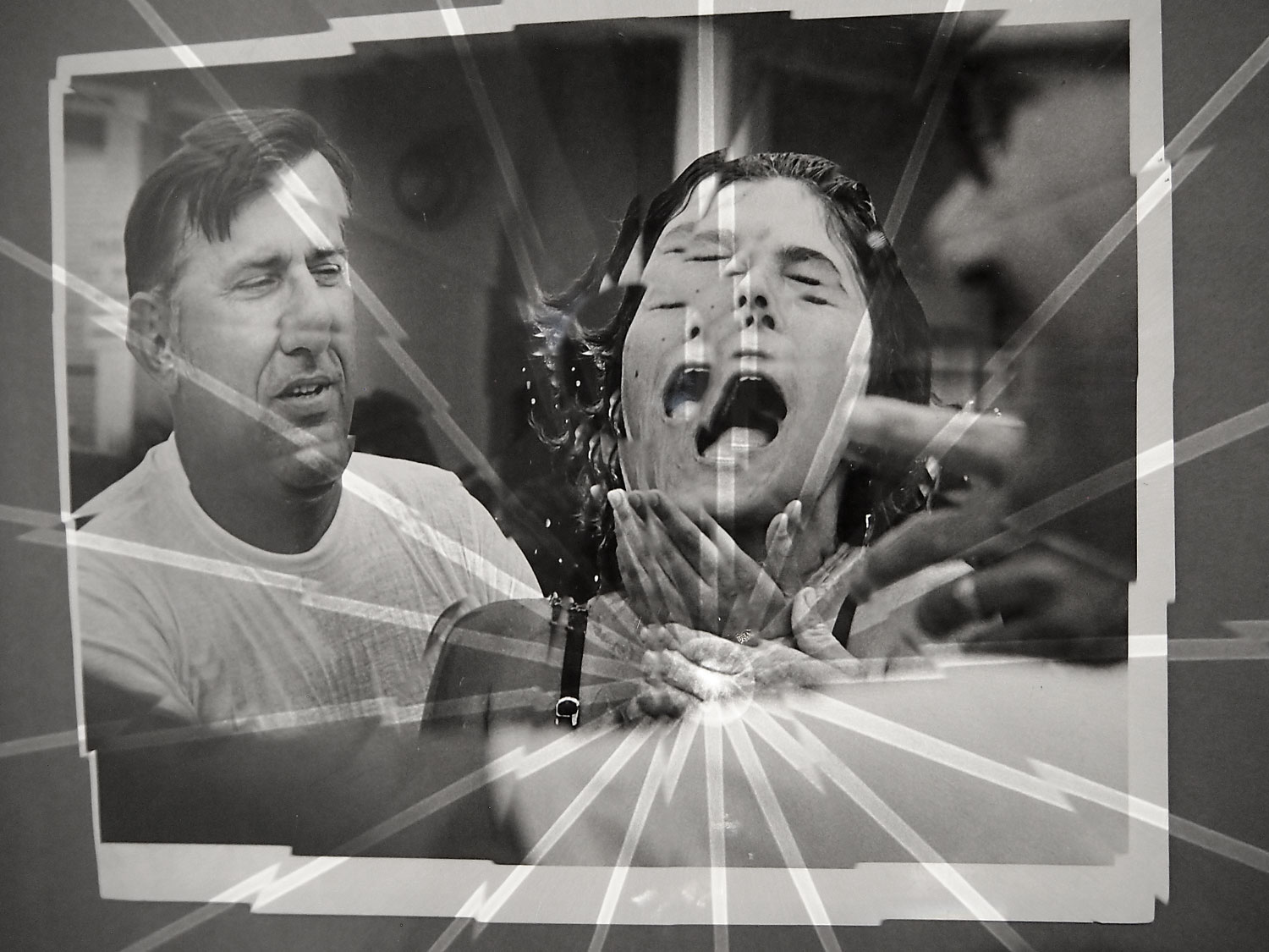
Towards Universal Pattern Recognition (Baptism Bayfront Center, 1982), Jeremy Shaw
Canadian artist, Jeremy Shaw works mostly in video. So it is perhaps not surprising that he’s added movement to these still black and white images.
Using acrylic, Shaw has created prisms in front of ‘typical’ images of evangelical scenes. As you shift your view point, the images become fractured, multiplied. You can create your own moments of revelation and ecstasy, or you switch the scene and turn preachers into multi-headed monsters, inflicting pain.
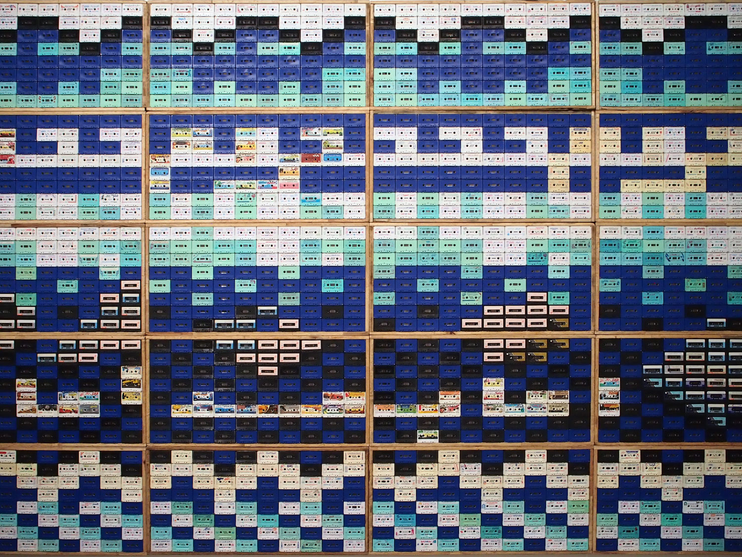
Food for Thought “Amma Baad”, Maha Malluh
From a distance, this work looks like ceramic tiling, the kind you might find on a minaret. But as you approach you realise that these are audio cassettes. They are instructional tapes, made by Imams, telling women how to behave. Layered on top of all that, the tapes are also (apparently) positioned to spell out the Arabic words ‘fitna’ (temptation), ‘haram’ (forbidden) and ‘jihad’.
Maha Malluh is a Saudi artist, the first female artist to ever publicly display work in Jeddah. She works with found materials, preferring not to add more stuff into the world. You have to admire that amidst the decadence of some of the works that surround hers.
8. Pavilion of Colours
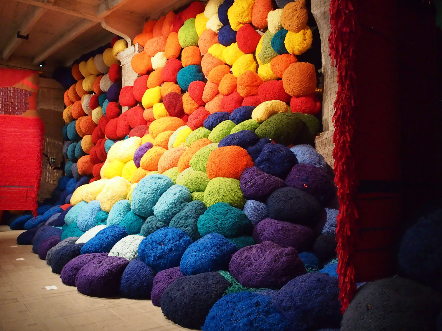
Escalade Beyond Chromatic Lands, Sheila Hicks
Sheila Hicks is described as a fibre artist, which is fun in itself. She has spent her long career exploring colour and texture.
This enormous installation of woolly balls can’t do anything but make you smile. Such soft surfaces, reflecting such vibrant colour. My only disappointment was not being able to jump in and sit amongst it all.
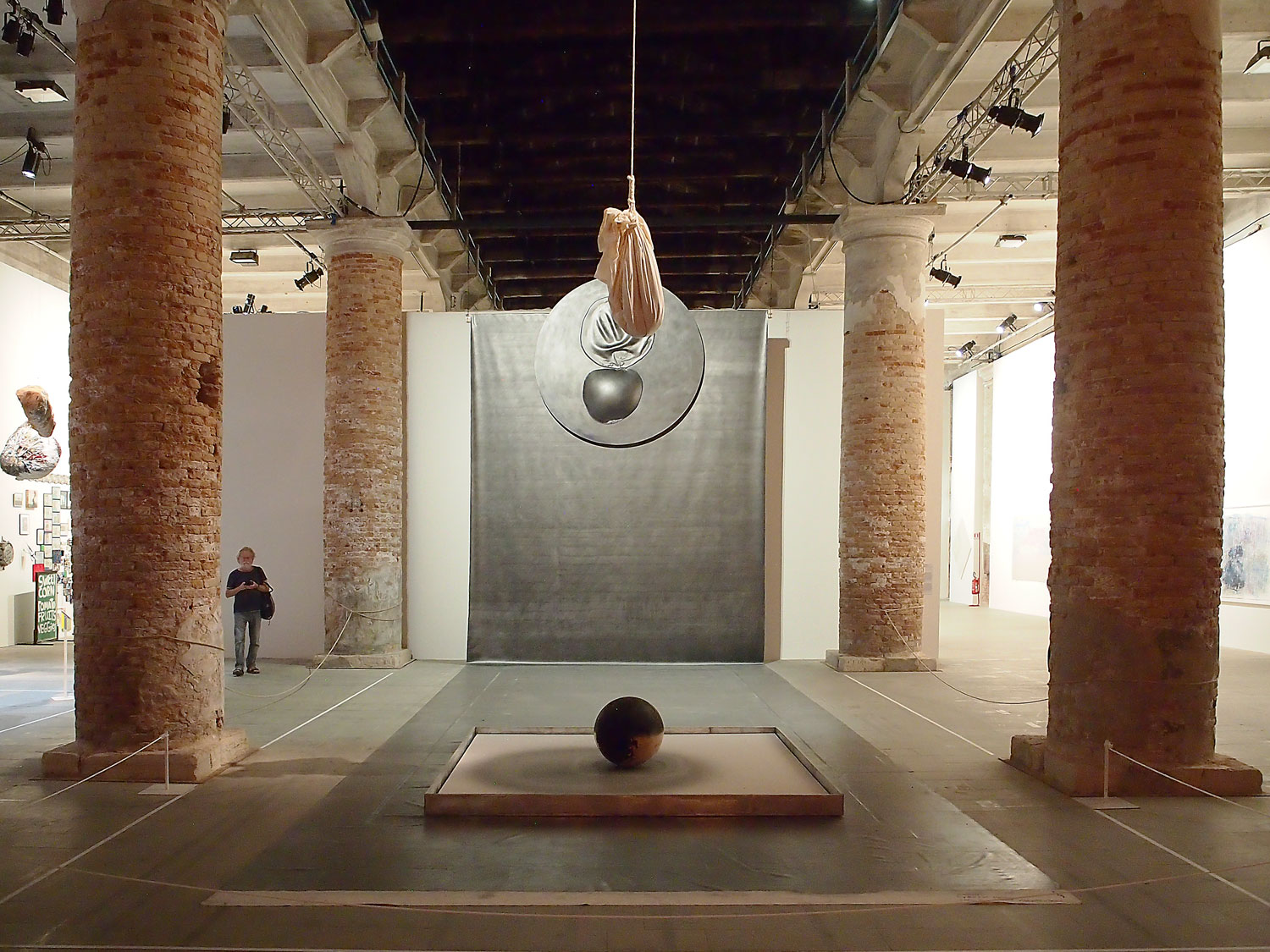
Venice Stream, Takesada Matsutani
Opposite the bright colours of Sheila Hicks is this monochromatic installation by Osaka-born artist Takesada Matsutani. Once part of the influential Gutai group, he continues to work with their theme of time as a sculptural element.
A backdrop of graphite grey gives grounding to a sack, hanging from the structural wooden beams of this former arms factory. The sack is filled with water and black ink, and Matsutani made multiple piercings through the material, allowing the ink to drop and form its own pattern on and around the sphere below.
9. Pavilion of Time and Infinity
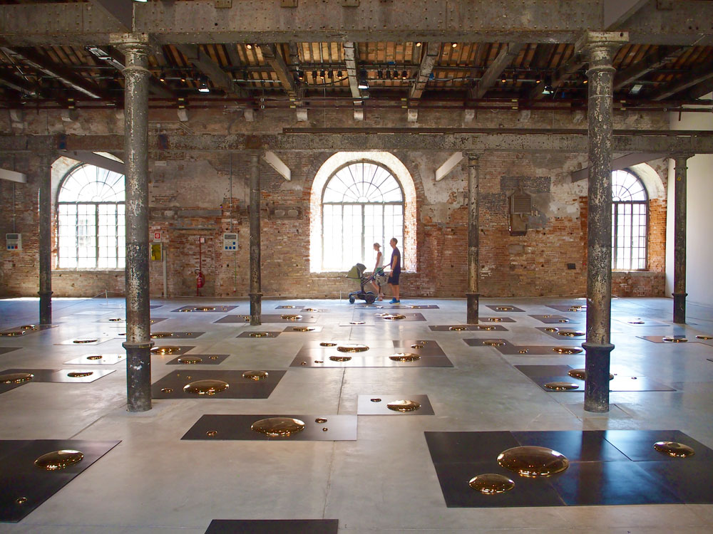
Square, Liu Jianhua
Porcelain is Liu Jianhua’s main medium and preoccupation. In this piece he has turned porcelain into liquid gold drops, placed on black metal sheets.
I can’t find any reference to it but I can only think that for a Chinese artist to call a work Square, he must at some level be referencing the fallen of Tiananmen Square. Or maybe it’s just an ironic title and he just loves the circular form of droplets.
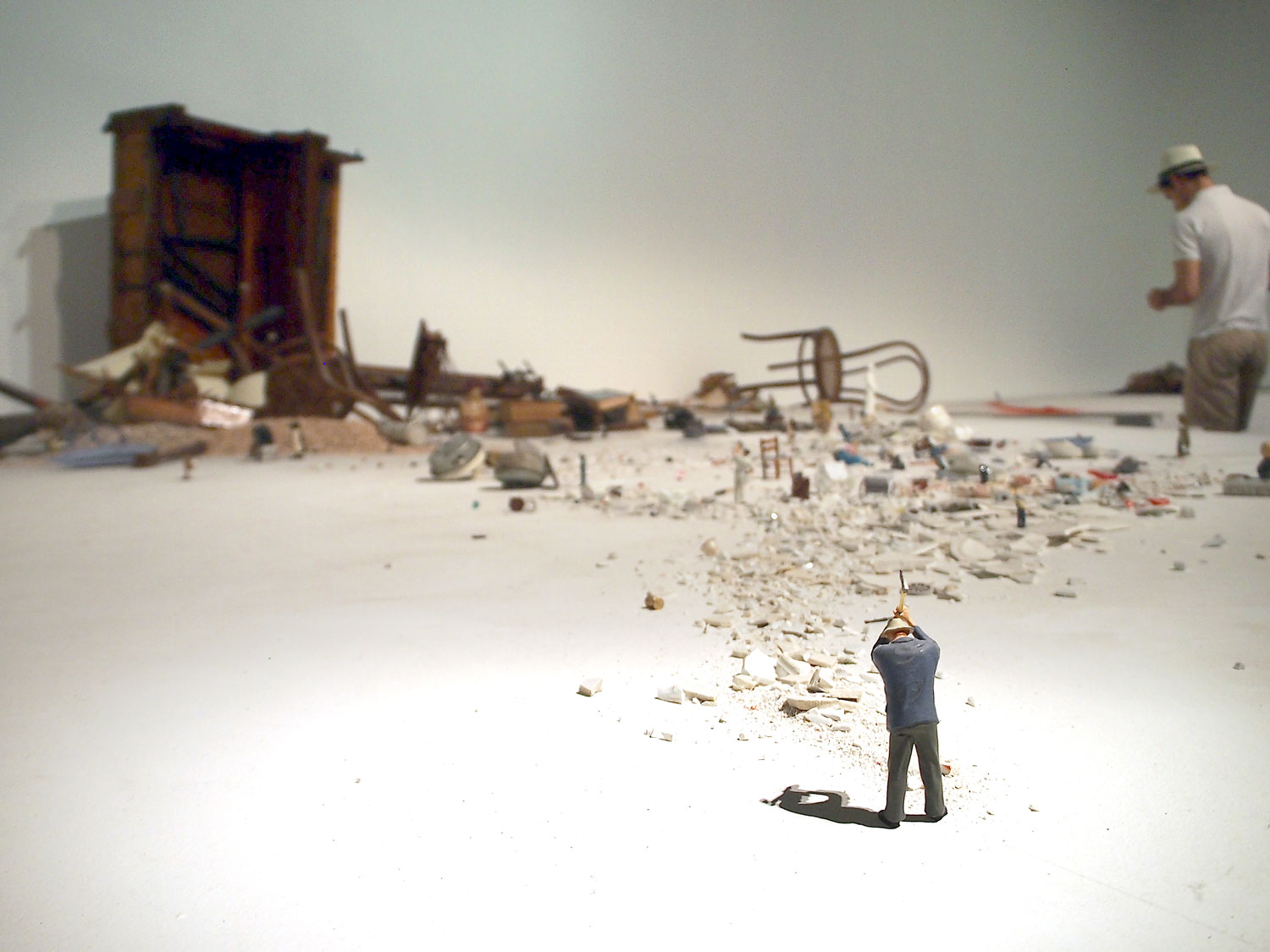
El hombre con el hacha y otras situaciones breves, Liliana Porter
Liliana Porter’s installation may not seem the most original but it does look like a huge amount of fun to set up.
Her work is all about juxtaposition and collage. This is a three-dimensional realisation of those themes, using tiny models of people, shattered ceramics, pools of paint and the guts of a piano. She’s playing with scale, with placement and mostly with humour.
That was the end of the Arsenale. Well, actually it wasn’t because there are several countries represented in the rest of the huge complex of buildings. But for the continuity of this article I’m going to jump over to the Giardini, to visit the introductory chapters of Christine Macel’s narrative. Confusing isn’t it?
1. Pavilion of Artists and Books and 2. Pavilion of Joy and Fears.
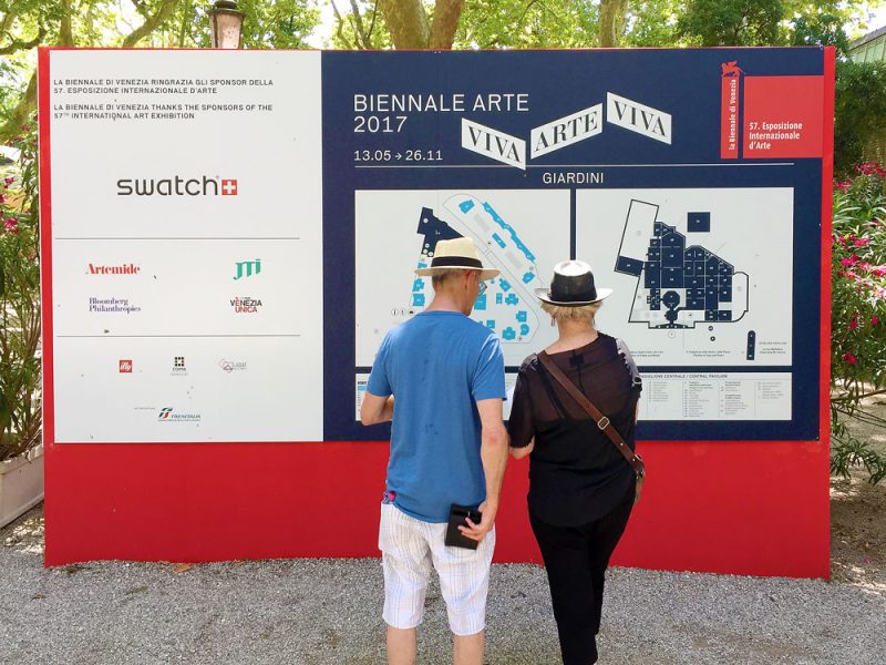
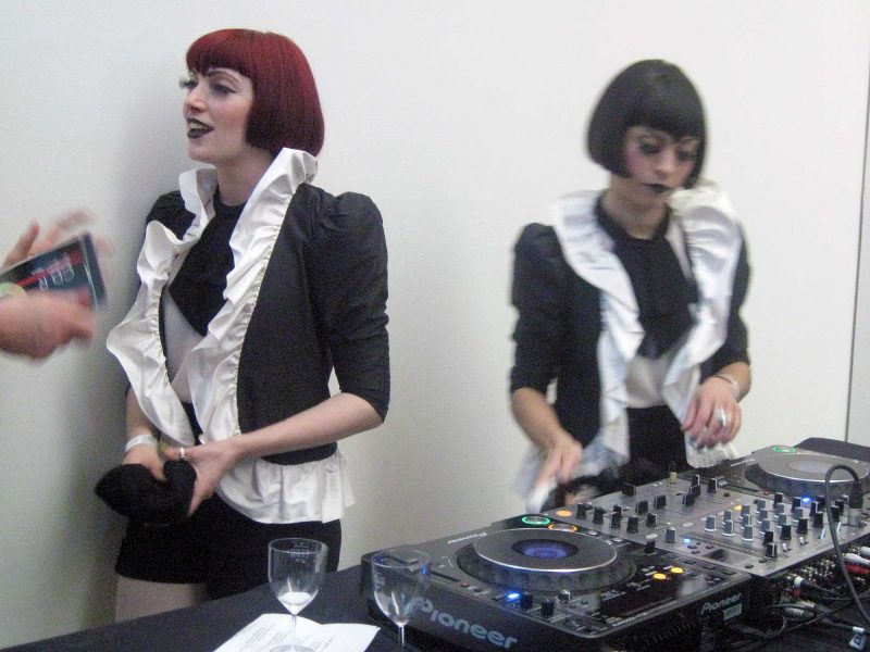
At the Giardini, the central pavilion looks a bit like a gift shop from the outside. But I ventured in, wandered round and found quite a lot to like (and a fair amount that I didn’t). I’m not sure I realised at the time that there were two pavilions inside. I certainly didn’t recognise any difference between the Pavilion of Artists and Books, and the Pavilion of Joy and Fears.
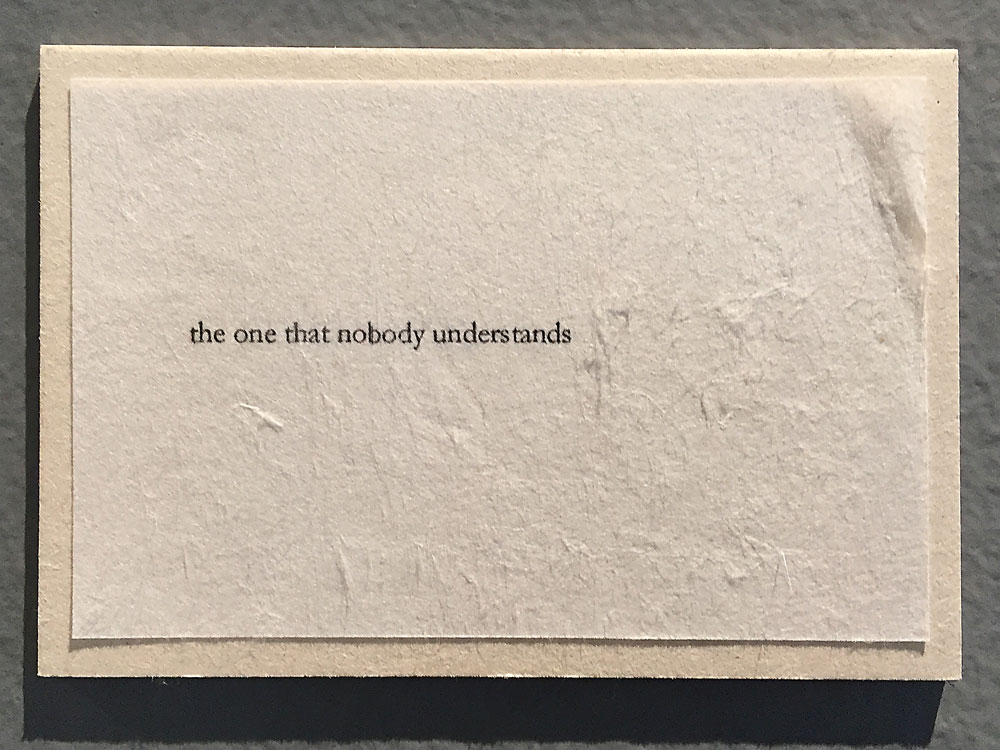
A card from Franck Leobovici’s piece about how people talk about art.
What was clear was that I’d come at the wrong time of the Biennale’s cycle. There were several working studio spaces set up but they all seemed devoid of artists or interaction, shut for the hot weeks of summer perhaps.
A couple of works did make me stop in my tracks….
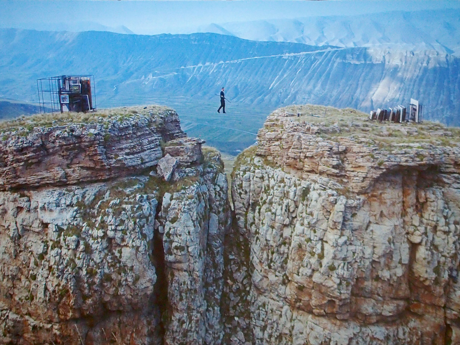
Tightrope, Taus Makhacheva
In her video work, Tightrope, Russian-Dagestani artist Taus Makhacheva directs a tightrope walker as he collects pieces of Dagestani art from one peak (in the Russian Northern Caucuses) and stores them on another.
This mesmerising video is part of a much wider exploration, by the artist, that has been collated into a book.
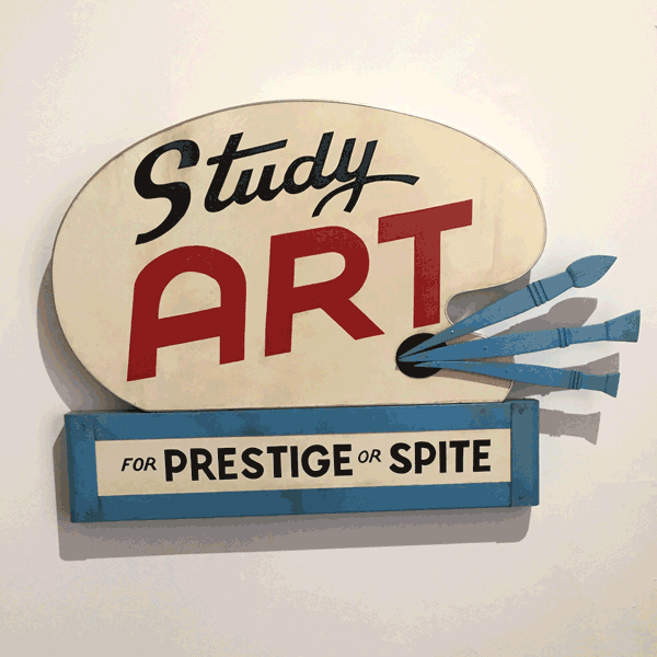
Study Art…, John Waters
Dotted throughout the space (often facing each other) are advertising signs that feel like they could be leftovers from 1950s New York. Their appearance in the Biennale gives them a kitsch context. But there’s also something disquieting about the choice of words, the reasons for studying.
I liked them so much that I collected the set as photographs so I could turn them into the above gif. It was only later that I realised the artist behind them was the film director John Waters.
So, I’d ticked off all nine pavilions of the Viva Arte Viva themed exhibition. I’m not sure how it compares to previous years of curator programming. I enjoyed the vast majority, despite lacking any real grasp of the themes or set-up.
In my next entry, I’ll start looking at the national pavilions, starting in the Giardini...
Related
Venice Biennale ’17 – introduction
Michael's introduction, and top tips for first-time visitors, to the Venice Biennale.
Venice Biennale ’17 – Giardini
Looking at the core national pavilions of the Venice Biennale, housed within the Giardini site.
Venice Biennale ’17 – Arsenale
Looking at the Venice Biennale national pavilions within the Arsenale site.
Venice Biennale ’17 – all Venice
Michael ventures beyond the main Venice Biennale sites, in search of activity across the city.
28 May ’19
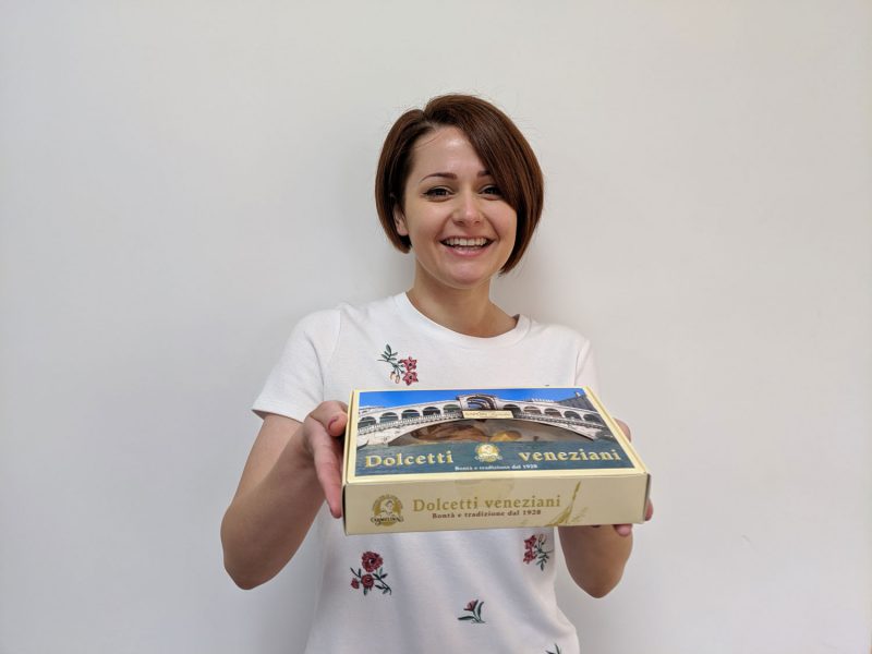
Emily visited Venice over the bank holiday weekend and she's brought us some Venetian treats back.
7 July ’17
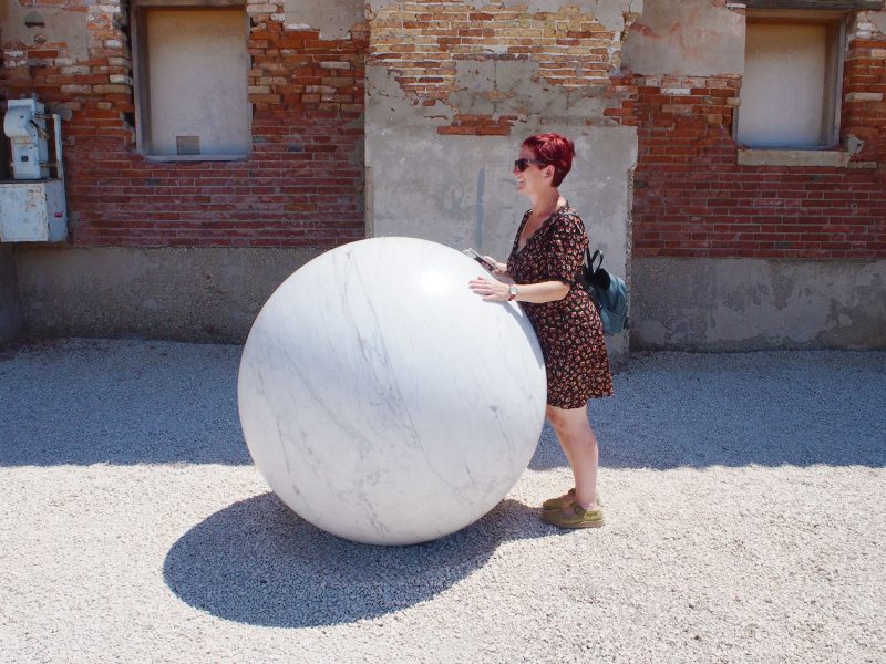
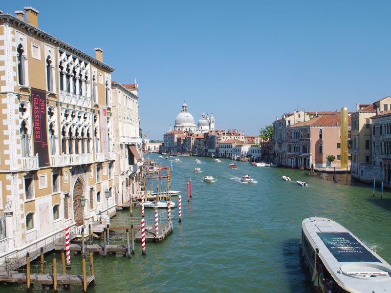
Michael is in Venice for the Biennale. The sun is shining and the art abundant.
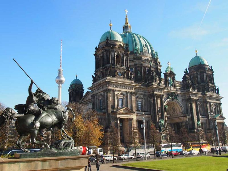
Cultural Berlin – Day 1
Day one of a week of cultural tourism in Berlin.
Cultural highlights of 2017
Michael gives a month by month overview of his favourite cultural events of 2017…
Cultural highlights of 2015
Michael gives a month by month overview of his favourite cultural events of 2015...

A year of our Cultural Calendar
Last August we sent out our first Cultural Calendar email, Anna looks back over the year and what we've learnt.
London Film Festival 2017
The BFI London Film Festival has become one of the capital's most important and exciting cultural highlights. Michael writes about...
Cog Culture Cup wall chart
An absolute game-changer of an interactive cultural calendar and world cup wall chart thing.
Glamour Factory: Late Shift at National Portrait Gallery
The National Portrait Gallery was packed for this special late night opening, organised by Contemporary Vintage, an excuse to dress...
Twombly and Poussin: Arcadian Painters at Dulwich Art Gallery
A unique exploration of contemporary artist Cy Twombly (1928 - 2011) and 17th century classical painter Nicolas Poussin (1594 -1665)....