To lighten the mood in this serious election, Design Week asked a handful of designers what they think of the brand/visual identity of each of the five major political parties. Here’s an expanded version of Michael’s contribution
Who would win a branding ballot?
When we first work with a new client, I give a short presentation, titled ‘is branding all bullshit?’ In it, I explain how powerful branding can be, but only if we can shake off the image of red-braced men, unveiling logos to the sound of popping Champagne corks. Political parties seem trapped in that period – the late 1980s, when designers were sticking badges of anything and everything. The Red Rose of Labour features heavily in my presentation.
![]()
Politicians and their advisers make for terrible clients. It must have been frustrating for agency, Perfect Day to work with David Cameron on that anodyne Tory tree, but being asked to fill it with a union flag (allegedly under instruction from disgraced spin-doctor Andy Coulson) must have been an excruciating conversation.
![]() Labour are equally culpable; they had the evocative red flag as an emblem until Neil Kinnock picked a photo of his favourite rose from a gardening catalogue and asked someone to redraw it as a logo (with, according to Kinnock, Peter Mandelson dictating the length of the stem). Now they’ve packed the rose in a box and painted it white. Still, at least they’ve rediscovered some pride in their name.
Labour are equally culpable; they had the evocative red flag as an emblem until Neil Kinnock picked a photo of his favourite rose from a gardening catalogue and asked someone to redraw it as a logo (with, according to Kinnock, Peter Mandelson dictating the length of the stem). Now they’ve packed the rose in a box and painted it white. Still, at least they’ve rediscovered some pride in their name.
![]() I do have a bit of a soft-spot for the Lib-Dem ‘bird of freedom’ because I can remember how innovative and fresh it felt when it first took flight in the late eighties (and Thatcher referred to it as ‘the dead parrot’). But whilst the Tories and Labour now have a really slick communication machine, the Lib-Dems seem to be leaving candidates to produce their own leaflets in MS Word and Paint.
I do have a bit of a soft-spot for the Lib-Dem ‘bird of freedom’ because I can remember how innovative and fresh it felt when it first took flight in the late eighties (and Thatcher referred to it as ‘the dead parrot’). But whilst the Tories and Labour now have a really slick communication machine, the Lib-Dems seem to be leaving candidates to produce their own leaflets in MS Word and Paint.
![]() The UKIP logo, like the party themselves, seems beyond parody. Brash pound-land politicians, reveling in their lack of sophistication, flicking Vs at the world. Of all the parties, UKIP have the most consistent brand but only in the way that you can rely on your racist uncle to be drunk and a bit grabby at your next family party.
The UKIP logo, like the party themselves, seems beyond parody. Brash pound-land politicians, reveling in their lack of sophistication, flicking Vs at the world. Of all the parties, UKIP have the most consistent brand but only in the way that you can rely on your racist uncle to be drunk and a bit grabby at your next family party.
![]() For all their talk of being the most progressive party, the Greens’ visual identity is just as tired and rooted in 1980s as all the others. Their logo in particular seems designed to be a pin-badge, worn on hessian dungarees. The Greens are pushing for innovation across all areas of policy and representation, it’s time they updated their branding to reflect that (rather than reinforcing tired stereotypes).
For all their talk of being the most progressive party, the Greens’ visual identity is just as tired and rooted in 1980s as all the others. Their logo in particular seems designed to be a pin-badge, worn on hessian dungarees. The Greens are pushing for innovation across all areas of policy and representation, it’s time they updated their branding to reflect that (rather than reinforcing tired stereotypes).
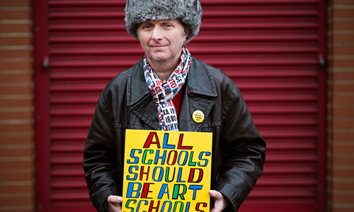
Bob & Roberta Smith. Photograph: Alecsandra Raluca Dragoi for the Guardian
My favourite ‘politician’ of this election has been Bob and Roberta Smith. Standing against Michael Gove in the Surrey Heath constituency, his campaign is focused, consistent and honest – art without artiface, and not a logo to be seen. #VoteBob.
To read what the other selected designers had to say, read the article on the Design Week site; you’ll need a (free) login.
Related
10 April ’15
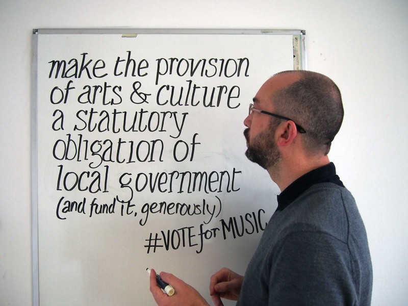
Michael's submitted his #VoteFor Music submission. It's a campaign to crowd-source agenda issues to put to the next UK government.
Advocating for culture
For the first time in our lifetimes we have a fixed date for the general election – 7th May. Arts...
National Youth Theatre’s Tory Boyz
It’s five years since James Graham’s Tory Boyz was at Soho Theatre. I can still remember the rave reviews and...
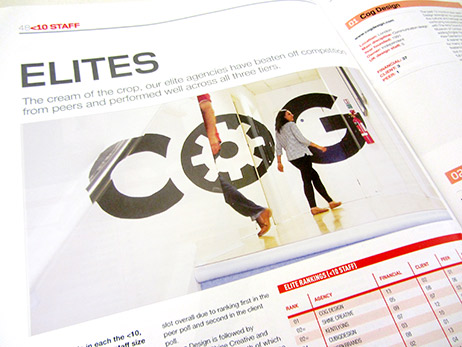
Voted number one small agency in the UK
Cog Design was ranked as the number one small agency in the UK by Drum magazine.
24hr design challenge
On 4th May we shut the studio to compete in a 24hr design challenge, creating a website for a new...
23 June ’16
It's the day of the Euro referendum... The Cog team are voting IN.