Where creative action transforms lives
The Foundling Museum website
Our studio is filled with light and music.
There are multiple meeting rooms, a well stocked kitchen, and an indoor garden (with fishpond). Talk to us about access needs, environmental factors and any accommodations we might make to enhance your visit. Pop-in for tea and stay to use a spare desk for as long as you need.
11 Greenwich Centre Business Park,
53 Norman Road, Greenwich
London SE10 9QF
We’re next to Greenwich train and DLR station. We have a door right on the concourse but it’s different to our postal address. Find us via: what3words.com/hungry.means.author
This video shows the route to take from the train that will arrive at Greenwich rail station from London Bridge. There's a gentle slope next to the staircase.
If you have to come by car, we have a couple of parking spaces. We have a charging point that you are welcome to use if you have an electric car. Call ahead and we'll make sure the spaces are free. Use our postcode (SE10 9QF) to guide you in.
We’d love to hear from you. Use whichever medium works best for you.
11 Greenwich Centre Business Park,
53 Norman Road, Greenwich
London SE10 9QF
It's exciting to chat about potential new projects. We don't have a ‘sales’ team or a form to fill in. Call us or give us a little detail via email and we'll get straight back to you.
[email protected]If you're a client then you'll be best served by calling us or contacting us via ClickUp, otherwise you can use this dedicated email that reaches all of the digital team.
[email protected]This email hits the inboxes of the people who deal with our bookkeeping and finances.
[email protected]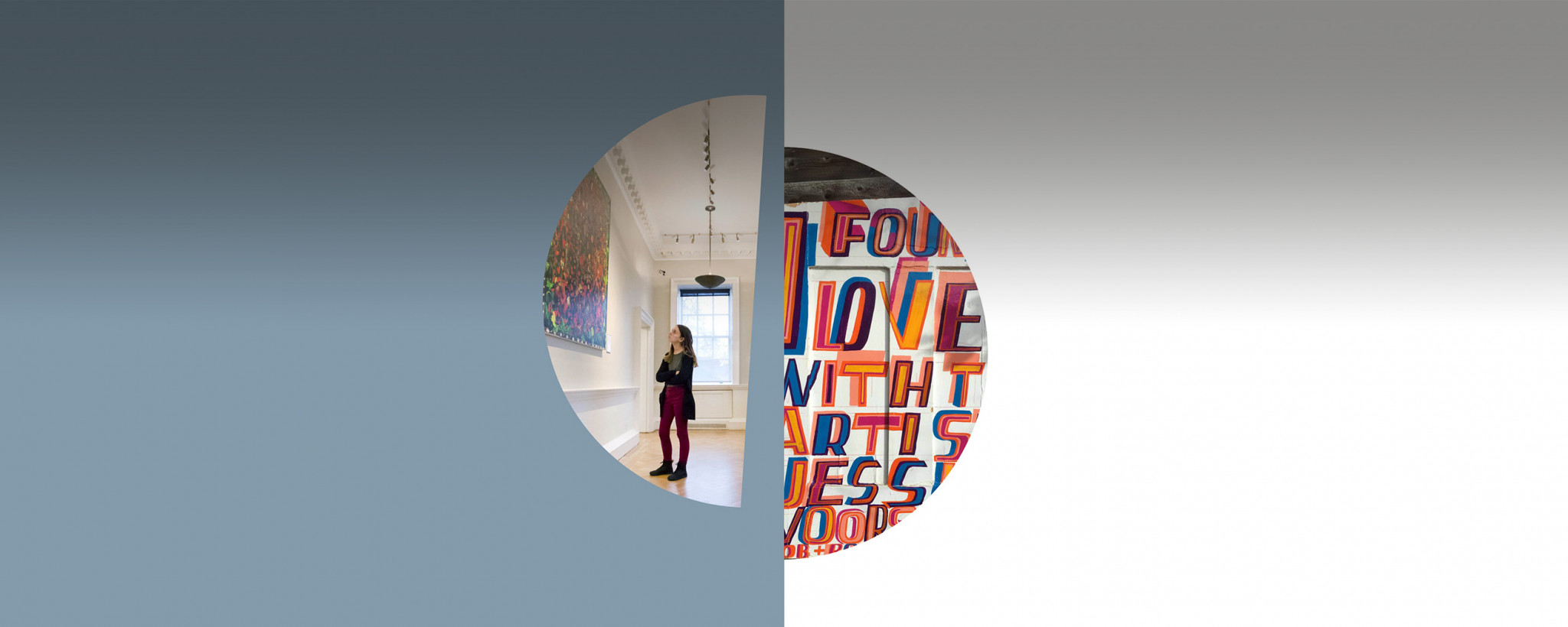
The Foundling Museum website
A digital presence to launch a new brand, juxtaposing a unique history against a compelling relationship with the arts.
In the heart of London, the Foundling Museum tells the story of the first charity set up (by Thomas Coram) to care for babies at risk of abandonment. Working in partnership with the branding agency, Hat-trick we created a site to tell their whole story, display highlights from their incredible collection, and provide a new platform for their charitable work.
Artist William Hogarth and composer George Frederic Handel were instrumental in helping Coram realise this vision by encouraging artists to donate work and conducting concerts in the Hospital chapel, establishing it as an art gallery and a place to visit.
The modern museum keeps this tradition alive, working with living artists, musicians and makers to raise funds and profile for the work of a vital charity working with vulnerable children and care leavers.
We worked in partnership with the branding agency, Hat-trick through a process of Discover, Design, Development and Deployment. Together we took their multiple messaging and complex offer, and created clear user journeys and compelling reasons to visit, support and engage with the museum and their work beyond the walls.
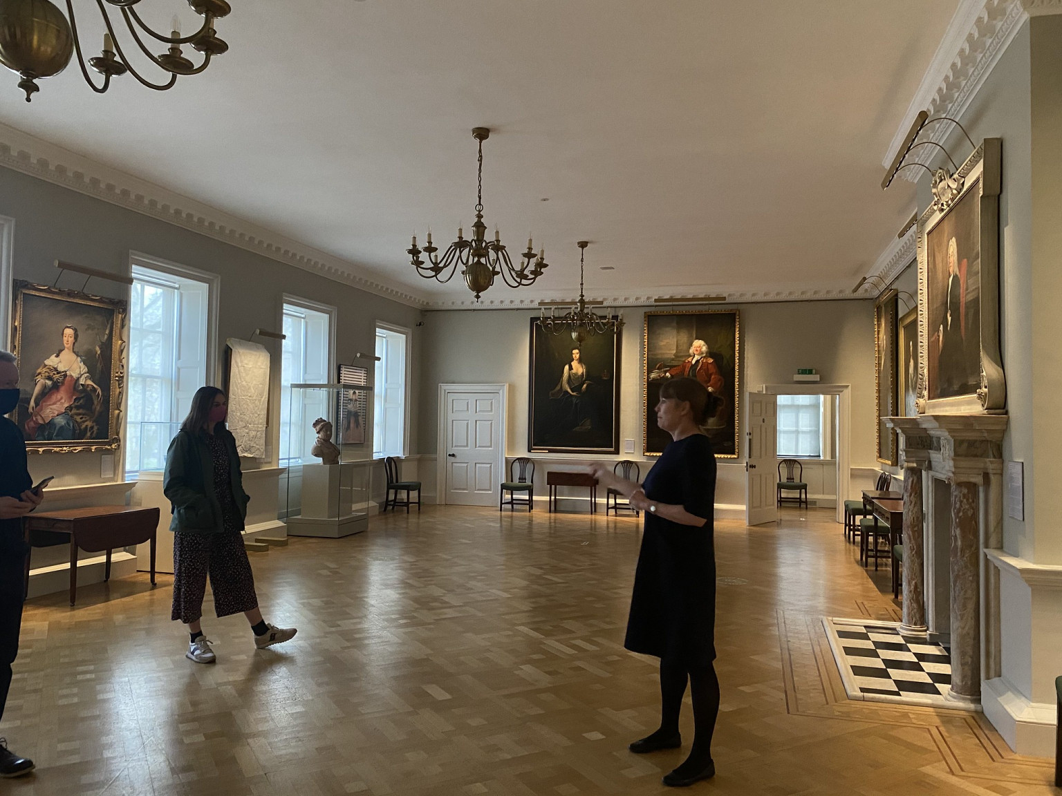 Director, Caro giving the team a tour
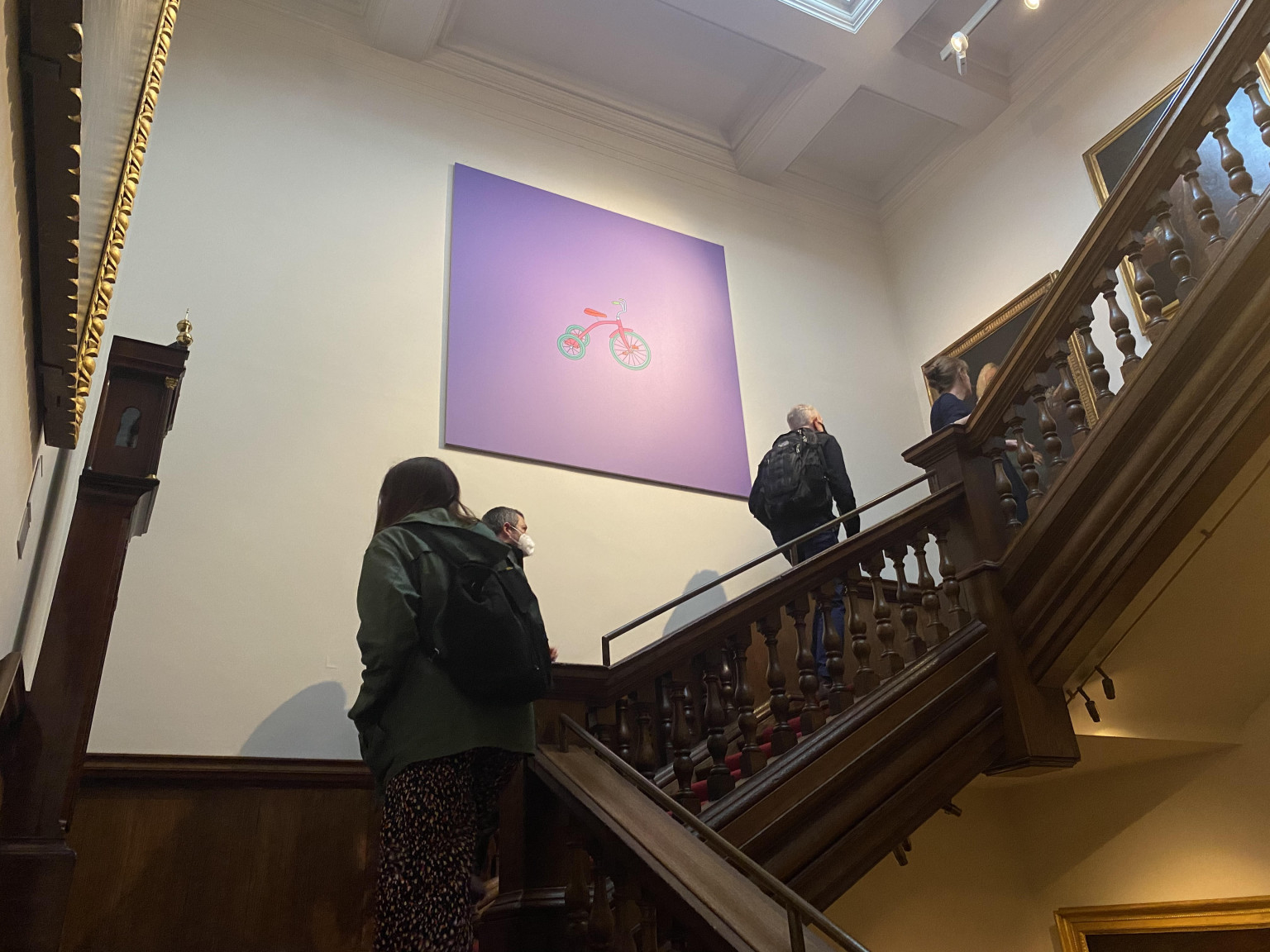 A piece by artist Michael-Craig Martin up the staircase
Anna and Emma were thrilled to be invited to visit the Foundling Museum in person. It was our first site visit for more than a year (because of the Covid pandemic). They were hugely inspired by a private tour from museum director Caro Howell.
The opening gallery space gives context to the history of the Foundling hospital. In it is a heart-breaking display of the museum’s most moving object – the tokens. Mothers leaving their babies at the Foundling Hospital would also leave a small object as a means of identification. The hope was that they would one day be able to reclaim their child. Children were renamed on admission, so the token would help prove their relationship. There are 391 tokens in the Foundling Museum Collection and these inspired Hat-trick’s work on the branding.
The Tokens were a means of identification - as such, they were powerful symbols of love, loss and longing - they have a talismanic poetry and potency.
Still unable to gather in person, we ran an online workshop to meet members of the team and understand the current and prospective audiences of the Foundling Museum. We asked everybody to chose an item from the collection that is important to them, this activity helped us understand the museum and how the objects tell their story.
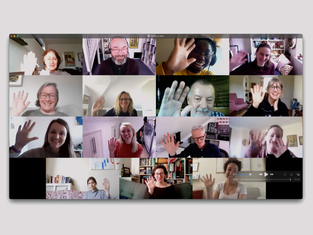
Online workshop in the summer of 2021
We talked about audiences and generated ‘personas’. What stood out was their breadth of audiences, from academics to young families, to couples planning their wedding.
From our analytics site review, we understood the Visit page gets most traffic and this would be key to establishing the venue and accommodating a day out for visitors.
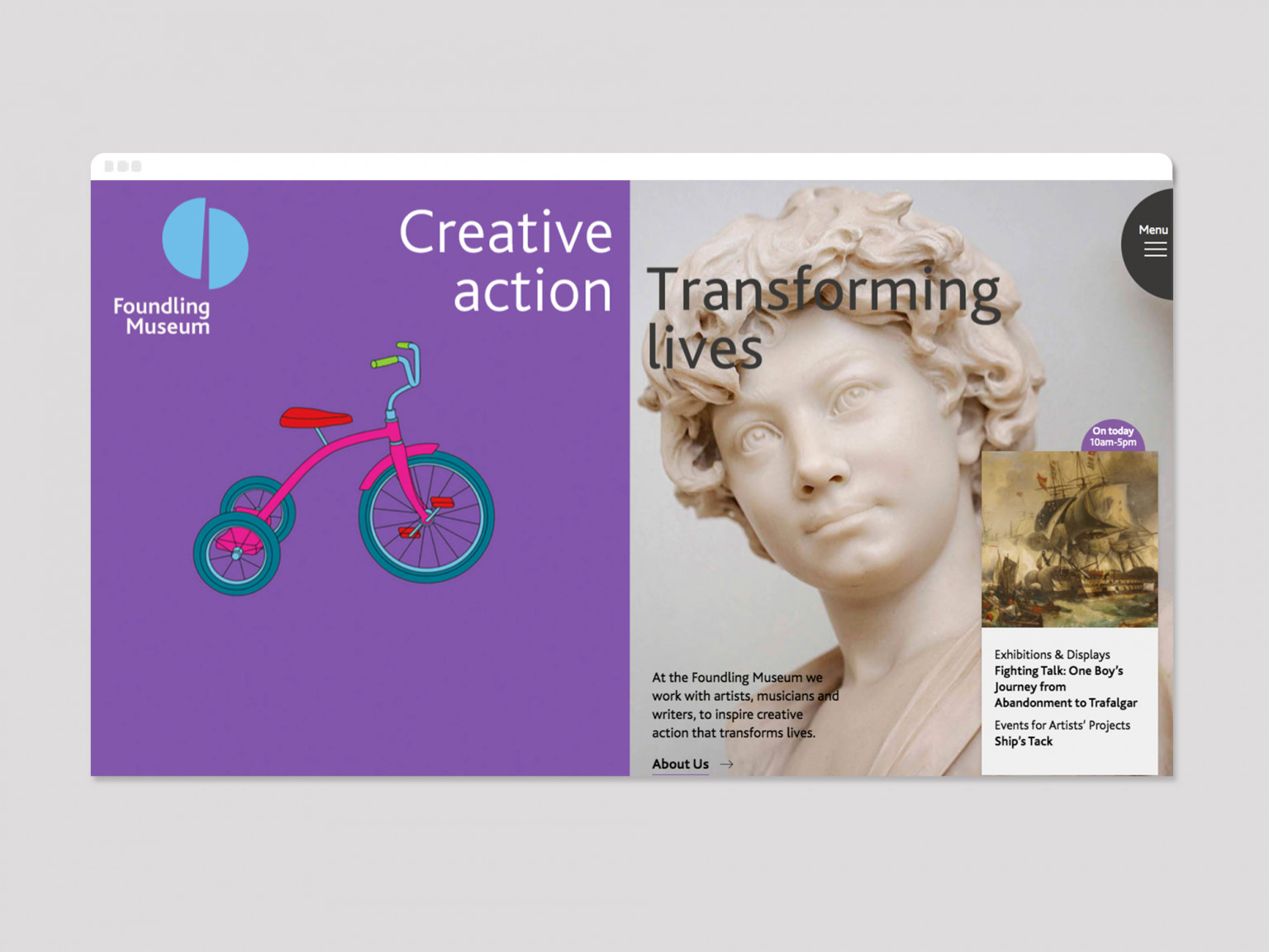 Homepage
We worked on a number of conceptual routes. But the ideas of contrast and juxtaposition (between history and contemporary) quickly became our main thematic approach, and worked well in bringing Hat–trick’s emerging visual identity work to life.
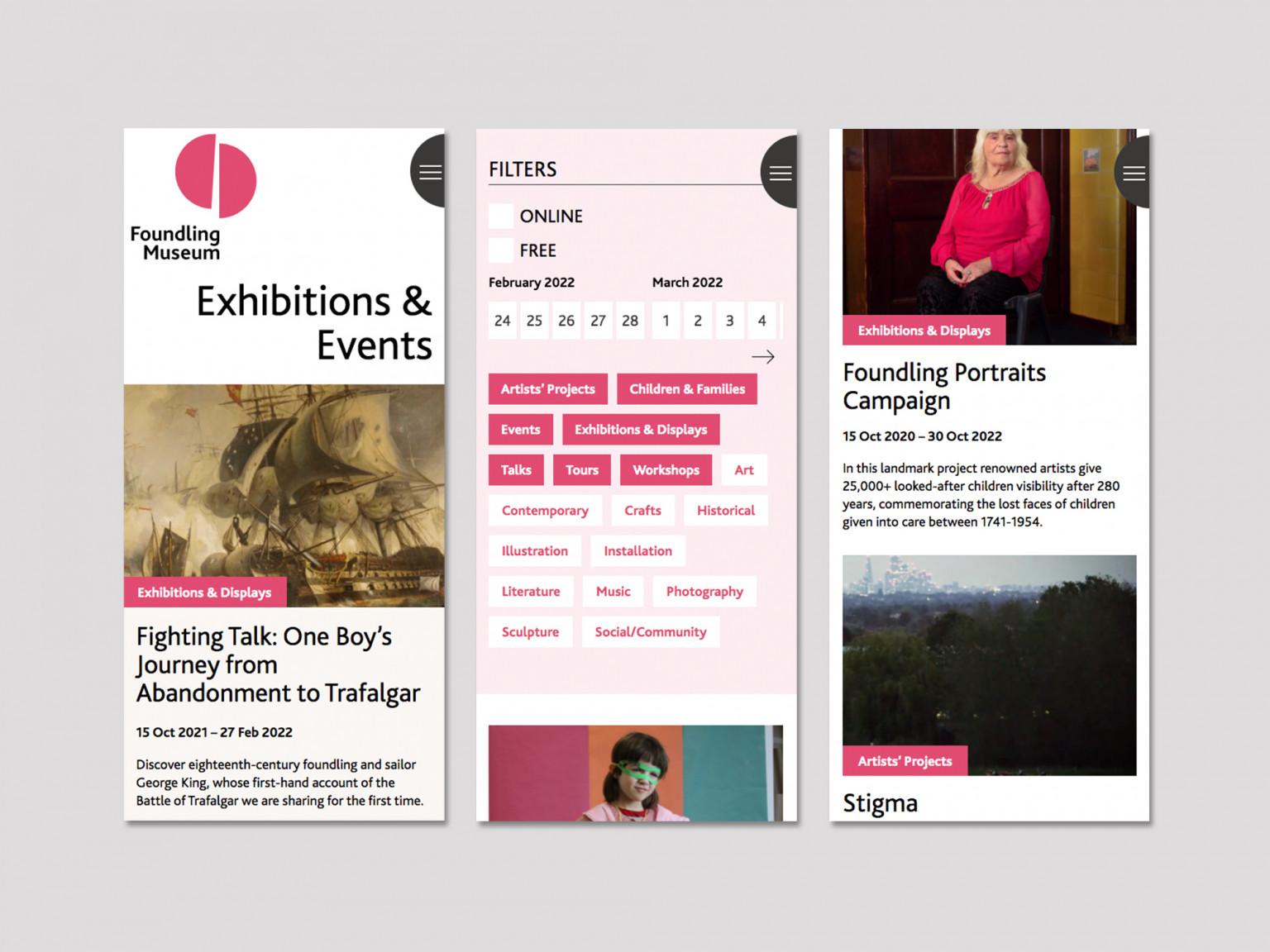
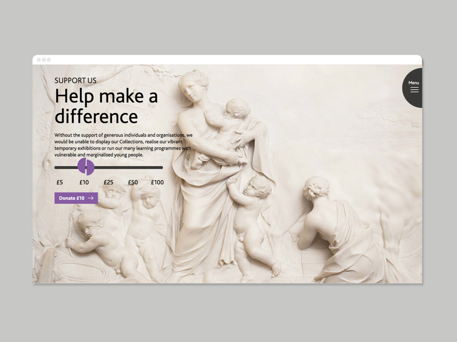
A home page animation/video sets the scene, using a split-screen to juxtapose images and introduce the visual reference of the emblematic token, a cheap-metal medal broken in half.
And the split-screen idea carries through the entire site, allowing us to display large images with enough room to breath and respect the subject matter.
Colour was also a key element to the designs. We didn’t want the site to feel dry and academic but it was also important not to feel corporate by settling on a uniform and fixed single colour. Working with Hat-trick we settled on a broad complimentary colour palette that adapts and changes through the site. And we gave the museum team the tools to change the colours for each panel of information.
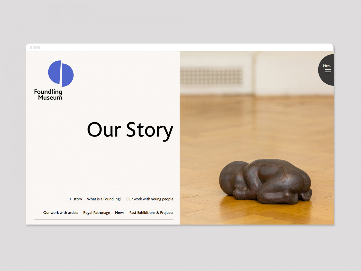
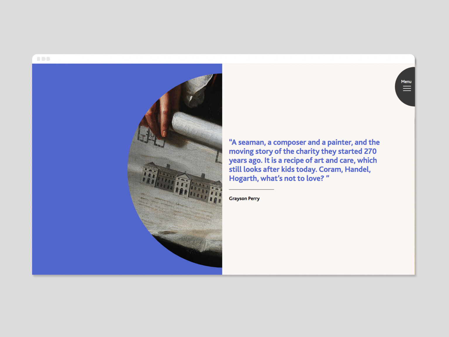
A sense of discovery and wonder was also an important factor in our design process. We knew that website visitors were likely to have a fixed idea of the Foundling Museum but we wanted ways to pique their interest in the wider work….
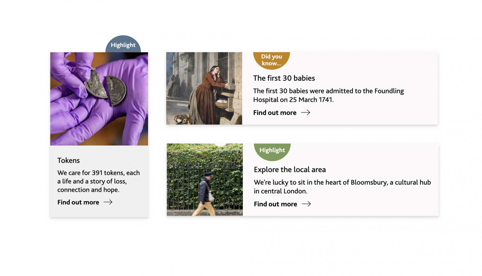
We’ve used WordPress as the underlying content management system, with lots of customisation to make it as simple as possible for different people to add content efficiently.
There’s all sorts of clever stuff going on in the back-end, allowing us to order content, manually adjust colours, reorder hierarchy and much more. It’s a hugely flexible set-up.
The site looks terrific and you all worked so hard to make it look so great and meet all of our functionality needs. I hope you are as proud of it as we are.
The website launched alongside Hat-trick’s excellent re-brand work. It was an important moment for the Foundling Museum, allowing them to reposition themselves as the dynamic and forward thinking charity they had already become.
We’re so proud of all we’ve achieved in this partnership and look forward to being the museum’s ongoing digital partners as they continue their journey and their story evolves.