Deptford's hub of culture and community
The Albany website
Our studio is filled with light and music.
There are multiple meeting rooms, a well stocked kitchen, and an indoor garden (with fishpond). Talk to us about access needs, environmental factors and any accommodations we might make to enhance your visit. Pop-in for tea and stay to use a spare desk for as long as you need.
11 Greenwich Centre Business Park,
53 Norman Road, Greenwich
London SE10 9QF
We’re next to Greenwich train and DLR station. We have a door right on the concourse but it’s different to our postal address. Find us via: what3words.com/hungry.means.author
This video shows the route to take from the train that will arrive at Greenwich rail station from London Bridge. There's a gentle slope next to the staircase.
If you have to come by car, we have a couple of parking spaces. We have a charging point that you are welcome to use if you have an electric car. Call ahead and we'll make sure the spaces are free. Use our postcode (SE10 9QF) to guide you in.
We’d love to hear from you. Use whichever medium works best for you.
11 Greenwich Centre Business Park,
53 Norman Road, Greenwich
London SE10 9QF
It's exciting to chat about potential new projects. We don't have a ‘sales’ team or a form to fill in. Call us or give us a little detail via email and we'll get straight back to you.
[email protected]If you're a client then you'll be best served by calling us or contacting us via ClickUp, otherwise you can use this dedicated email that reaches all of the digital team.
[email protected]This email hits the inboxes of the people who deal with our bookkeeping and finances.
[email protected]
The Albany website
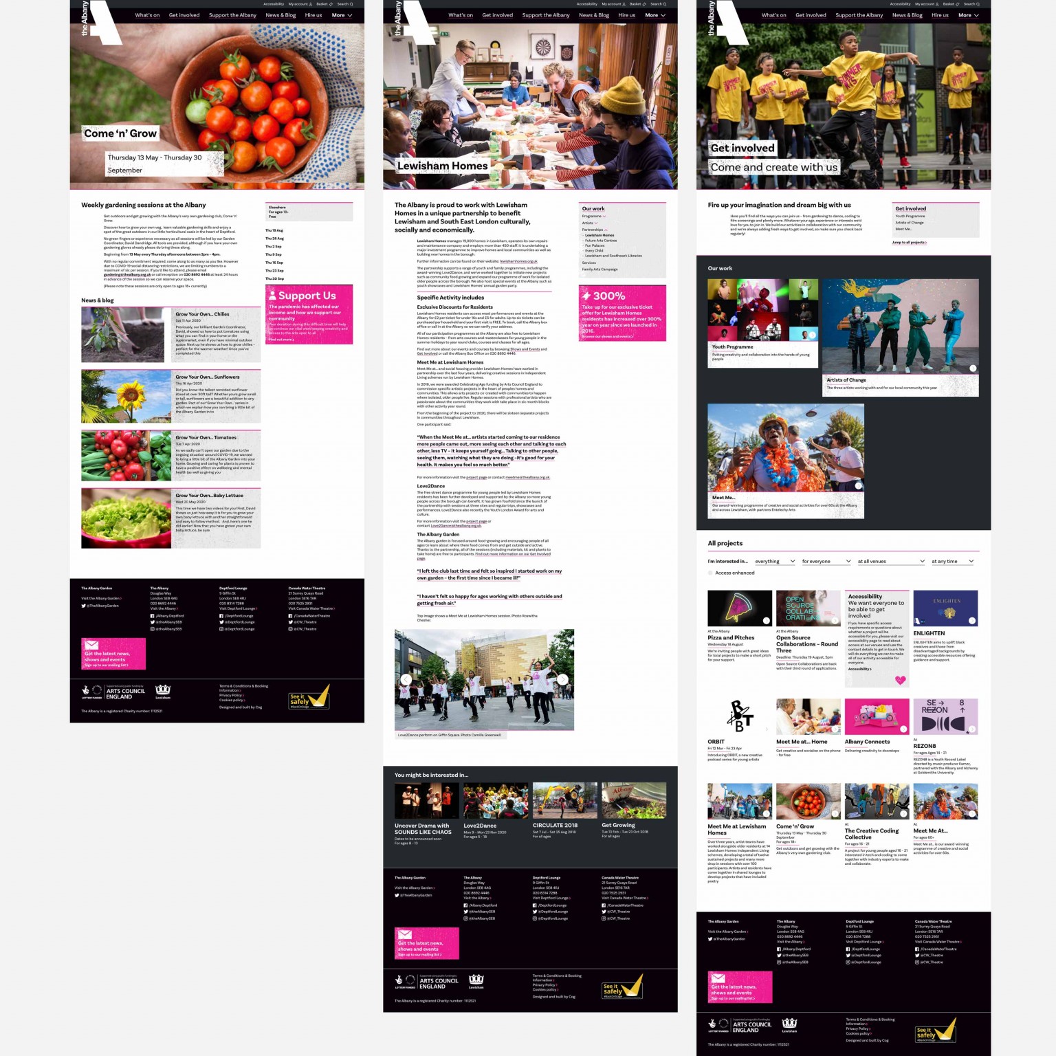
A Spektrix integrated site for this incredible centre for creativity, an arts hub at the physical and spiritual heart of Deptford.
We’d been speaking with The Albany for a few years, about options to upgrade their website. With a hugely expanded reach (across three venues), sector-wide initiatives, and a vast array of community projects, it seemed clear to us that their events-based site was no longer fit for purpose.
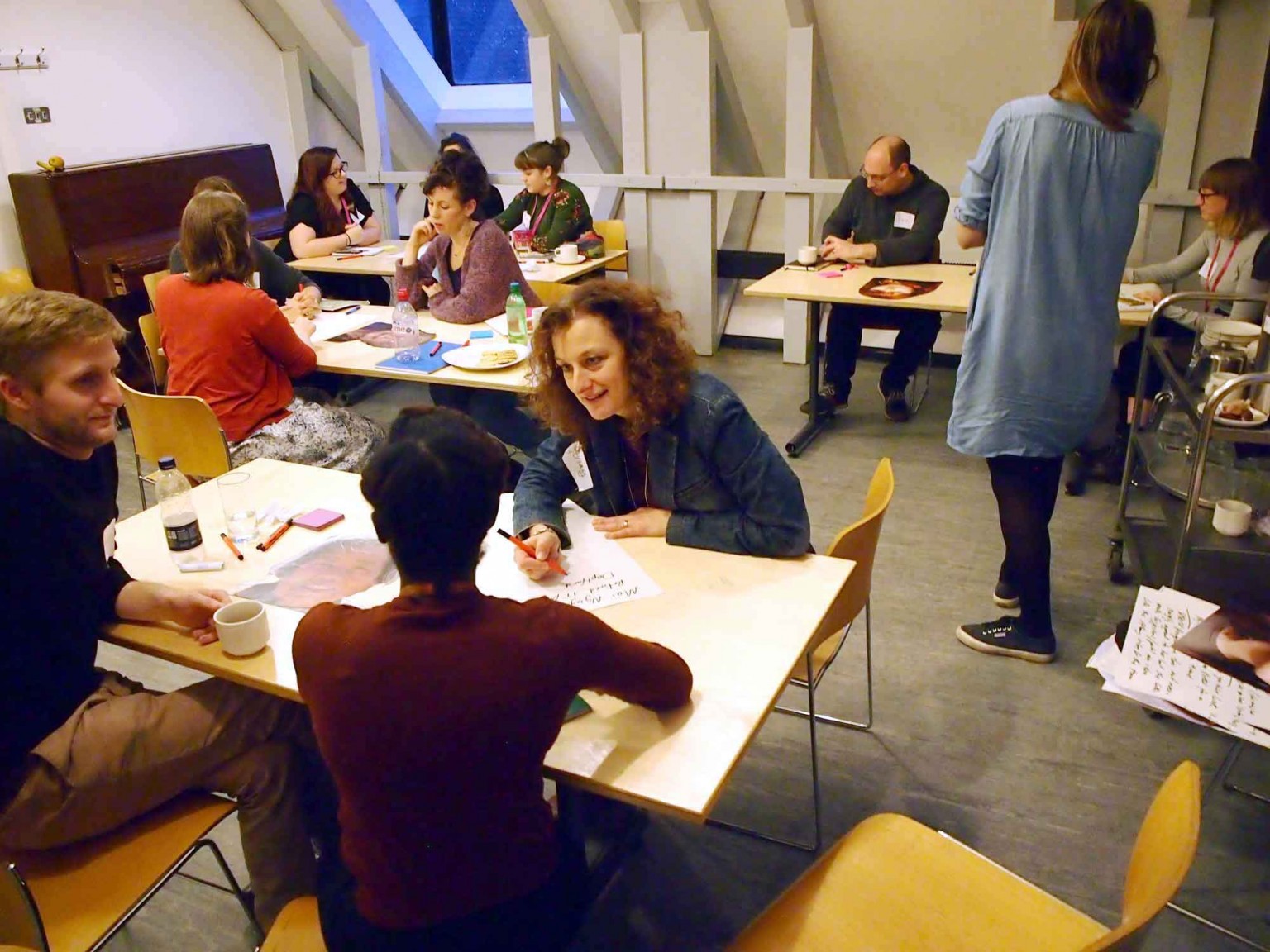
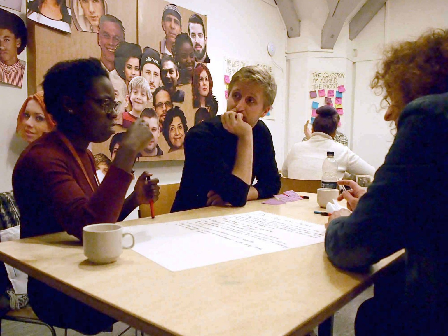
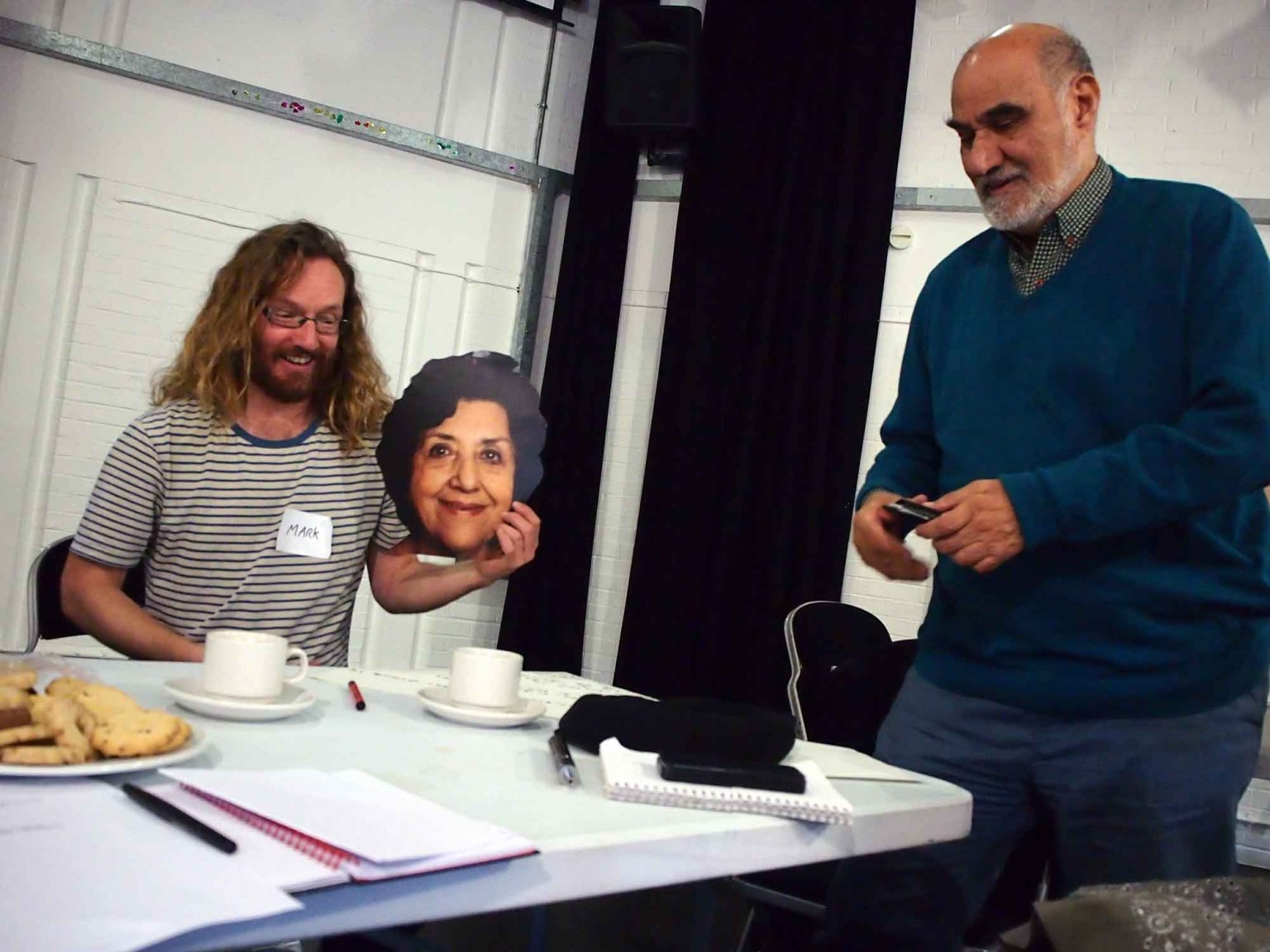
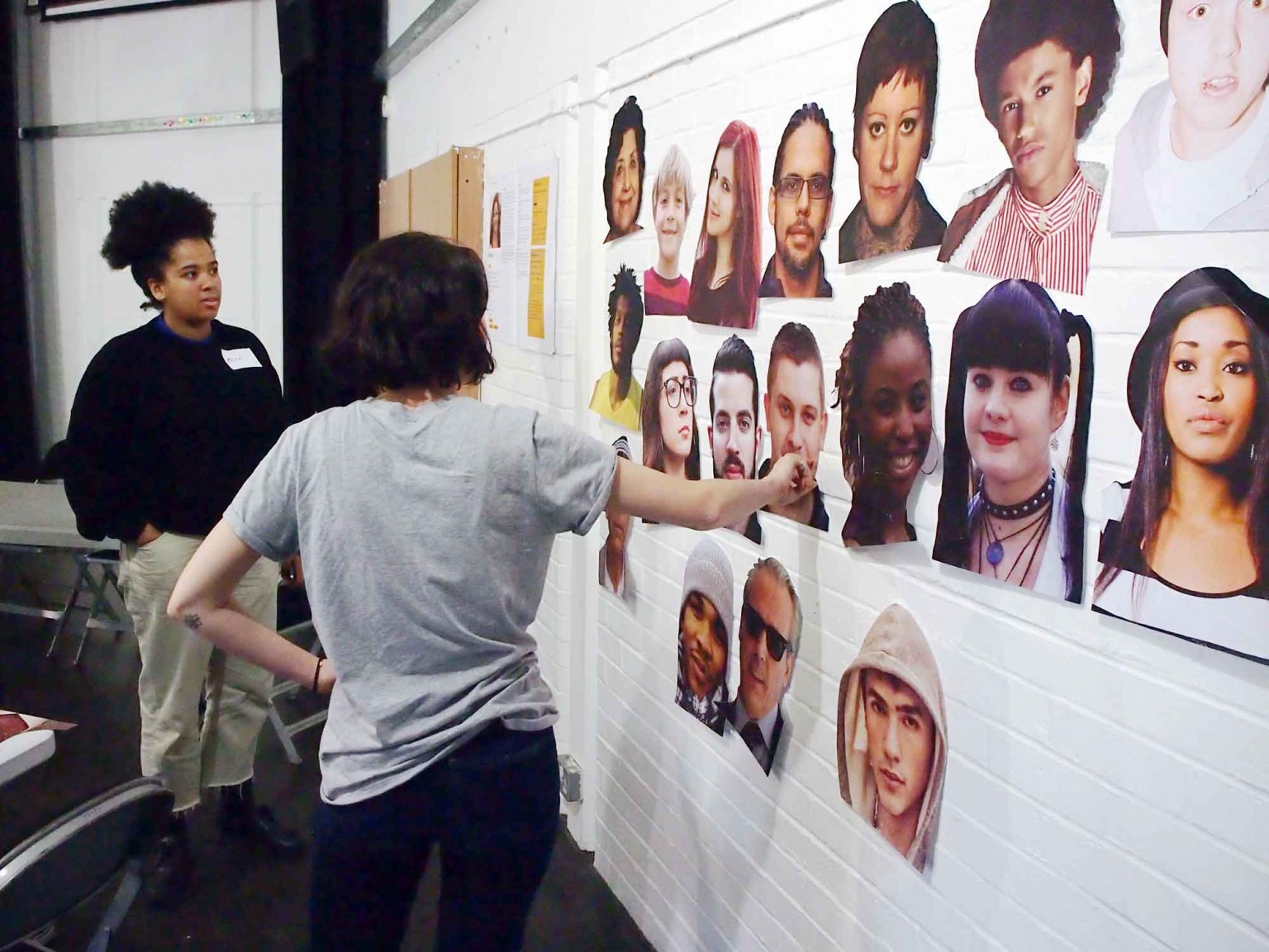
We began our Discovery process with a series of workshops. We worked with audiences and participants, cultural stakeholders, staff and board members.
Taking the results of that Discovery process we began creating options for a more holistic website, a site that would inform and encourage participation (and support) as much as selling tickets.
We presented three Design routes, each with its own weighting of messaging and individual visual aesthetic (but all still sitting within the values of their existing visual identity).
Our proposals were well received and helped their senior management team to look at their communications challenges afresh. Between us we took the bold decision to pause the project to give them time to properly assess the proposals and think about the implications they might have across all areas of their work.
It proved to be time well spent their team the time to consider their website as an extension of their activity as a community focused organisation.
Because of the process Cog used and the questions they asked within it, we actually got more out of the process than a new website. We wanted to find ways to weave our broader mission and values throughout all areas of the site and give anyone visiting it a sense of our broader work. Cog provided design solutions that enabled this and then we shifted the project timeline to give us time to curate the words, facts and content to populate those designs.
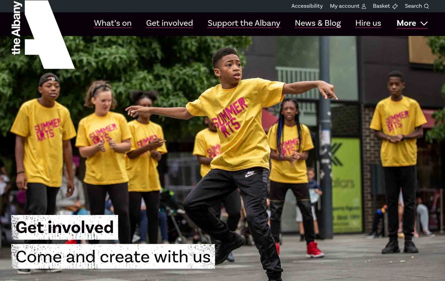
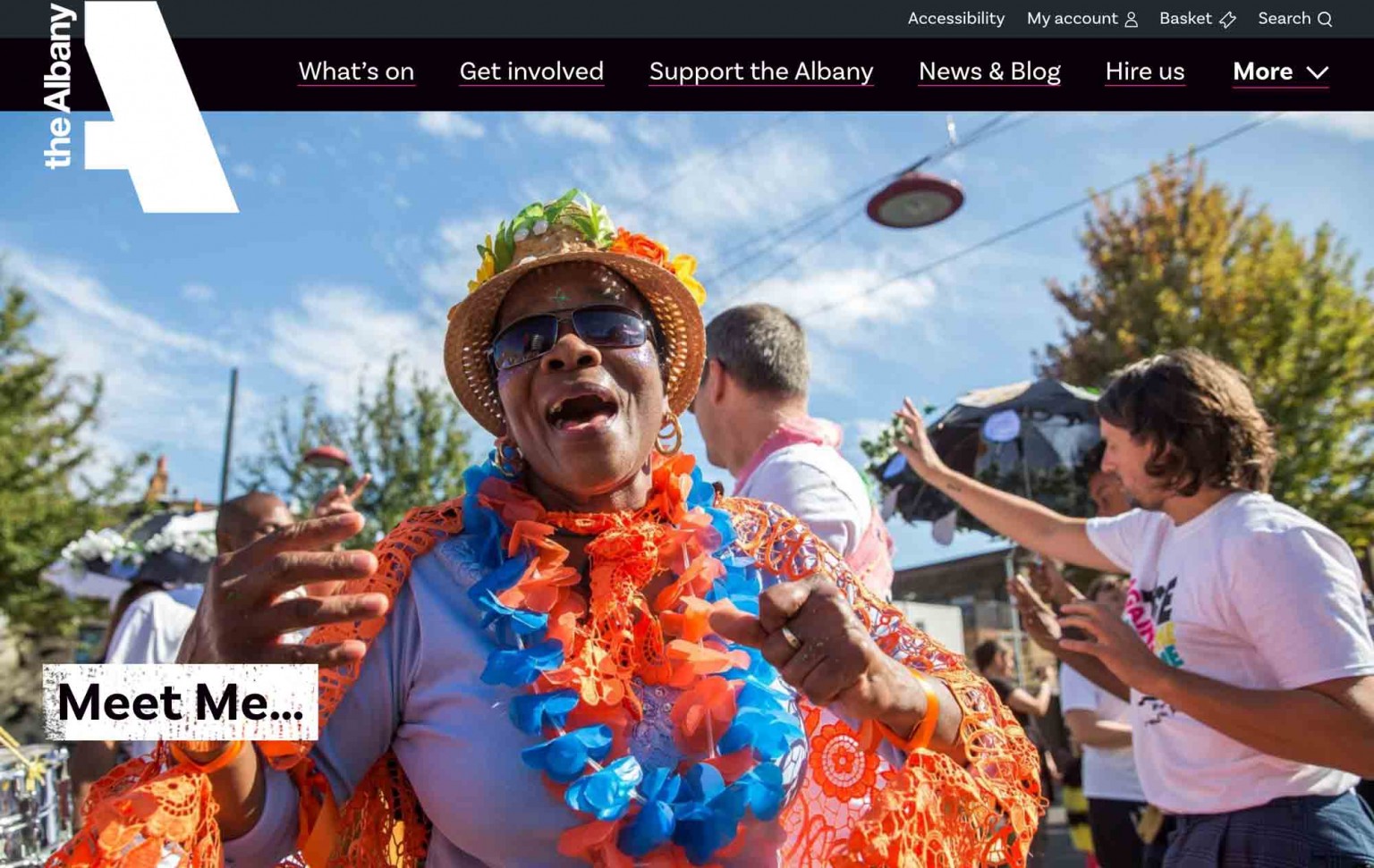
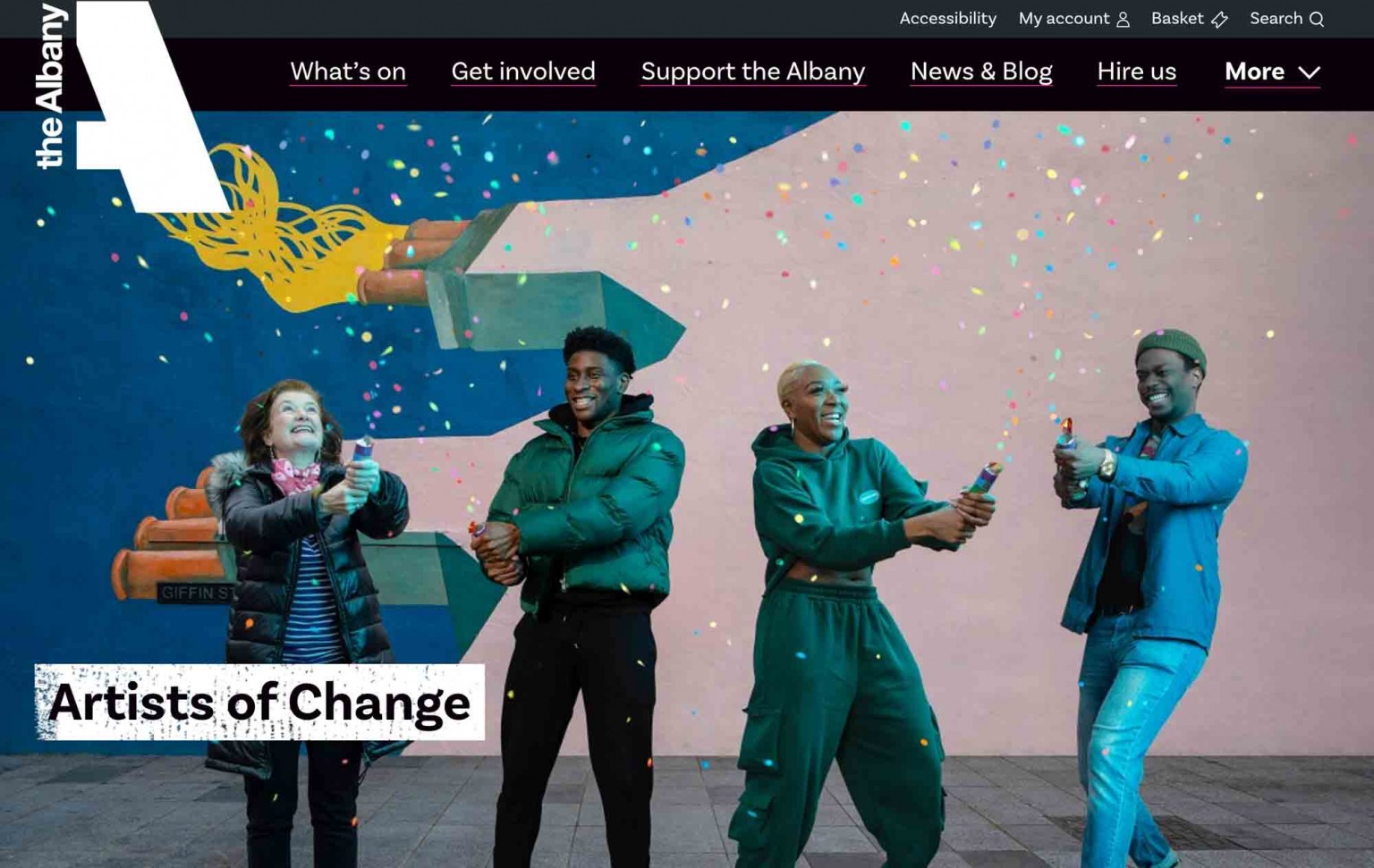
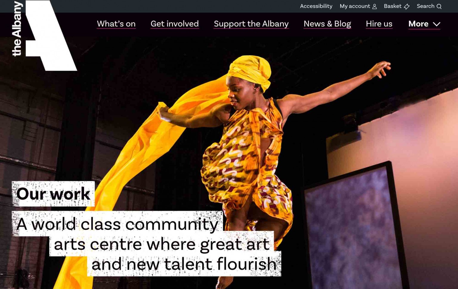
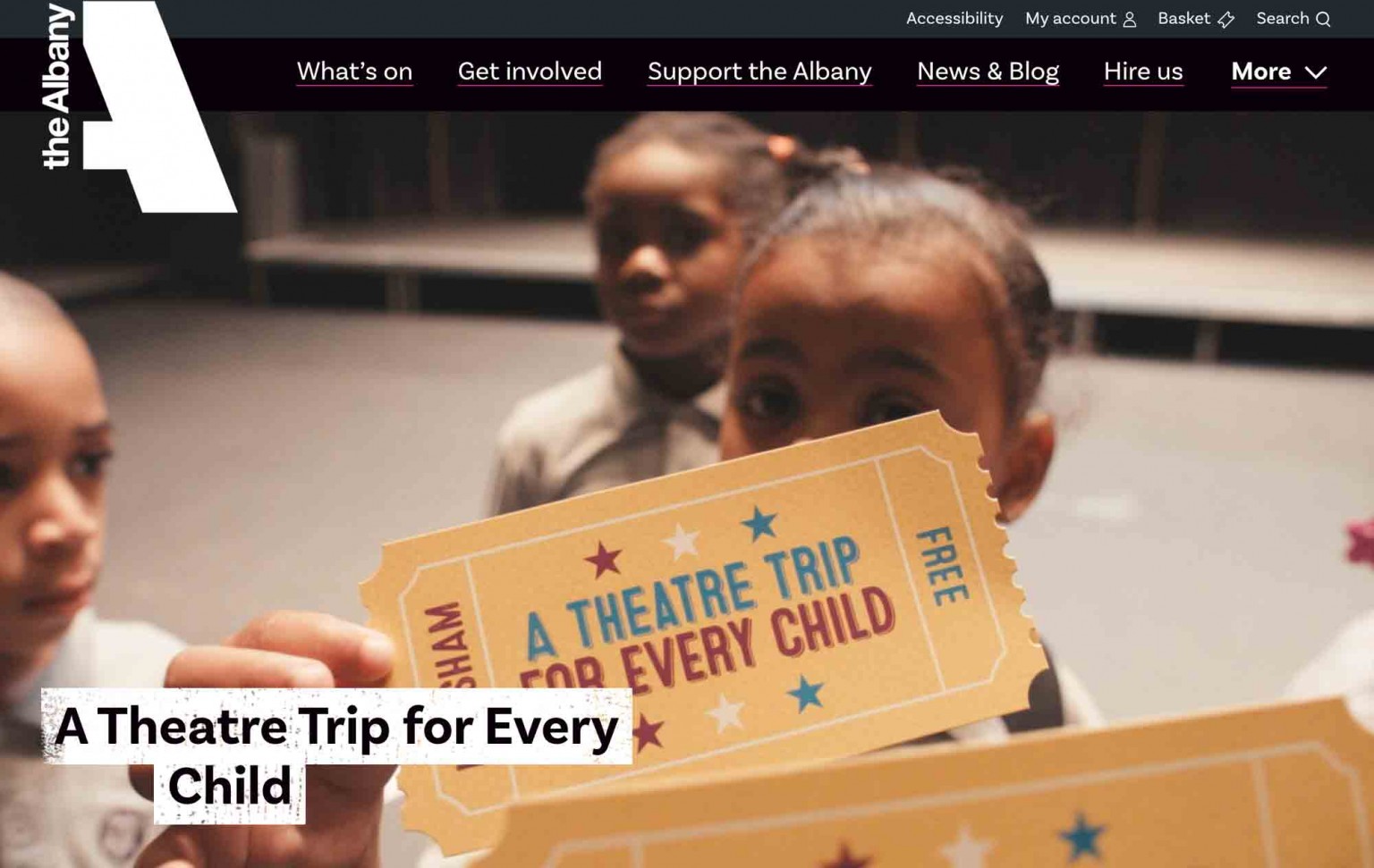
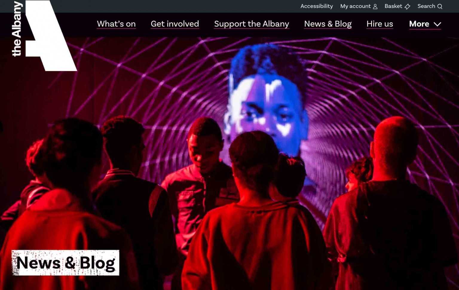
Not only do we love the site and feel like it actually reflects our quite complex organisation, but we’ve had fantastic feedback and our visitor numbers increased 29% in the month since launch compared to the same period the previous year.
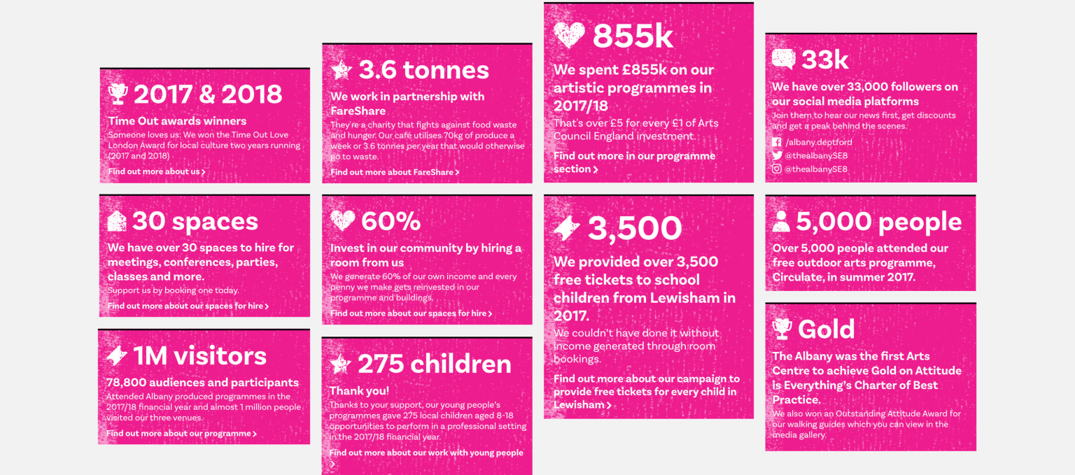
A really nice feature is the ability for their team to sprinkle facts and figures throughout the site. These data snippets help to reinforce value and make the case for support, as well as providing a fun visual garnish.
And to back-up the fundraising messages, we created a neat donation slider (hooked up to Spektrix) that can be edited and dropped in to any page.
The site is comprehensive, colourful and able to joyfully accommodate a broad range of content, much like the venue itself.
