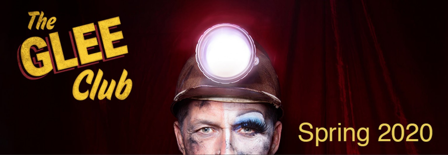
Bringing joy to The Glee Club
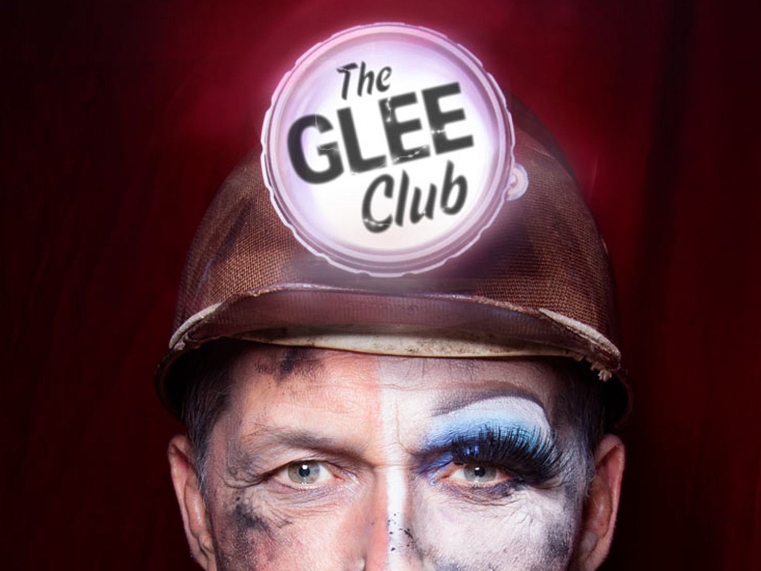
Publicity images for Out of Joint's The Glee Club
Our studio is filled with light and music.
There are multiple meeting rooms, a well stocked kitchen, and an indoor garden (with fishpond). Talk to us about access needs, environmental factors and any accommodations we might make to enhance your visit. Pop-in for tea and stay to use a spare desk for as long as you need.
11 Greenwich Centre Business Park,
53 Norman Road, Greenwich
London SE10 9QF
We’re next to Greenwich train and DLR station. We have a door right on the concourse but it’s different to our postal address. Find us via: what3words.com/hungry.means.author
This video shows the route to take from the train that will arrive at Greenwich rail station from London Bridge. There's a gentle slope next to the staircase.
If you have to come by car, we have a couple of parking spaces. We have a charging point that you are welcome to use if you have an electric car. Call ahead and we'll make sure the spaces are free. Use our postcode (SE10 9QF) to guide you in.
We’d love to hear from you. Use whichever medium works best for you.
11 Greenwich Centre Business Park,
53 Norman Road, Greenwich
London SE10 9QF
It's exciting to chat about potential new projects. We don't have a ‘sales’ team or a form to fill in. Call us or give us a little detail via email and we'll get straight back to you.
[email protected]If you're a client then you'll be best served by calling us or contacting us via ClickUp, otherwise you can use this dedicated email that reaches all of the digital team.
[email protected]This email hits the inboxes of the people who deal with our bookkeeping and finances.
[email protected]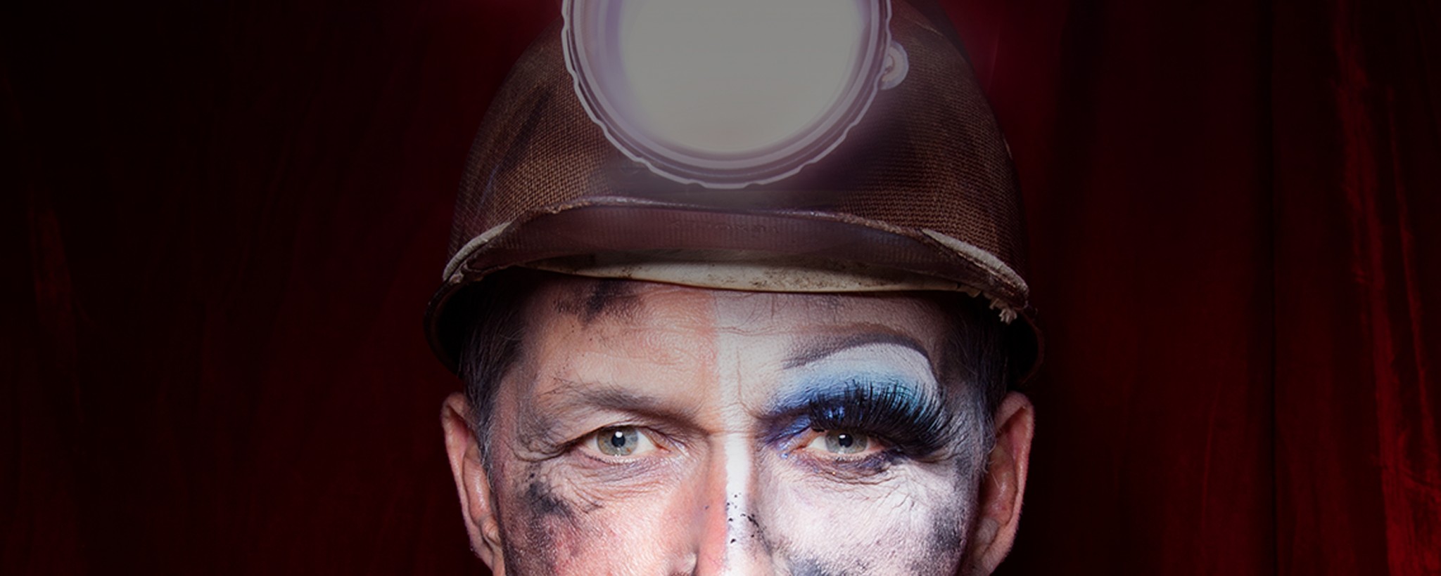
Publicity images for Out of Joint's The Glee Club
We’ve always been fans of Out of Joint Theatre so we were thrilled when they approached us to produce designs for their national touring revival of Richard Cameron’s The Glee Club.
An added bonus was that The Glee Club had been the opening show at Cast in Doncaster when that venue opened with our naming and branding. And Cast was to be the opening venue for this new production.
The Glee Club is a raucous comedy about masculinity. It’s the story of a group of miners at a pivot-point in British history. In the Summer of ’62, five hard-working, hard-drinking miners and a church organist, prepare for the local gala. At least one of them has a secret that the others struggle to understand.
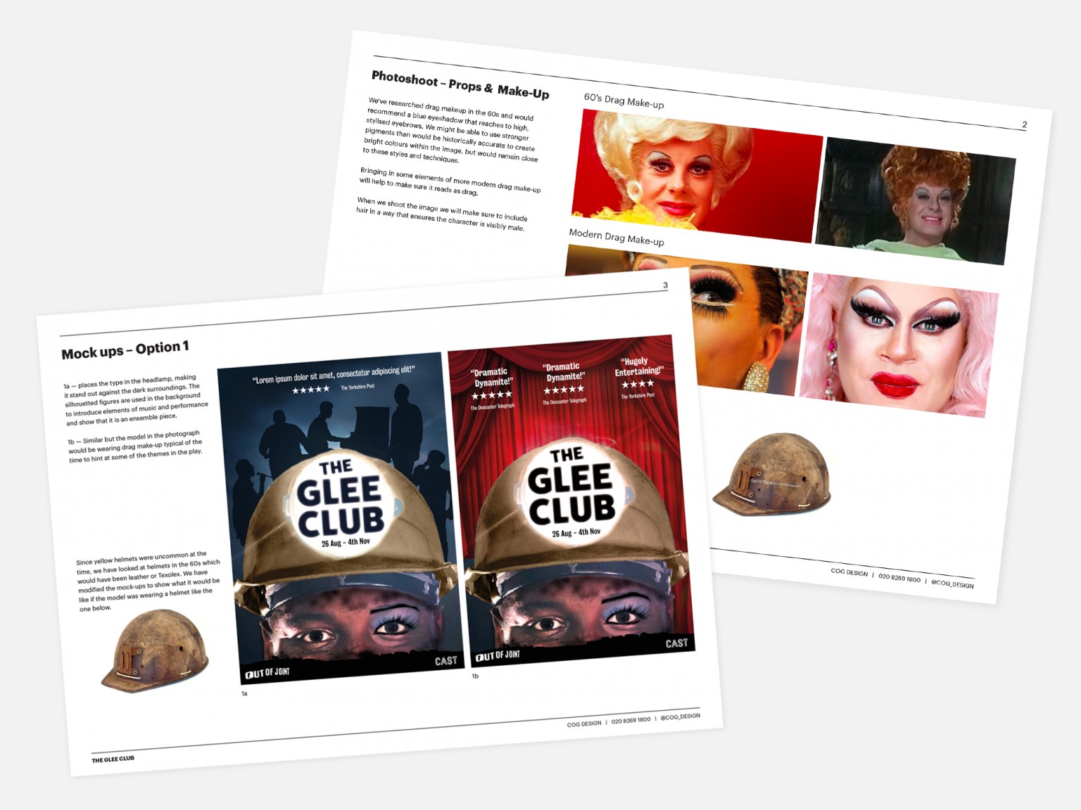
Through a series of discussions and sketched ideas, we worked with the Out Of Joint team to settle on a concept of duality: the hardened bravado of life in the pit, juxtaposed with a nighttime persona of glitz and drag. In the age of Ru Paul’s Drag Race, it felt like it would really strike a chord with audiences.
But it was really important that the imagery didn’t feel gimmicky. We wanted to authentically recreate the period. So we did a lot of research into the drag make-up of the period, and we even bought (from ebay) a miner’s helmet and lamp from the ’60s.
We loved working with Cog on our campaign image for The Glee Club. They were both flexible and extremely creative when it came to the concept and they worked collaboratively to find something that would suit the different venues and partners within our tour.
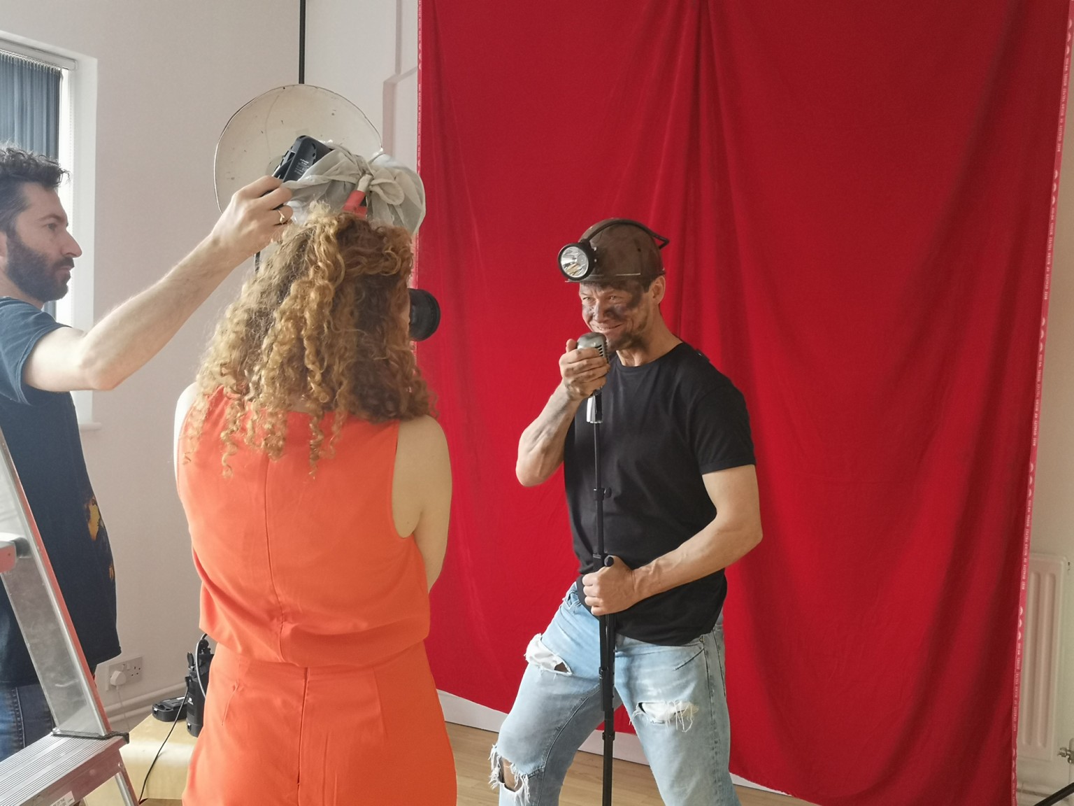 Photoshoot in the Studio
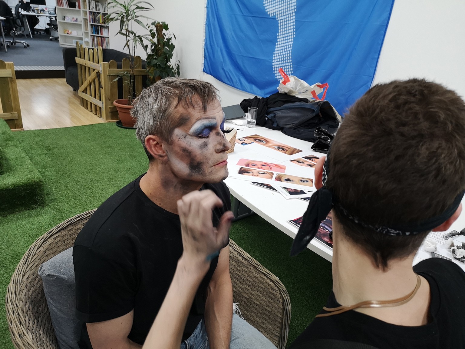 Jack applying Bill's drag makeup
We pulled together a brilliant team of specialists to deliver the image.
We were lucky enough to be able to get the actor Bill Ward to come to spend (a generous amount of) time with us.
Working with the brilliant theatre photographer Bronwen Sharp we converted our meeting room into a photographic studio for a day.
And, in our indoor garden, we created space for the drag make-up artist Jack Ellis .
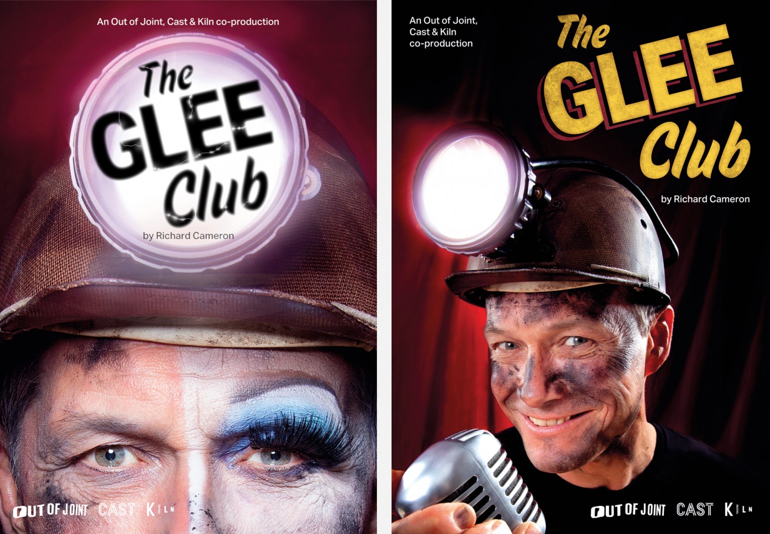 Poster Variations
We were all delighted with the image but also knew it wouldn’t be appropriate (or at least picked up and used) for all uses and all venues. So, while we had the set-up in place, we also produced a more conventional ‘crooner’ pose for use as a second image in venues.
And we quickly mocked-up a couple of possible poster designs to show how the image would work in context.
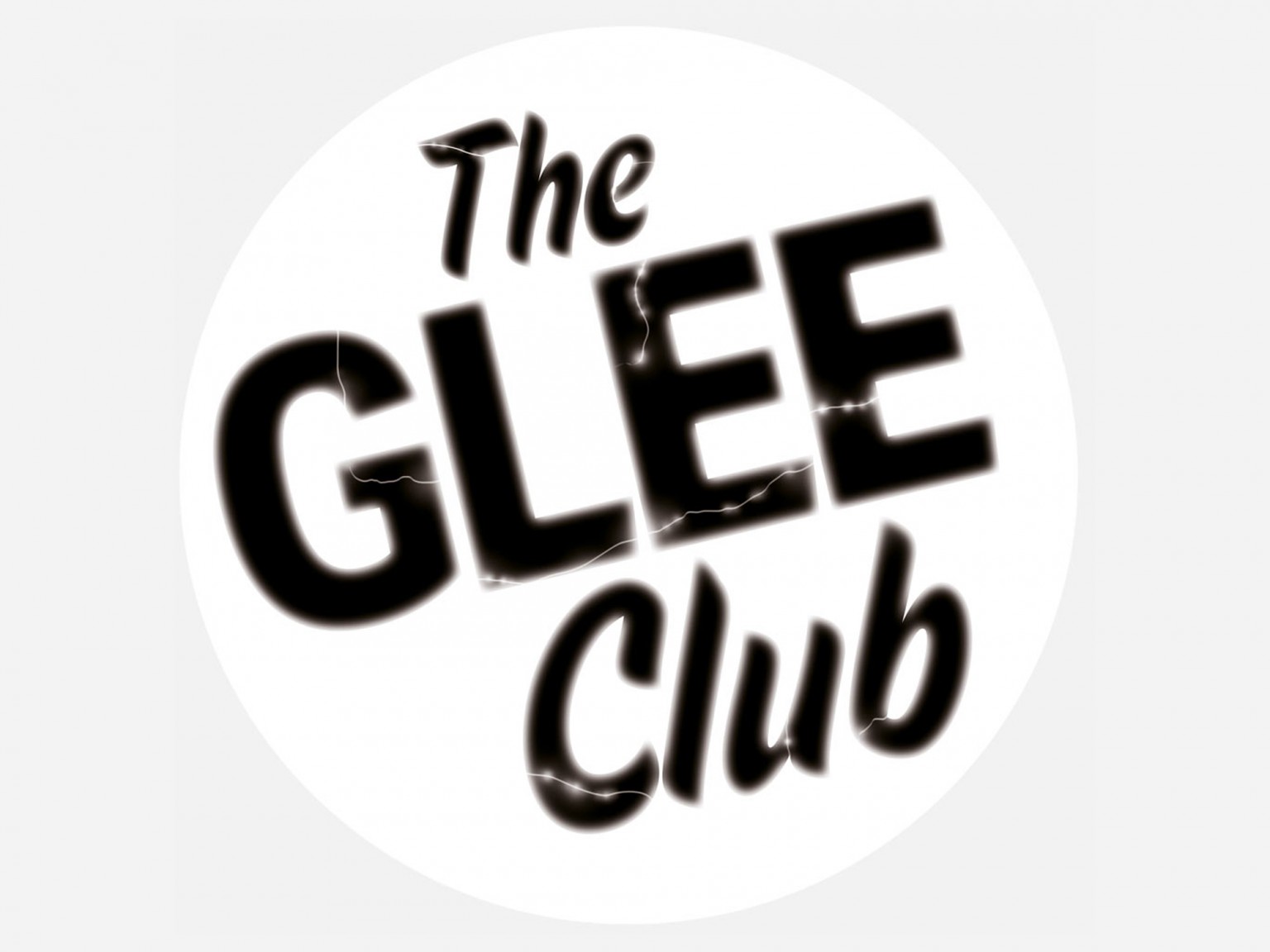 Glowing cracked type
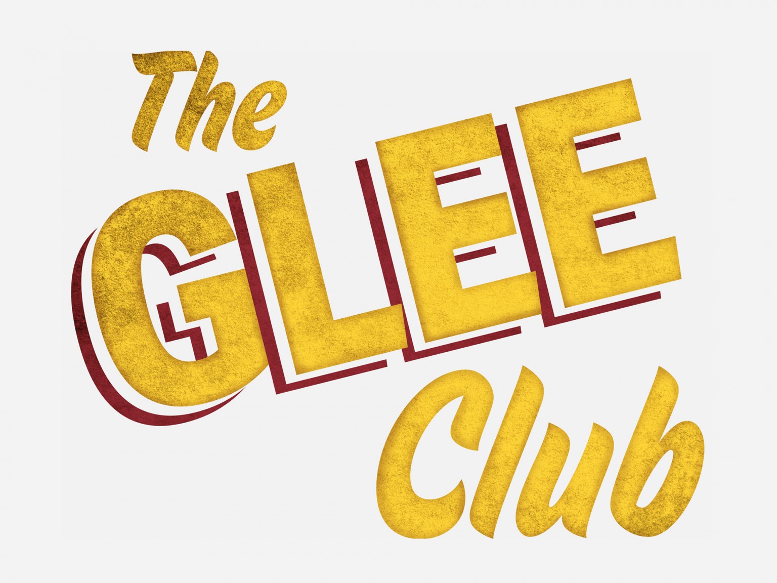 Textured and aged type
The final touch was to add a little extra design finesse to the typography.
Cracking and glowing, as if the type had been printed onto the glass, for times when the type will be imposed onto the miner’s lamp.
And textured and aged, as if the text were authentic 1960’s vinyl lettering, for when the type will sit away from either image.
It was a great collaborative process and we were hugely proud to see the imagery being used in brochures, on websites and across publicity materials throughout Britain.
”We were thrilled to get two great images which can be used to communicate the show to different audiences.”
