Everyone is welcome. Young people lead.
Contact branding and website
Our studio is filled with light and music.
There are multiple meeting rooms, a well stocked kitchen, and an indoor garden (with fishpond). Talk to us about access needs, environmental factors and any accommodations we might make to enhance your visit. Pop-in for tea and stay to use a spare desk for as long as you need.
11 Greenwich Centre Business Park,
53 Norman Road, Greenwich
London SE10 9QF
We’re next to Greenwich train and DLR station. We have a door right on the concourse but it’s different to our postal address. Find us via: what3words.com/hungry.means.author
This video shows the route to take from the train that will arrive at Greenwich rail station from London Bridge. There's a gentle slope next to the staircase.
If you have to come by car, we have a couple of parking spaces. We have a charging point that you are welcome to use if you have an electric car. Call ahead and we'll make sure the spaces are free. Use our postcode (SE10 9QF) to guide you in.
We’d love to hear from you. Use whichever medium works best for you.
11 Greenwich Centre Business Park,
53 Norman Road, Greenwich
London SE10 9QF
It's exciting to chat about potential new projects. We don't have a ‘sales’ team or a form to fill in. Call us or give us a little detail via email and we'll get straight back to you.
[email protected]If you're a client then you'll be best served by calling us or contacting us via ClickUp, otherwise you can use this dedicated email that reaches all of the digital team.
[email protected]This email hits the inboxes of the people who deal with our bookkeeping and finances.
[email protected]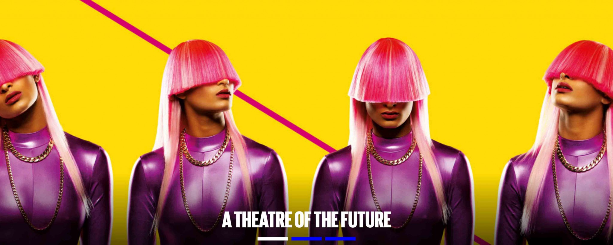
Contact branding and website
We worked with one of the most innovative and exciting theatres in the UK to help them become a future-facing cultural location for everyone.
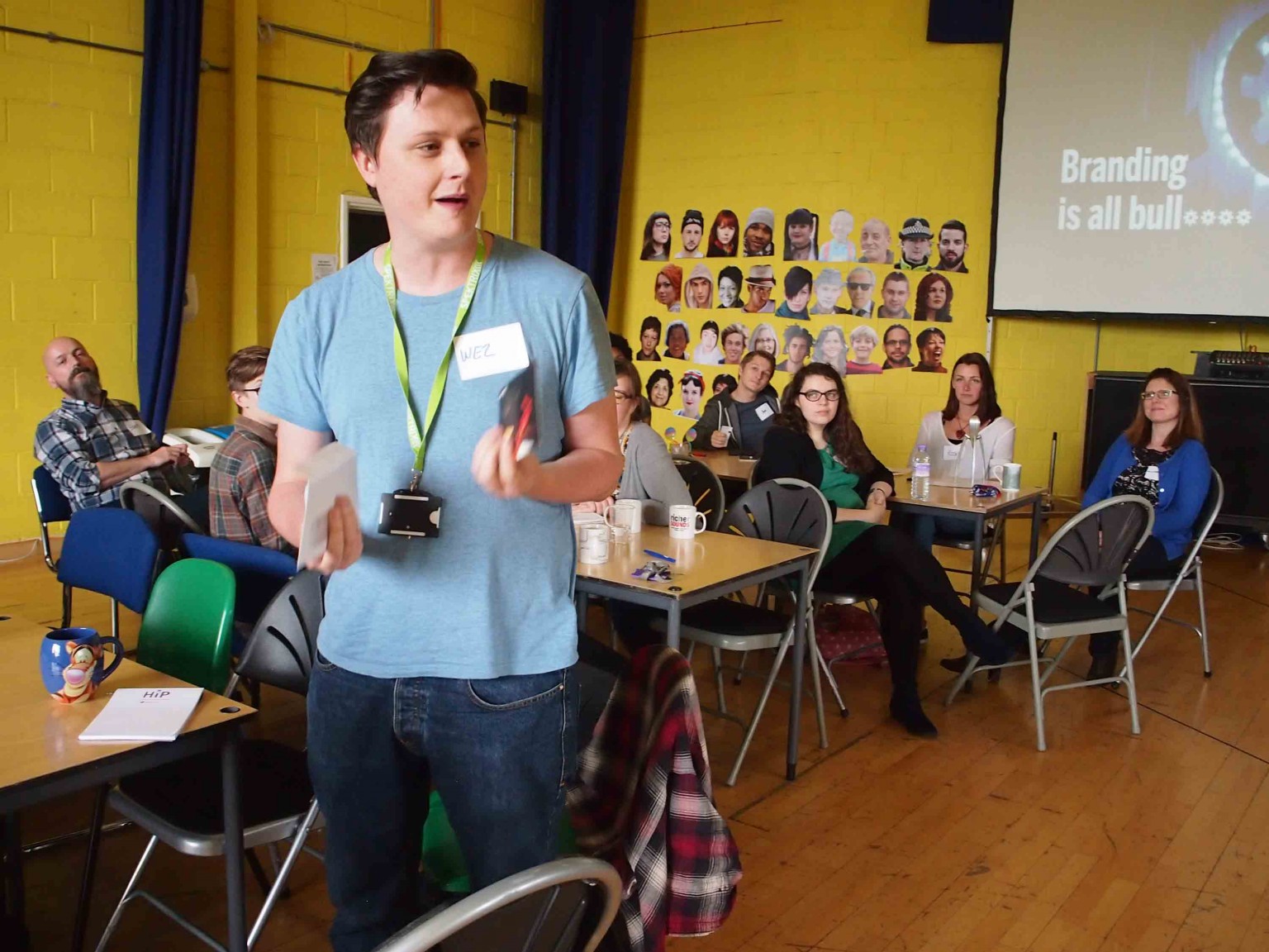 Contact's Wez Thistlethwaite, speaking at our branding workshop
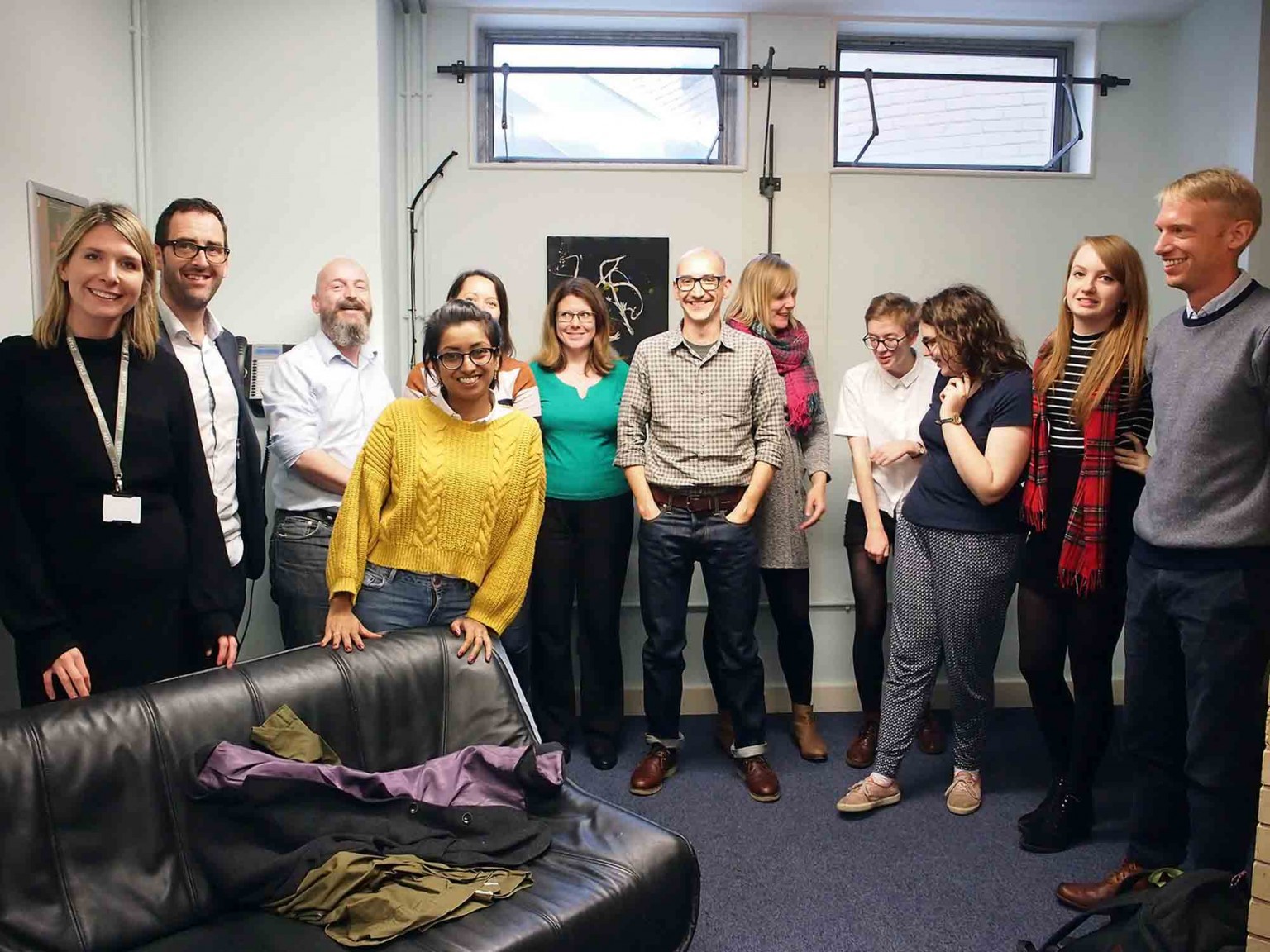
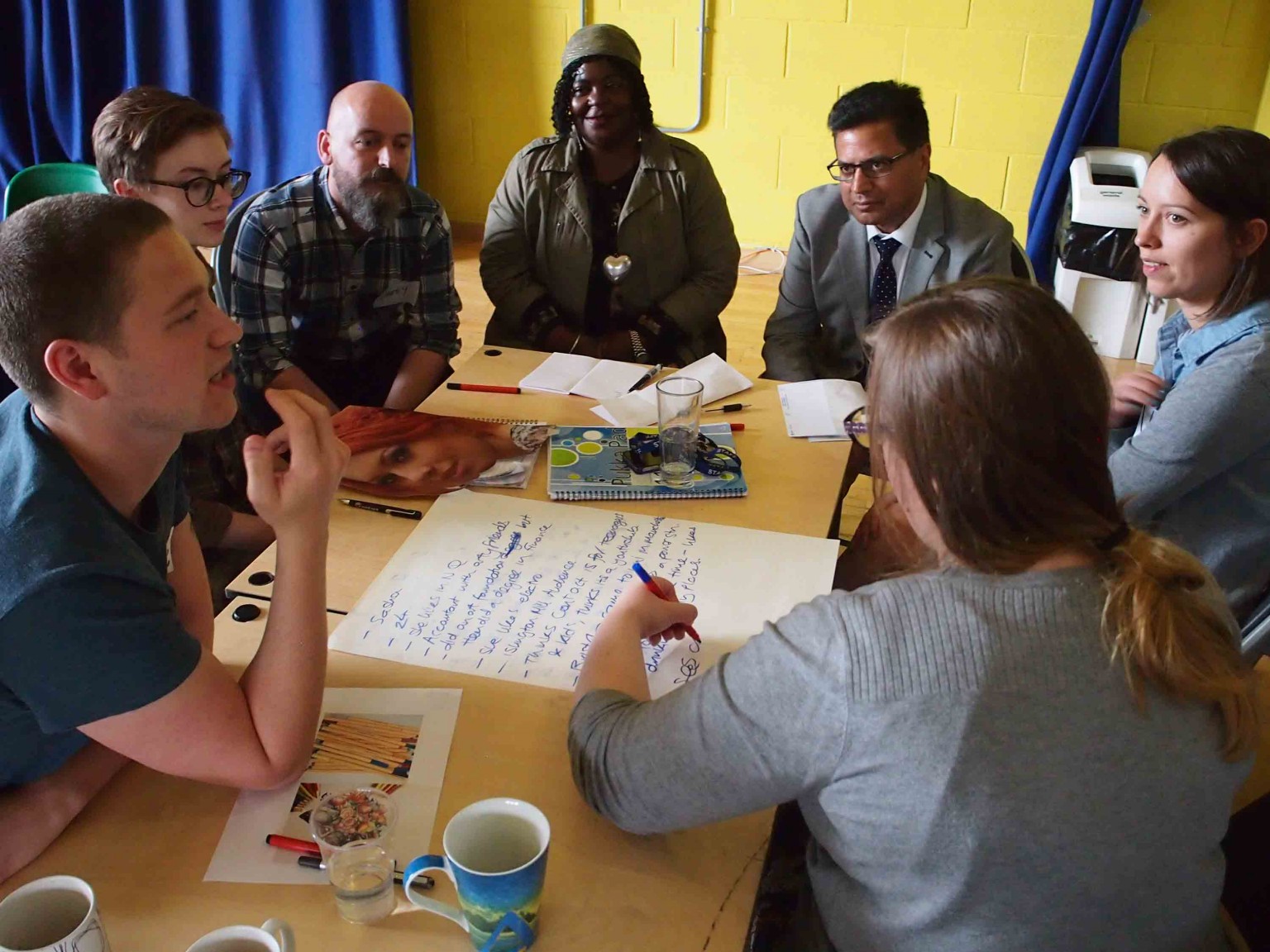 Branding workshop with board members, youth panel and staff from across the organisation
Contact is a theatre and arts venue that places young people, inclusivity and originality at the heart of everything they do.
They approached us with a brief to update their existing brand which, though effective at the time, wasn’t doing the job of communicating the values and personality of a modern, youthful and energetic theatre.
As always, we began with a period of Discovery, including a great workshop with board members, youth panelists and staff from across the organisation.
We went back to the studio and started experimenting. We needed to find an adaptable visual language that conveyed the personality traits we’d settled on during the workshop…

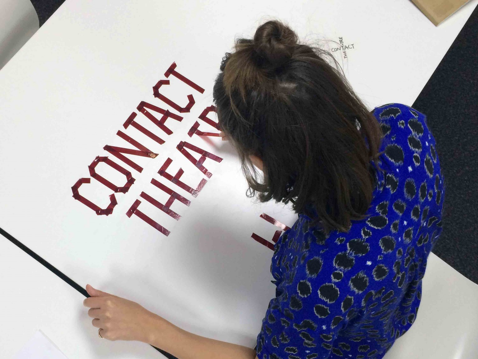 Anna, playing with tape to create typographic ideas
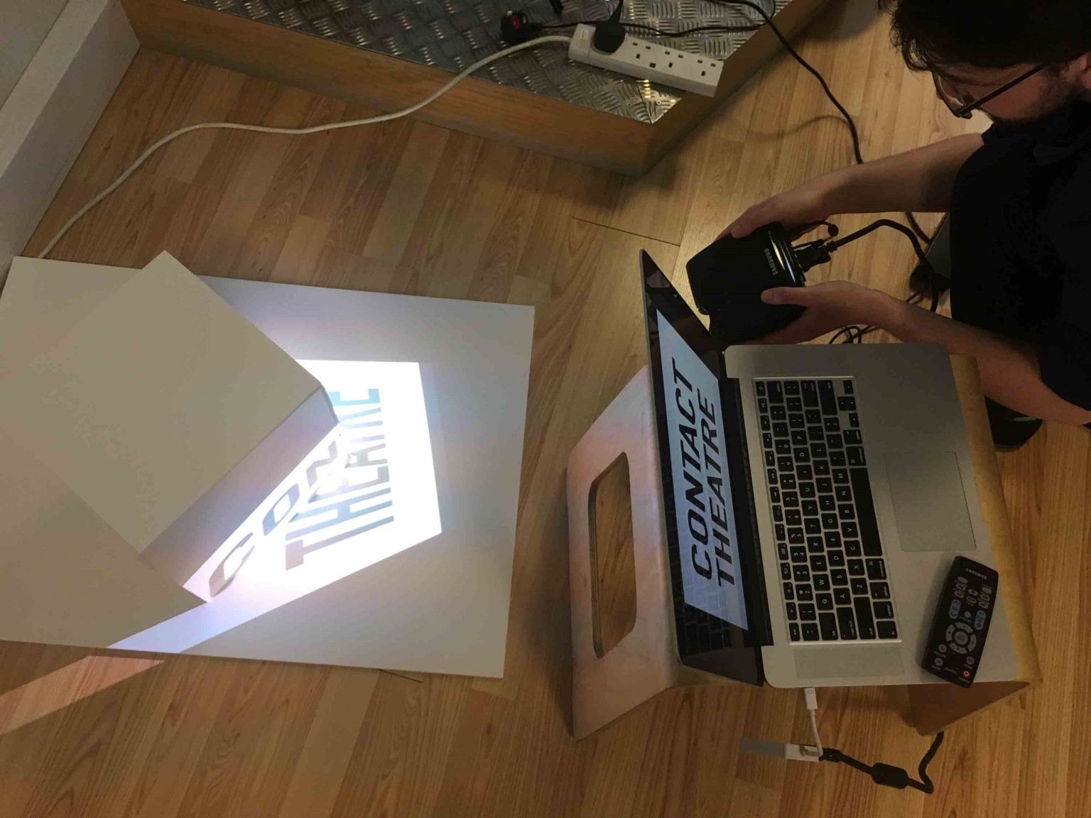 Experimenting with projected type
After some fun in the studio we presented for routes that tackled the identity in different ways. Each had its own logo…

We met with their team in Manchester and chatted through the options and possibilities.
Together we decided strong lines would form the basis of the identity. It nodded to the taped markings used on stage and in rehearsal rooms but mostly it provided a visual language of interconnectivity and inclusion.
We’re really happy with the coherent look and feel of the refreshed brand, which already gives such a better statement about who and what we are, and the tools to communicate that more ambitiously.
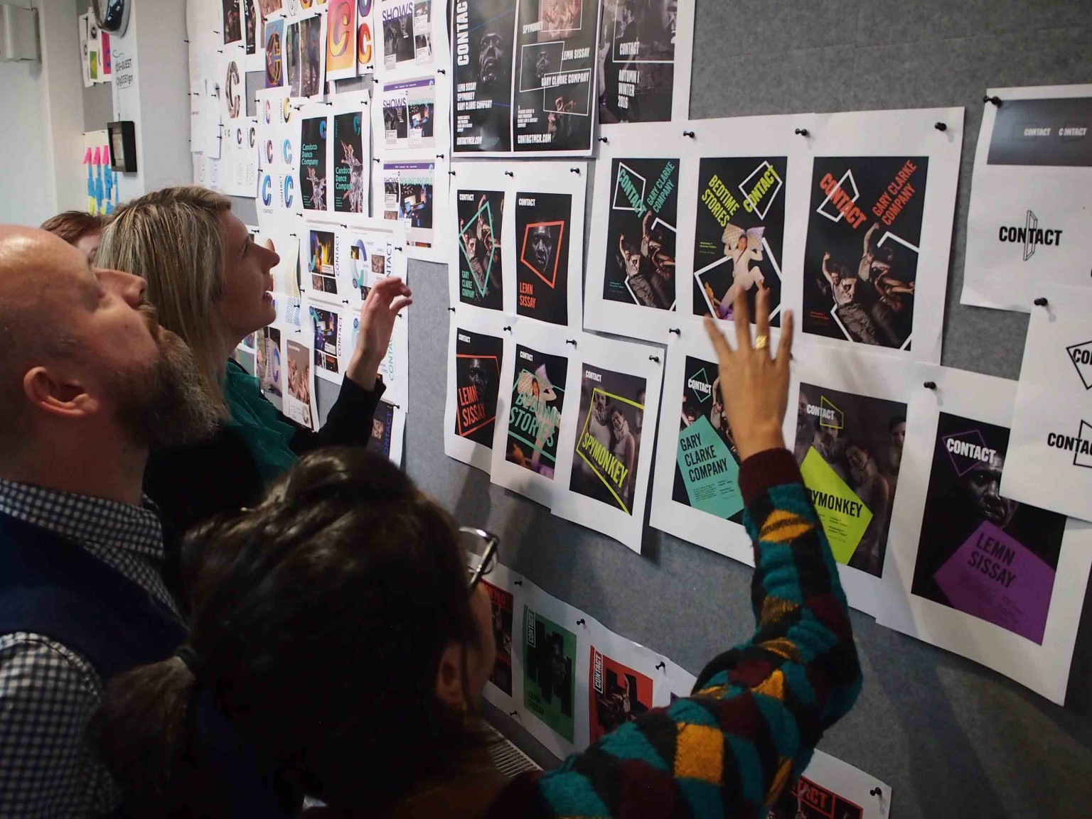
On a practical level, using consistently sized lines served to tie productions, festivals and events together, visually. And it provided a versatile resource for further application such as wayfinding and merchandise.

We kept the logo simple but crafted the type so it feels perfectly weighted when used in portrait or landscape.
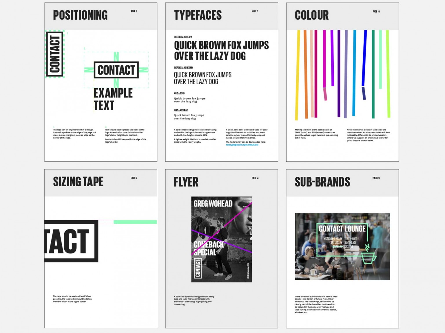
Creating an easy-to-use and flexible system for the brilliant in-house team was essential. We produced brand guidelines that weren’t too prescriptive and could be played with.

A wide range of images from various production companies (most of whom use excellent photography) could potentially make the visual identity quite messy. But the inclusion of the simple line motif helps to provide a visual consistency.
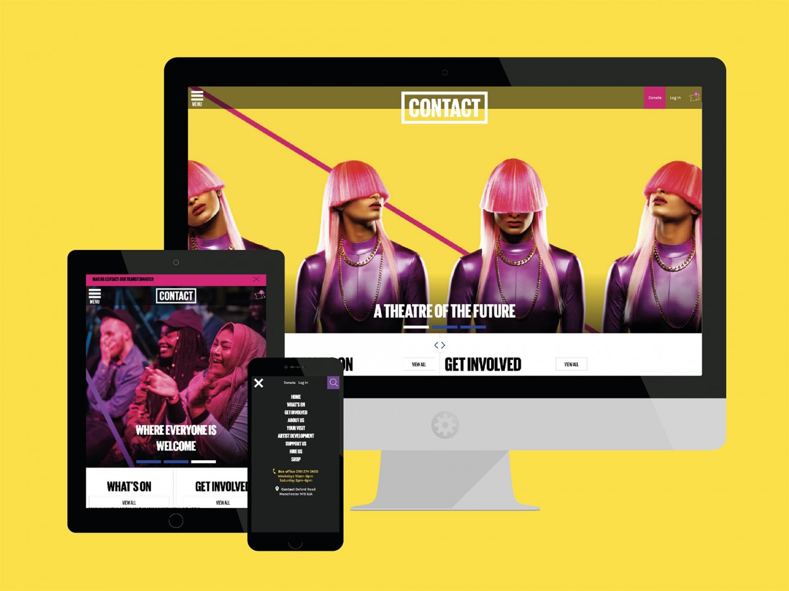
With the new branding in place we were able to move on to the website designs. It was important that the site captured the bold, innovative, inclusive spirit of the organisation at a time when their theatre was closed for an architectural overhaul.
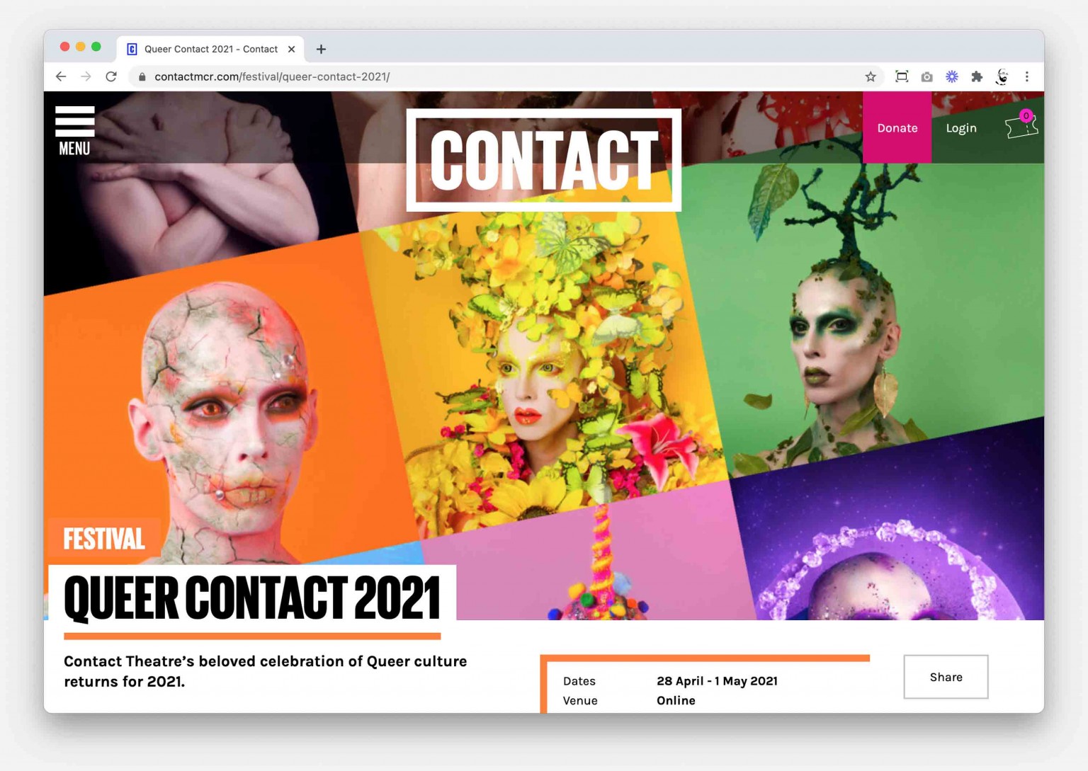
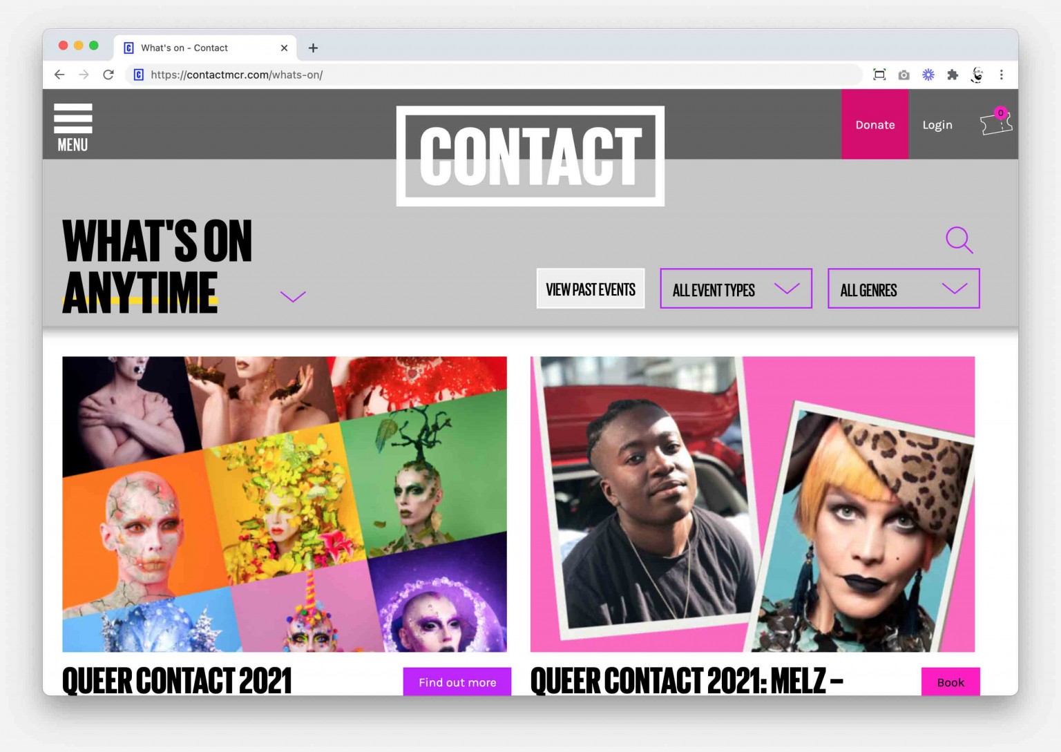
One of our favourite features is a way to display live events alongside workshops and classes. We debated for a long time about ways to give equal parity to these areas of work before deciding to give audiences the choice.
They can use our slider to decide how the listings should be weighted.
The website was brilliantly guided by design agency Cog, we think the results are stunning.
