Giving The Marlowe presence and personality
The Marlowe branding
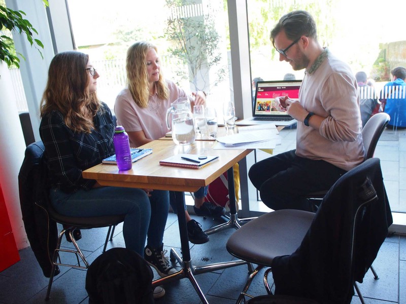
Our studio is filled with light and music.
There are multiple meeting rooms, a well stocked kitchen, and an indoor garden (with fishpond). Talk to us about access needs, environmental factors and any accommodations we might make to enhance your visit. Pop-in for tea and stay to use a spare desk for as long as you need.
11 Greenwich Centre Business Park,
53 Norman Road, Greenwich
London SE10 9QF
We’re next to Greenwich train and DLR station. We have a door right on the concourse but it’s different to our postal address. Find us via: what3words.com/hungry.means.author
This video shows the route to take from the train that will arrive at Greenwich rail station from London Bridge. There's a gentle slope next to the staircase.
If you have to come by car, we have a couple of parking spaces. We have a charging point that you are welcome to use if you have an electric car. Call ahead and we'll make sure the spaces are free. Use our postcode (SE10 9QF) to guide you in.
We’d love to hear from you. Use whichever medium works best for you.
11 Greenwich Centre Business Park,
53 Norman Road, Greenwich
London SE10 9QF
It's exciting to chat about potential new projects. We don't have a ‘sales’ team or a form to fill in. Call us or give us a little detail via email and we'll get straight back to you.
[email protected]If you're a client then you'll be best served by calling us or contacting us via ClickUp, otherwise you can use this dedicated email that reaches all of the digital team.
[email protected]This email hits the inboxes of the people who deal with our bookkeeping and finances.
[email protected]A round-up of recommendations and reviews, sent on the first Friday of each month, topped-off with a commissioned image from a talented new illustrator. Sign-up and tell your friends.
Sign me up
An irregular update of activity from our studio. Showing off about great new projects, announcements, job opportunities, that sort of thing. Sign-up and tell your friends.
Sign me up
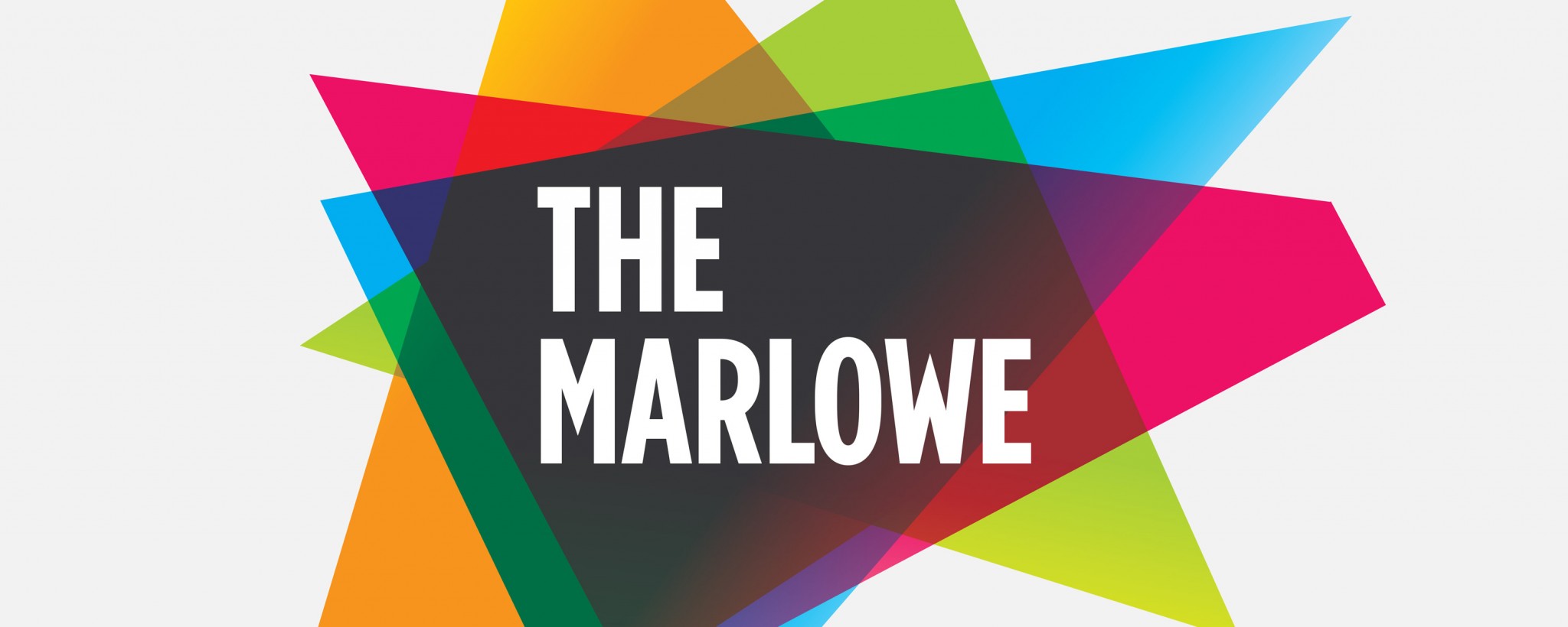
The Marlowe branding
Following an extensive credentials pitch, we were commissioned to create the branding for this new-build theatre, which was to replace a much-loved but no longer fit-for-purpose theatre in the heart of Canterbury.

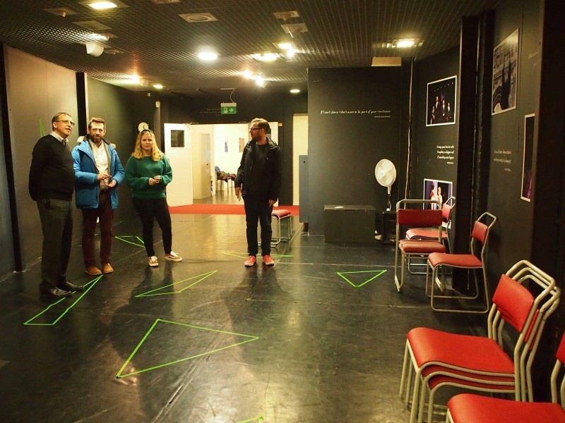
Ben Travis (from Canterbury City Council), James Hurst and Ocky Murray on our first site visit to The Marlowe in Canterbury.
Specific challenges of the brief included:
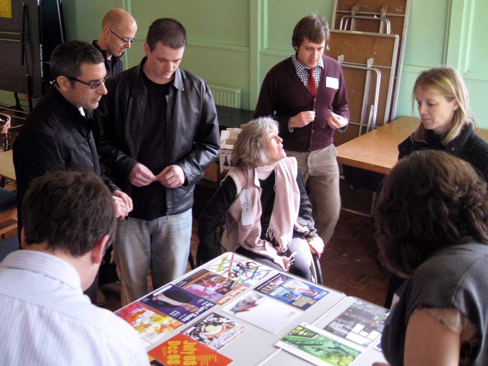
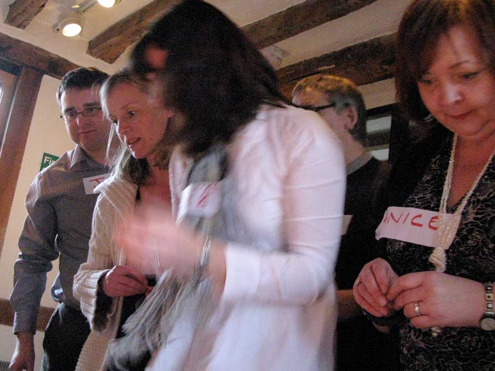
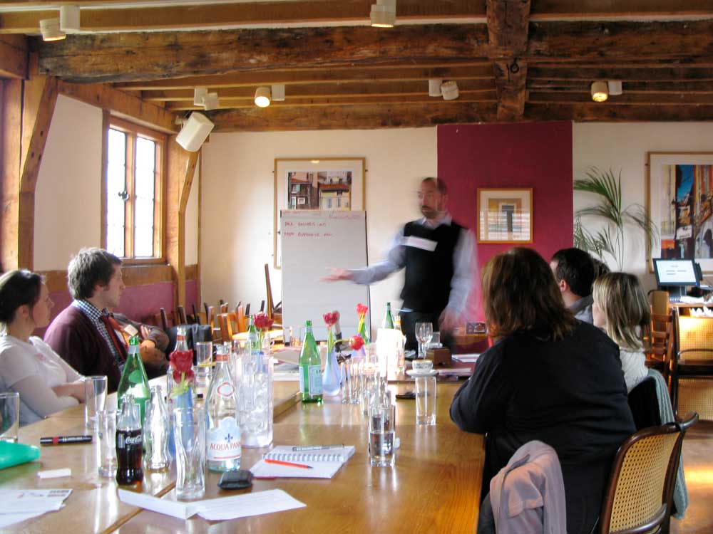
We employed a pyramid-style approach, meeting first with the key decision makers to get their buy-in for the process we would follow together. We then convened a ‘brand strategy team’, drawn from Council and venue staff, and we ran drop-in sessions with various stakeholder groups, including their loyal Friends committee.
We ran workshops with the brand strategy team, to bring them into the process and listen to their insights. Amongst other exercises, one of our favourites is to ask everyone to bring objects that represent the old and the new organisation.
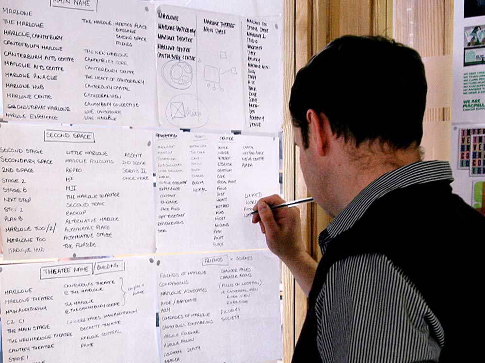
Out of these various workshops we were able to build a real sense of the personality of the new organisation and a sense of what the new building would be like.
We spoke about naming, positioning and language, and settled on an audience focused approach – that the venue existed for its audience: the venue was about experiences, feelings and memories, not just about the shows that were happening.
Our thinking was about building loyalty to the venue rather than having to ‘sell’ every individual event.
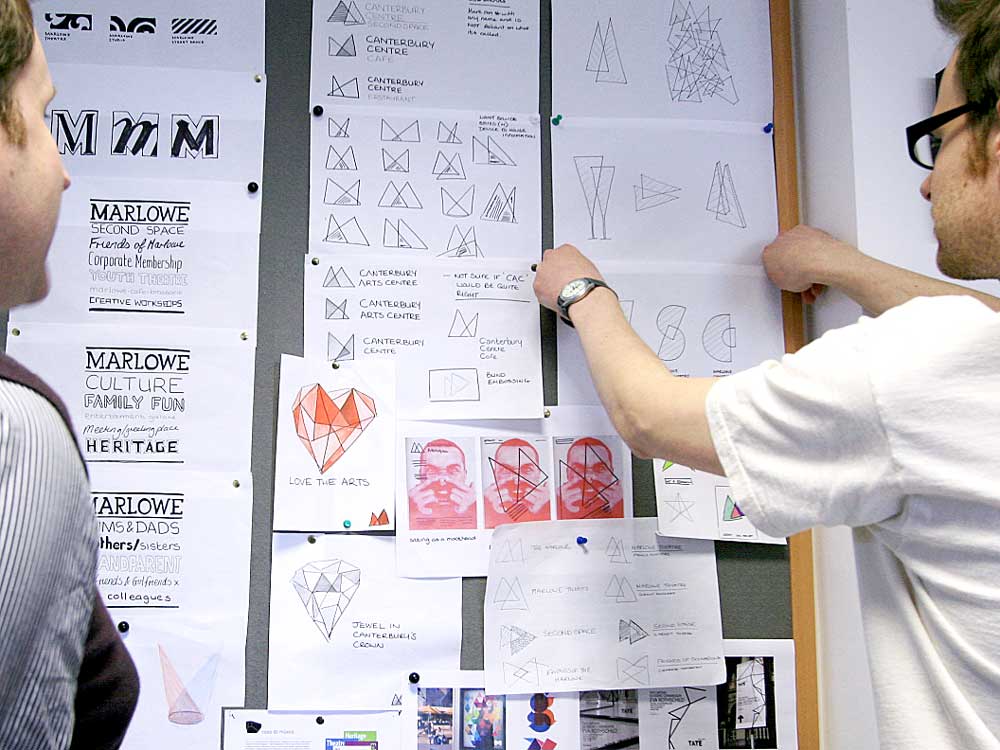
The starting point for the visual design was the shape of the building’s most distinctive architectural feature, its fly-tower. Taking that basic shape and giving it a translucent quality allowed us to build up colours like the coloured gels of theatre spotlights.
Our proposal was an endlessly adaptable visual identity, constructed from those simple shapes. Using these graphic devices, every iteration is unique but they all convey the same visual essence.

We collaborated with a wide group of stakeholders throughout, involving them in decision making and involving them in the creative process of filtering ideas until we had the perfect solution.
The ultimate decision lay with the Council Leader so we were sure to involve their team in our conversations, and created presentations tailored to their decision making processes.
Using the experiences from our original workshops, and our ongoing discussions with the teams, we worked with the senior managers to codify a mission statement and wording that formed the basis of all press releases, announcements and speeches. We also created materials for recruitment and training
And we gave them simple guides to language, tone of voice, writing about accessibility, writing for the web, when to use italics and how to avoid Americanisation etc.
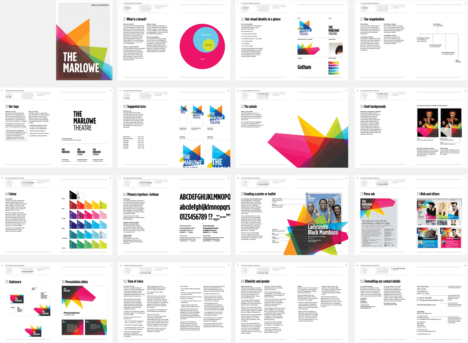
Turning the brand into a guidebook
For a project of this size and complexity, we find that it can be really useful to publish a physical set of brand guidelines.
The guidelines don’t need to be the end of the process but they are a really useful tool for everyone involved – a reference tool, a training tool, a reminder of the hard work and investment made in specific decisions.
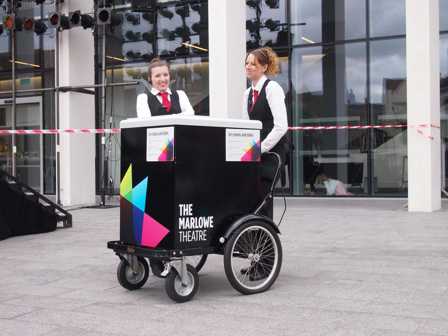
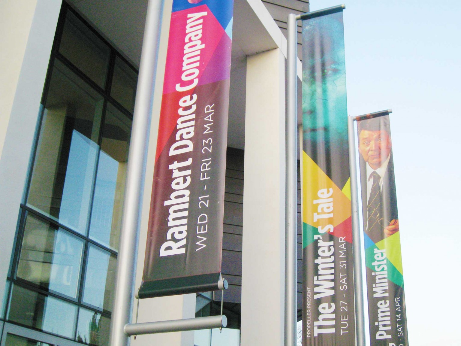
We worked on all aspects of the brand implementation including the design of their season brochure, industry-facing press advertising, designs of their digital posters and physical banners, fundraising and development materials, and a new (celebrity focused) magazine for a newly launched Friends scheme.

We were involved at every level, including copy writing, uniform design, staff training and anything else needed to make the communication successful.
And since the initial branding we have continued to be their design partners and have been successful in winning pitches to design and produce their ongoing communication materials and their website.
Cambridge Corn Exchange
Saffron Hall
Rich Mix branding
The Beaney branding
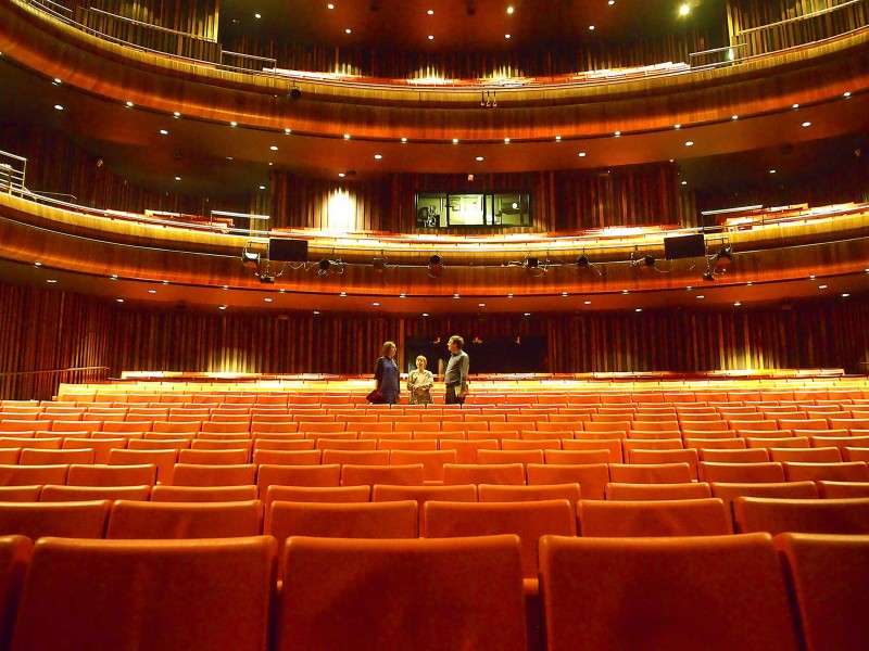
Michael and Anna are at The Marlowe in Canterbury. Here's Anna being given a tour of their wonderful, aisle free,...
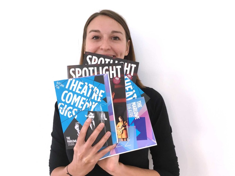
Anna's received the full set of Marlowe Autumn brochures.
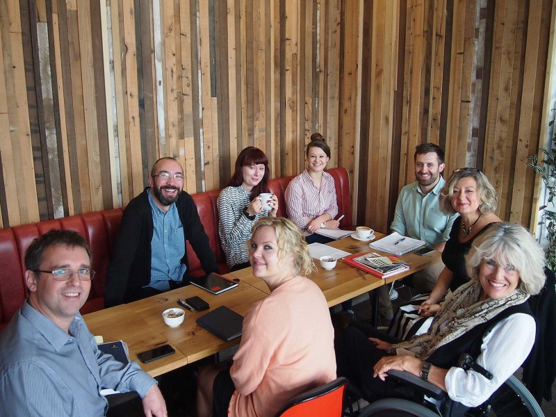
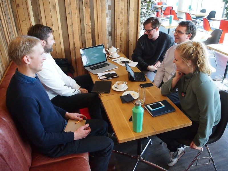
We've been at The Marlowe all day. Anti-clockwise from bottom left: John Baker, Helene Skoge, Mia Power, Sarah Munday, Ben...
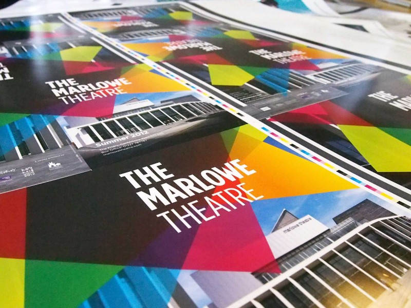
Our studio has been dominated by the design of the latest season brochure for The Marlowe Theatre, now it’s filled...
Jack and Michael are at The Marlowe, chatting about ways to make their website even better.
Laxmi is having a look through the new Marlowe brochures we've designed.
Michael and Jack are being given a tour of The Kit in Canterbury – their guides are John, Ben and...
Michael, Matt and Jack are in Canterbury, presenting initial website concepts to our friends at The Marlowe.
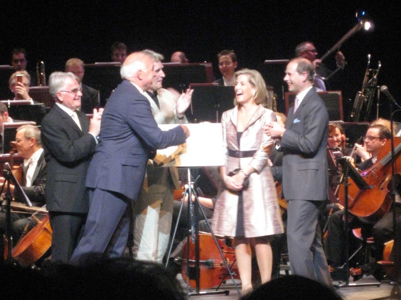
The Royal Gala opening of The Marlowe Theatre. Michael, Ocky, The Duke and Duchess of Kent and 1200 other people...
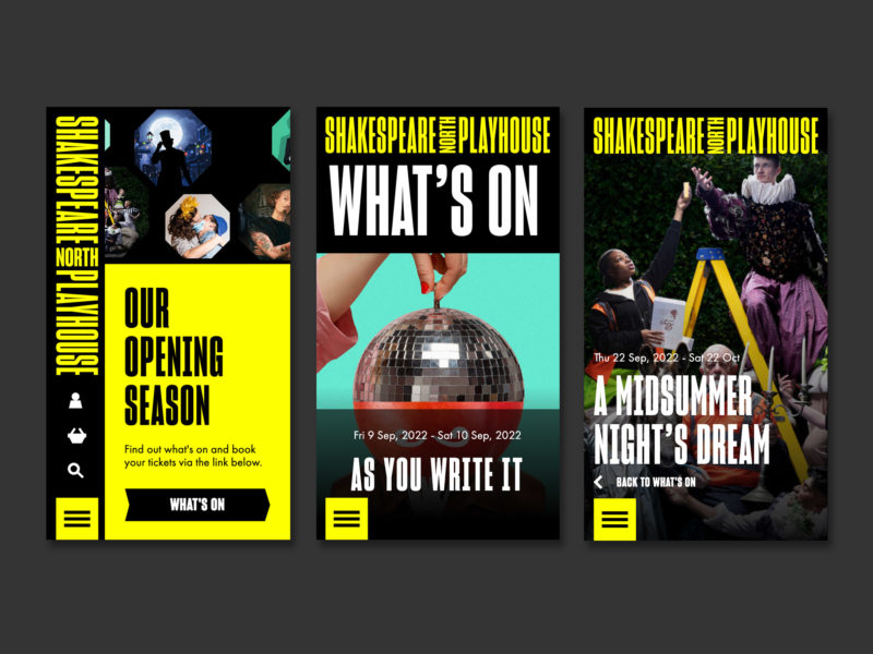
Shakespeare North Playhouse
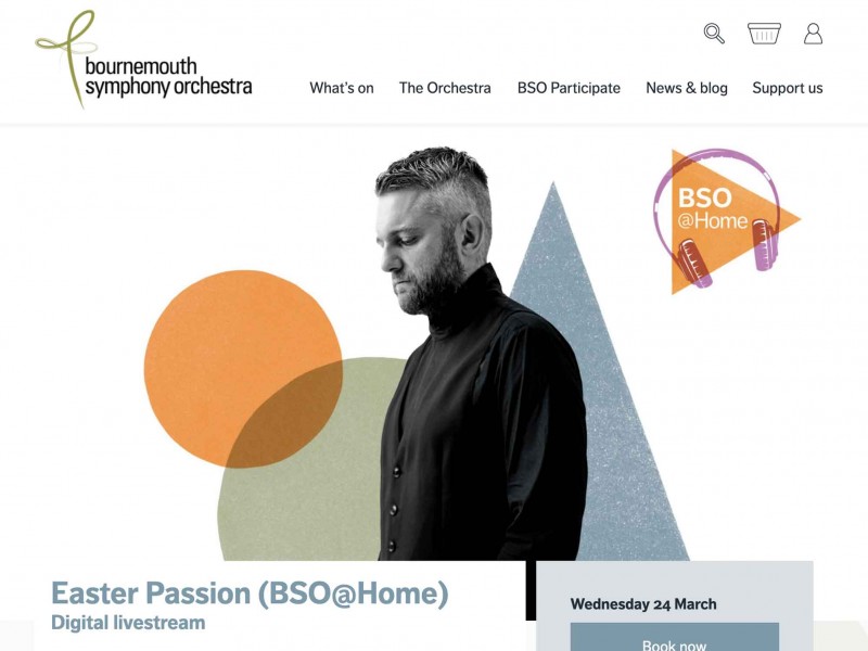
Bournemouth Symphony Orchestra
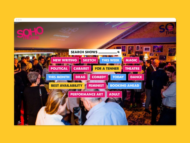
Soho Theatre