Telling amazing stories in the round
Royal Exchange Theatre
Our studio is filled with light and music.
There are multiple meeting rooms, a well stocked kitchen, and an indoor garden (with fishpond). Talk to us about access needs, environmental factors and any accommodations we might make to enhance your visit. Pop-in for tea and stay to use a spare desk for as long as you need.
11 Greenwich Centre Business Park,
53 Norman Road, Greenwich
London SE10 9QF
We’re next to Greenwich train and DLR station. We have a door right on the concourse but it’s different to our postal address. Find us via: what3words.com/hungry.means.author
This video shows the route to take from the train that will arrive at Greenwich rail station from London Bridge. There's a gentle slope next to the staircase.
If you have to come by car, we have a couple of parking spaces. We have a charging point that you are welcome to use if you have an electric car. Call ahead and we'll make sure the spaces are free. Use our postcode (SE10 9QF) to guide you in.
We’d love to hear from you. Use whichever medium works best for you.
11 Greenwich Centre Business Park,
53 Norman Road, Greenwich
London SE10 9QF
It's exciting to chat about potential new projects. We don't have a ‘sales’ team or a form to fill in. Call us or give us a little detail via email and we'll get straight back to you.
[email protected]If you're a client then you'll be best served by calling us or contacting us via ClickUp, otherwise you can use this dedicated email that reaches all of the digital team.
[email protected]This email hits the inboxes of the people who deal with our bookkeeping and finances.
[email protected]
Royal Exchange Theatre
Opened by Laurence Olivier in 1976, this architectural marvel has been home to some of the UK’s most radical productions from many of our greatest theatre makers. We worked with their team to launch a new website that captures that spirit and provides a seamless booking experience through their Spektrix ticketing platform.
We’d already been working on a couple of large digital projects with the Royal Exchange team when we began their new website project.
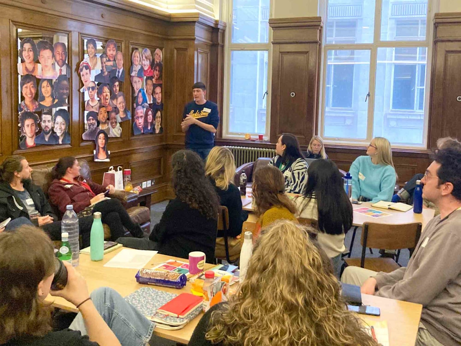
We felt we knew them well, but we’re never complacent and we know how important it is to bring the whole team along on the journey together. So we organised one-to-one discussions alongside an open workshop where staff from across the organisation were invited to contribute.
 Nick, leading our workshop
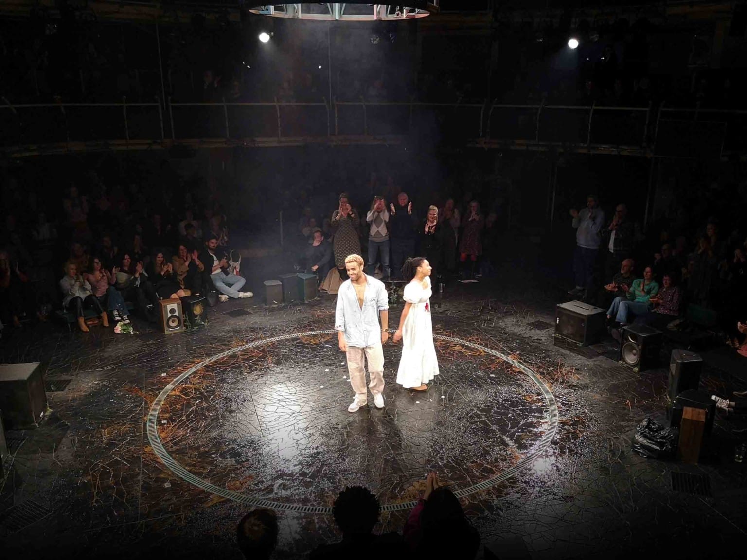
 The brilliant production of Romeo and Juliet
It was a dream working with you developing this new, beautiful site. I'm so happy with how it looks and how it integrates with Spektrix.
Alongside the anecdotal exercises from workshops, we delved into all of their analytical data (from Google and Spektrix), and we produced a comprehensive peer analysis looking at how other venues manage similar challenges.
And of course we went to their brilliant shows, ate in their restaurant, drank in their bar and hung out in the space.
If we’re honest, we were probably a bit in awe of the history of this incredible venue when we first worked on design ideas. We tried to work within their existing visual identity, using their fonts, colours and tone of voice. But between us all, we quickly realised that approach wasn’t working.
We took a step back and started again, this time with a clean palette – we selected new fonts and a refreshed colour palette, and we made full-screen images a key visual motif throughout the site.
We kept their logo as that had a lot of brand recognition, and we animated it to give punch to the pages.
Lots of that work has now been adopted back into their visual identity, print and digital marketing.
We’re thrilled with the results.
The site is filled with subtle animations and interactions that all add to the overall feeling of professional play.
Perhaps the most arresting feature is the ‘locked’ homepage.
The homepage is essentially a slideshow, but the animated transition packs a punch and elevates the aesthetic. Images fill the page and users can only navigate away by using the menu or the two key navigation headings (or clicking on any of the buttons within the slides).
The content of those slides allow the client team to use their brilliant advanced publicity images, production images for the current shows, and additional messages about memberships, participation partnerships etc.
The ‘burger’ menu allows users to access any other area of the site, via landing pages or drilling down another layer to more content.
Event pages (like the rest of the site) are constructed in blocks of different content types, allowing our clients total flexibility whilst retaining a tightly regulated overall visual framework.
There’s lots of clever Spektrix integration going on in the background, including all of the usual capacity calculations and pulling through of accessibility tags.
And we’re doing some smart things with messaging around advanced booking periods and upselling memberships.
This can be seen in the video, where we’re showing the states for:
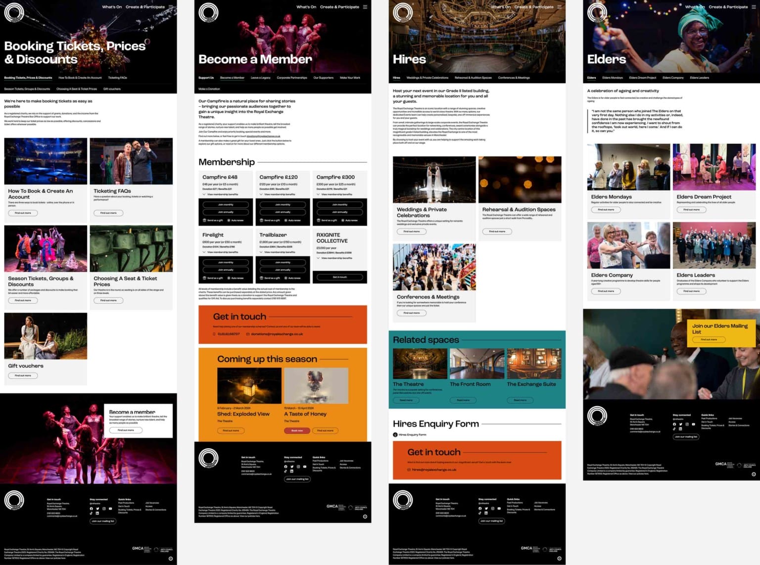
The rest of the site is deceptively simple but packed with an impressive depth of content.
Landing pages guide users to areas of interest from which they can delve deeper and cross reference between topics.
Each page is designed from a hugely flexible template so our clients can build their content, block by block.
