A promotional feast for the eyes
Science Gallery's Fed-up campaign
Our studio is filled with light and music.
There are multiple meeting rooms, a well stocked kitchen, and an indoor garden (with fishpond). Talk to us about access needs, environmental factors and any accommodations we might make to enhance your visit. Pop-in for tea and stay to use a spare desk for as long as you need.
11 Greenwich Centre Business Park,
53 Norman Road, Greenwich
London SE10 9QF
We’re next to Greenwich train and DLR station. We have a door right on the concourse but it’s different to our postal address. Find us via: what3words.com/hungry.means.author
This video shows the route to take from the train that will arrive at Greenwich rail station from London Bridge. There's a gentle slope next to the staircase.
If you have to come by car, we have a couple of parking spaces. We have a charging point that you are welcome to use if you have an electric car. Call ahead and we'll make sure the spaces are free. Use our postcode (SE10 9QF) to guide you in.
We’d love to hear from you. Use whichever medium works best for you.
11 Greenwich Centre Business Park,
53 Norman Road, Greenwich
London SE10 9QF
It's exciting to chat about potential new projects. We don't have a ‘sales’ team or a form to fill in. Call us or give us a little detail via email and we'll get straight back to you.
[email protected]If you're a client then you'll be best served by calling us or contacting us via ClickUp, otherwise you can use this dedicated email that reaches all of the digital team.
[email protected]This email hits the inboxes of the people who deal with our bookkeeping and finances.
[email protected]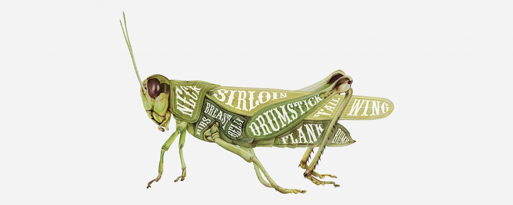
Science Gallery's Fed-up campaign
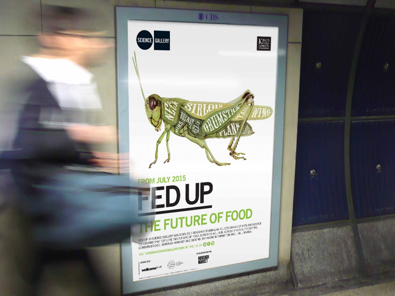
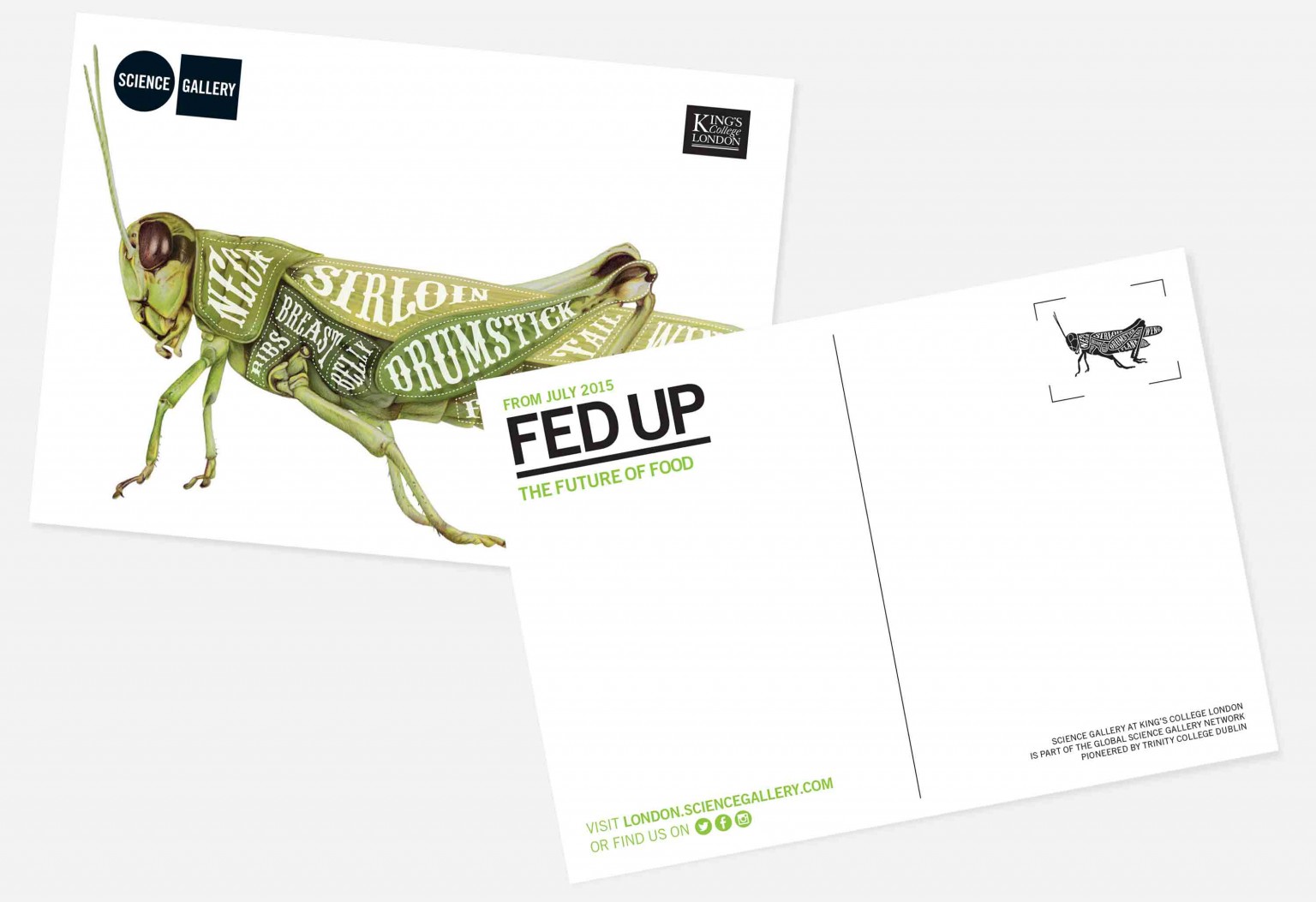
Science Gallery London approached us to create a campaign images that summarised their explorations around the future of food, targeted at a 15–25 year old audience.
A flagship project for King’s College London, Science Gallery London is based on the hugely successful model of Science Gallery Dublin. This campaign was the first to be designed outside of Ireland.
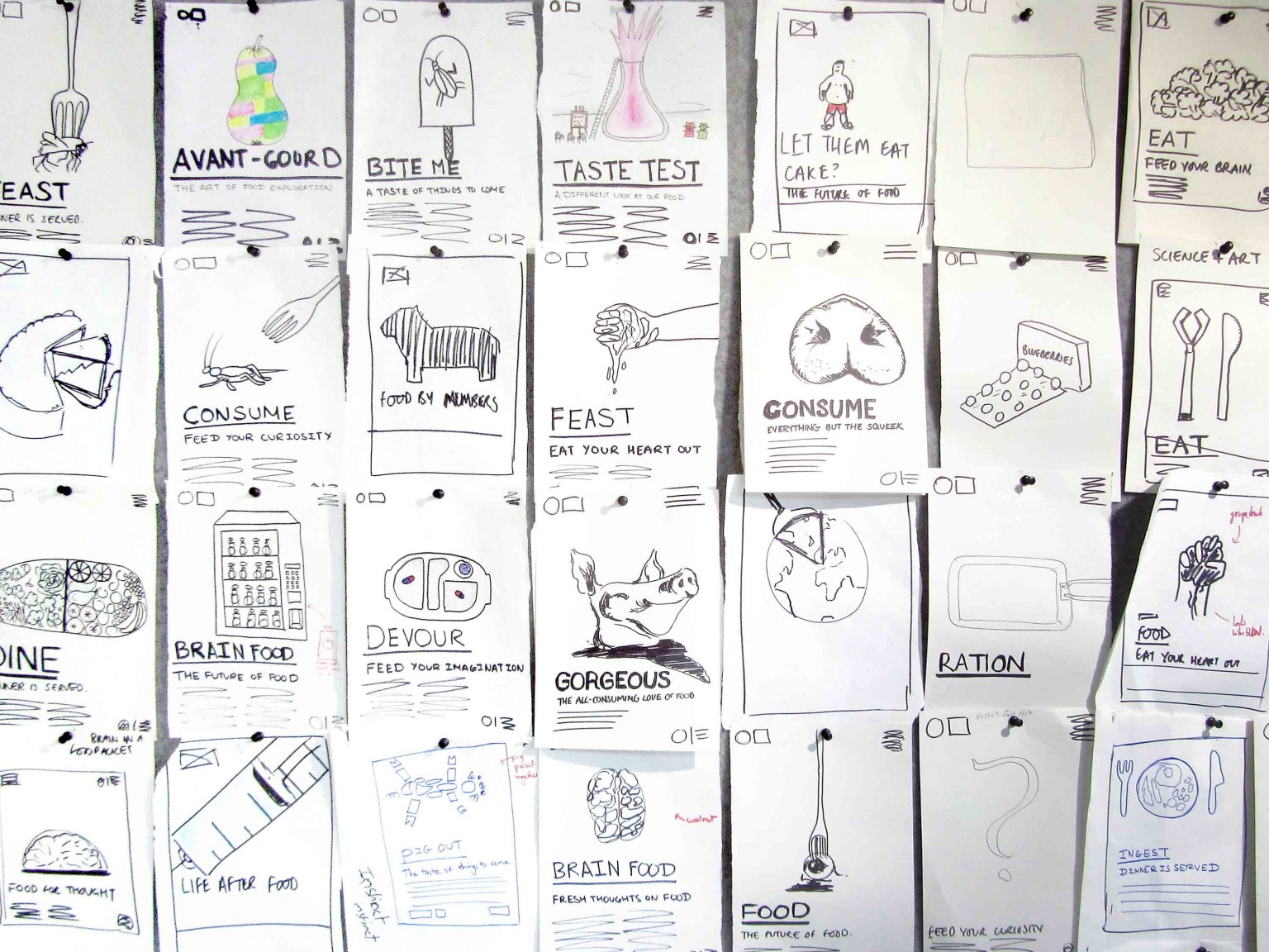
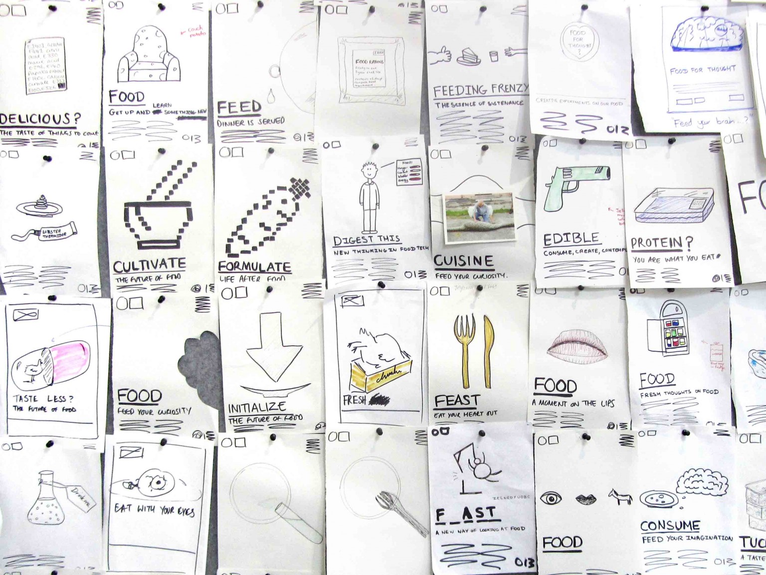
We were charged with naming and producing the publicity campaign for a season of events about the future of food. Our pinboard walls came in to full effect as the whole team contributed ideas for a strong central campaign image and an engaging title,
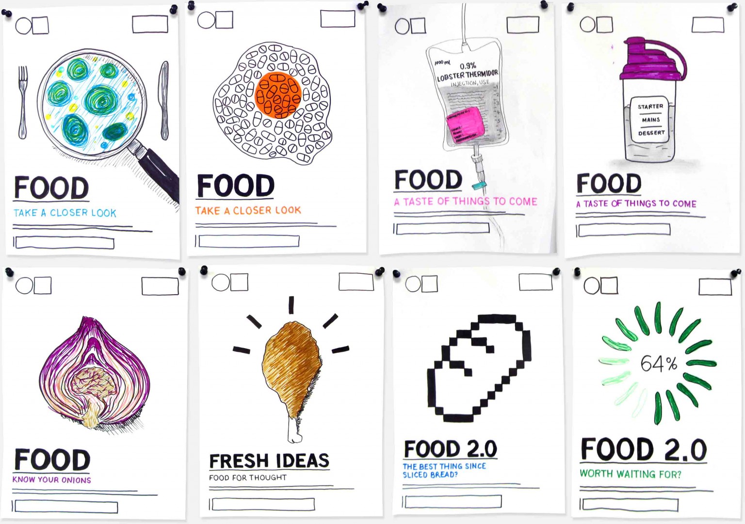
We are always keen to involve our clients in the creative process (if they want to be involved) so, with the pinboards full of sketches we invited Museum Director, Dr Daniel Glaser and his team to come and chat through the work we’d done.
What was great about working with the team at Cog wasn’t just their ability to work conceptually, without a huge amount of direction, but also the maturity with which they shared their creative process – allowing the Science Gallery London team to stay at the centre of the project through to its realisation.

As so often happens when we talk to brilliant people, they focused our ideas and opened up new directions. We spoke a lot about the near future of food, how it’s less likely to be lab-based science and more likely to be about discovering and re-purposing ancient techniques. We also talked about the core audience: young people who feel bombarded by messages about healthy eating, but feel excluded (by price and social conventions) from accessing those alternatives.
Invigorated by the client feedback, we looked through our sketches, pulled them out and reworked them to more clearly aim at the youth audience. By this stage, we began to properly marry the season titles, taglines and imagery but were still working in sketch form so the ideas were consistently presented.
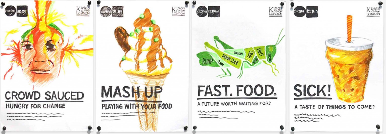
After some simple audience research with potential audiences, the grasshopper route was chosen.
We spoke to photographers and found sources for buying live samples, but we opted to use an illustration as that would give us much more control of the finished image.
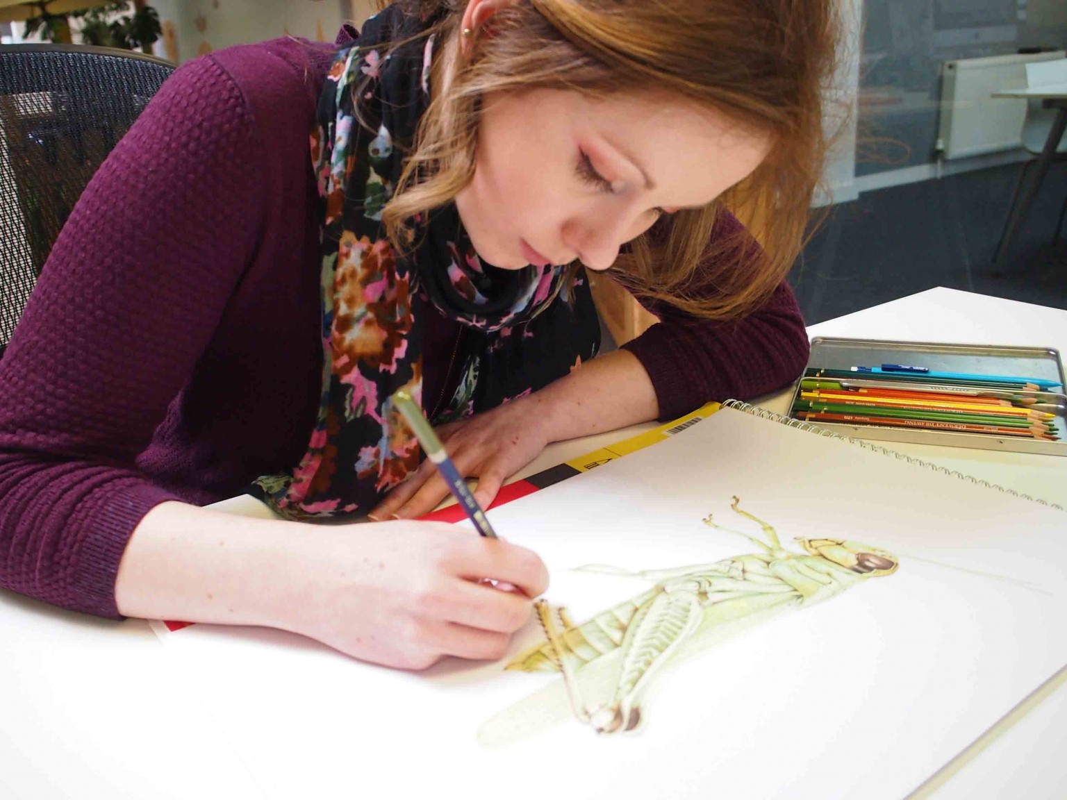
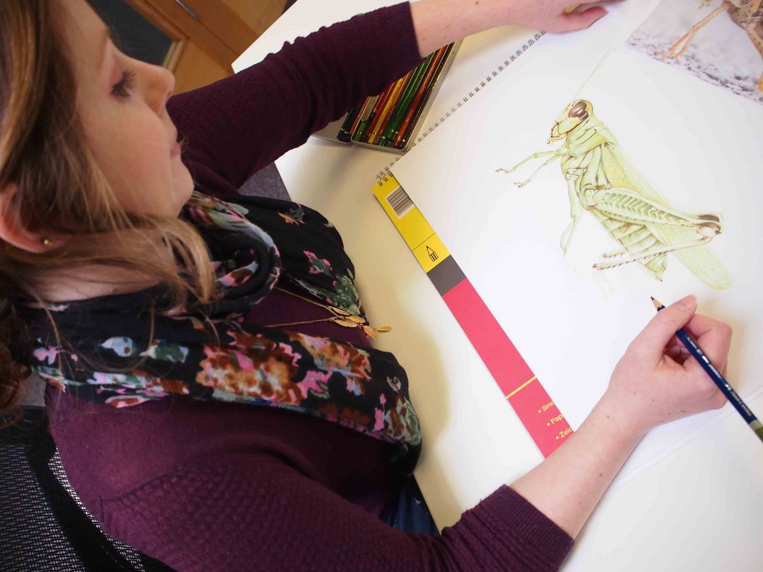
We commissioned the wonderful illustrator, Becca Muir (who happened to be one of our digital project managers at the time).
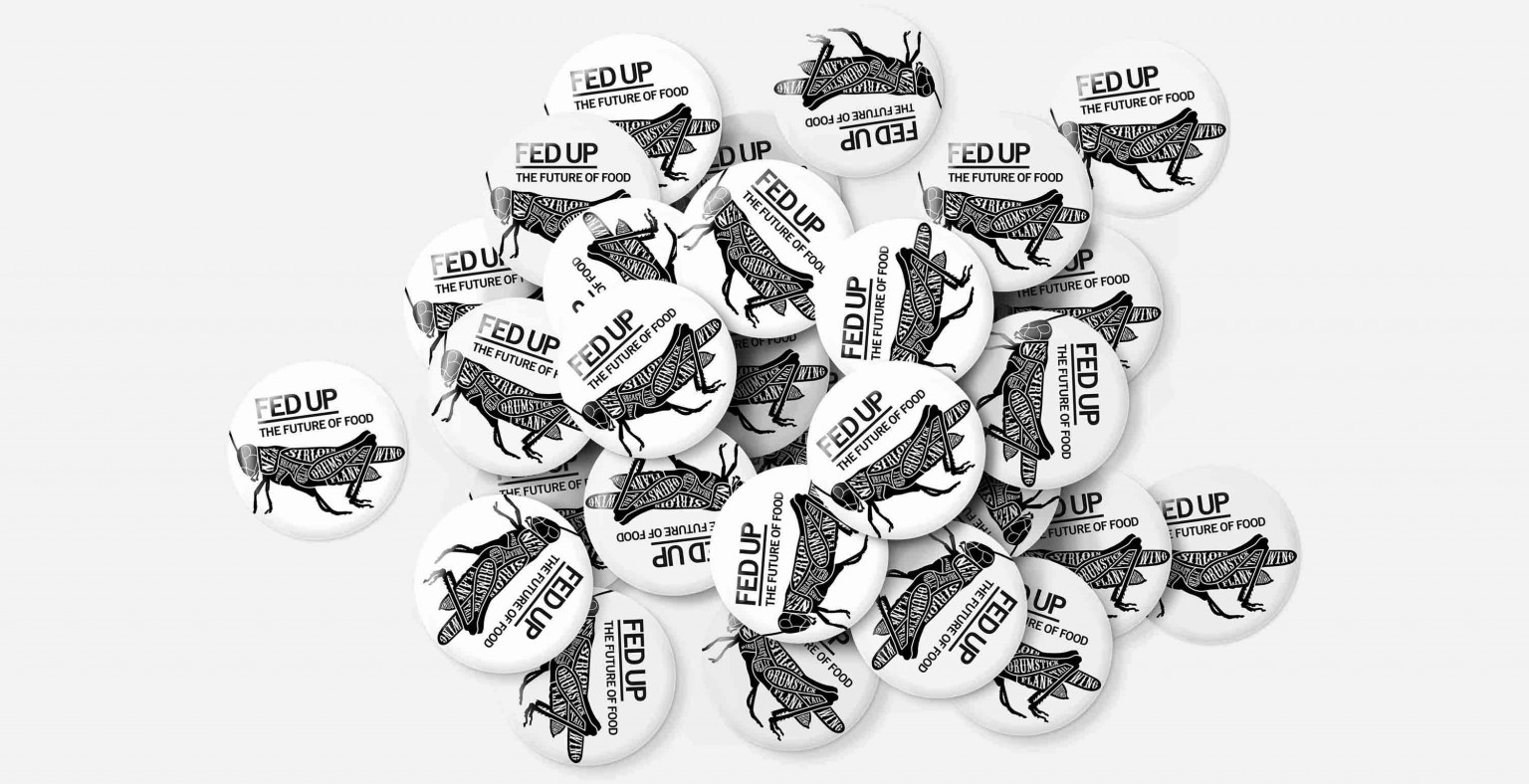
As well as the full colour posters and print, we knew that our client would need the image to work on small, low-budget items. So we reworked it as a simple black and white outline drawing for promotional merchandise.
