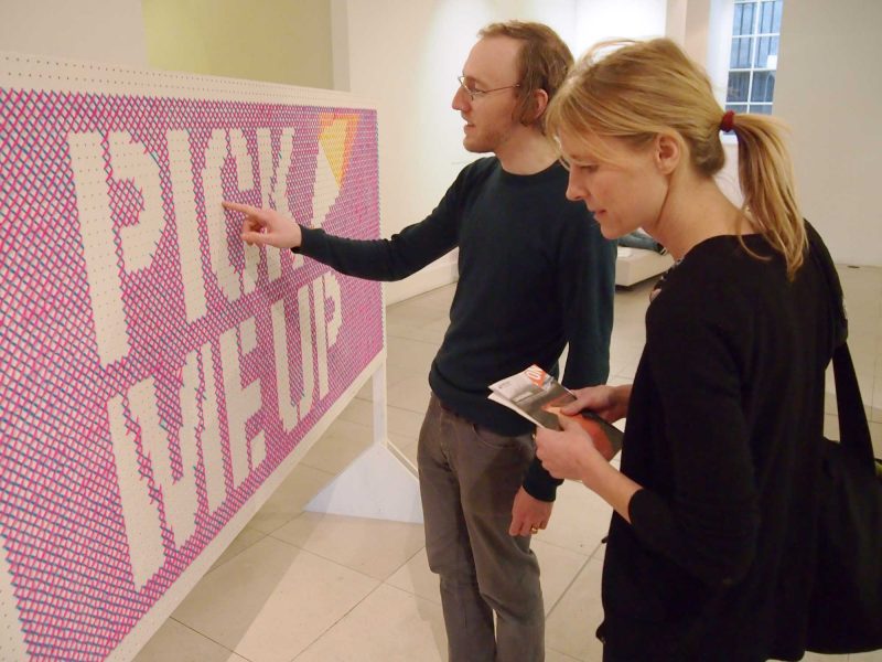
For our July Cog Night we went to Somerset House for ‘Daydreaming with Stanley Kubrick’, an exhibition of artistic responses to the director’s work. Michael is a big Kubrick fan so could this show hope to match his expectations?
Daydreaming with Stanley Kubrick at Somerset House

I love Kubrick; I love that his ‘style’ was to reinvent his approach to perfectly suit the genre of each film; I love that his exceptional eye for, and attention to, every detail of film-making, was always used to enhance the story he was telling.
And, of course, I’m not alone; his films have influenced and inspired generations across all disciplines. So, it is fitting that James Lavelle (best known as the founder of UNKLE and Mo’Wax) has gathered a truly eclectic roster of artists to contribute pieces to this exhibition.

Marketing design by Barnbrook Studios
Before we go in, let’s doff our caps to the excellent visual identity from Barnbrook Studios. Perhaps, a little ironically, it seems to be inspired by David Pelham’s 1972 book-jacket design for A Clockwork Orange rather than poster for Kubrick’s film (released at the same time). But that doesn’t take anything away from its relevance and simple brilliance – bold, relevant, adaptable and instantly recognisable; wish we’d done it.
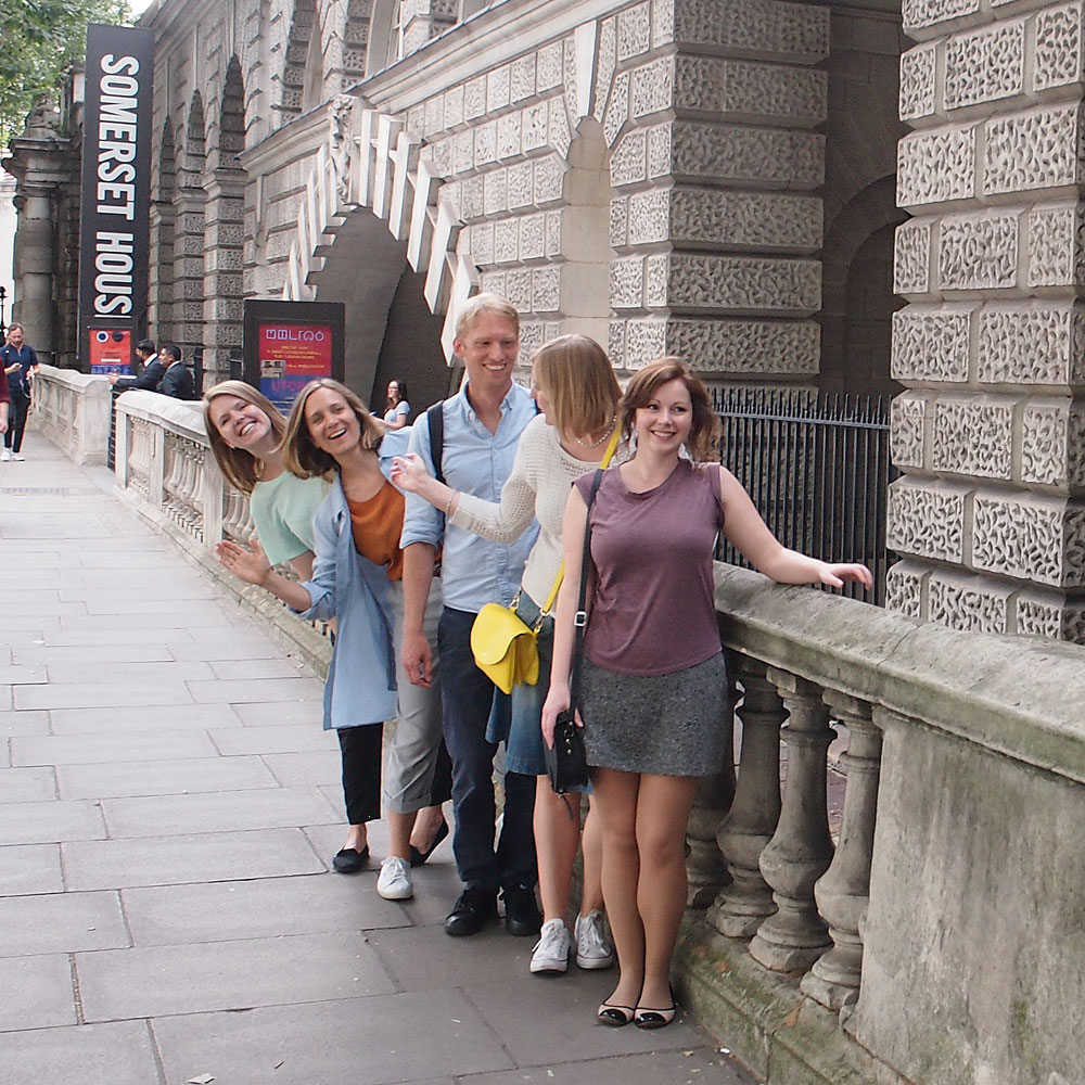
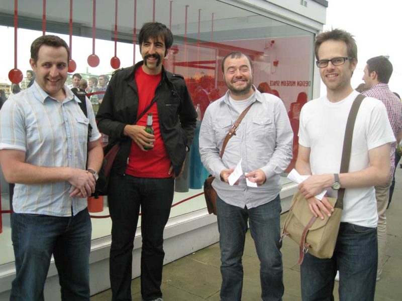
Some of the Cog team arriving at Somerset House and forming our own orderly queue.
We have one more short pause before we go in. We’re here for a timed slot but the evening openings are very busy so we’re held in a queue and let in gradually. As is often the case, our on-line booking has to be cross-referenced on a clip-board with a biro… then we’re in.
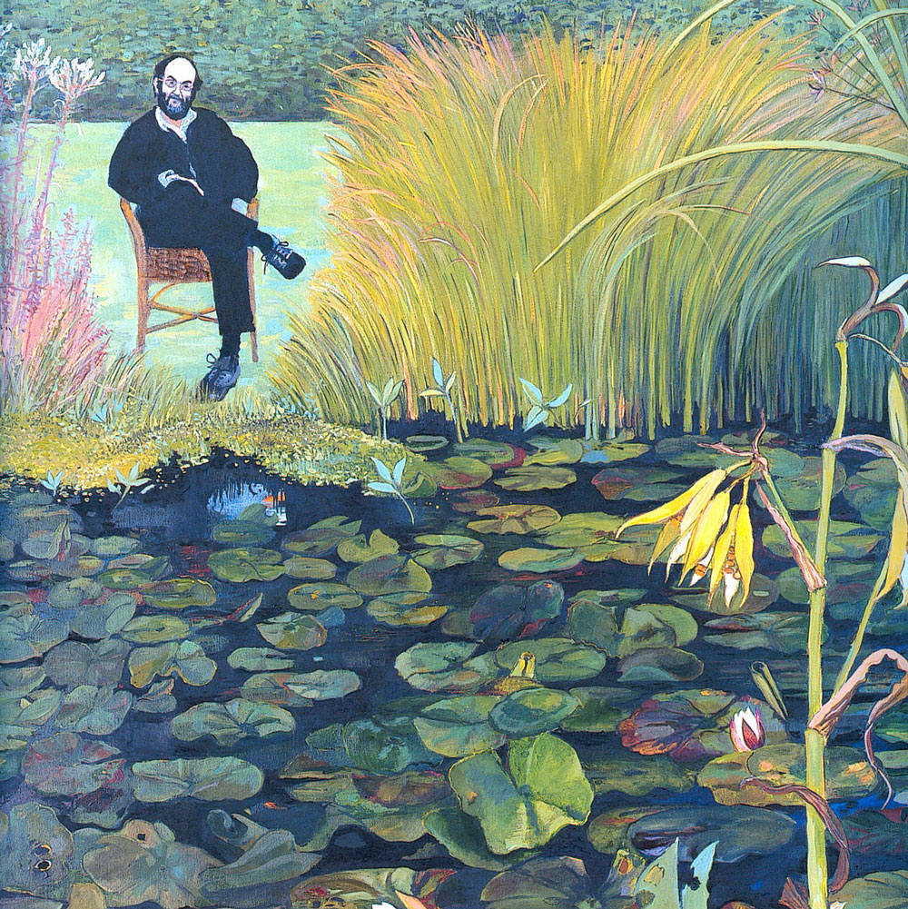
Cropped image of Christiane Kubrick, ‘Remembering Stanley’ 1999
In the entrance hall the first work is a painting of Kubrick by his wife, Christiane Kubrick. It’s sweet and touching that she’s featured, and (from what I’ve heard in interviews) Lavelle seems genuinely sensitive to making sure she is happy with exhibition. It’s also one of the better paintings in the show (there are some ‘fan-art’ pieces later that made me wince a little).
The exhibition is laid out along the ground floor of Somerset House’s West Wing, with lots of relatively small rooms, feeding off a long corridor. This exhibition suits the space perfectly, not least because Adam Broomberg and Oliver Chanarin got to cover the floor with a recreation of the The Shining Carpet.

Having been told we could take photos (which must be a massive help in the marketing of any exhibition as we all fill our social media streams with photos), there was a No Photography sign in the first room. Matt Collishaw’s tribute to 2001 A Space Odyssey is a space helmet, containing a skull, made invisible from the front by an interior projection of a primate. It deserves to be undisturbed by pointless flash photography.
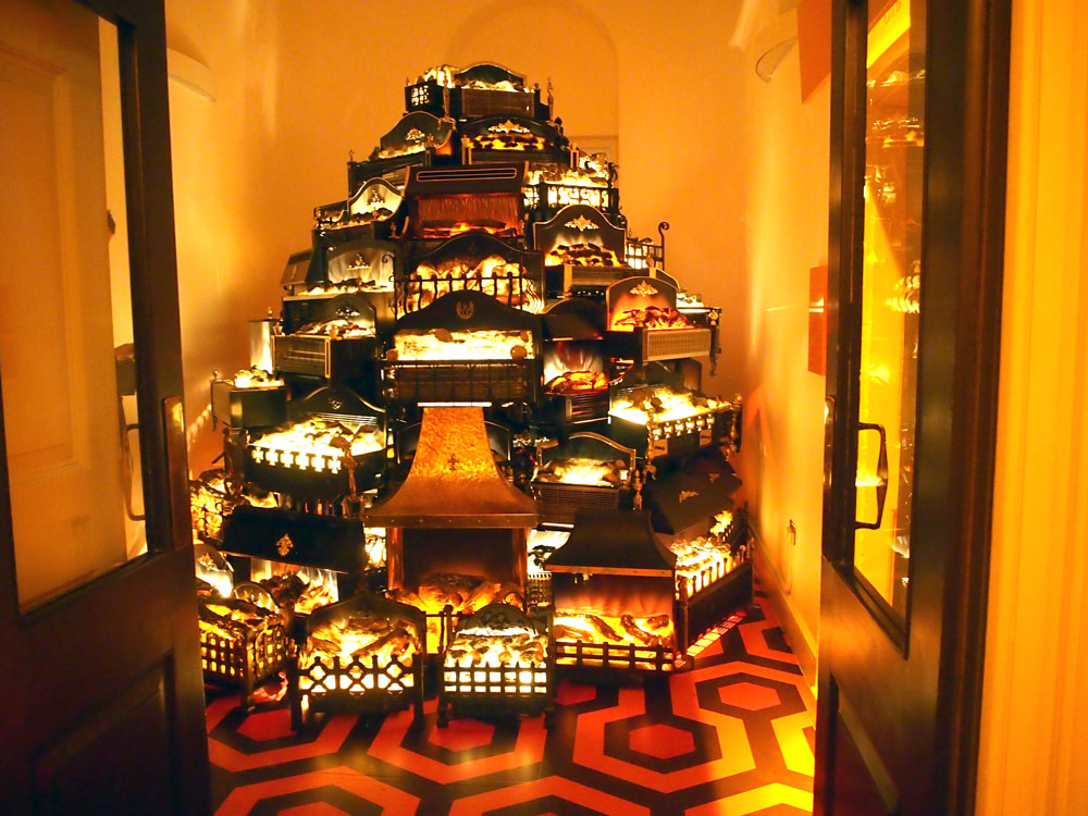
Stuart Haygarth, ‘PYRE’ 2016
The next space is filled with a stack of electric heaters, an homage by Stuart Haygarth to the motifs of The Shining. Many of those heaters were turned on. So, on top of the stifling temperatures of a stormy summer’s evening, the building was filled with additional heat. It’s impressive and oppressive, and must be a nightmare for the health and safety officers.
What struck me about the exhibition as a whole was how much I liked the work of the emerging artists and how little I cared about the work of the established names in visual art (whose work I usually admire). Marc Quinn seems to have pulled a couple of vaguely relevant canvases out of storage. Anish Kapoor’s concave mirror with dissonant sounds, Bit Bang Mirror, is interesting but not really anything to do with Kubrick, and Sarah Lucas has (if you’ll excuse the expression) shoved in her trademark giant phallus.
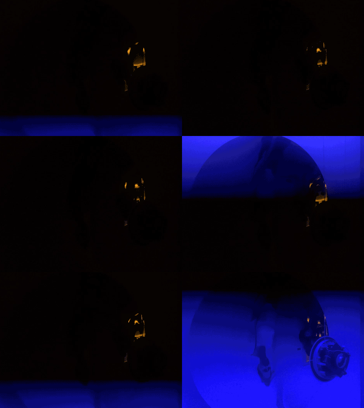
Haroon Mirza and Anish Kapoor, ‘Bit Bang Mirror’ 2013-2015
More interesting to me were the multi-media pieces, especially in their use of sound.
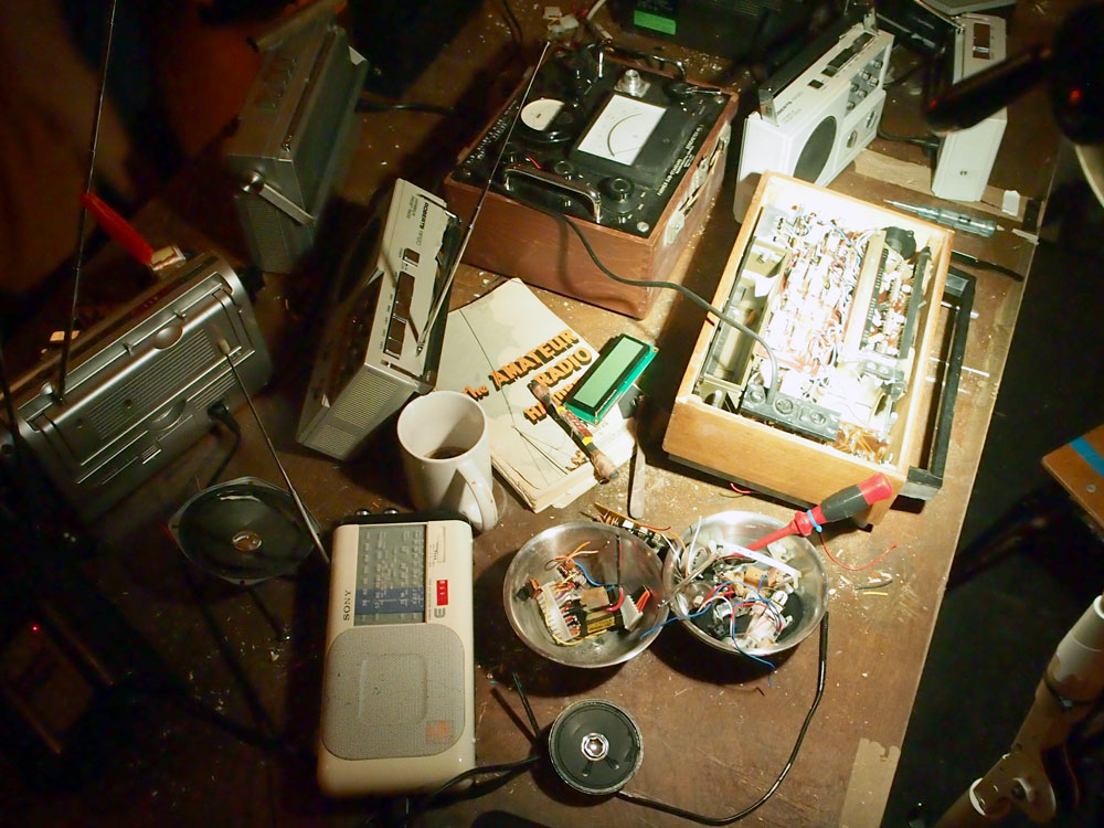
A detail from Iain Forsyth and Jane Pollard’s ‘Requiem for 114 radios’ 2016
Requiem for 114 radios, by Ian Forsyth and Jane Pollard, is truly eerie. 114 analogue radios each move slightly in and out of broken reception, playing performances of Dies Irae from the Roman Catholic Mass (as featured in The Shining and A Clockwork Orange). Apparently, the voices include Jarvis Cocker and other notable names but that passed me by, perhaps because I was so overtaken by the contrast between the heat and the chill down my spine.
The most remarkable room for me was given over to Toby Dye’s ‘silent’ film, The Corridor. Each of the four walls of a square room were filled with film. On each side a tracking shot moved the camera down a white corridor. Each wall featured characters inspired by Kubrick films, including parts played by Joanna Lumley and Aidan Gillen. And underscoring it all is the menacing Lonely Soul by UNKLE, with vocals from Richard Ashcroft. Sadly I didn’t get to see the looping sequence all the way through because the room filled with so many people I felt obliged to move on.
You can watch a clip of it on Vimeo but it’s been set-up to not allow it to be embedded in blogs. I’ve asked if they’ll let us use it… I hope so.
A second video and sound coupling held me spell-bound in a different room. Doug Foster’s Beyond The Infinite is a kaleidoscopic vision, reminiscent of the ‘Stargate’ scene in 2001. Strangely, I found myself alone in that room so sat dead-centre as the visuals endlessly evolved towards me. The sound was supplied by cellist Phillip Shepherd, via a chest-wobbling sub-woofer. Do watch this clip, full-screen with the sound turned up.
There is a 360-degree, virtual reality room which recreated the centrifugal living space from 2001 but, like all virtual reality art experiences, the queue didn’t seem to outweigh the expectation of the wait for me.
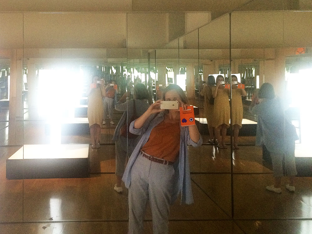
Melissa, photographing Anna, photographing Melissa… in Doug Aitken’s installation, ‘Twilight’ 2014
Several artists had picked up on the theme of endless repetition. A phone booth glowed endlessly white in the mirrored room of Doug Aitken’s installation, Twilight. It also made a useful bypass to avoid blocking people’s view of the bizarre Julian Rosefeldt film, with Cate Blanchett reading from the Futurist Manifesto. This was apparently part of a much bigger work of 13 characters but ,is shown in part here because there’s a weird suspended slab like the one in 2001.
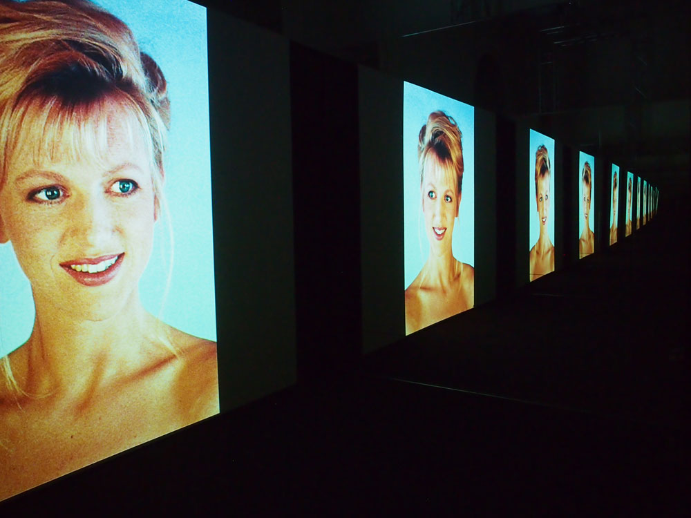
A test shot of actress Johanna ter Steege, from Jane and Louise Wilson’s film, ‘Unfolding the Aryan Papers’ 2009
Jane and Louise Wilson’s film portrait of actress Johanna ter Steege is also in a mirrored room. For me, it’s the most interesting interpretation of the Kubrick brief. Steege speaks about the detailed process Kubrick used in selecting her (above Julia Roberts or Uma Thurman) for his unrealised 1990’s project, Aryan Papers. In it she talks of being selected as the ideal Aryan example. She speaks of how Kubrick stared at her. And while she says it, we are staring at her, endlessly. But we’re often not just staring at the original stills from the casting process, we’re looking at moving recreations of those shots, filmed by the artists of the actress in 2009. Almost all of the shots are from behind so we barely see her face.
There are a couple of other small works that are particularly worthy of remark. Chris Levine somehow uses LED to project an image of Kubrick that only appears in your peripheral vision; and Nancy Fouts’s ‘breathing’ camera is a beautifully small statement amongst the huge scale of some of the works (she also created the huge director’s chair that sits on the terrace as a marketing tool).
I could take or leave the graffiti artist works, or the airbrush paintings by the poster artist of the original A Clockwork Orange release, but I appreciate the need for them to be there.
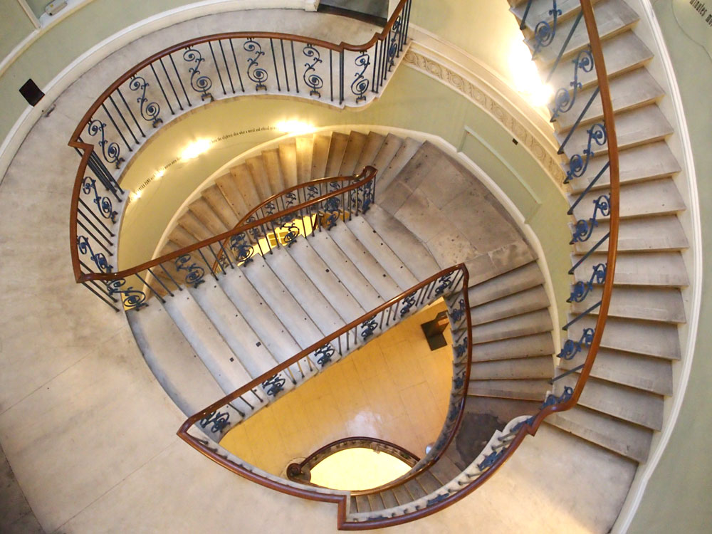
The Nelson staircase with ‘A Grammatical Remark’ #9 2016 just about visible between the lights
After the sensory assault of the rest of the exhibition the ending felt anti-climactic. I wandered out, almost by accident, and was at the bottom of the ‘Nelson staircase’, a hugely impressive architectural feature of Somerset House. Across three flights, Joseph Kosuth had installed a transcript of the climatic confrontational scene between Jack and Wendy on the stairs in The Shining. Apparently, it’s the ninth installation of the piece on staircases around the world. Maybe the others were better juxtaposed with their surroundings.
The exhibition had its problems. There were some issues around the leaking of light and sound between the spaces which diluted the experiences a little, but not as much as the crowds of us sweaty visitors, clumping around works and queuing in the corridor. They really do need to sort out the heat.
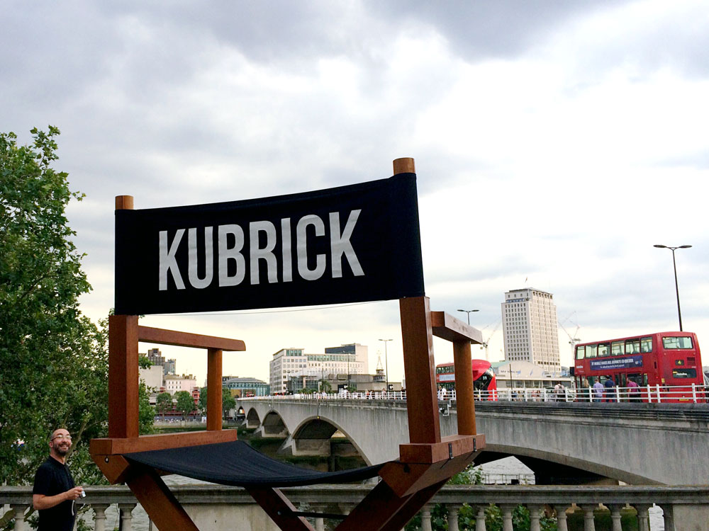
Nancy Fouts ‘Kubrick’s Chair’ 2016, facing Waterloo Bridge, with a smiling Michael, bottom left
There were some niggles, but I loved the exhibition (or perhaps it was more of an immersive experience). The curation was thoughtful and considered, the work was broad ranging and accessible. Perhaps, unsurprisingly, most artistic responses were to just three or four of Kubrick’s films but that was OK too.
Congrats to everyone involved.
