The world's top music education brand
ABRSM brand refresh
Our studio is filled with light and music.
There are multiple meeting rooms, a well stocked kitchen, and an indoor garden (with fishpond). Talk to us about access needs, environmental factors and any accommodations we might make to enhance your visit. Pop-in for tea and stay to use a spare desk for as long as you need.
11 Greenwich Centre Business Park,
53 Norman Road, Greenwich
London SE10 9QF
We’re next to Greenwich train and DLR station. We have a door right on the concourse but it’s different to our postal address. Find us via: what3words.com/hungry.means.author
This video shows the route to take from the train that will arrive at Greenwich rail station from London Bridge. There's a gentle slope next to the staircase.
If you have to come by car, we have a couple of parking spaces. We have a charging point that you are welcome to use if you have an electric car. Call ahead and we'll make sure the spaces are free. Use our postcode (SE10 9QF) to guide you in.
We’d love to hear from you. Use whichever medium works best for you.
11 Greenwich Centre Business Park,
53 Norman Road, Greenwich
London SE10 9QF
It's exciting to chat about potential new projects. We don't have a ‘sales’ team or a form to fill in. Call us or give us a little detail via email and we'll get straight back to you.
[email protected]If you're a client then you'll be best served by calling us or contacting us via ClickUp, otherwise you can use this dedicated email that reaches all of the digital team.
[email protected]This email hits the inboxes of the people who deal with our bookkeeping and finances.
[email protected]A round-up of recommendations and reviews, sent on the first Friday of each month, topped-off with a commissioned image from a talented new illustrator. Sign-up and tell your friends.
Sign me up
An irregular update of activity from our studio. Showing off about great new projects, announcements, job opportunities, that sort of thing. Sign-up and tell your friends.
Sign me up
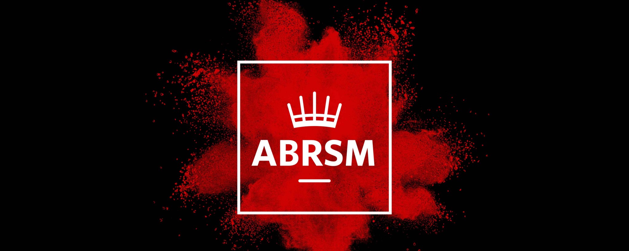
ABRSM brand refresh
ABRSM, the world’s leading provider of music exams was evolving and expanding. They asked us to reconsider their branding and provide communication materials to keep them relevant, consistent and at the top of their sector.
The Associated Board of the Royal Schools of Music is the UK’s largest music education body, one of its largest music publishers and the world’s leading provider of music exams. Each year they assess 630,000 candidates in 93 countries. They’d been through an extensive rebrand (by agency 300Million), completed in 2009, which included a new marque and naming as ABRSM.
With a new Chief Executive in place, ABRSM approached us to complete an audit of their needs. Everything was open to discussion and there was much talk of an all new visual identity and a clean slate.
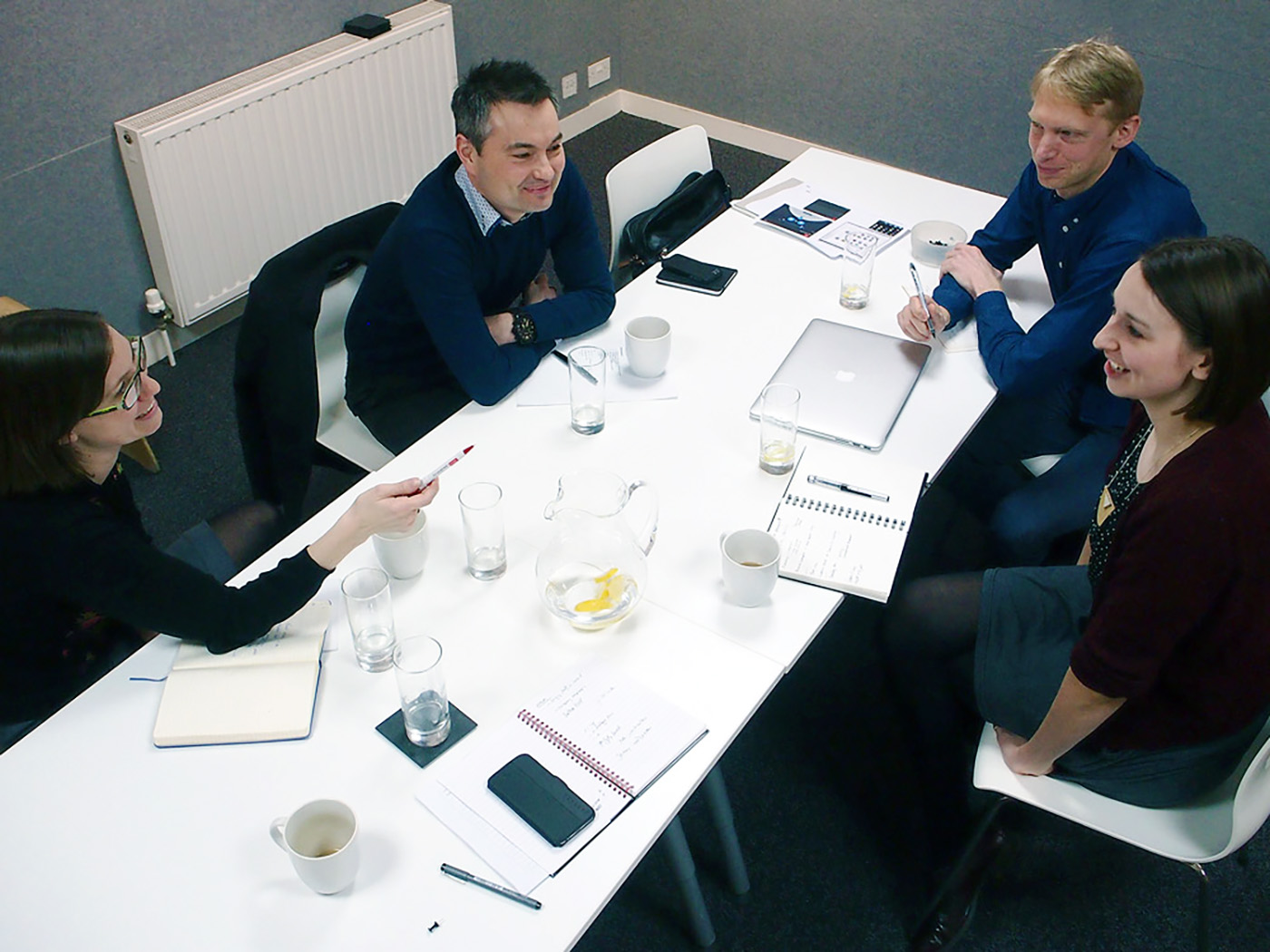 An early meeting with Gilly and Tony from ABRSM
 The existing marque, designed by 300Million
We spent time considering all of the options until we were clear in our recommendation to evolve their current branding rather than reinvent it.
It’s unusual for a design agency to argue against a rebrand but we felt it was in our client’s best interest for several reasons:
Plus… we really liked the marque. We remember how jealous we were when the rebrand happened and we saw that very clever design solution.
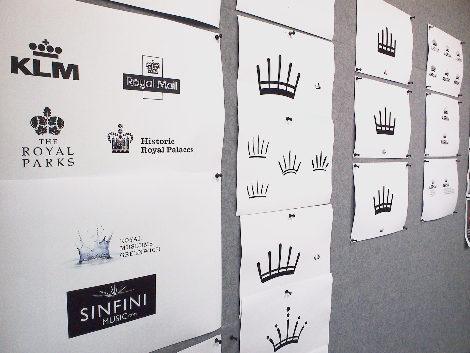 Research around the crown graphic
There were also strong arguments for change, not least as a signal (both external and internal) that the organisation was growing and evolving.
We identified three key reasons for change and focused our thinking in these areas:
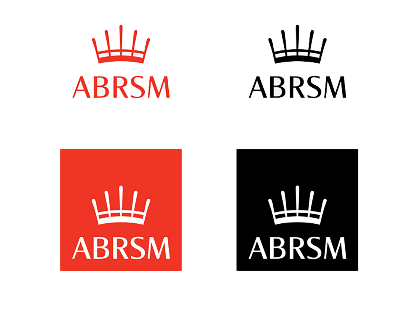
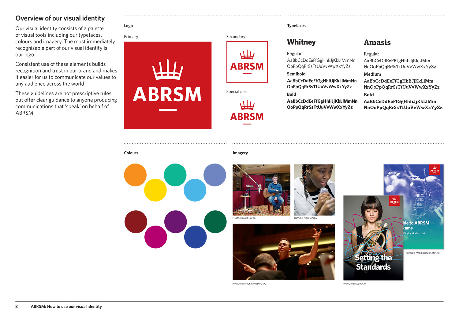
We began by looking at the existing logo. We knew that we wanted to retain the crown/stave idea but needed to simplify it for digital use; it needed to be bold, clear and confident at the smallest size (one centimetre square on an online social media feed) and the largest iteration (projected behind the keynote speaker at their annual conference).
We worked through many variations of the crown, redrawing every element until we achieved the perfect balance – even enough to be consistently legible but curved enough to retain its character. We wanted to retain its charm but make it a more solid, confident marque.
We also looked at dozens of typefaces to achieve a similar effect with the lettering. Eventually we settled on a characterful font that we adapted and redrew to make it perfect (and unique) for this purpose.
I’m particularly struck by how much sharper and more dynamic the logo looks in an on-screen context (particularly evident when looking at our social media pages on a mobile device).
The existing logo had particularly strong recognition when used in its a red box configuration. But it had been designed to hang off the top of a page of print so it felt unbalanced and bottom-heavy when used as a standalone element. With our new version we wanted a marque that would work consistently in all contexts. And we wanted to ensure that the emphasis of the logo was clearly on the lettering, with a crown on top.
The addition of a simple underline provided the solution to both issues – the red boxed logo now had consistent balance wherever it was used and the ‘shadow’ meant that the crown could be reduced in size without losing its gravitas, giving an increased prominence to the lettering.
We also took the opportunity of moving to a more sophisticated shade of red, a richer tone that felt more distinct to ABRSM.
It’s been instructive to see how a series of (individually) small-scale changes can effectively combine forces to have a significant collective impact.
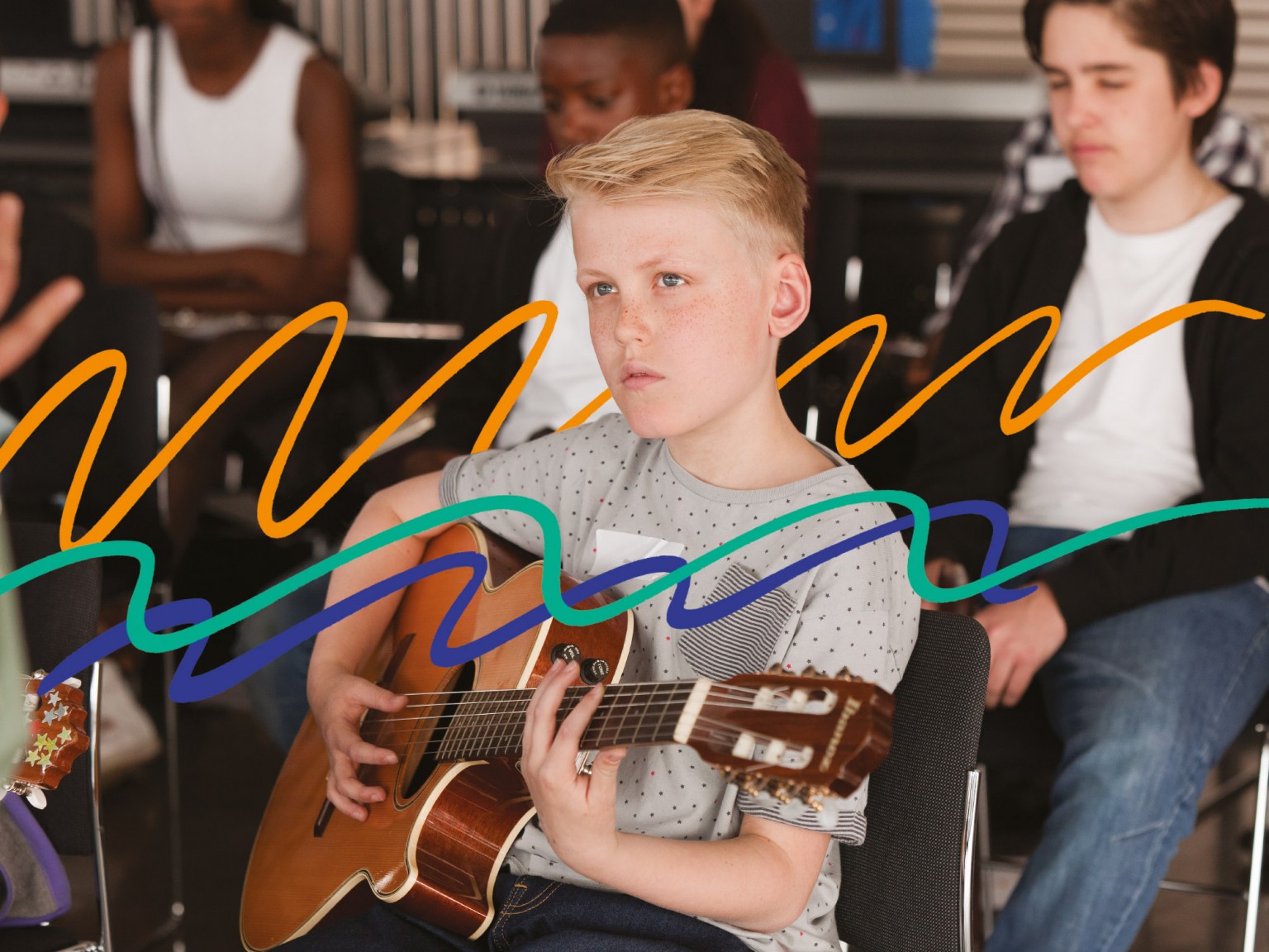
We’d deliberately made the logo marque more solid and less frivolous but we’d always planned to counter that seriousness through playful implementation. We wanted to include options for movement and energetic treatments (reflecting the youthful energy of the audience).
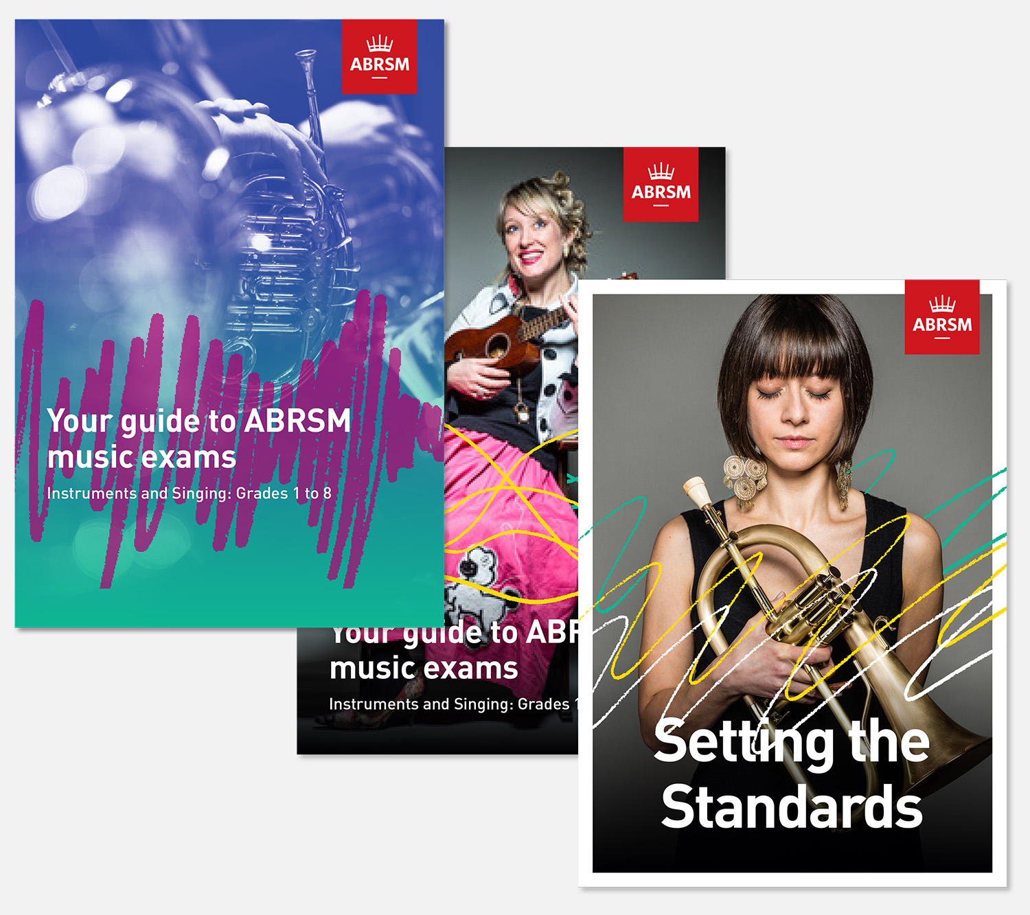
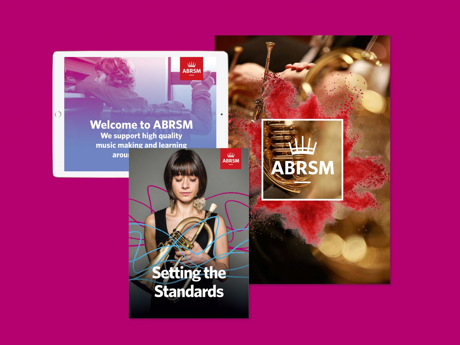
We worked with our clients to create a visual system that could accommodate a full spectrum of communications: from traditional examination certificates to posters in the classroom; from academic reports to classroom teaching materials.
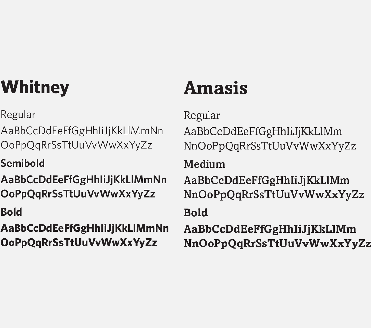
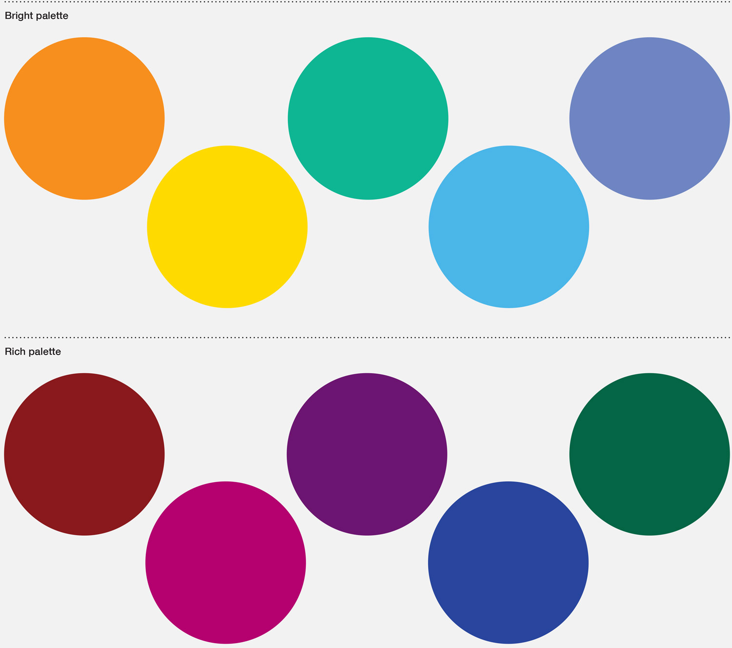
We introduced two new colour palettes – ‘bright’ for communicating with potential students, ‘rich’ for business communications and reports. And we selected two new typefaces, specifically designed to work on screen and in print – distinctive, characterful and with similar letterforms so they sit well near each other and can swap between headlines and text.
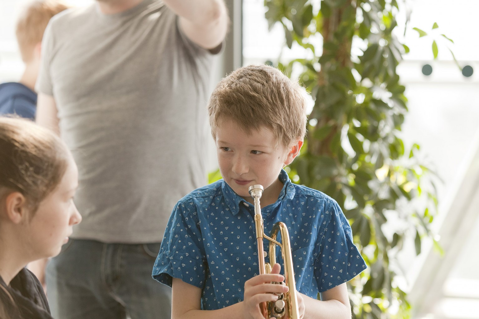
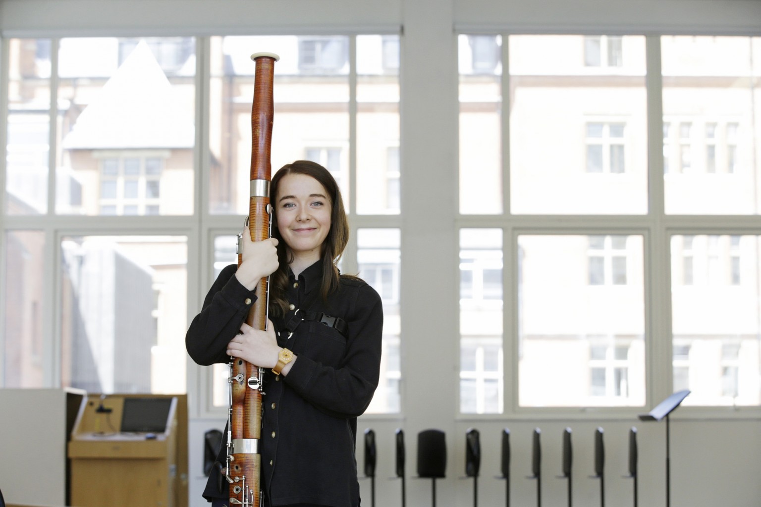
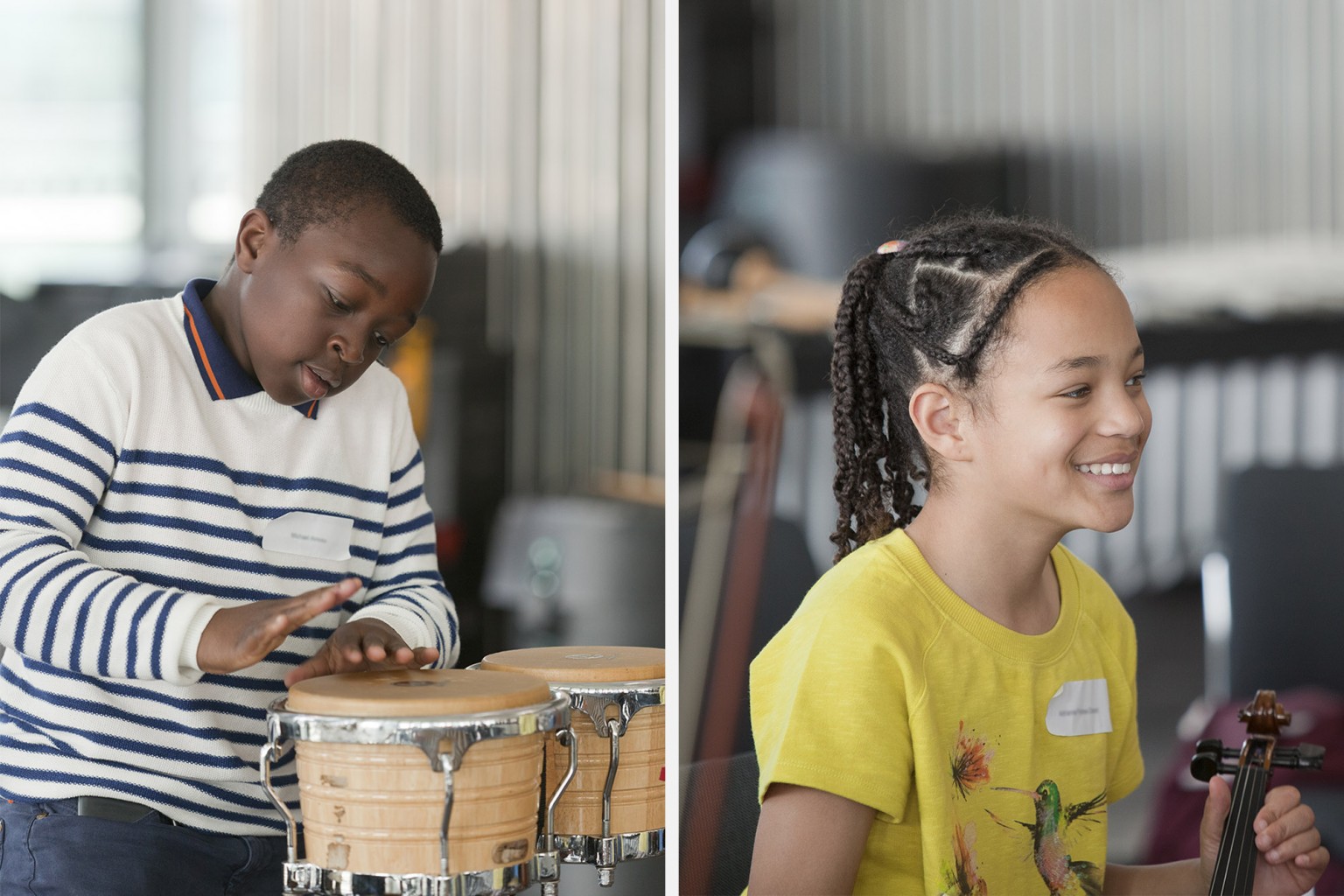
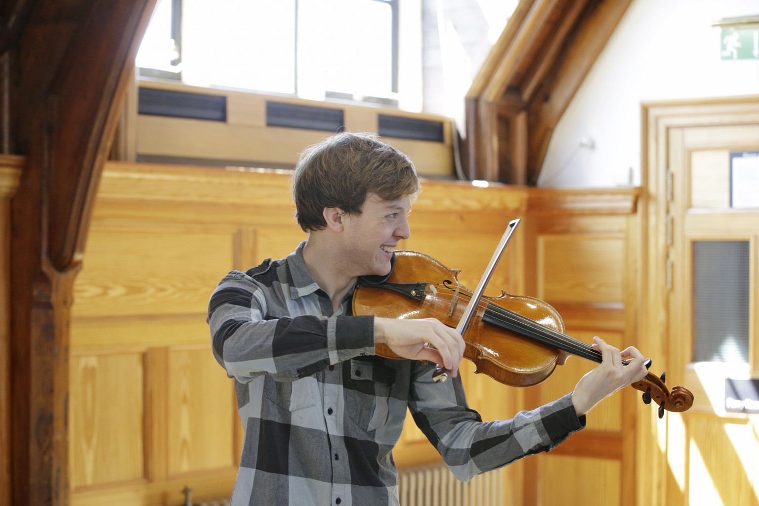
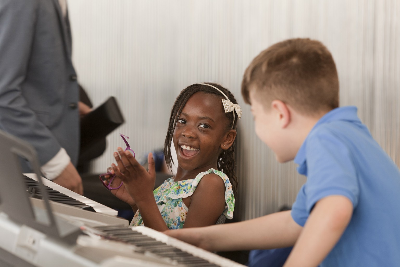
One of the big challenges that we’d identified early on was the quality of photography that ABRSM had been using. They had relied on stock-libraries for many years and had long since exhausted the supply of ‘young music makers’. They tended to opt for the best image available at the time, rather than seeking the perfect images for each piece of communication.
We worked with them to commission photographers Patrick Harrison and Olivia Hemingway, and gave them a brief to focus on human interaction: people, engaged in their music; engaged with each other whilst making music; or engaged with the viewer in a musical setting. They did a great job and provided ABRSM with an initial library of images that they will continually build on.
We also got our paint-brushes out to show how simple strokes of colour could enhance even the simplest piece of communication.

With all the elements in place we produced a series of examples of how everything could be brought together to create different types of communication for varied audiences.
And how the marque could be used in a variety of ways, to add personality and dynamism whilst retaining a consistent visual framework.
 Exploration for the use of colour and texture in materials
And we distilled all of our thinking down into simple instructions that could be sent to their international offices, ensuring a consistent application of the flexible visual identity.
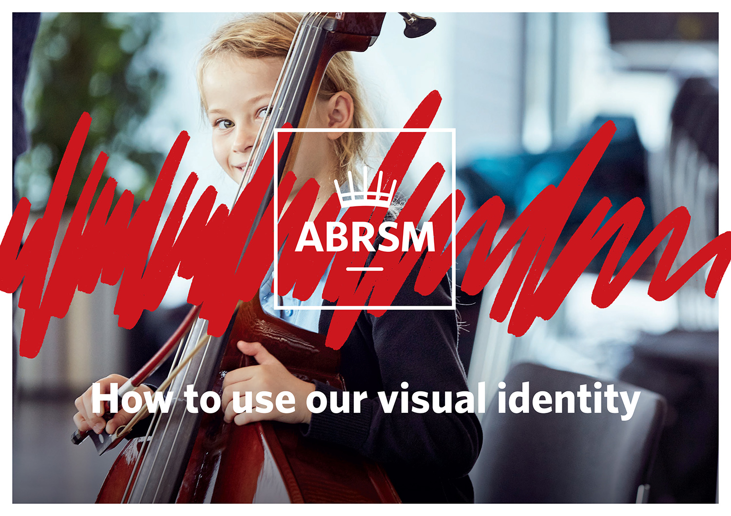
 Visual Identity Guide
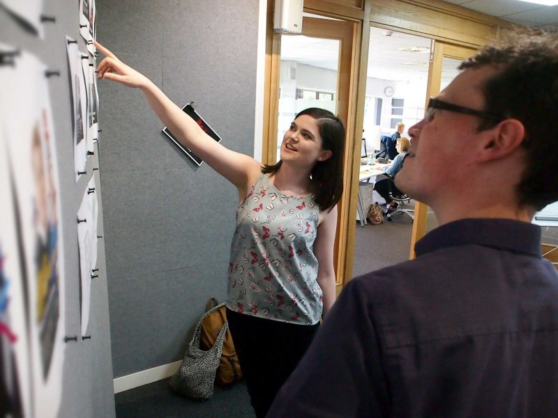
ABRSM are here for their weekly catch up with Anna and Michael. Here's Triona pointing out some detail to Ed....
London Chamber Orchestra
Saffron Hall
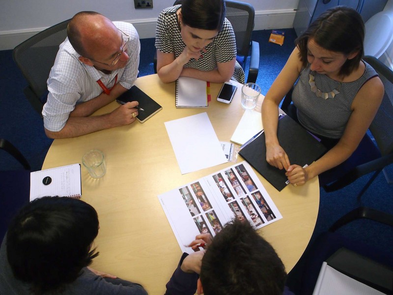
Michael and Anna are at our regular catch up meeting with ABRSM. New work to be revealed in mid July.
Royal College of Music
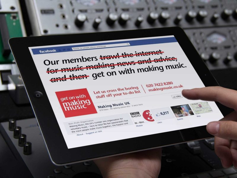
Get on with Making Music
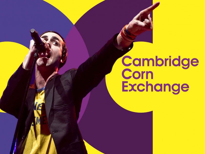
Cambridge Corn Exchange
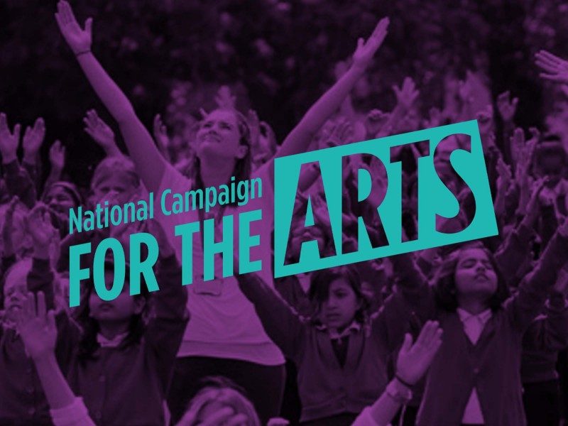
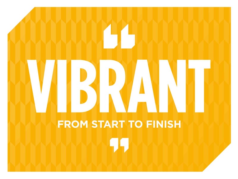
National Campaign for the Arts
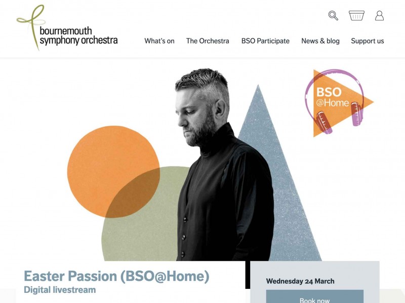
Bournemouth Symphony Orchestra
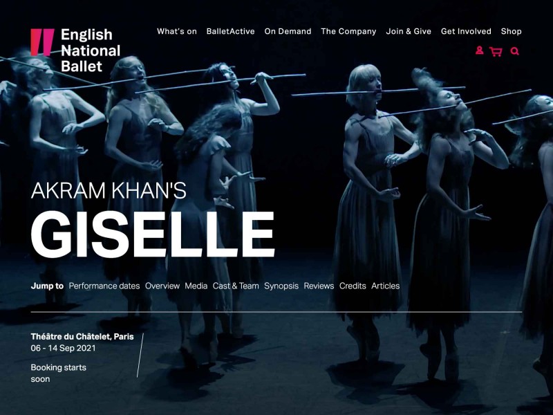
English National Ballet
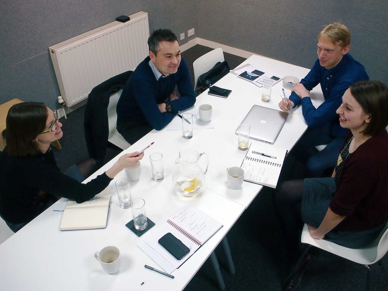
The latest in our series of 'clients acting like they're discussing design' features Gilly and Tony from ABRSM, 'meeting' with...
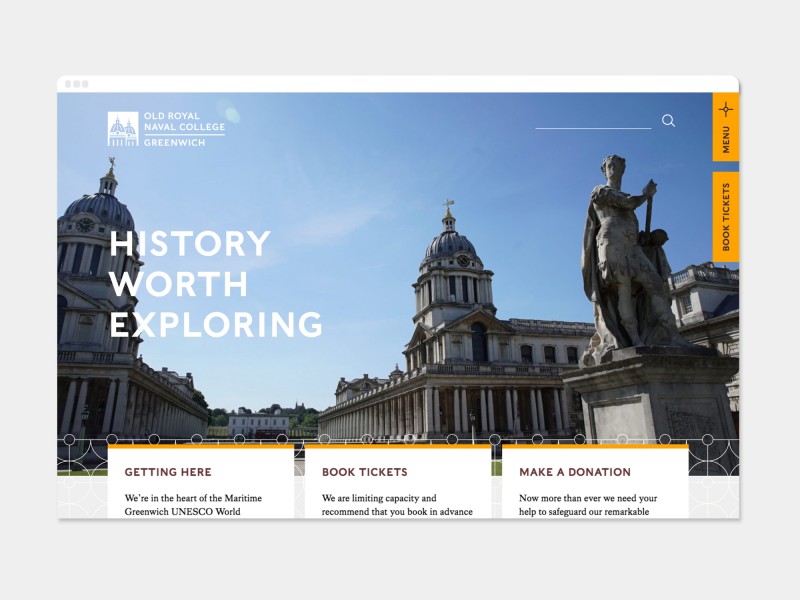
Old Royal Naval College
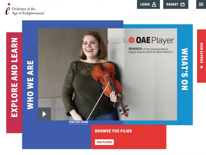
Orchestra of the Age of Enlightenment