Girls = Power
With And For Girls branding
Our studio is filled with light and music.
There are multiple meeting rooms, a well stocked kitchen, and an indoor garden (with fishpond). Talk to us about access needs, environmental factors and any accommodations we might make to enhance your visit. Pop-in for tea and stay to use a spare desk for as long as you need.
11 Greenwich Centre Business Park,
53 Norman Road, Greenwich
London SE10 9QF
We’re next to Greenwich train and DLR station. We have a door right on the concourse but it’s different to our postal address. Find us via: what3words.com/hungry.means.author
This video shows the route to take from the train that will arrive at Greenwich rail station from London Bridge. There's a gentle slope next to the staircase.
If you have to come by car, we have a couple of parking spaces. We have a charging point that you are welcome to use if you have an electric car. Call ahead and we'll make sure the spaces are free. Use our postcode (SE10 9QF) to guide you in.
We’d love to hear from you. Use whichever medium works best for you.
11 Greenwich Centre Business Park,
53 Norman Road, Greenwich
London SE10 9QF
It's exciting to chat about potential new projects. We don't have a ‘sales’ team or a form to fill in. Call us or give us a little detail via email and we'll get straight back to you.
[email protected]If you're a client then you'll be best served by calling us or contacting us via ClickUp, otherwise you can use this dedicated email that reaches all of the digital team.
[email protected]This email hits the inboxes of the people who deal with our bookkeeping and finances.
[email protected]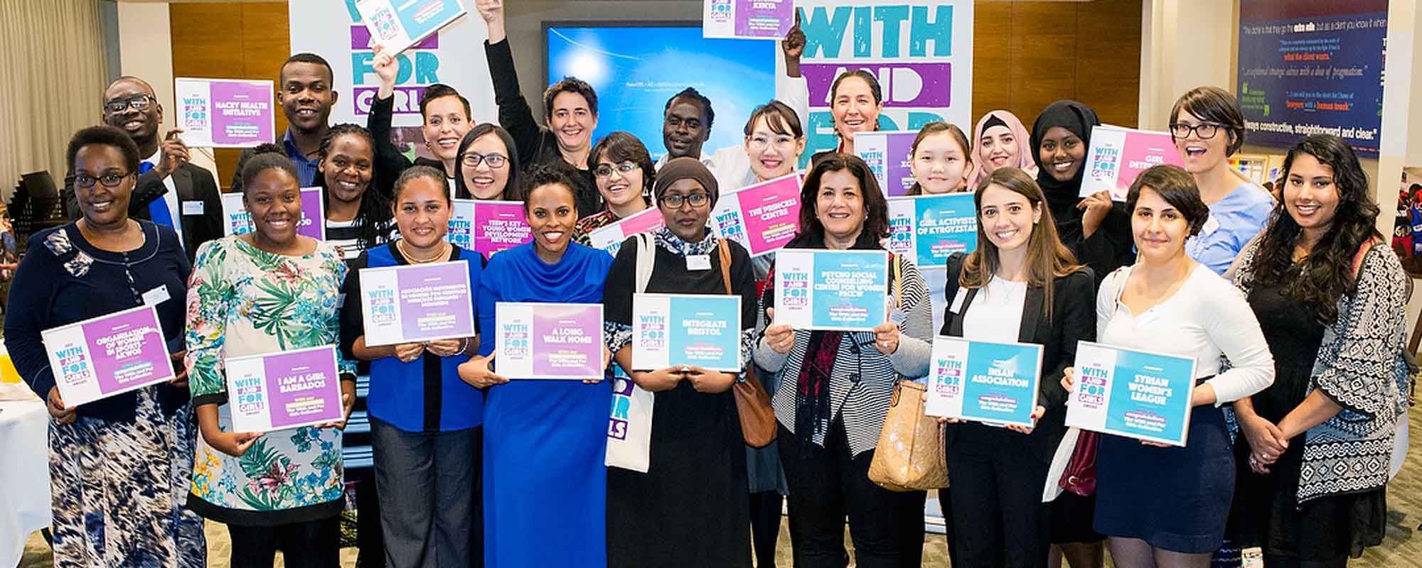
With And For Girls branding
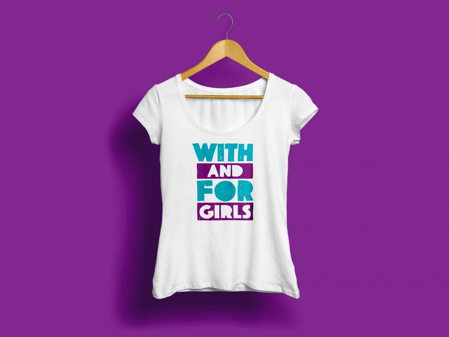
Working collaboratively with girls across the globe, we created the branding for this $1m awards scheme, With And For Girls.
The With And For Girls collective is a group of eight organisations – EMpower, Mama Cash, Nike Foundation, NoVo Foundation, Plan UK, Stars Foundation, The Global Fund for Children and The Malala Fund – with a track record of supporting civil society organisations working to improve the lives of girls and their communities.
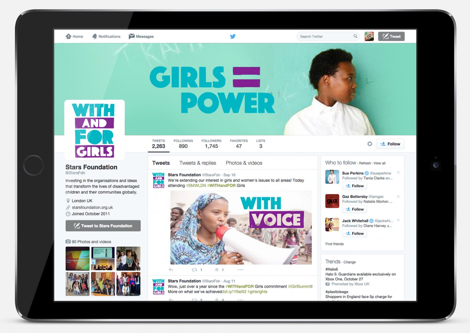
In their first year, With And For Girls announced the winners of awards which provided $1m to strong, grassroots, girl-led and girl-focused organisations across five global regions: Asia and the Pacific; Europe and Central Asia; The American Continent and the Caribbean; The Middle East and North Africa; and Sub-Saharan Africa.
Over a fascinating few months, we worked with them, especially with the lead organisation (Stars Foundation), and with the direct input of girls across the globe, to create an empowering brand for the organisation and a marque that the winners can proudly display and own.
A feature of the awards is an insistence on the participation and agency of girls throughout the process, including the judging of the awards themselves. We were lucky enough to be able to tap into that network of adolescent girls at every stage. It was a very different way of working and fascinating to be able to include their voices in the process.
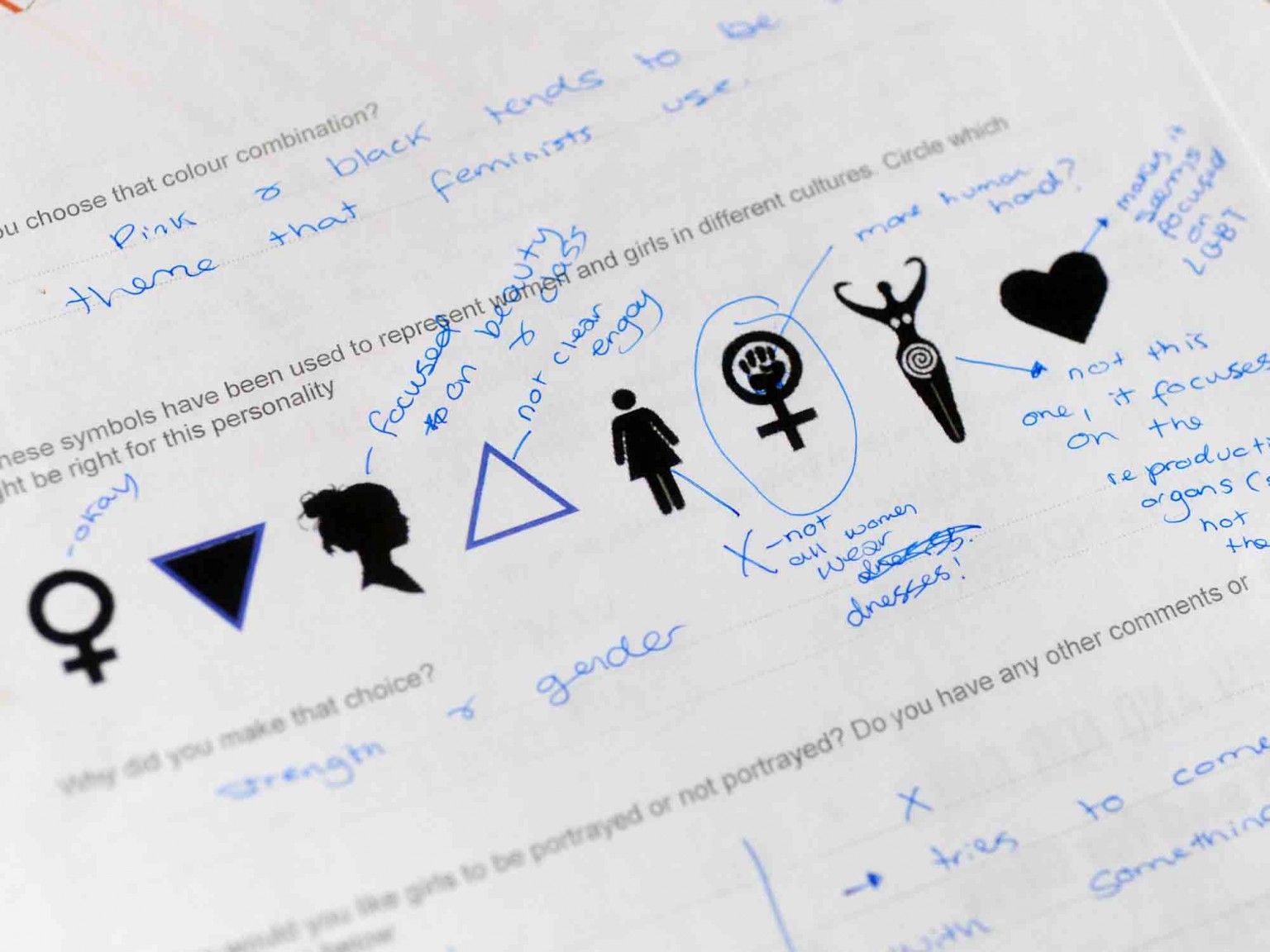
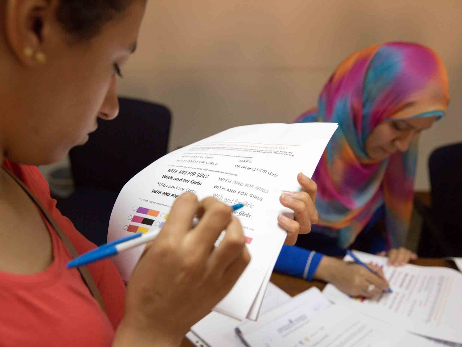
Our first step was to create a simple questionnaire to explore the cultural relevance of popular themes, keywords, ideas, colours and shapes. Panels of girls from Mexico, Egypt, Tanzania, the UK and India contributed their thoughts (either directly or through translators).
Through their (often forthright) responses, it was clear that we needed to express the power and activism of the brand whilst avoiding cliches or culturally specific symbols – interestingly, the girls did want an identifiable marque that they could use as a campaigning tool.
We created four visual approaches based on this feedback and presented those ideas to the eight funding partners. And from that feedback we narrowed the options down to two, for the twenty award-winning, girl-led organisations to review and vote on.

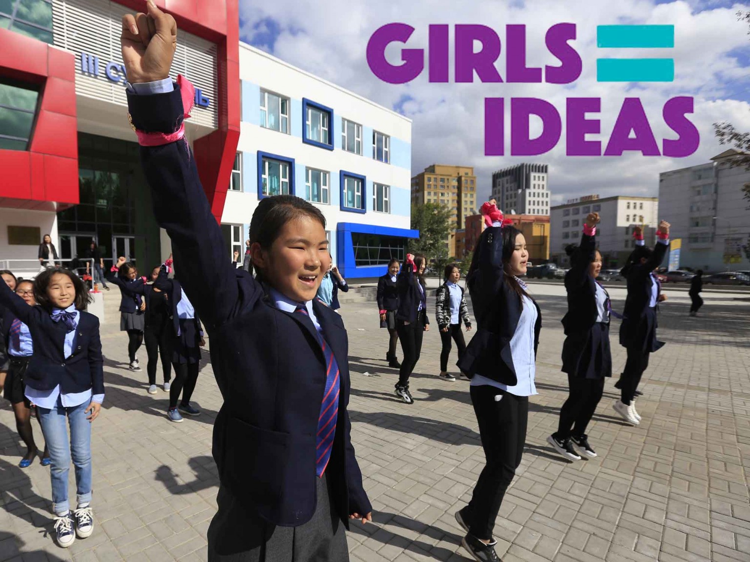
A clear ‘winner’ emerged, utilising the equals symbol (=) as the core idea. Using this mathematical language we were able to produce a mix of communications which is powerful and immediate (across all cultural and language barriers) whilst avoiding cliches and stereotypes.

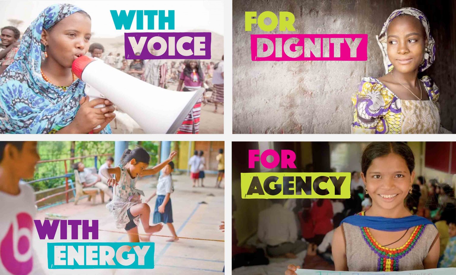
Taking that idea, we honed the language and refined the visual elements until we were able to provide a robust brand that we rolled out across a number of applications.
We usually work collaboratively, but this process took that to a new level. It’s been hugely liberating to leave decisions in the hands of those who will be directly affected by the success of the brand.
Congratulations to all the winners, and thank you for the opportunity of working with you through this fascinating journey.