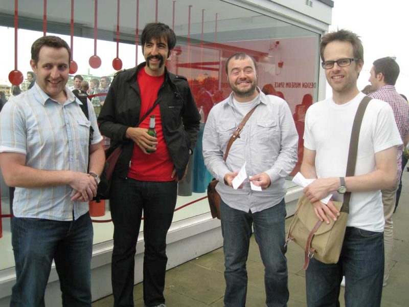
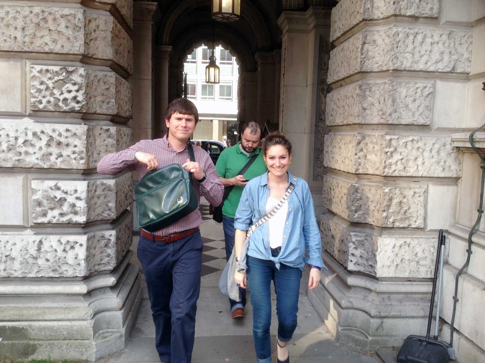
On the 21st of June the team set out on an outing to the infamous Royal Academy’s Summer Exhibition. For those unaware, the summer exhibition is classed as ‘the world’s largest open-submission exhibition’, featuring over 1,000 works in all styles and media, ranging from photography, sculpture, painting, printmaking, film and architecture.
RA Summer Exhibition
For it’s 245th year, the exhibition was co-ordinated by Norman Ackroyd RA and Eva Jiřičná RA. In an attempt to veer away from the exhibition’s general perception as a somewhat stuffy, exclusive event, the aforementioned co-ordinators made a concerted effort to add some contemporary ‘edge’ to this year’s event.
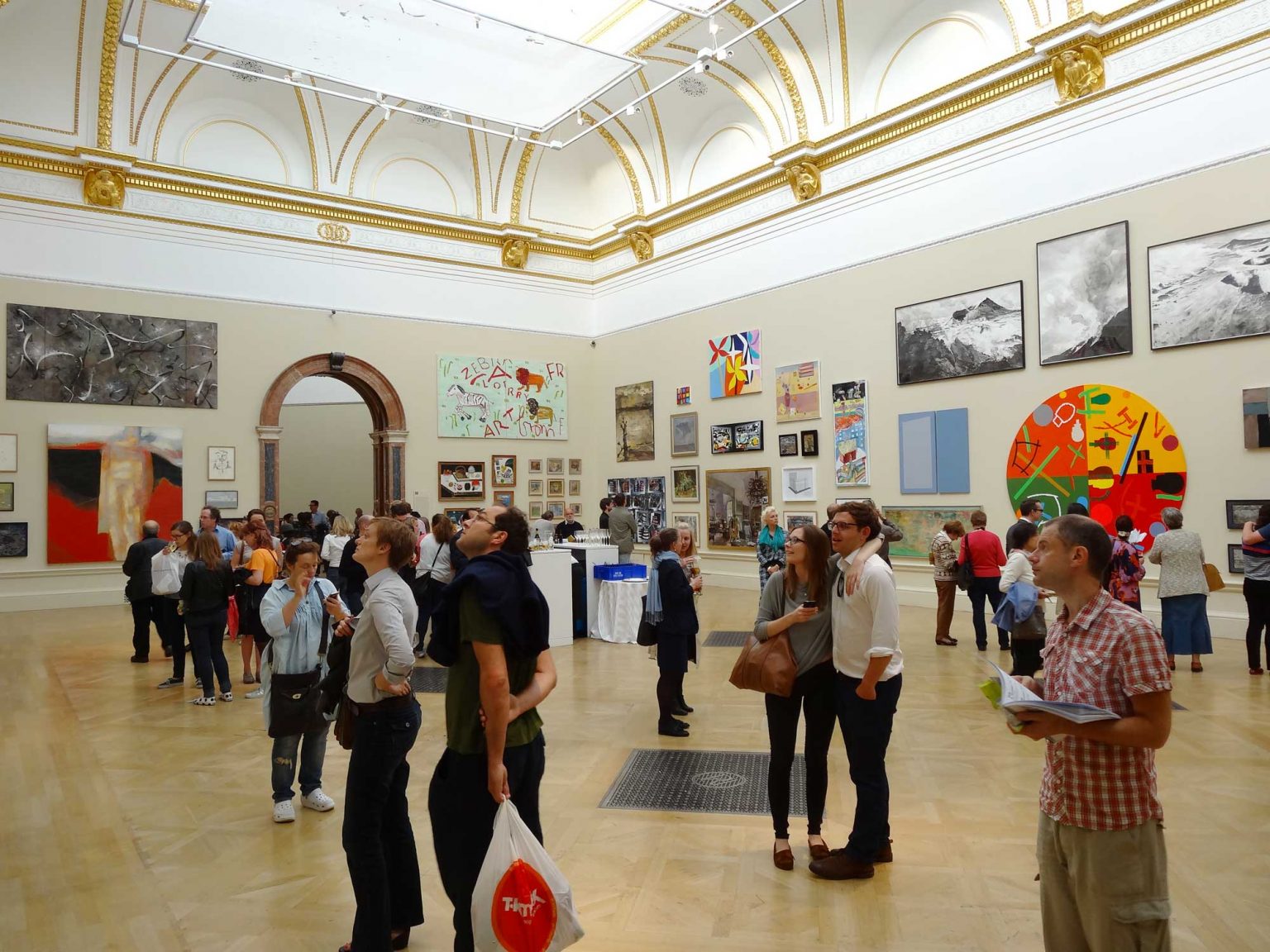
Upon entering the exhibit, we were immediately bombarded with with the art of the 1000+ featured artists literally splayed ‘wall to wall.’
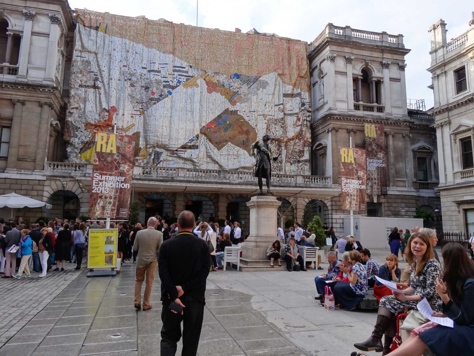
On our approach, we were immediately confronted with evidence of this new ‘edgy’ approach in the form of Ghanaian artist El Anatsui’s tapestry entitled, Tsiatsia (‘searching for connection’). Adorning the Burlington House façade, it is a towering, abstract piece measuring 15 metres by 23 metres and comprised of bottle tops, printed plates and roofing sheets amongst other found materials. It was arresting display to say the least.
Upon entering the exhibit, we were immediately bombarded with with the art of the 1000+ featured artists literally splayed ‘wall to wall.’ According to the programme, ‘all works are fastidiously selected by a panel of celebrated artists and architects.’ There was certainly a wealth of varied works but I can’t help but feel this is a fairly liberal use of the word ‘fastidious.’
As we strolled from room to room, the general consensus was that the experience was somewhat jarring, due largely to the juxtaposition of wildly varying skill levels from one piece to the next. Further contributing to that sense was the lack of coherence in curation, although one could be forgiving of this given the panel had to sift through over 10,000 submissions.
The final room contained a particular highlight for me, Grayson Perry’s ‘The Vanity of Small Differences.’ It is a series of 6 tapestries, all intricately depicting surreal panoramic narratives that each explore themes on class mobility. I suspect a big part of my attraction to this series was less its execution and more with offering of context and an overarching theme, if only a loose one. After the dizzying barrage of unconnected pieces in the main exhibit, I was desperately in need of some coherence!
Some particular standouts amongst the team were Ron Arad’s lifesized 3D model of a Fiat 500, Emma Stibbon’s large-scale monochrome drawings of stark, expanding Icelandic landscapes, Marilene Oliver’s Dream Catcher displaying a (painstakingly accurate) hollow human body made of a series of laser cut acrylic circles, hovering above a sort of cloud of ostrich feathers.
All in all, despite the varied skill levels and disparate themes and styles, there were certainly quite a number of masterful pieces which make the exhibition well worth a visit. If you’d like to see some additional images, have a look through our flickr set here.


