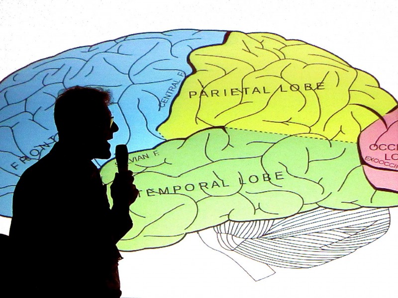
For his Typographic Circle talk, the outspoken typeface designer, Bruno Maag raced through a history of screen-based type design. Michael was there to listen and learn.
Bruno Maag at Typo Circle
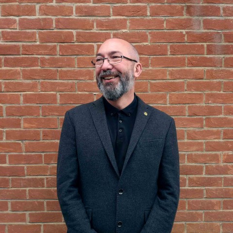
Bruno Maag is a typographic character: clever, quirky and Swiss. He’s also refreshingly outspoken and seldom afraid to have an opinion, even if that means upsetting the design establishment – I’ve never met him but I like him a lot.
Maag founded his typeface design company, Dalton Maag, in London in 1991, the same year that Cog started. I can remember Maag having a reputation for being single-minded and passionate. But, at a time when we were shelving our Letraset catalogues, and ‘affordable’ Apple Macs were delivering dozens of fonts to desktops, why would we ever want to pay for a custom-designed typeface?
He was genuinely incensed that taxes might be wasted on this ‘hateful woman’
Dalton Maag were always a presence, frequently popping up a lot in the design press, Bruno Maag seemed tireless in his speaking commitments and international commissions.
We crossed paths a couple of times. My favourite was in 2006 when he came to Deptford for a Pecha Kucha event. Several speakers did their thing, improvising through slides. Then Maag came on. He was agitated. He told us he didn’t want to talk about type or flick through his slides. He had something more important to talk to us about. He’d heard that the government were planning a state funeral for Thatcher (there were rumours of her failing health although she lived on until 2013). He was genuinely incensed that taxes might be wasted on this ‘hateful woman’. He implored us to protest and he came pretty close to marching us on Parliament, there and then. Perhaps it’s an indication of the power of his address that I don’t remember anyone else on the bill that night, or maybe it’s just that I so whole-heartedly agreed with him.
As on-screen typography came of age, Dalton Maag found their audience. They have become one of the world’s most influential typeface design companies. They specialise in custom fonts for companies and organisations, including notable commissions for Nokia, BMW, Vodafone, Ubuntu and Toyota.
For tonight’s event, Maag had chosen to talk about the brain and how our perceptions are so important to his work as a screen-based typographer. It was a broad topic covered in exceptionally specific detail.
There was so much packed in that I can’t hope to do it justice by detailing it all here. I’ve tried to cover some of the highlights, or at least the bits I can remember (I’m writing this several weeks later).
He began by talking about global demographics. To a room of mostly young designers he explained how the ageing population in Western Europe means that you can’t afford to use 4pt type or light grey on white text (by 50 years old we will all have lost most of our sight). But if you are designing for India, with its inversely youthful population, you can be more experimental.
He worked through the full history and ongoing journey of screen-based type, from bitmap displays through to pixel-in-pixel hi-def screens, with fully visualised examples of each. He showed how, in the early days of screen-based type, he’d battled with the vagaries of Apple’s ‘hinting’ and how, due to the vertically striped RGB diodes, iPad screens need different allowances between portrait and landscape orientation.
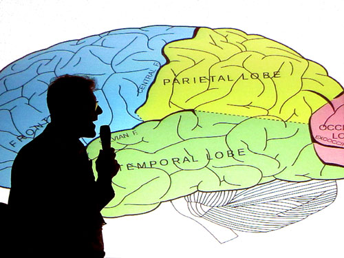
There was even a comic interlude where he called in a special guest neuroscientist to explain the path of recognition within the brain, and the difference between the occipital, frontal and temporal lobes.
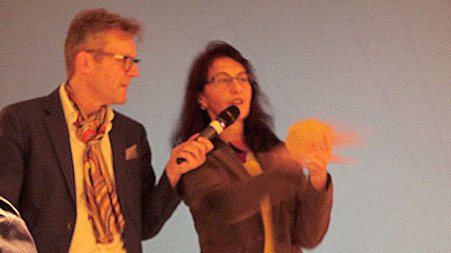
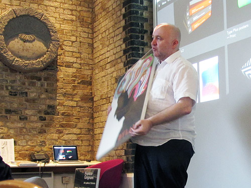
Bruno Maag with neuroscientist, Dr Alessia Nicotra.
I wish this surprisingly insightful talk were available on YouTube… it was like a six-month typography syllabus, squeezed into half hour talk.
Having set the scene and explained the landscape, Maag talked about the specific challenge he’d just been working on, a new typeface for Amazon’s Kindle, called Bookerly. He guided us through the technology (the Kindle is somewhat akin to an etch-a-sketch with type being temporarily ‘printed’ and erased) and the many other parameters he worked within. He explained about user-testing and about optical recognition, and about extended character sets, and about ranged-left rather than justified type. It was fascinating to be in the presence of someone who truly understood their subject and spoke about it so passionately.
Seemingly mindful of his reputation as the ‘angry man of type’, he also squeezed in three topics/opinions that he could be impassioned and shouty about:
- Three font styles is plenty for any typeface – Roman, Italic and Bold (but Maag will include a Bold Italic to keep the client happy).
- Kerning is not the same as spacing – kerning is the individual spacing between specific pairs of letters, done after the type is properly spaced.
- Don’t deliver a brand to a client if you can’t afford to license the fonts. Call your friendly type foundry and make sure you are properly licensed for the use you need.
And, although his talk was all about his craft and his love of type, he was clear that he wasn’t doing his job solely out of a desire for aesthetics. If he can design a typeface that allows Kindle readers to read faster then Amazon can sell more books. If they can sell one more book to every customer across the planet, ‘then that’s a fucking lot of books’ and a lot of extra profit.
I’ve been to many talks by designers. They can be a mixed bag. Most successful designers seem to have such self belief that they barely prepare, and trot out anecdotes and portfolio pieces to fill the time (or usually wildly overrun the time because they have failed to prepare). Maag was organised, fascinating, quickly spoken but cleverly paced. Admittedly, it does seem that this was a version of a session he hosted in New York in June but, for a tenner, this talk was a lot cheaper than a ticket to that Typographics conference.
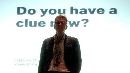
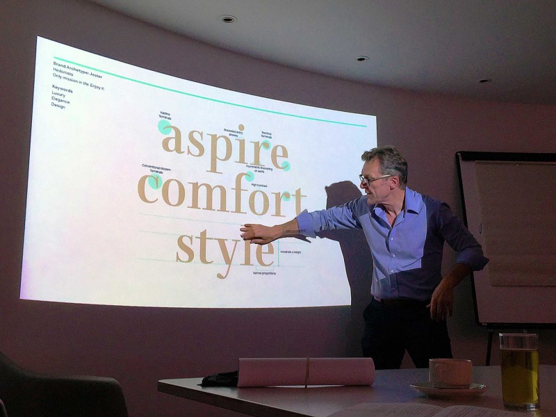
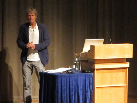
Bruno Maag.
I wish this surprisingly insightful talk were available on YouTube so I could share it with our design team (and every other young designer who ever puts type on a screen); it was like a six-month typography syllabus, squeezed into a half hour talk.
