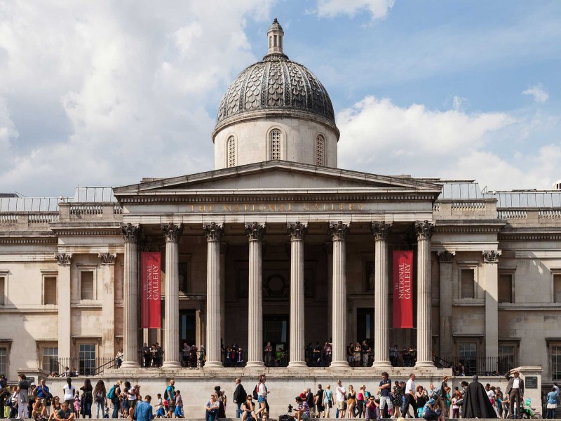
September’s Cog Night saw Lily visiting the recently reopened National Portrait Gallery. Here are her thoughts:
The National Portrait Gallery
In a Cog Night first, I ended up being the only team member at this month’s cultural outing. I took this as a valuable lesson in studio management and not selecting the outing on a Friday night at the end of a busy month.
I’d put off visiting the NPG since its reopening in late June for long enough, so I dusted off my almost-forgotten art history degree and set out for The National Portrait Gallery on my own.
Upon reaching the gallery, I was greeted by Tracy Emin’s bronze relief doors. I stood taking in the 45 female-faced panels that make up ‘The Doors’ and found myself drawing my own parallels to the grand panelled doors of medieval cathedrals.
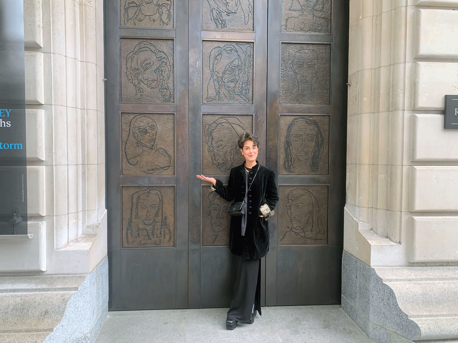 Tracy Emin's 'The Doors.'
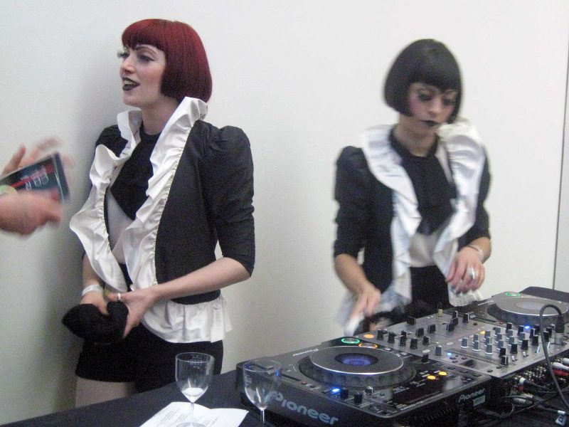
Inside, I was greeted by an enthusiastic gallery assistant dressed in an NPG branded work jacket.
Launched in January, as part of the gallery’s new branding, the NPG monogram is a reimagining of an 1893 sketch found in the workbook of the gallery’s first director, Sir George Scharf. The new monogram, colour scheme and typeface (NPG Serif) are easy to spot throughout the gallery and gift-shop. You won’t catch me buying a 75p branded envelope, let alone a £180 bottle of perfume (though it did smell gorgeous).
The gallery assistant helpfully directed me towards the escalator, suggesting I begin at the top floor, with the Tudors. It was a relief to see that some things remain the same.
I was also made aware of the location of the lift, now directly accessible from the new main entrance. It was a relief to see that some things have changed.
I’m keen to praise the NPG for providing much better access, although this adjustment was well overdue.
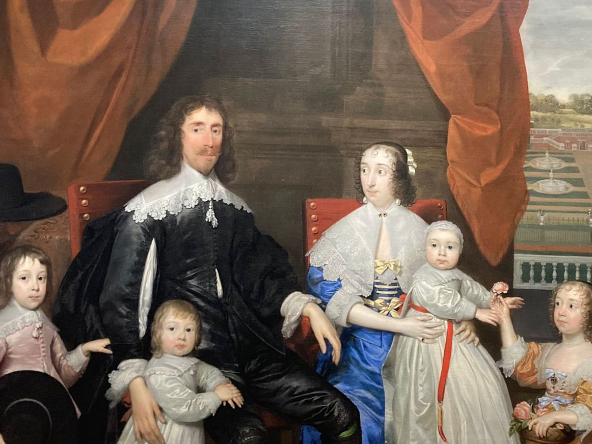 Cornelius Johnson's oil on canvas portrait of The Capel Family.
At the top of the escalators I was met by the piercing eyes of the Capel family. This reminded me that I’ve often found the top floor a bit dull in the past. But I like dark spaces and I was eager to see what changes had been made. I was not disappointed.
The monotony of the ‘classics’ was broken up with insights into the craftsmanship of their production. This was a reminder that behind the owl-like portraits of Elizabeth I was a real human, sitting. Sketches and unfinished works hung alongside complete pieces, breaking up the portraits full of draped velvet dripping with emeralds, pearls and unrelatable ostentation.
The use of technology in the rest of the gallery had a similar positive effect. Video displays were informative, engaging and tastefully executed. As with many other aspects of the new gallery, contemporary innovation has been used to make the past feel less distant and abstracted.
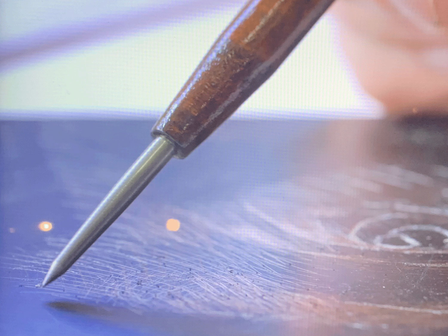 Still from a video demonstrating the process of etching and aquatint.
One of the most impressive aspects of the reopening was the thoughtful curation. A renewed emphasis on diversity is clear in the representation of historically marginalised groups. The NPG has achieved this in a way that doesn’t wash over past crimes but that weaves organically through old favourites.
Notably, their recent (shared) acquisition of Joshua Reynold’s Mai stands out.
The notion of the ‘noble savage’ depicted in this portrait is not without issue (to say the least) but the importance of representing non-white figures in roles which extend past slave or servant is one that has not been overlooked in this collection. There were examples of this throughout the gallery, including the striking portrait of the indigenous American Mohawk warrior Thayendanagea (who called himself Joseph Brant from his youth), a valuable ally of the British during the American war of independence.
This is a sensitively curated revision of Britain’s historical narrative. It is worlds apart from the often jarring (and poorly judged) attempts at representation in countless other museums and galleries with segregated rooms dedicated to half-baked notions of identity. I was pleasantly surprised.
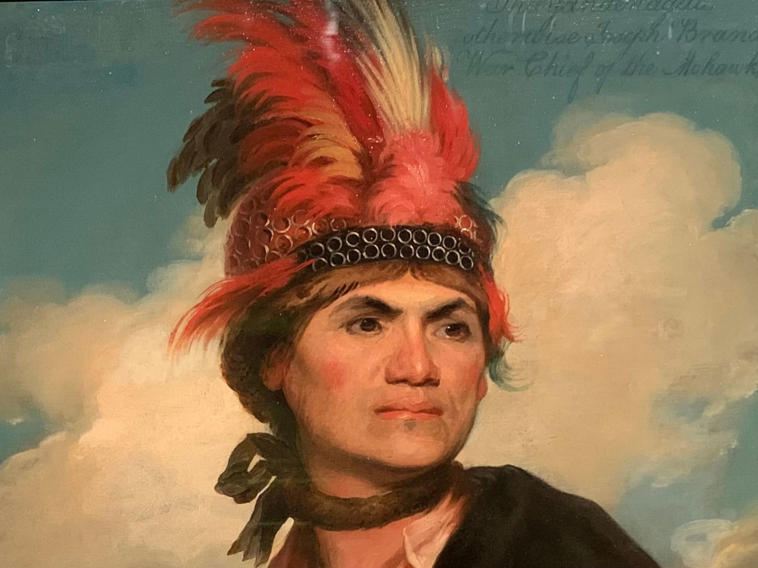 Close up from oil on canvas portrait of Thayendanegea (Joseph Brant).
Of course, the NPG has its shortfalls. After time my attention inevitably wavered, and I found myself captivated by a miss-matched patch of paint on the wall. This is less a criticism of the wall painter, picture hanger or handy-person and more an acknowledgment that such a massive collection is a lot, and it’s all just people, really.
The last works to make an impression, just before my departure, were portraits of current British royals. I found them unsettling and lacking in aesthetic value, their presence incongruous with the carefully curated selection that came before them. A portrait of Catherine, Princess of Wales in a red dress posed as if she’s modelling in a Next catalogue raised my eyebrows. It seems a pity to have such vapid portraits hung amongst actual examples of modern exemplary British figures: Marcus Rashford, Jeannette Winterson, Riz Ahmed, and Sir Steve McQueen, to name just a few. I understand that the modern royals are a part of British history, but I couldn’t help but frown.
Royals aside, I’ll likely pop by again soon. My evening at the NPG was both a comforting reunion with the past and an impressively well considered retelling of it. The same remarkable scale of the collection that failed to fully hold my attention also lends itself to multiple visits, as does the free entry. Perhaps next time I’ll convince others to join me.
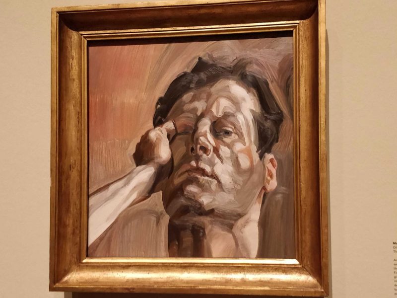
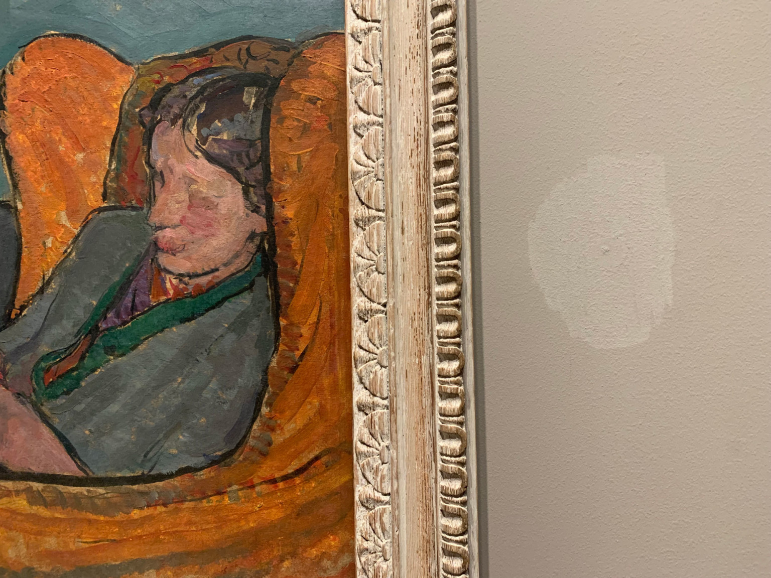 Vanessa Bell's Virginia Woolf, and patched up hole.
Bonus content!
Wracked with guilt at missing September’s Cog Night, Justin decided to visit the National Portrait Gallery a few days later to check out two temporary exhibitions:
Paul McCartney: Eyes of the Storm is the NPG’s autumn blockbuster, featuring photos taken by the man himself between 1963-4, a period encompassing the rise of Beatlemania and the Beatles’ first trip to America.
Photography is sometimes thought of as an art of selection: the photojournalist Robert Frank famously shot 28,000 images for his book The Americans, but included only 83. McCartney, who curated the this exhibition himself, doesn’t feel the same way. Hundreds of images are on display here, and almost every snap from this recently rediscovered trove is included.
None of these pictures were ever intended to be published, and few images among the set stand out as brilliant shots in their own right, but superfans eager to get their hand on any scrap of new Beatles content will probably appreciate the completeness of this approach.
It’s interesting to see shots of McCartney’s bandmates and other interesting characters in the Beatles’ milieu, like manager Brian Epstein, and fellow Liverpool singer Cilla Black. But many other images are fun to look at because they are so ordinary and simple.
My favourite was a candid photo from the Beatles’ arrival in the States: it’s a lovely shot of a grinning Pennsylvania railway employee waving back at the camera from the other side of train tracks – maybe he knew who was taking his photo, but he probably didn’t.
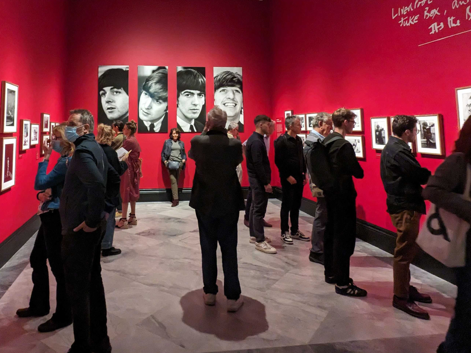 The Fab Four are still a huge draw for exhibition-goers, and the show was packed when Justin visited.
Yevonde: Life and Colour explores the career of the London portrait photographer Yevonde, whose archive was acquired by the NPG in 2021.
Staged chronologically, this exhibition starts with the story of Yevonde’s first studio, set up in 1914, which soon became a must-visit destination for London society figures keen to have their portraits taken.
But the exhibition really comes to life when we’re introduced to Yevonde’s pioneering work in colour photography. She was one of the first serious practitioners of this new form, and an expert in the cutting edge Vivex process. This colour work forms the main body of the show, which includes fabulous large format prints alongside some great interpretation focusing the technology behind early colour photography.
Yevonde’s approach to colour photography was dramatic, and her images from the 1930s remind me of the best work by British filmmakers Michael Powell and Emeric Pressburger, whose work the Technicolor process in the 1940s is full of rich, saturated hues.
A signature Yevonde image used in much of the exhibition’s marketing shows the red-haired model Joan Maude, with red lipstick and a red gown, posed in front of a vivid red background, to electrifying effect. Credit goes to the exhibition team for finding a perfect quote from the artist to sit alongside it: “if we are going to have colour photographs, for heaven’s sake let’s have a riot of colour”.
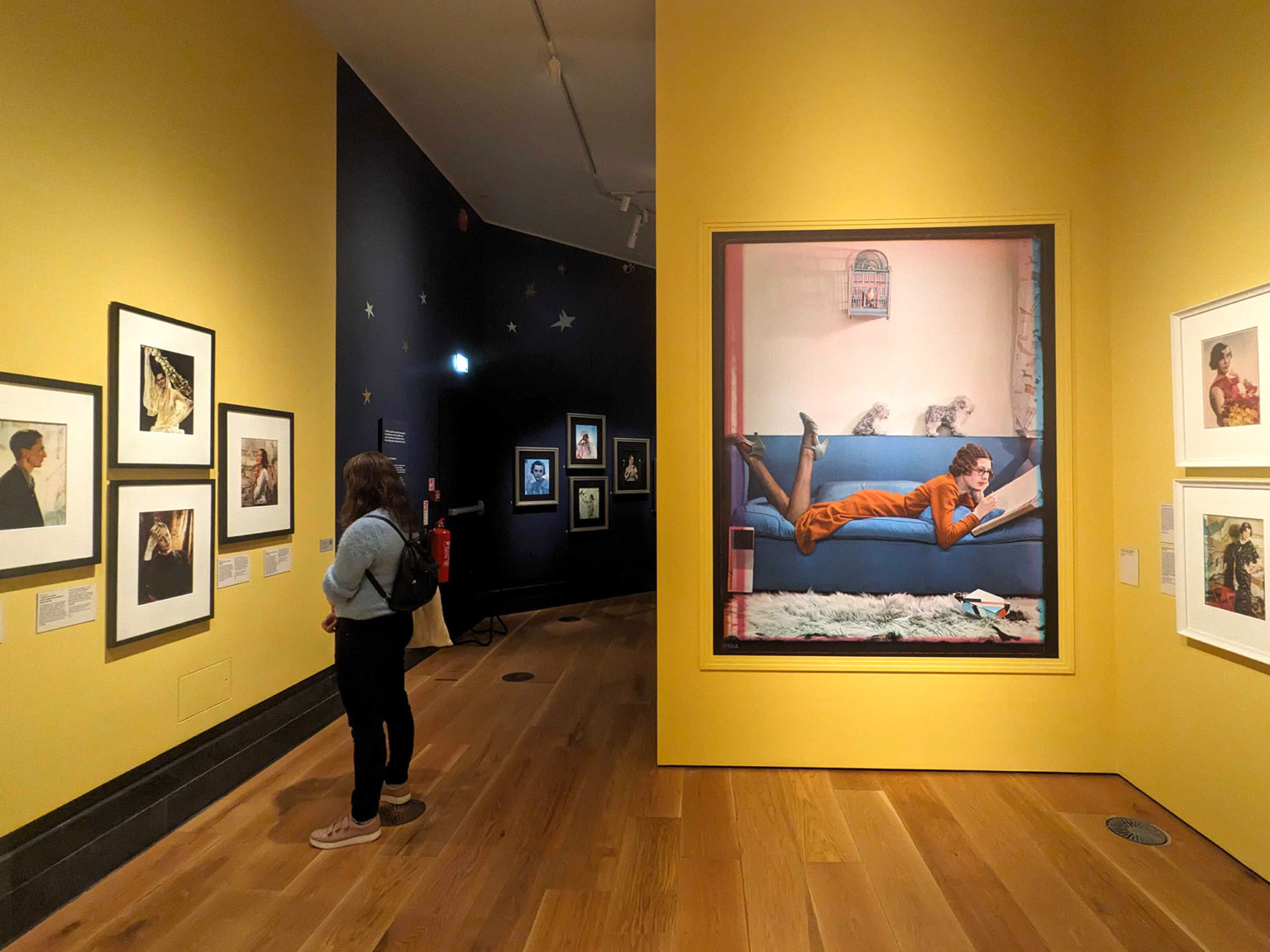 The second room of the Yevonde: Life and Colour exhibition.
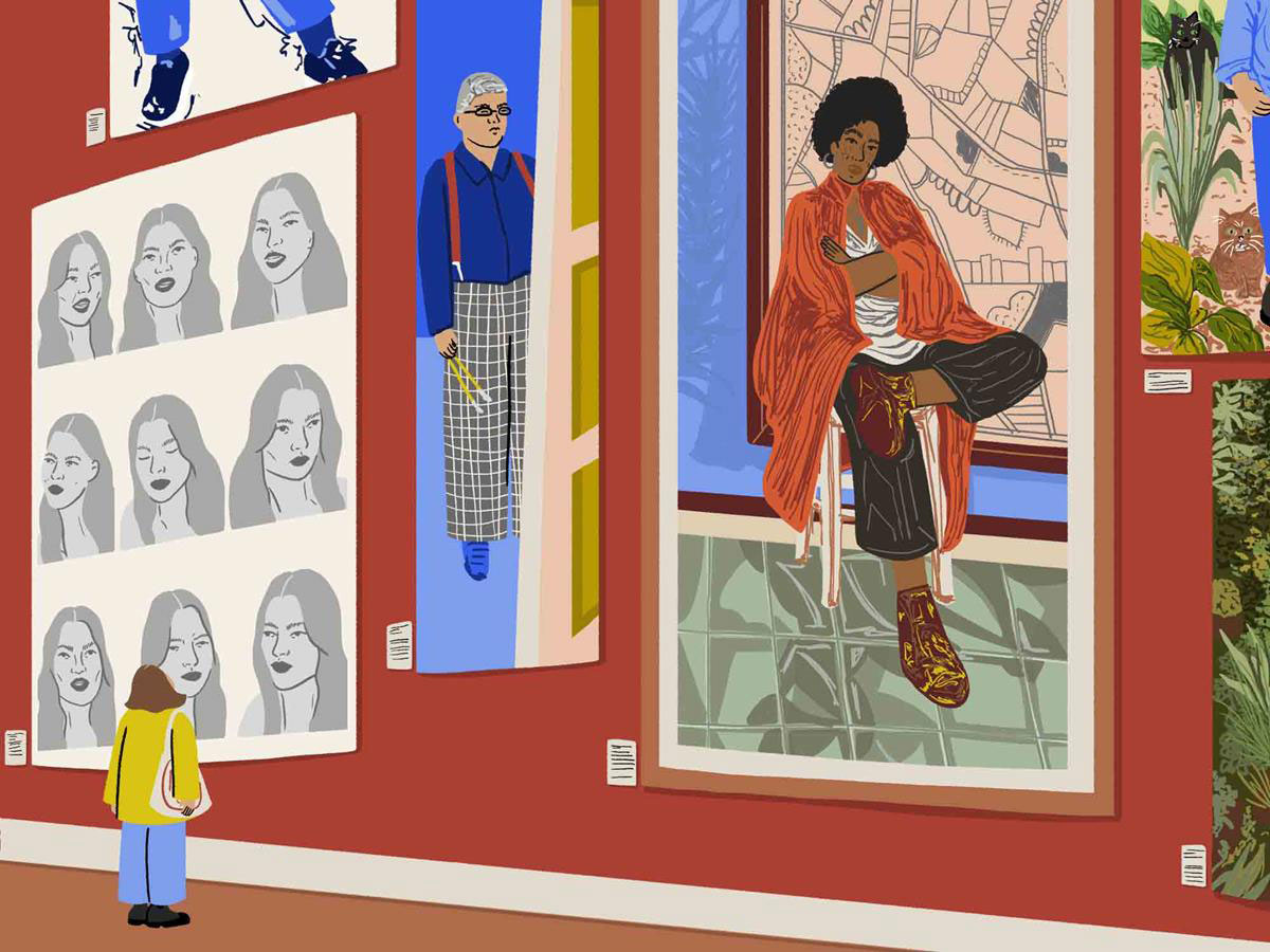
Illustration by Sophie Parsons for our Cultural Calendar.
