Rebranding an icon of UK rock history
Cambridge Corn Exchange branding
Our studio is filled with light and music.
There are multiple meeting rooms, a well stocked kitchen, and an indoor garden (with fishpond). Talk to us about access needs, environmental factors and any accommodations we might make to enhance your visit. Pop-in for tea and stay to use a spare desk for as long as you need.
11 Greenwich Centre Business Park,
53 Norman Road, Greenwich
London SE10 9QF
We’re next to Greenwich train and DLR station. We have a door right on the concourse but it’s different to our postal address. Find us via: what3words.com/hungry.means.author
This video shows the route to take from the train that will arrive at Greenwich rail station from London Bridge. There's a gentle slope next to the staircase.
If you have to come by car, we have a couple of parking spaces. We have a charging point that you are welcome to use if you have an electric car. Call ahead and we'll make sure the spaces are free. Use our postcode (SE10 9QF) to guide you in.
We’d love to hear from you. Use whichever medium works best for you.
11 Greenwich Centre Business Park,
53 Norman Road, Greenwich
London SE10 9QF
It's exciting to chat about potential new projects. We don't have a ‘sales’ team or a form to fill in. Call us or give us a little detail via email and we'll get straight back to you.
[email protected]If you're a client then you'll be best served by calling us or contacting us via ClickUp, otherwise you can use this dedicated email that reaches all of the digital team.
[email protected]This email hits the inboxes of the people who deal with our bookkeeping and finances.
[email protected]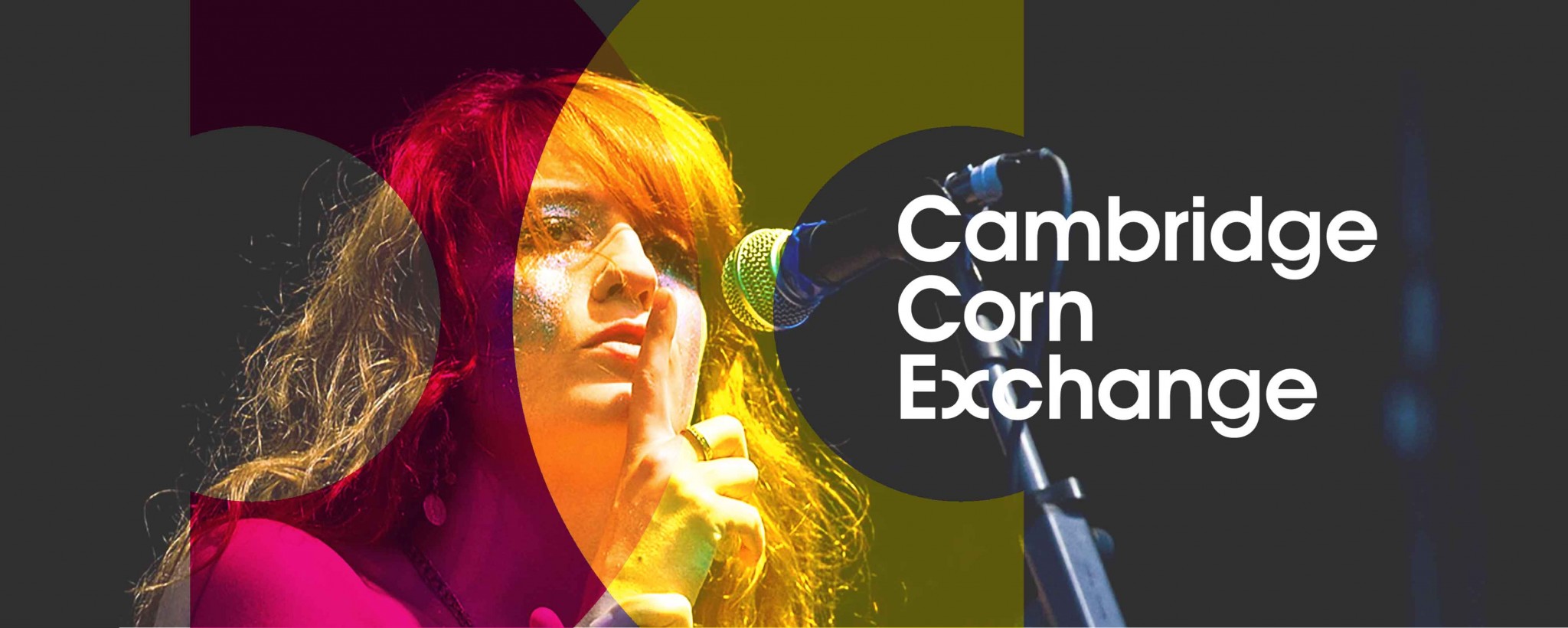
Cambridge Corn Exchange branding
We knew Cambridge Corn Exchange in an incredible live music venue. They’ve hosted Pink Floyd, The Who, David Bowie, Queen, Oasis and many other legendary acts. So we were excited when Cambridge City Council approached us about a rebrand.
In some ways, Cambridge Corn Exchange is a typical UK venue – a multi-arts, flexible performance space, funded and managed by the City Council.
In other ways it’s very special – an easy commute from central London with a history of hosting some of the biggest names in rock and pop.

We gathered a core team of representatives from across the organisations for a workshop, to learn more about the varied experiences of visiting the venue.
You’ve been great to work with: a superb creative vision mixed with a relaxed style which has worked really well for us. We are delighted with the results.
We created ‘personas’ of typical audience members, and we chatted about their experiences – how they’d heard of the venue, why they might come, how they’d book tickets, how excited they’d feel before, during and after, what they’d tell their friends about the venue etc.

Beyond the amazing history, it was the atmosphere of attending a show in this huge venue, tucked into the meandering streets of Cambridge that really hit home.

Their existing visual identity (featuring a woodblock-style engraving of corn-sewing) felt wrong for two reasons – it evoked the spirit of the short-lived original purpose of the (stunning) brick-built architecture, and it was a badge that was ‘plonked-on’ posters and leaflets.
We needed a modern visual system that could adapt to any event type but would always be recognisably a Cambridge Corn Exchange event.
We returned to the studio and started sketching. Amongst many other routes, we hit on the idea of using the X (the distinct sound within the name) as a marker on a map, a meeting point of ideas, of overlapping performance genres, or of people meeting for a great night out.

The Corn Exchange team, visiting our Greenwich studio
We invited our clients down to our studio and chatted through our initial thinking and visual approaches. They were particularly excited to see how we could bring the X idea to life, as a visual system.

A small section of our studio wall
Through discussions with our clients, we settled on what is the simplest solution of all – the two Cs of Cambridge and Corn, overlapping to form the X of the Exchange.

The simple type treatment can stand on its own and the crossing-Cs device can be scaled up or down and used in all sorts of creative ways whilst always being recognisable and distinct.
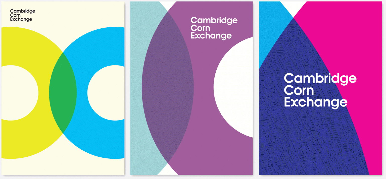
We crafted every detail, from the distance between the letters to a grid that formed the basis of all poster and leaflet layouts.

We provided numerous examples of how the design could be used. It helps that the brilliant music photographer, Stuart Leech, let us use his images for the mock-ups.

We looked at how to crop images and use bold colour. We looked at two-colour examples, using each shape to shift the image to provide a sense of movement. And we looked at examples where we led with a simple image crop and a large artist’s name…
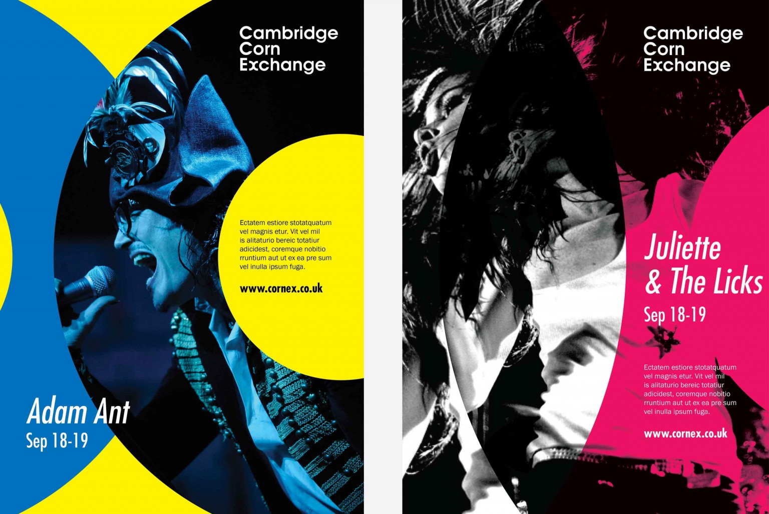
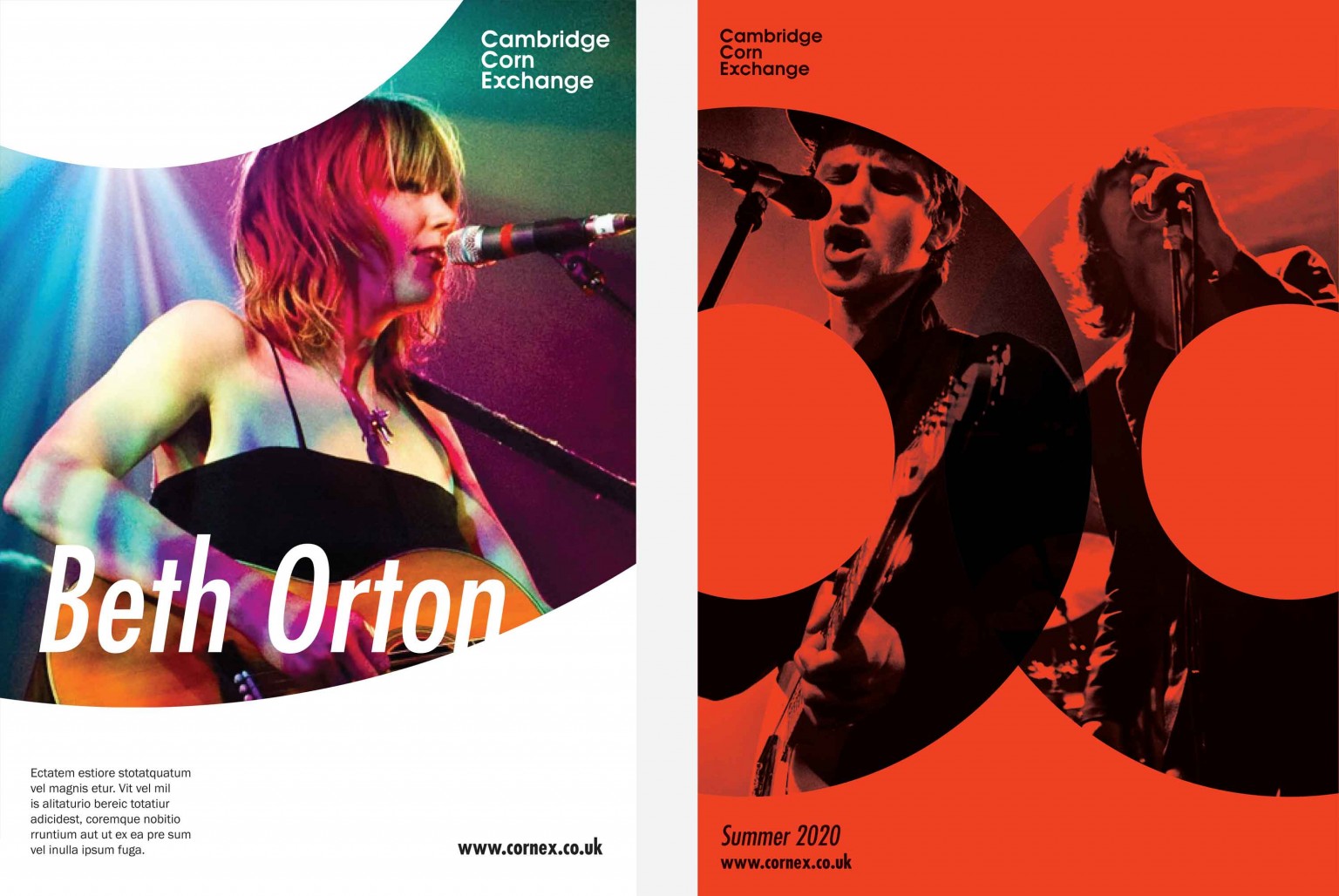
This is an exuberant, eclectic entertainment venue. The branding needed to reflect that; it needed to work on everything from a Wednesday afternoon kids show, to a Sunday evening with the London Philharmonic Orchestra, via a Saturday night with Professor Green. So we kept every aspect flexible, including the colour-palette.
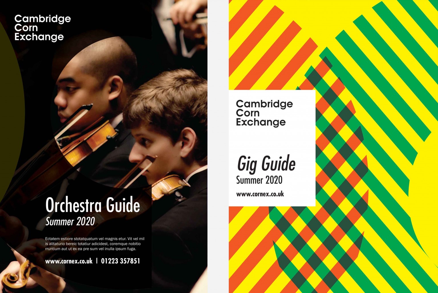
As well as the event-led designs, we were also keen to demonstrate how the branding could be pushed in unusual ways. We wanted to show that our clients needn’t be precious about the visual identity – it is robust enough to be played with and adapted in many ways, without losing its distinctive visual appeal.
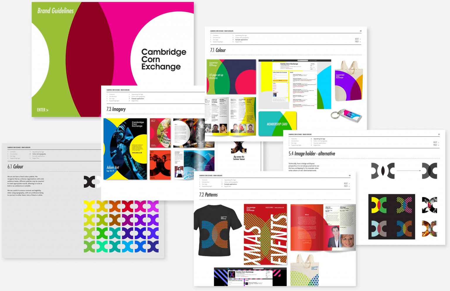
It was great working with the team at Cog, you made a complicated process seem effortless which we are very grateful for.
We delivered the branding in the form of a comprehensive set of guidelines, including text that capture the essence of the Cambridge Corn Exchange experience:
Snuggled into the centre of our city is one of the country’s best music and entertainment venues. Steeped in history, Cambridge Corn Exchange has a national reach and an international reputation. It is a special place, a place of unrivalled atmosphere, where unforgettable live events become our cherished memories.