On 4th May we shut the studio to compete in a 24hr design challenge, creating a website for a new political party.
24hr design challenge
Sometimes we like step out of our routines and push ourselves to work differently. We did just that on Wednesday 4th May 2016, during the week that we celebrated our 25th anniversary.
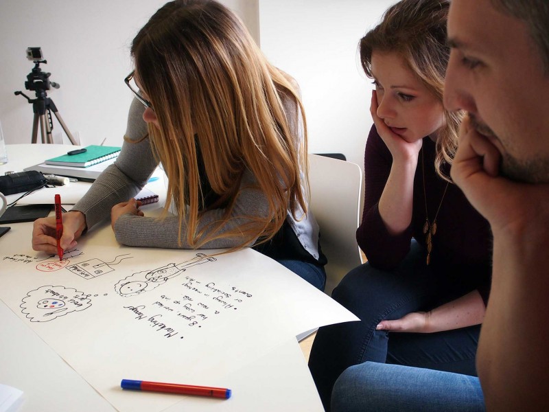
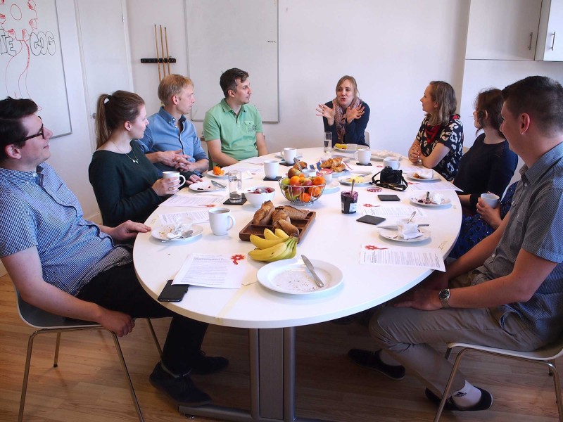
At 10am, over breakfast, I split us into two teams. Each team had a developer, a project manager and at least one designer. Sam, our head of digital, was assigned the task of moving between the teams to provide support and an informed eye.
I provided a brief to create a web presence for a new political party – a party aligned to our brand.
After filling up on fruit, croissants and coffee, the teams went their separate ways to form their plans… one team found a quiet corner of the studio, the other headed straight outside to the sunshine.
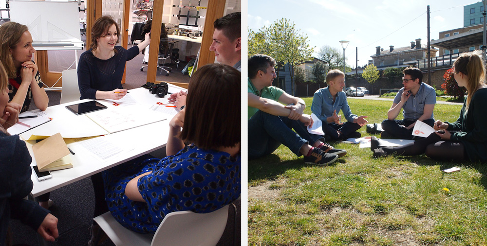
For the next few hours the studio was often very busy and messy with people making props, and occasionally completely empty as they went out to film videos or take photos.
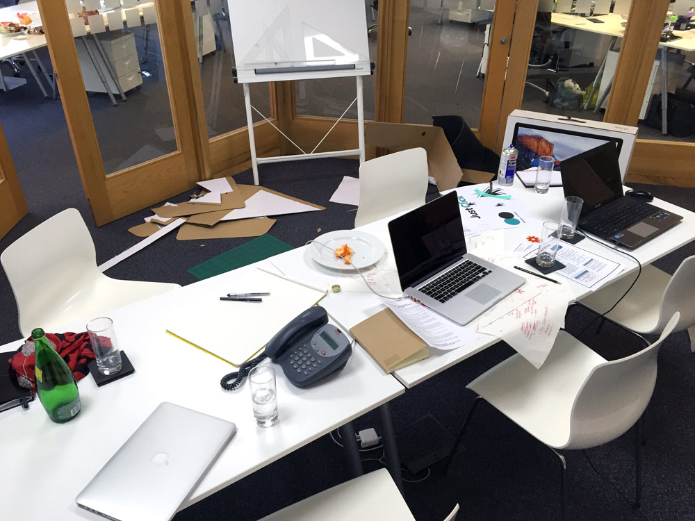
An abandoned corner of the studio, as team ‘Click for Culture’ are out making their video
The day was filled with a mix of fun making and intense writing (words and code)…
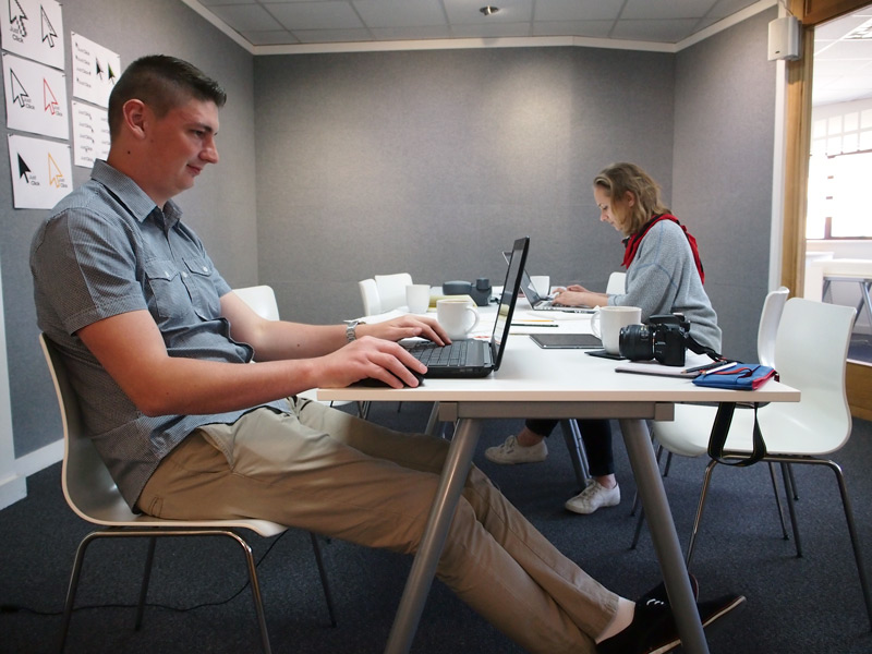
Zoltan coding and Melissa writing copy
And both teams worked very late into the night, fuelled by beer and pizza, to nail every detail…
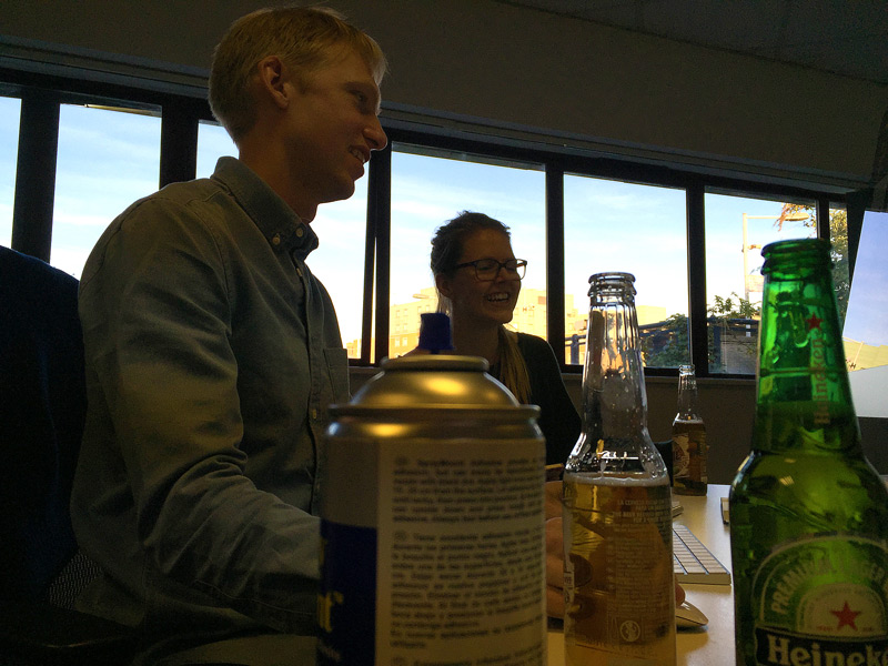
Matt and Sæunn, settling in to a long evening of beer and Spraymount
Thursday 5th was election day. We were at the polling stations as soon as they opened so we could rush back to the studio to make finishing touches in time for the 10am deadline.
Just as we’d started, 24hrs before, we were back for another team breakfast, ready to see the results of everyone’s hard work.
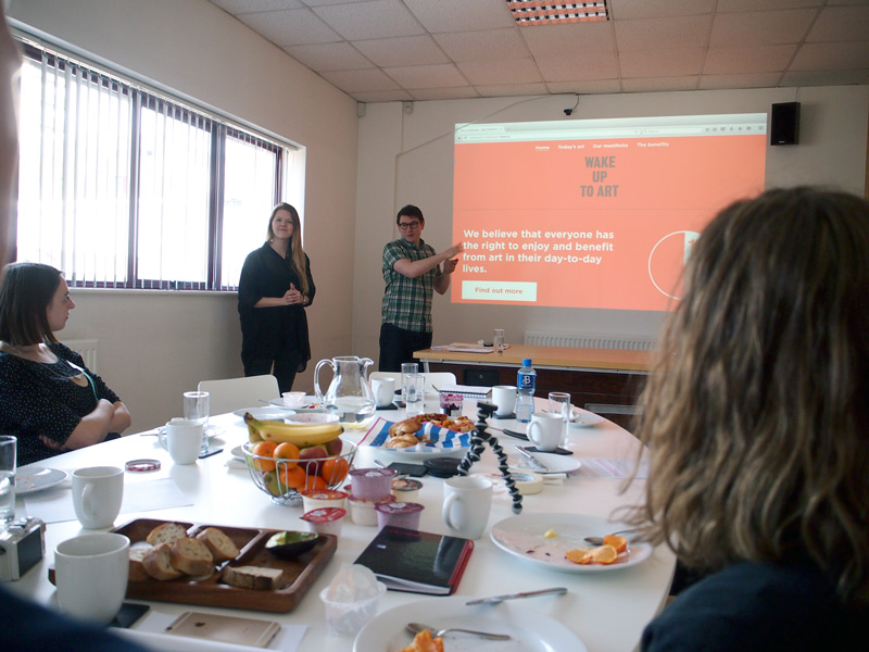
Team ‘Wake Up To Art’ making their pitch
First up were Sæunn, Ross, Razvan and Matt with a one-issue political party called “Wake up to Art”. Their concept was a world where every employee would be given the statutory right to time off, to appreciate art and feed their creative mind. And, whilst they were waiting to come to power, they were launching a taster website to explain the benefits of a quick dose of daily art.
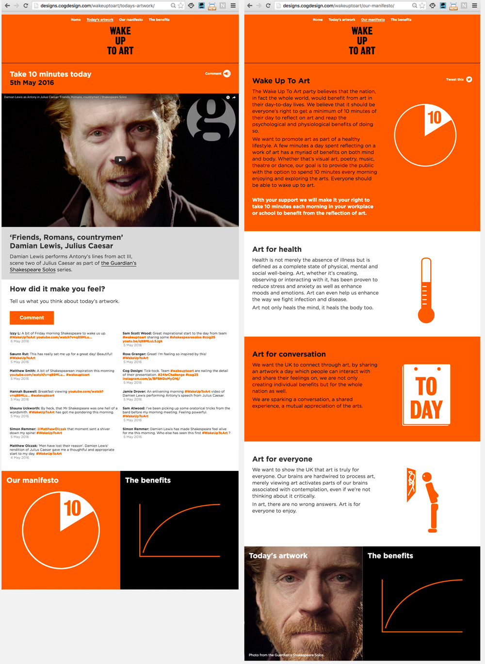
Astonishingly, they’d built a fully-functioning (and responsive for mobile) website, written all the copy, filmed interviews, created the illustrations, embedded video from the Guardian and even got their friends to tweet so they could pull in a feed from their hashtag. And they gave a great presentation; it must have been pretty intimidating for the other team.
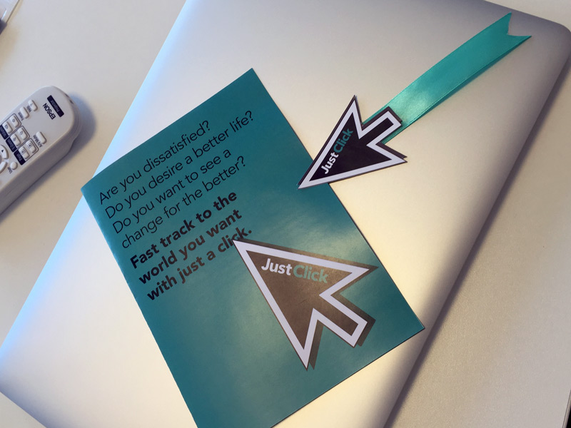
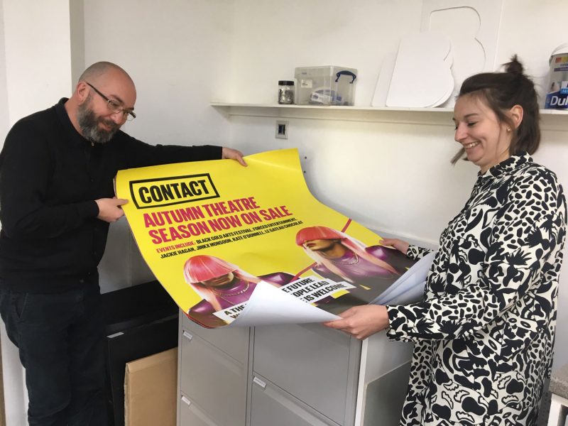
Presentation materials from team ‘Click for Culture’
Anna, Becca, Melissa and Zoltan’s team didn’t seem phased by the competition. They handed out leaflets, put up posters and even wore their own badges. Their script read ‘enter the room with energy’ which they definitely did. Their presentation even included dancing…
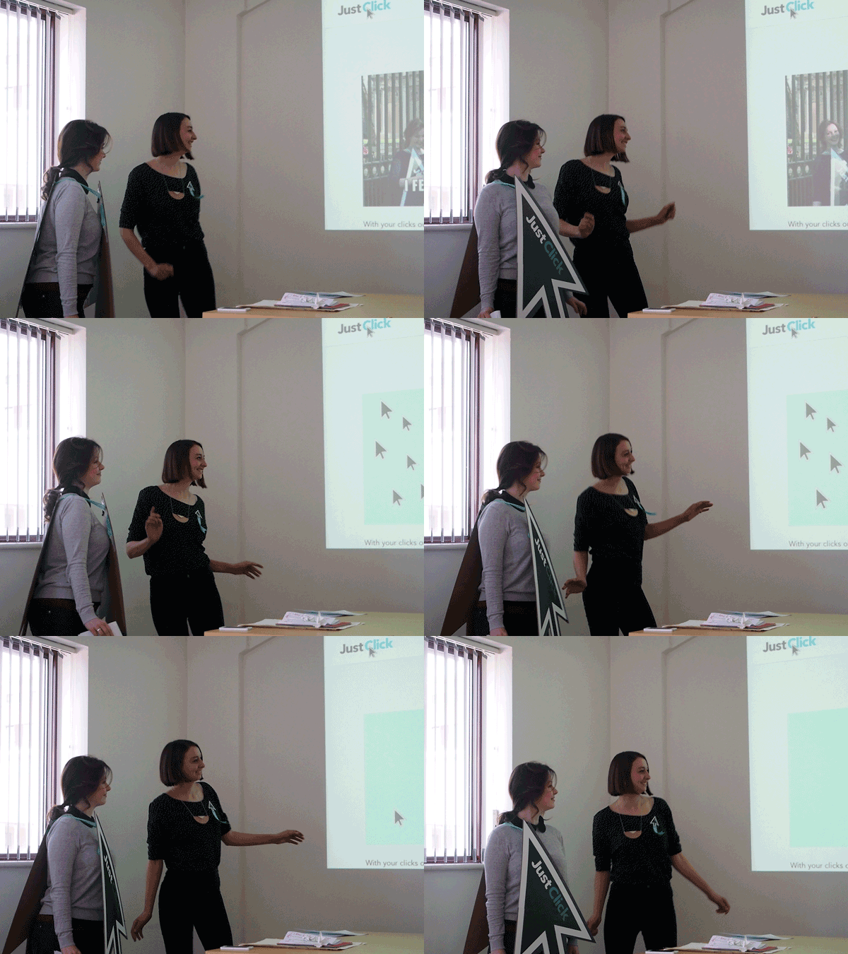
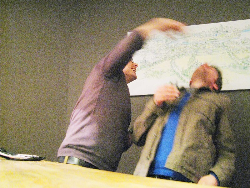
Becca and Anna bringing the groove to their team’s presentation
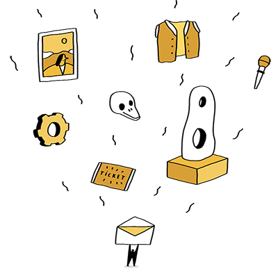
They’d produced a pastiche site encouraging people to ignore culture and to click instead of going to the theatre or visiting the museum.
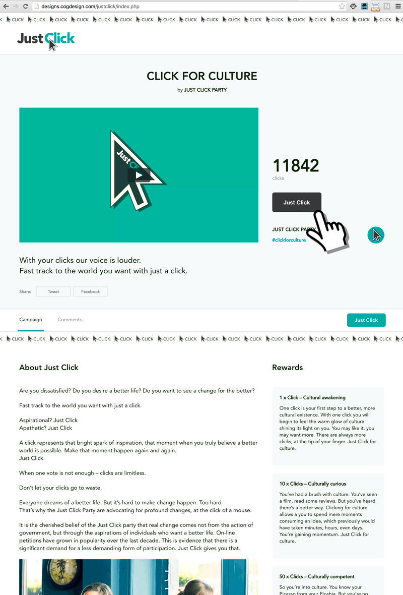
Their site was also fully functioning, included a live ‘click’ feature (with friends clicking to increase numbers throughout their presentation), brilliantly funny copywriting and an hilarious video featuring members of the team and original music from Becca’s boyfriend, Jake.
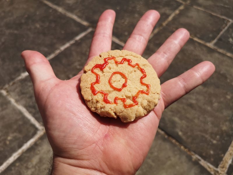
The pay-off, from the site, is a message from the Cog Party, explaining that there is no substitute for experiencing and engaging with culture… “Don’t JUST click. Get out there!”
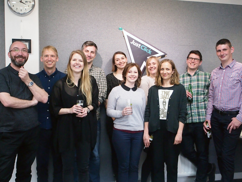
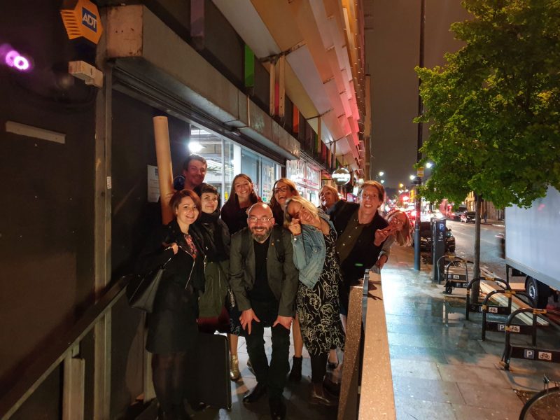
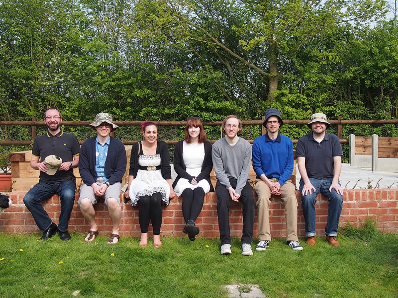
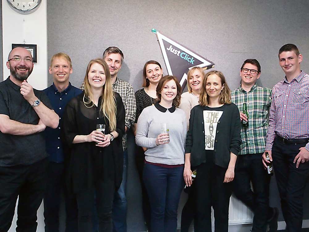
The whole Cog team enjoying a drink in the afternoon after the political presentations
Both sites are online so do have a look for yourselves:
Both teams did brilliantly; I was delighted by the quality (and quantity) of the excellent work from all involved. I couldn’t bring myself to judge one as the winner so we had prizes for all. Well done everyone.
