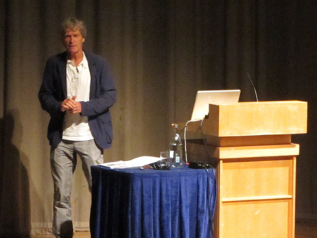
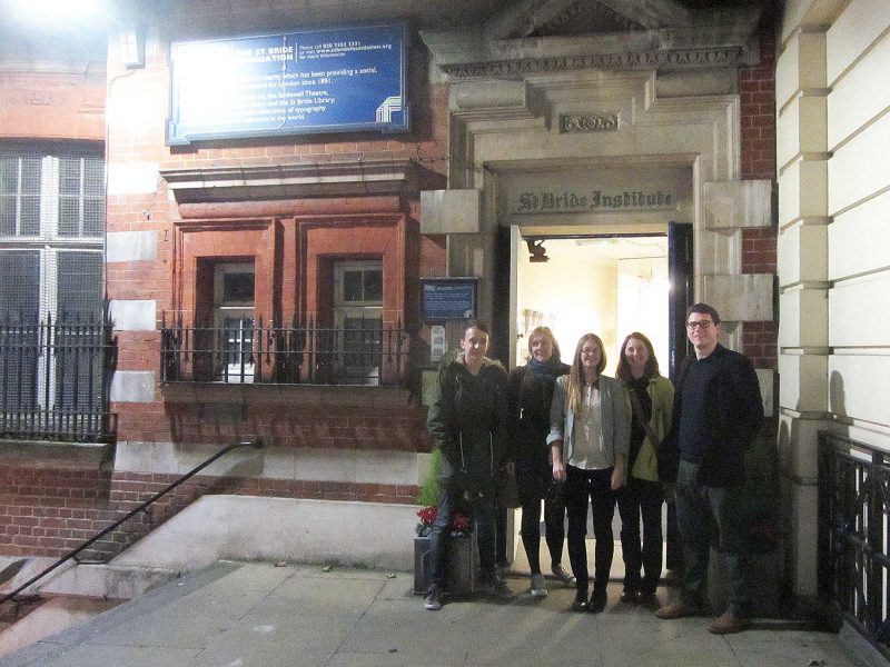
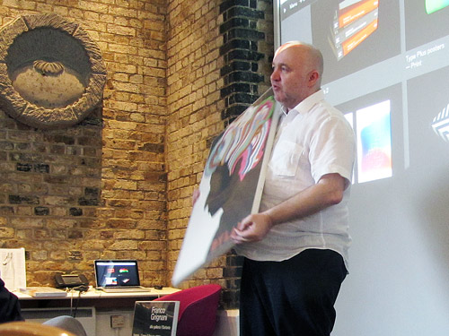
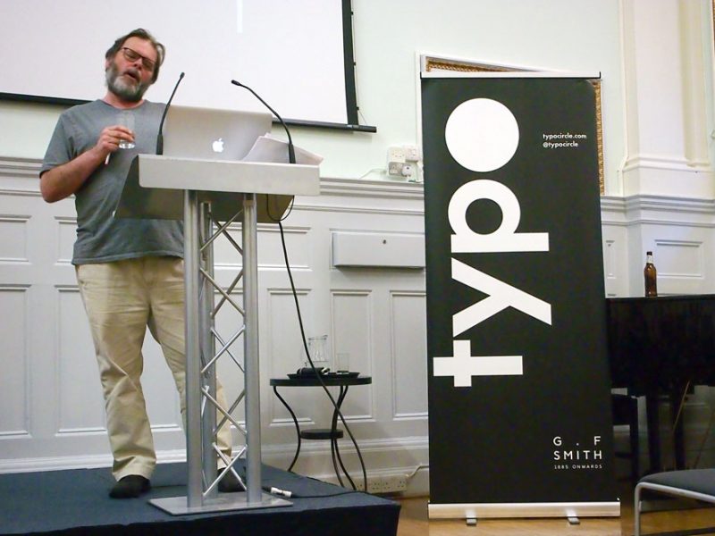
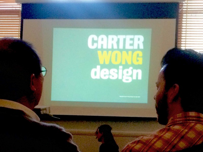
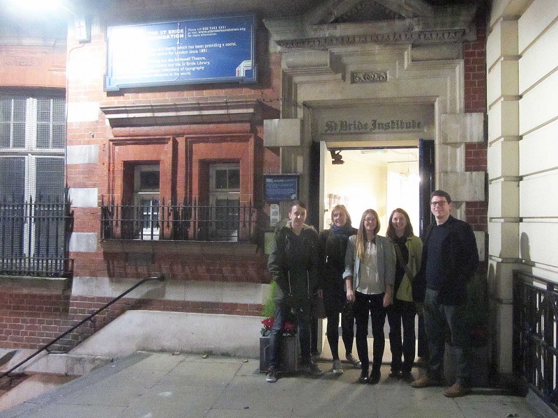
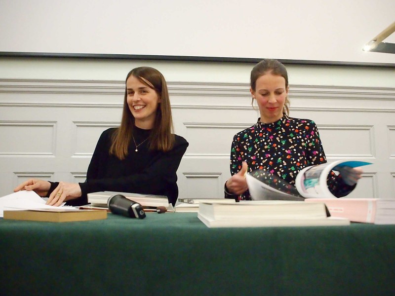
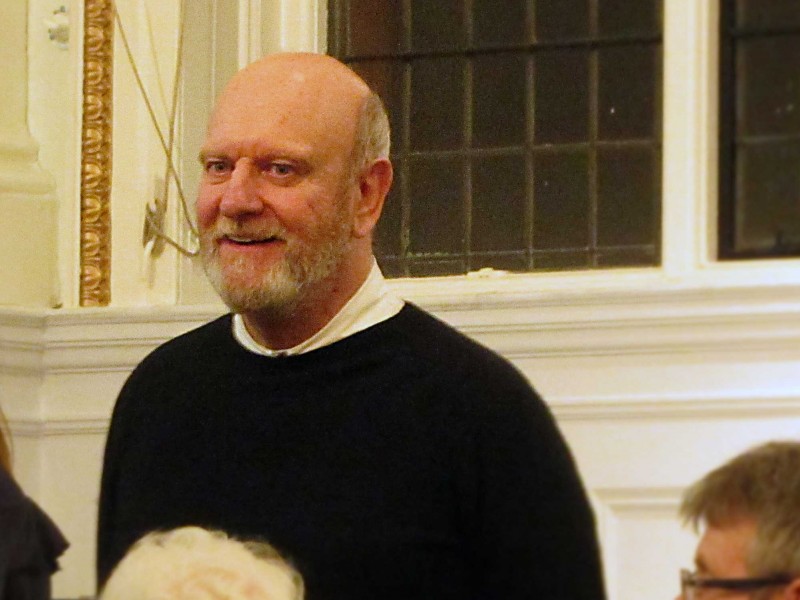
As a small design studio, Carter Wong have punched above their weight for three decades. In a talk, titled 60 minutes at 29, they told their story to an audience at St Bride Foundation. Michael and Ross were there to listen.
Carter Wong at Typo Circle
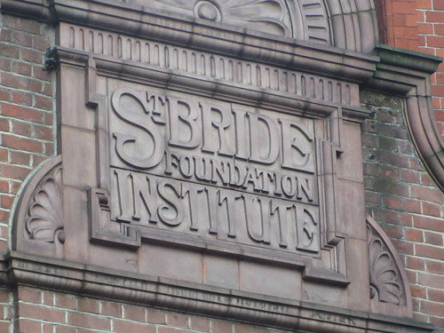
This was such a different talk to the one I went to earlier in the month (with Tony Brook from Spin), not better and certainly not worse but a world away in terms of visual style. As Phil Carter explained in his introduction – there are so many different approaches and ways of tackling design; Carter Wong’s approach is to search out the creative idea and use craft techniques to bring that idea to life.
Phil Carter and Phil Wong met at Norwich School of Art in the 1970s. A decade later they decided to set up their own agency but there was already an agency called Philips so they opted for Carter Wong.
There’s a lot to admire about the output of the Carter Wong studio, including some stunning set-piece projects where brave clients and audacious ideas have been pushed way beyond what budgets can possibly have allowed.
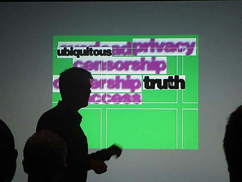
Like most design talks, this was a slide show tour of their greatest hits, following the convention of ‘how do you transform x into y’. What was very different was that each member of the Carter Wong team (apart from the enigmatic Phil Wong) spoke about a project. It was great to see such a generous approach with everyone showing in-depth knowledge and passion for the projects they’d been involved with.
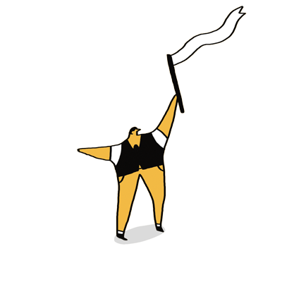
As Creative Director, Phil Carter spoke the most. It was lovely to hear from someone who still has such a passion for simple, crafted solutions and was able to explain complex thoughts with such clarity. The image that struck me was a diagram that he said he’d drawn countless times: I’ve tried to draw it below, from memory (apologies if I’ve put my own spin on it). 
It shows the Carter Wong approach of pushing expectations and defying conventions – they always push clients beyond their comfort zone: “if they don’t like it, we can always bring them back to something they’re more comfortable with”, said Carter.
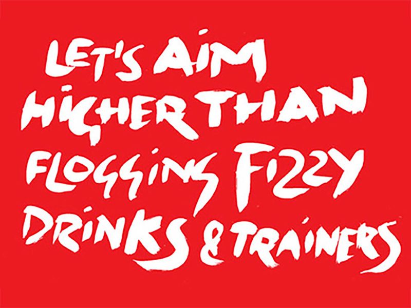
There’s a lot to admire about the output of the Carter Wong studio, including some stunning set-piece projects where brave clients and audacious ideas have been pushed way beyond what budgets can possibly have allowed (see the video below for their award-winning typeface design for Welsh clothing company, Howies).
But it’s not so much the designs but the ethos and camaraderie of the studio that is most impressive. That sense of a united team was evident throughout the evening, from photos of studio parties to the way each team member spoke with affection about their bike trips when visiting clients.
Was the evening perfect? No. It was billed as 60 minutes but it was at least an hour and a half. My complaint is that that I’d have happily listened for another hour. Congrats to Carter Wong on their first 30 years. Here’s to many many more.
