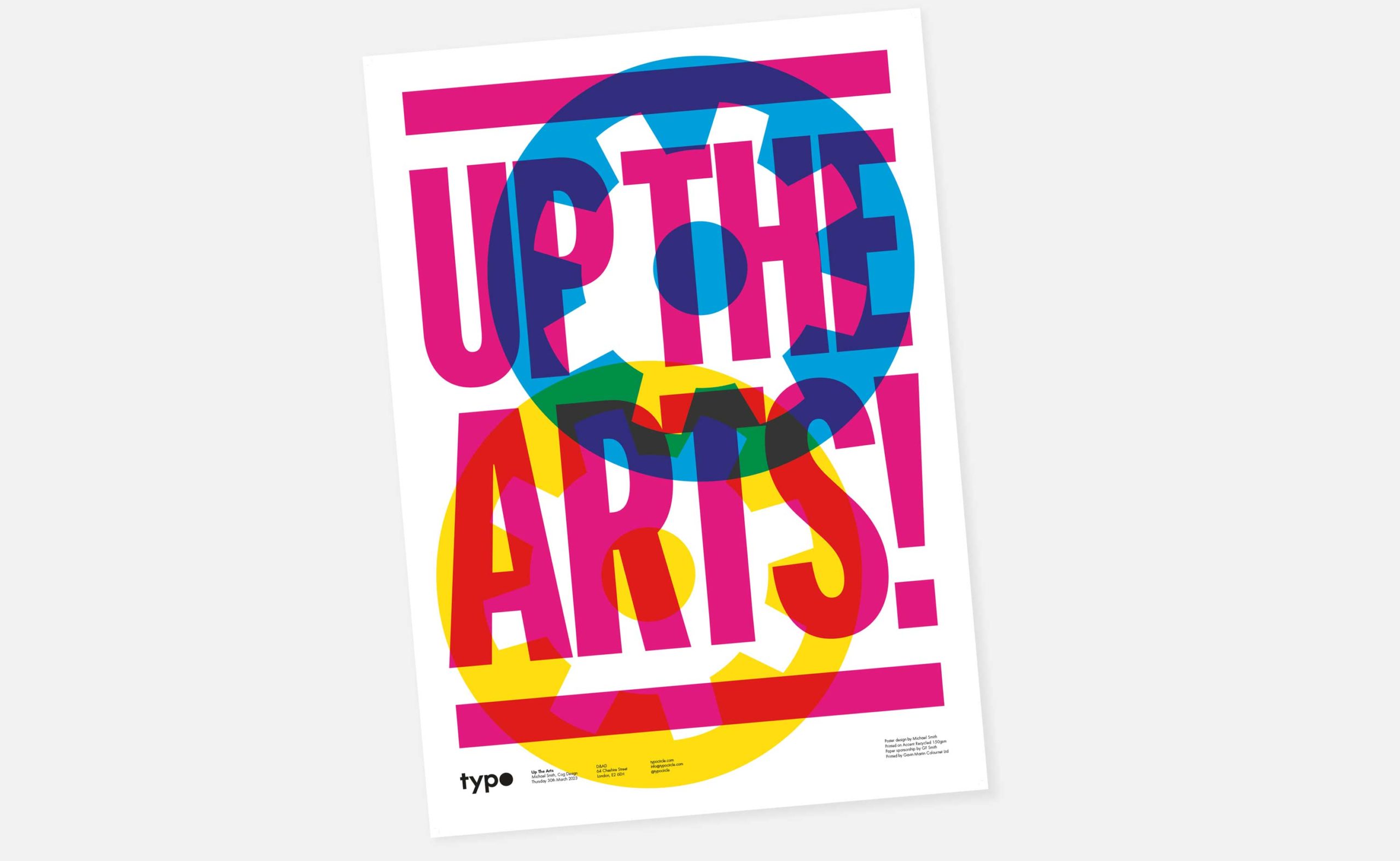
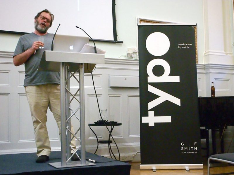
On 30th March ’23 I gave a talk, for TypoCircle, at D&AD’s headquarters. I titled it ‘Up The Arts!’.
Here’s what I said, all about Cog’s 32 years of helping arts organisations inspire their audiences, with some of the slides.
Our studio is filled with light and music.
There are multiple meeting rooms, a well stocked kitchen, and an indoor garden (with fishpond). Talk to us about access needs, environmental factors and any accommodations we might make to enhance your visit. Pop-in for tea and stay to use a spare desk for as long as you need.
11 Greenwich Centre Business Park,
53 Norman Road, Greenwich
London SE10 9QF
We’re next to Greenwich train and DLR station. We have a door right on the concourse but it’s different to our postal address. Find us via: what3words.com/hungry.means.author
This video shows the route to take from the train that will arrive at Greenwich rail station from London Bridge. There's a gentle slope next to the staircase.
If you have to come by car, we have a couple of parking spaces. We have a charging point that you are welcome to use if you have an electric car. Call ahead and we'll make sure the spaces are free. Use our postcode (SE10 9QF) to guide you in.
We’d love to hear from you. Use whichever medium works best for you.
11 Greenwich Centre Business Park,
53 Norman Road, Greenwich
London SE10 9QF
It's exciting to chat about potential new projects. We don't have a ‘sales’ team or a form to fill in. Call us or give us a little detail via email and we'll get straight back to you.
[email protected]If you're a client then you'll be best served by calling us or contacting us via ClickUp, otherwise you can use this dedicated email that reaches all of the digital team.
[email protected]This email hits the inboxes of the people who deal with our bookkeeping and finances.
[email protected]A round-up of recommendations and reviews, sent on the first Friday of each month, topped-off with a commissioned image from a talented new illustrator. Sign-up and tell your friends.
Sign me up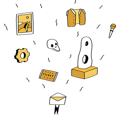
An irregular update of activity from our studio. Showing off about great new projects, announcements, job opportunities, that sort of thing. Sign-up and tell your friends.
Sign me up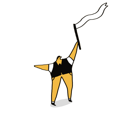
On 30th March ’23 I gave a talk, for TypoCircle, at D&AD’s headquarters. I titled it ‘Up The Arts!’.
Here’s what I said, all about Cog’s 32 years of helping arts organisations inspire their audiences, with some of the slides.
Thank you for that intro and thank you for coming. I feel very privileged to have been invited. I’ve been to many Typo Circle talks and D&AD Lectures through the years. I’ve seen and heard from dozens of my design heroes.
The next few slides are screenshots from my journal entries on Cog’s website.
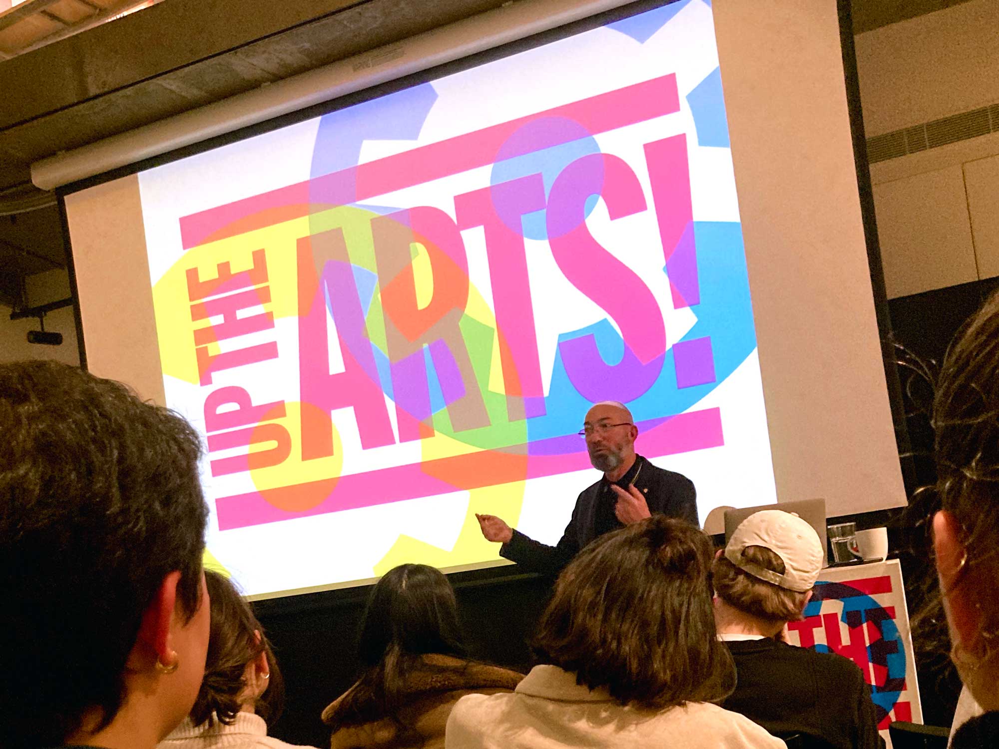
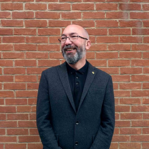
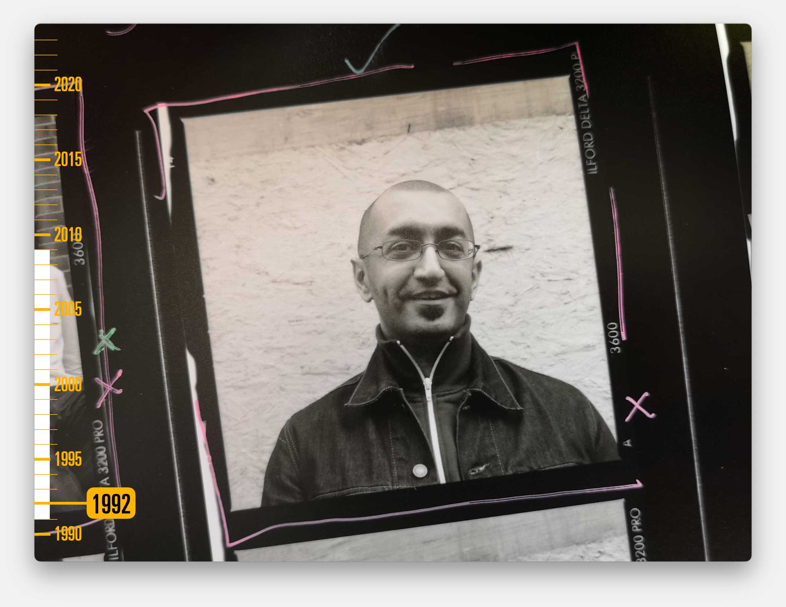
Photo by Anna Serocold
I’m very aware that I fall within the demographic of so many of these speakers. Despite great efforts from Typo Circle and D&AD to broaden the reach, like most of these speakers, I am yet another white, middle-aged, cis-gendered man passing the prime of life.
And, like most of the talks I’ve been to, I am going to show some work to illustrate my history and I am going to chat about the design agency I founded, and why I think it’s special.
But I think my story is different in lots of ways.
Usually at these talks we hear from people who live, breathe and are devoted to their craft. The design industry trope is of a brilliant individual who interns in a few amazing places and then thrives at a big-name, award-winning agency. Then they splinter off and start their own thing, either on their own or with other equally brilliant people.
They are focused on the detail and zealous about their craft, and they hone their skills to exceptional levels. Their specific discipline, be it design, advertising or copy-writing is everything to them. And usually that means they lend their expertise to whoever will pay them, they enjoy applying their craft to challenges from lots of different types of clients.
Their shelf of awards and media coverage brings big paying corporate clients that fund their studio and they do some fun charity things, for buttons, on the side. Often, although not exclusively, it’s the quirky, loss-leading work for charities that you’ll see when awards season rolls around because it’s those passion projects that designers are most proud of, and so they wildly over invest their studio’s time in them.
You’ll know that story because those are the agencies that win the plaudits, are written about in journals, are interviewed and invited to tell their stories at talks like this. And so that story becomes the archetype. Those are the people that design students aspire to be because theirs are the stories we have all heard.
And, of course, because they are also exceptional, talented, brilliant people. And, with a couple of notable exceptions (none of which you’ll see in these slides), they are all lovely, thoughtful and generous with their time.
So the next generation of brilliant designers learn to shape their own stories to mirror those that they’ve heard. And so the cycle continues.
I have nothing but admiration for these people, for these agencies. When I was a student that was definitely the archetype I wanted to emulate. Maybe it still is.
A Yellow Pencil from D&AD was definitely my goal. But life didn’t work out like that and I’ve come to realise that there are many other stories that don’t get heard as much.
The majority of people who work in design have very different stories to those you usually hear at lectures. So, as I’ve been given the opportunity to stand here, I thought I’d tell you mine.
My story is pretty much the opposite of all that stuff.
My design agency isn’t one you’ll read much about in the design press, and my design agency hasn’t won many awards.
In fact, outside of this kind of audience, I very rarely use the term ‘design agency’ to describe what Cog does any more. And it’s been a long time since I’ve thought of my job as being a designer.
I started trading under the name of Cog Design, straight out of college, in 1991. I probably said we were a graphic design company. We definitely have called ourselves a design agency for a long time.
I started a marketing agency and ran that on the side for a few years. We also bought and sold advertising space and published event programmes and I used to write the editorial in those.
I started a web agency and ran that in parallel to Cog for a few years.
I bought a building to be our studio and had to start a property management company.
At some point we started describing Cog as a communications design agency, before moving to using the term branding and design consultancy for a brief period.
When I talk to potential clients now, I probably use the phrase – design-led, digital agency. Most of our work is creating and now maintaining websites. Maybe that will change again in a few years too.
Since it’s become fashionable, we might use the term ‘pivot’ to describe those changes, the term fits neatly with the analogy of a Cog. But I don’t want to pretend that I’ve ever been that calculating.
The reason we’ve changed so often, and kept going for so long is that rather than being focused on a particular discipline or approach to design, we are focused on a specific type of client.
We only work in the arts sector.
Actually, strictly speaking, arts & heritage (because museum people get upset if you lump them in with the arts).
But Up the Arts & heritage doesn’t have the same ring to it.
Almost all of our clients are registered charities – they aren’t the shop window to our agency, they are the whole shop. All of our projects are passion projects.
We exist to help arts organisations inspire their audiences.
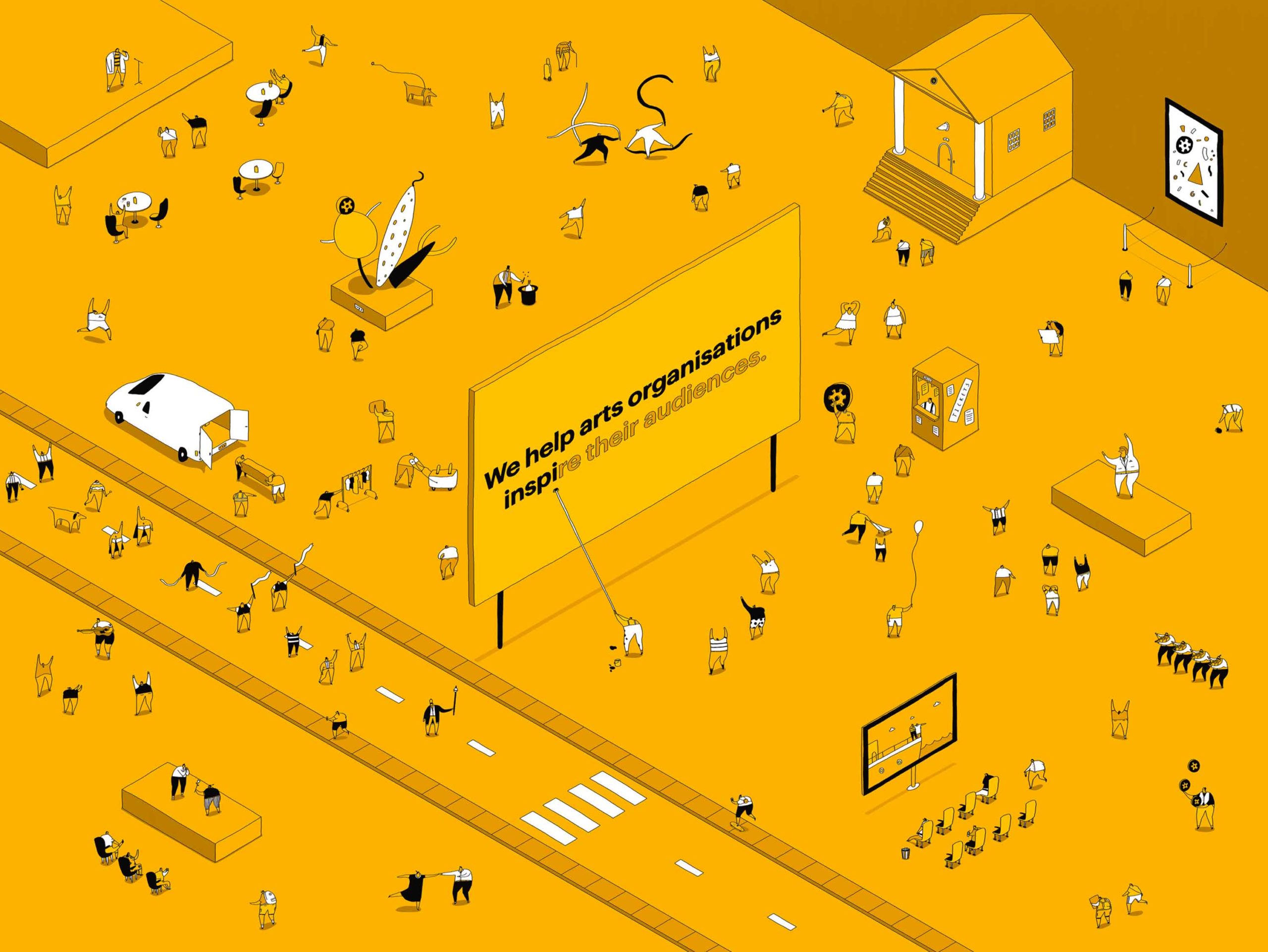
And so we adapt to their changing needs and frankly, to their changing budgets. We are client-facing rather then design sector facing. That’s the world where we live and breathe.
There are no big paying corporate clients in our closet. We don’t have an ethical split, with morally dubious clients funding the charitable work, in the way that I’ve heard other agencies describe their set-up.
In fact we have an unwavering ethical policy which means: we will not work for petrochemicals, gambling, porn, arms, alcohol or tobacco, or McDonald’s restaurants. We’ve always stuck to those principles.
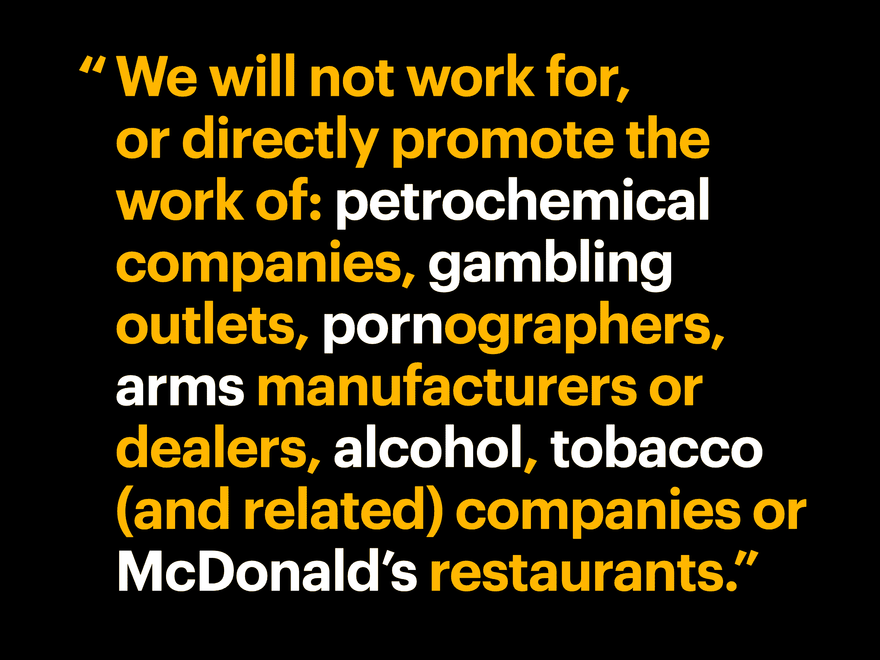
And I get quite grumpy with people who take the money and ignore the human misery that comes through these industries.
We’ve always been a values-driven company with an ever more militant approach to sustainability, which is why we became a certified B-Corporation.

I’ll happily talk to anyone about that at the end. Come and find me.
While I’m here I thought I’d tackle a couple of other designer cliches head-on.
We are not early adopters or trend-setters. We aren’t disruptors who only work with brave, risk taking entrepreneurs. I find those people far too difficult to be around.
We create engaging, intelligent work that eases interaction, demands attention, and prompts action from specific audiences. We work with kind, empathetic, thoughtful people who want to do their best because they genuinely believe in the power of the arts to shape lives. And sometimes they are really hard work too.
Our goal is always long term relationships because those are where we do our best work. And frankly because it is so much more financially efficient to do more work with an existing client than to get a new one. So, for today’s talk, I am going to run through the illustrated story of Cog’s history. Highlighting some of the client relationships that have shaped our story.
You’ve heard me use the word ‘story’ a lot so far. Although I have been able to look back and turn Cog’s history into a narrative, I am trying to squeeze three decades of history into less than an hour.
This is a story, a version of history, from my particular perspective. Design leaders are good at spinning complex narratives into simple stories because that’s kind of our job. But I want to be honest in a way that I very rarely hear people be at these things.
I’m going to try to tell an unvarnished story. I’m going to talk about some of the challenges, some of the things that forced change rather than reinventing history to pretend everything was planned. Most of the changes, or pivots, that I’ll talk about came by chance, through luck and accidents and circumstances beyond my control.
I have run an agency for a long time but I have never thought of myself as a businessman; I’ve only ever written one business plan and I’d sum up my business strategy as grasping at opportunities.
Of course those lucky opportunities present themselves because we all work hard, because we make sure we are in the right places at the right times, and because I benefit from all the privilege that comes from me being a white, cis-gendered, now middle-aged and I guess middle-class man.
It’s also worth pointing out that I’ve never had another job. I’ve never had a proper job. So maybe I have no idea what I’m talking about.
____________________________
My history is intertwined with the history of Cog because I founded the company and I’ve been there for 32 years.
So please excuse the times when it sounds like I’m referring to myself in the third person. When I say ‘we’ I mean Cog Design. I mean the collective of brilliant, talented, accomplished individuals who I have been lucky enough to employ at Cog, and have helped to shape its story, each of them has been instrumental in the twists and turns of our narrative.
At Cog we are a team. There are no prima donna designers. We recognise that everyone is vital to the success of every project.
OK – Let’s do the history thing.
As I say, it’s a story. I’ve kept it fairly linear but I’ve realised, in putting these slides together, that even I find it difficult to give context to the timeframe.
So, I’ve added a timeline on the left so you can follow along.
And if you drift off then you’ll be able to see where we’re up to when you wake up.
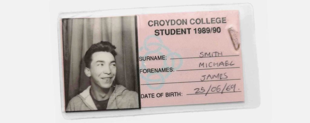
After a bumpy journey and a failed first choice, I ended up at Croydon College on their Graphic Design Higher National Diploma. That piece of luck proved to be exactly the right fit for me.
They ran the course like a commercial studio. In fact we all worked on several paid projects which funded quite a lot of the equipment, including a typesetting machine which I used a lot, and an Apple II which I never used because I thought of myself as a proper designer, and using a computer felt like cheating.
Whilst I was at Croydon they arranged a placement at Addison Design.
It was a two week placement but I persuaded them to let me stay for two months, moving between different teams. Everyone there was kind and supportive and I learned loads.
But the biggest thing I learned was how much I disliked the interpersonal politics of a big agency. I couldn’t stand the hierarchy or the fact that people seemed to care more about how they were perceived than how their work would help their clients. Addison is a great company but I learned that a big agency wasn’t the right fit for me.
I finished at Croydon in June 1990. We hired a room in Covent Garden for the end of year show because we’d heard stories, at talks like this, about how agencies would come and leave their cards and hire us.
But nobody came and hired us because none of us had invited anyone. Another valuable lesson learned.
I was completely lost as to what to do next.
I spent months lying on my parent’s sofa, watching TV all day, signing-on for Unemployment Benefit and spending that money going out to gigs or clubs several times a weeks.
Actually I was having the time of my life.
I was writing to companies, occasionally, looking for a junior design role. But frankly I was too scared to try too hard. College had taught me that I could achieve good results if I worked 18hrs a day and had a relaxed attitude to deadlines – but how can anyone be expected to be creative day-in, day-out from 9 to 5?
I’m still in awe of people who can do that. I’ve worked with lots of them.
As 1990 turned to ’91, the first of many powerful women in Cog’s story entered my life. My then new girlfriend (and now partner) Jane.
She was and still is much more gregarious than I am. She introduced me to the people who ran the clubs we went to, and managed the bands we went to see. She told me to get off my arse and start doing something with my life. So I started designing fliers for those clubs and t-shirts for those bands. I mostly got paid in free entry and alcohol so I figured it was OK not to tell the social.
Once you’ve been unemployed for six months, the rules change (or at least they did then). You are obliged to attend a restart interview where they give you an ultimatum. Either you find yourself a job or they’ll make you take one.
At my restart interview there was a third option: the Enterprise Allowance Scheme.
On social security I was getting £27 a week and wasn’t allowed to accept any casual work, paid or otherwise. On the Enterprise Allowance Scheme they were offering £42 per week if I set up my own business.
There were three criteria.
I was lucky to be able to borrow the £1000 which I put in the bank account and paid back the next day. And I wrote a two page guesstimate of figures that remains the only business plan I have ever written.
On the day before the business training course I realised that they would ask me what the business would be called.
I can remember lying in bed thinking that Michael Smith Design would be a tedious company name. And so Cog Design was born.
I’m sure I spun them some story about what it stood for, and I’ve made up several different versions of that story since. But, between us, the truth is I just thought it’d make a cool logo.
![]()
I drew this logo on a piece of CS10 artboard with a pair of compasses and a Rotring pen – some references there for the old folk in the room.
I signed the paperwork on 6th May 1991 so that’s when I count as Cog’s founding. I took it all very seriously.
Cog’s first office was a rented a room above a dry cleaners in Barking.
It was owned by the family of a friend called Andy Allen who Jane had introduced me to. He ran clubs, managed bands and started a t-shirt printing business called Backstreet International. That business ran from the first floor and I was on the second. Backstreet is now one of the world’s biggest music merchandise companies.
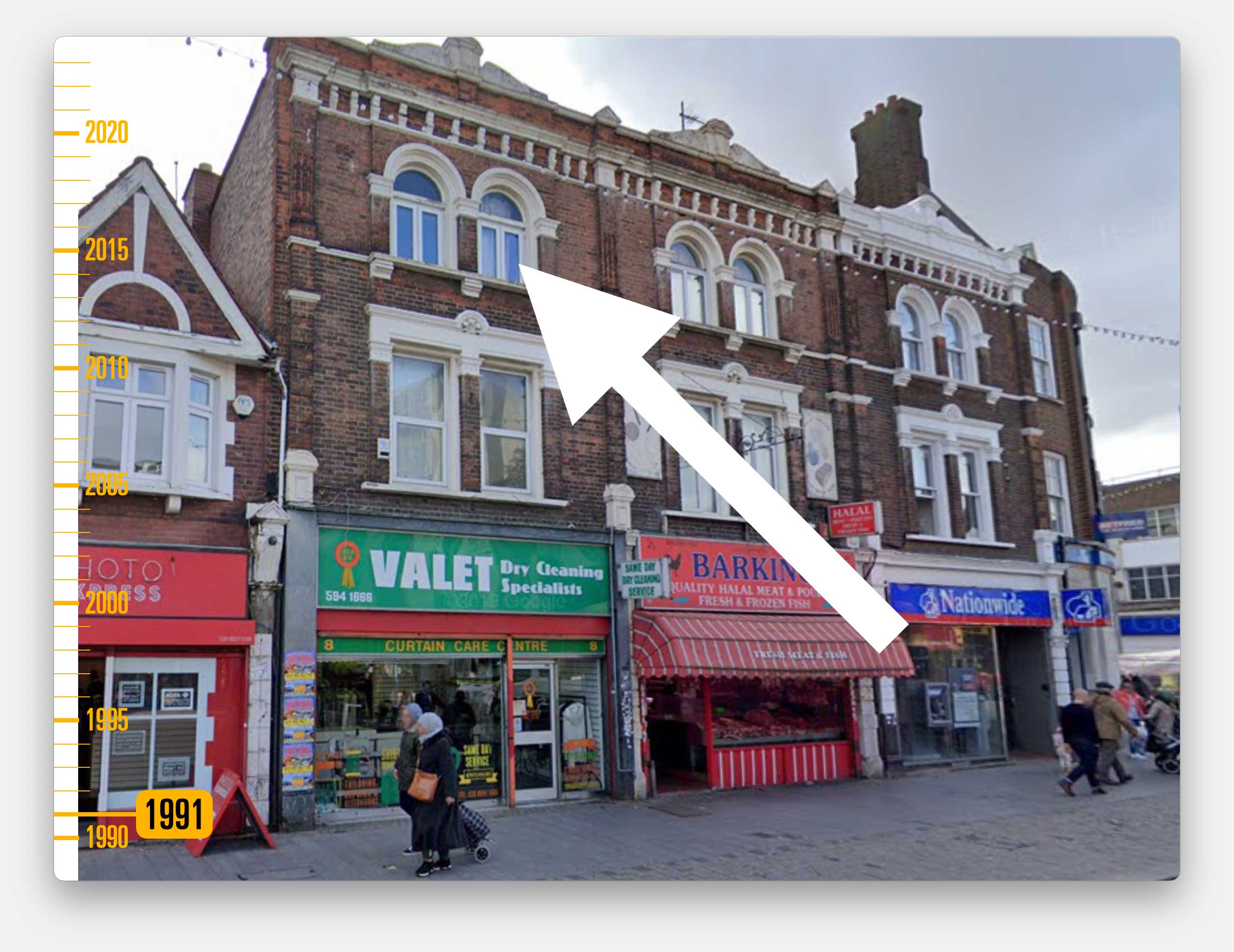
I carried on designing his club flyers and t-shirts. Everything was done by hand.
I still didn’t have enough work to fill my days so I went hunting for clients. I had no idea how to do that.
Like all young designers (at least back then) I really wanted to design record and CD sleeves. Of course I wanted to be the next Vaughan Oliver or Neville Brody. So I thought a good place to start would be touting my portfolio around record companies.
This was pre-internet and pre-email so I picked up a copy of a phone directory called The White book, which had contact details for everyone who worked in the music industry. I started at Z and working my way forward.
It was incredibly demoralising. I received no after no after no. But in a disciplined (or maybe masochistic) way I tasked myself with calling 20 companies a day, every day… until I got to S.
At S I phoned what I thought was a record company called Serious Speakout.
I spoke to a man called David Jones who patiently explained that he didn’t work for a record company. He was a live music producer which meant he put on gigs.
He offered me a trial commission to design a poster for a keyboard player called Klaus Schulze, at a place called the Royal Festival Hall at the Southbank – I’d never heard of any those. But I did the design.
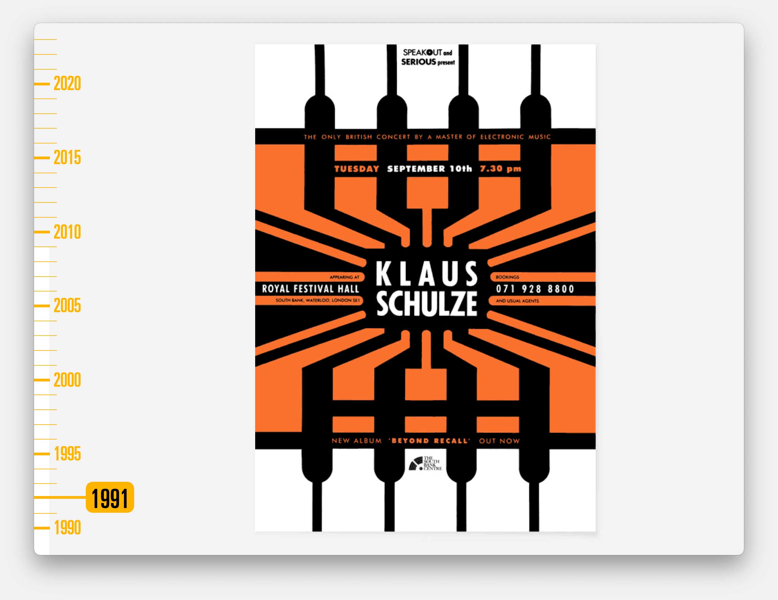
The type was done with Letraset, rub down transfers, and everything else was hand-drawn. God knows how long it took.
I invoiced for the time I thought proper designer should take. At a rate of £11ph which seemed unfathomably high to me.
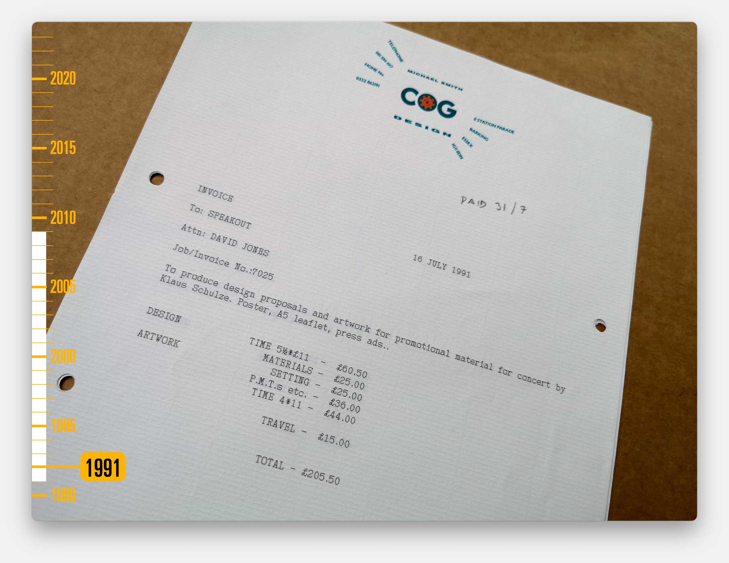
David was delighted with the work. And Cog became their design partners for almost two decades.
I did put up our prices.
Along the way Cog moved to Deptford – because Jane and I had moved nearby and she got bored with me moaning about driving to Barking and found me an office I could walk to.
And within a year I’d employed my first team member…
…the excellent designer Rejash Bhela who’d started at Croydon College the year left. He stayed with us for more than 15 years. A year later we hired someone else, and someone else, and someone else until suddenly we are like a proper company.
Our work with Serious Speakout was fast paced and had to be immediately impactful.
Usually we’d be given one of two publicity photos for an artist, plus their name and the details of the concert, then our job was to create a poster you couldn’t miss in the street. Printing in full colour was too expensive so we had to stick to one or occasionally two colours.
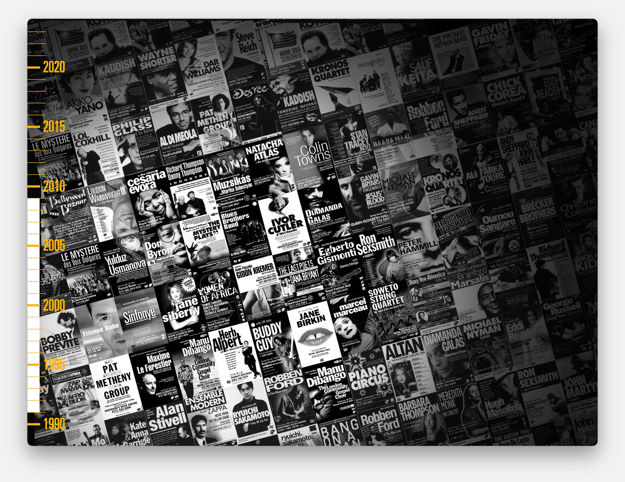
We worked with Serious Speakout for close to 20 years.
I didn’t really realise it at the time but we were working with the biggest non-pop music artists in the world: Michael Nyman, Philip Glass, Steve Reich and hundreds more.
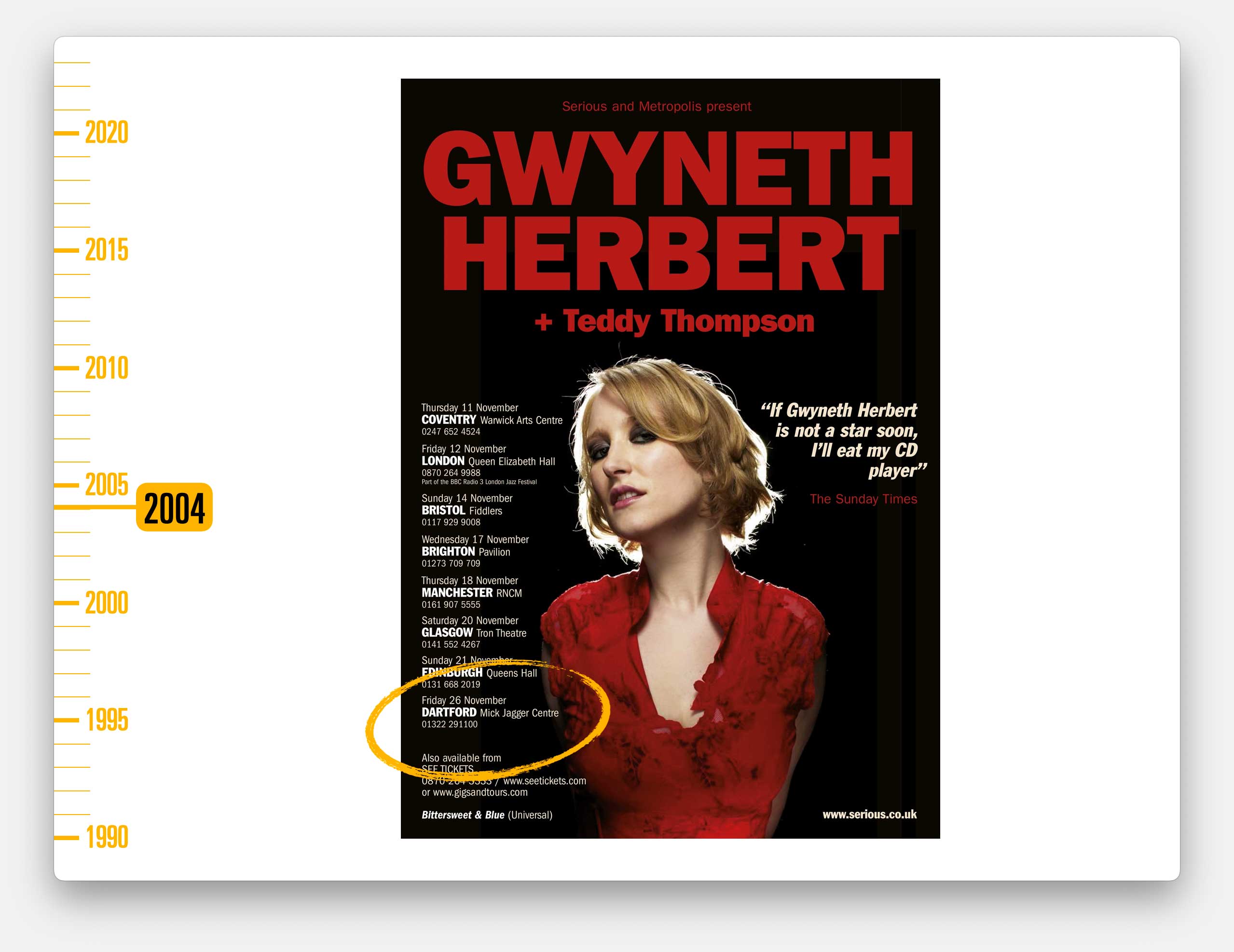
Although this, much later tour by the wonderful signer Gwyneth Herbert, is one of my favourites because it went to the newly opened arts centre in my old school, in Dartford.
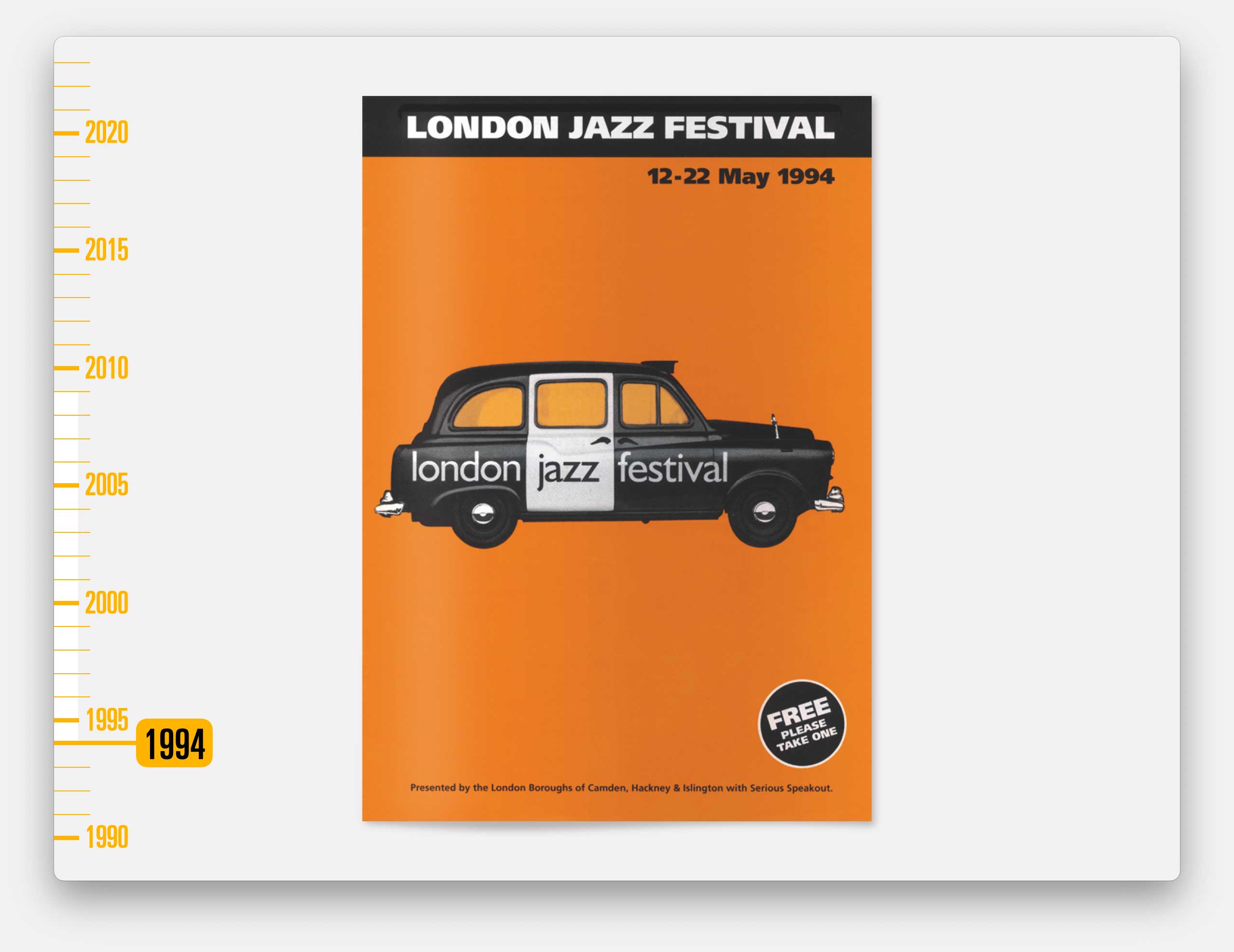
Serious Speakout were also the producers of the London Jazz Festival so we got to work on that for many years too. Here are a couple of my favourites…
This was only the second year of the festival and the first one we worked on.
I can remember pitching the idea of using an iconic London cab which they loved but didn’t have anything like enough budget for a photoshoot.
So I went to Hamleys and bought an airfix model of a taxi, made it and taped it, side-on, to our new flat-bed scanner.
I can also remember working through the night to transfer the artwork of the brochure onto a series of Syquest disks, driving them to the printers and working straight through the next day to scan images and drop them into the pages as they made the plates.
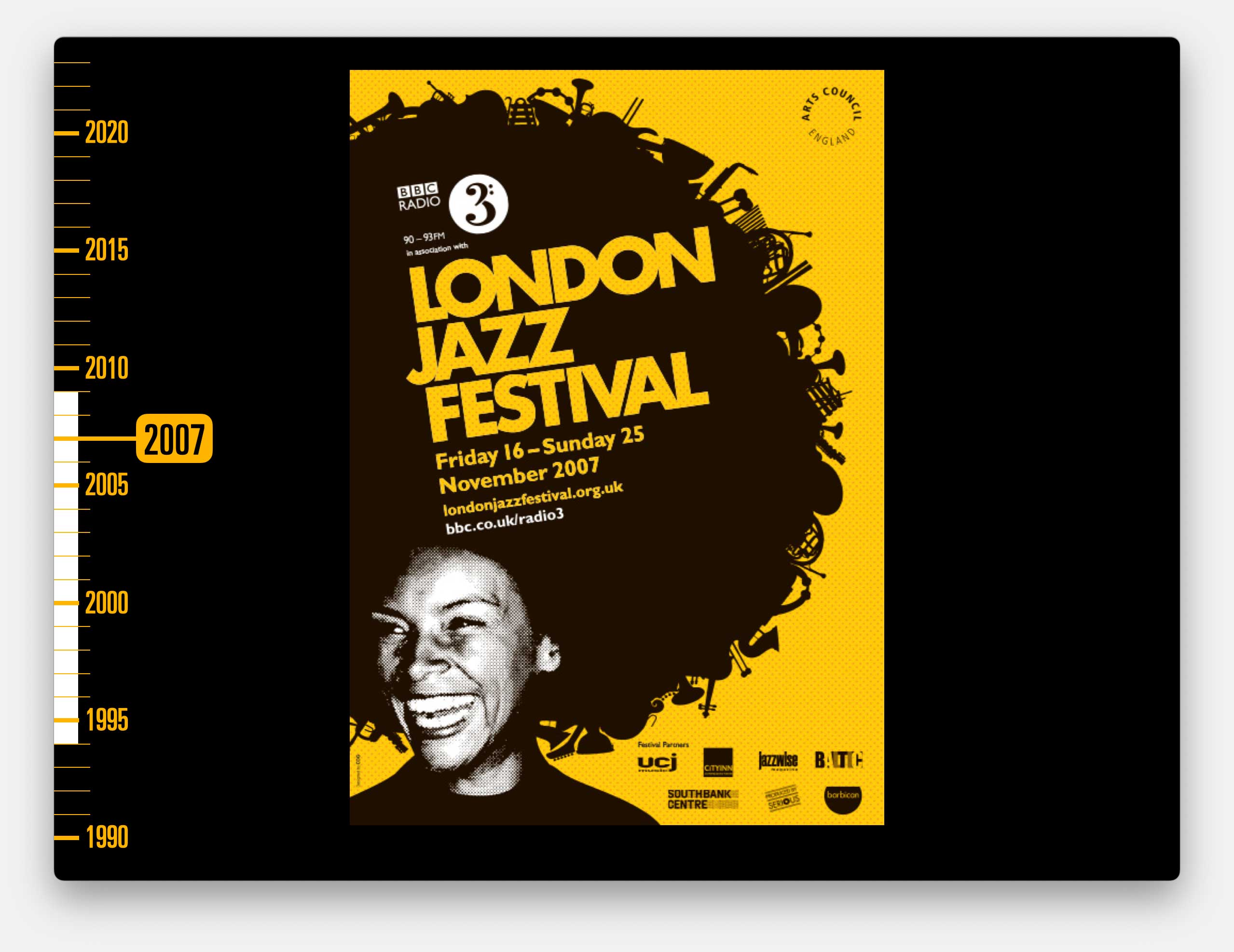
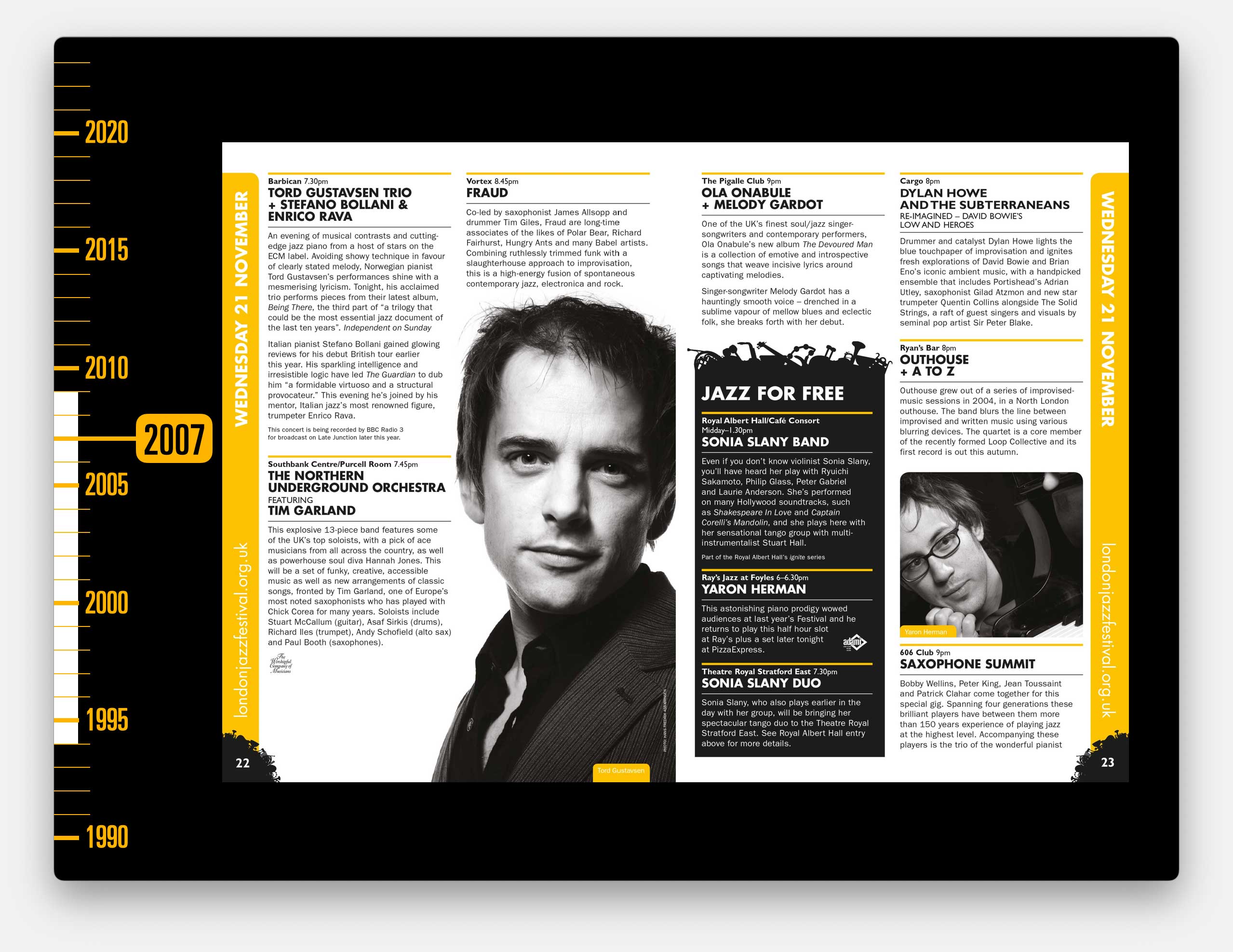
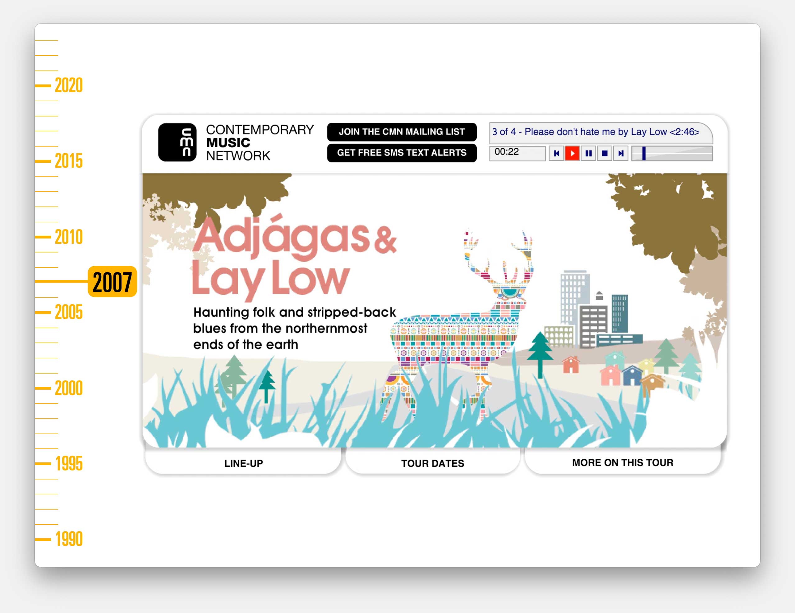
By the 2007 festival our computer set-up was a lot slicker.
As we did each year, we produced the main publicity materials for the festival, plus everything else that went with it. Dozens of individually sized press ads, tailored to each publication.
Programmes for each large venue, and for each individual concert, outdoor advertising, signage, wayfinding, lanyards, press-packs and much, much more
Plus the brochure which contained maybe a hundred concerts, each confirmed at the very last minute. All having to conform to a format but also having to accommodate varying text lengths, partner logos, and the ability to push specific concerts with images of varying quality.
This was the bread and butter work we were doing for dozens of clients at the time.
And we became so well known in the jazz world that, by then, we were also designing and producing Jazz Quarterly for Verve records, the monthly subscription journal Jazz UK, and the high-street monthly magazine Jazzwise, plus numerous other brochures and magazines for other arts clients.
We had clients across theatre, dance, street performance, poetry, classical music and much more. All that work opened up connections to a world I hadn’t known about before. It was like a curtain had been pulled back to reveal an alternative world. I’ve been living behind that curtain ever since.
And I can trace a line of connection from almost any of Cog’s clients back to that first commission from David Jones, so I am hugely grateful to him taking a chance on me.
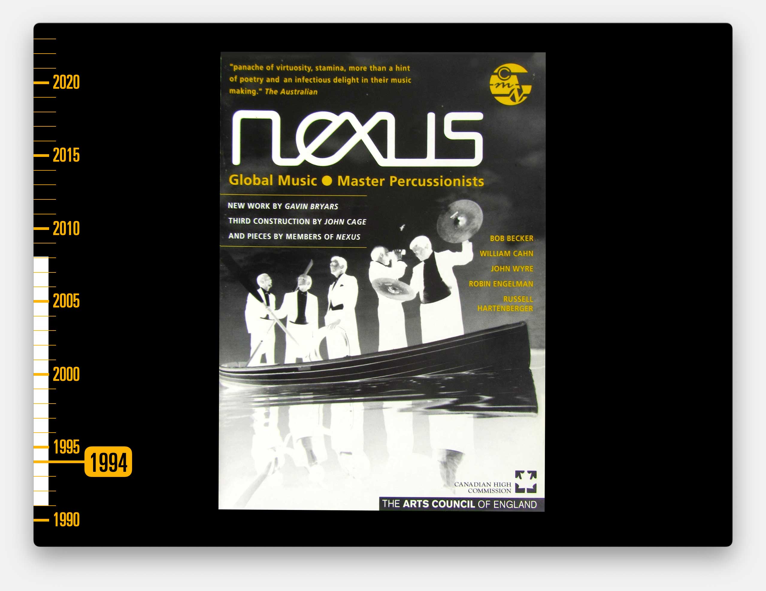
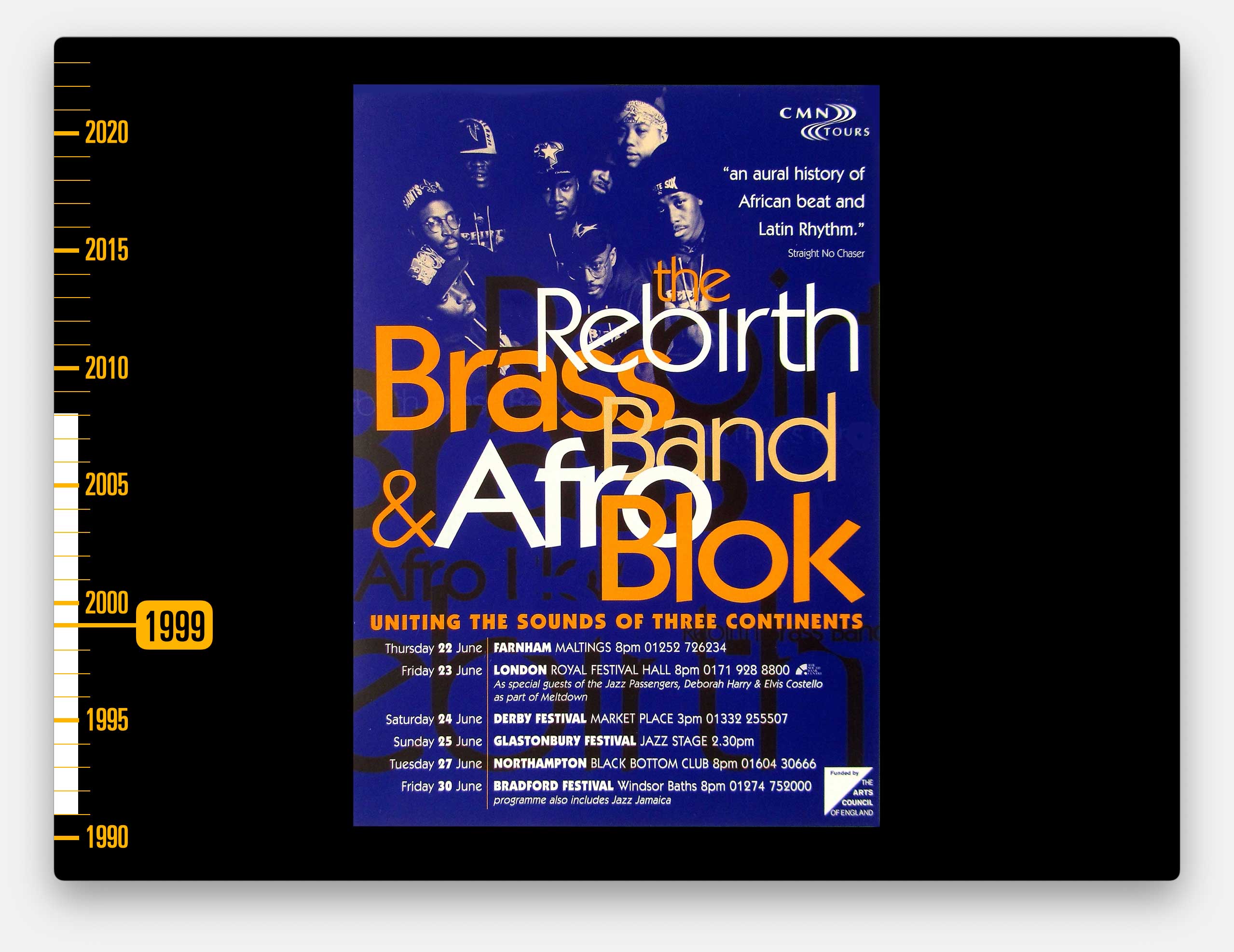
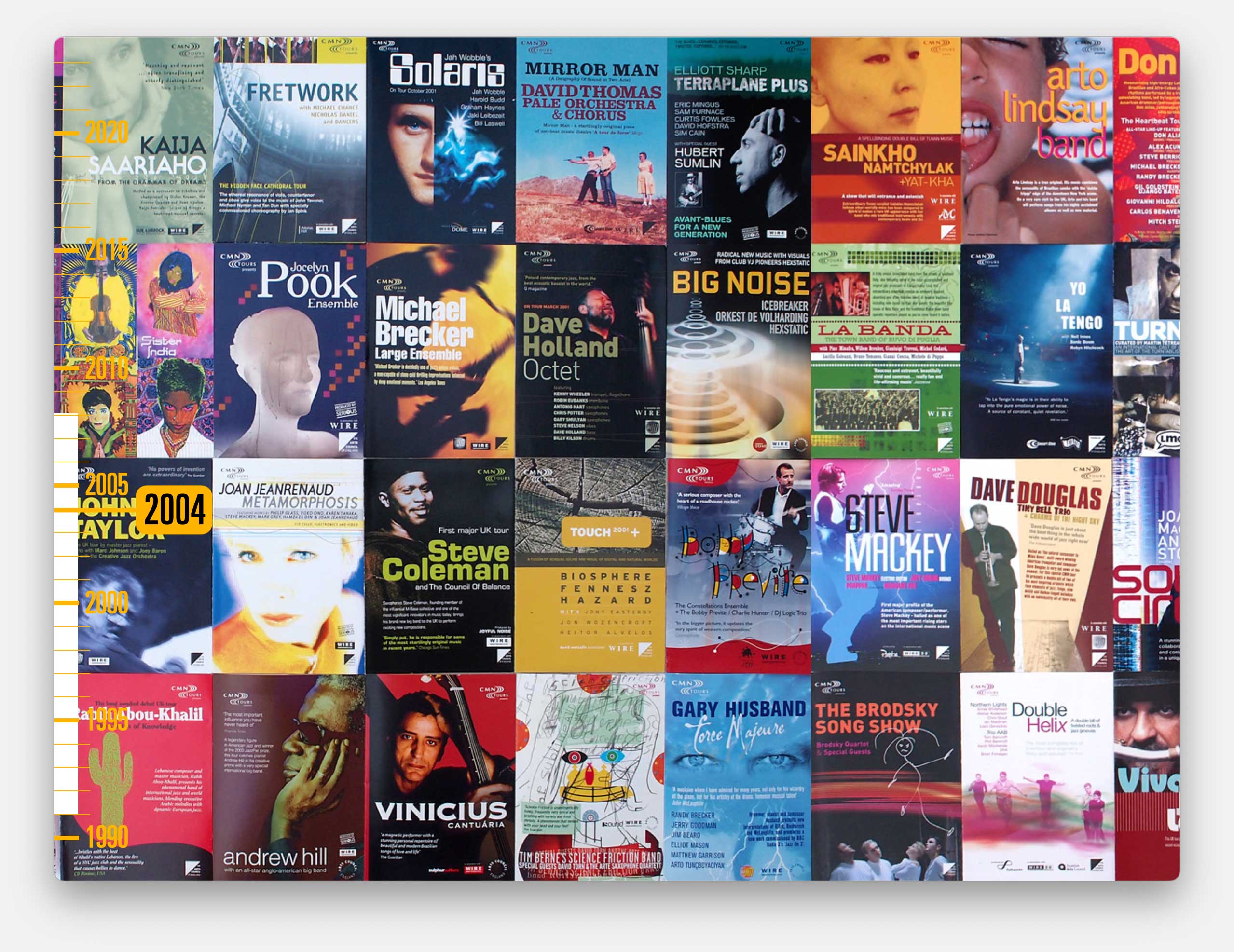
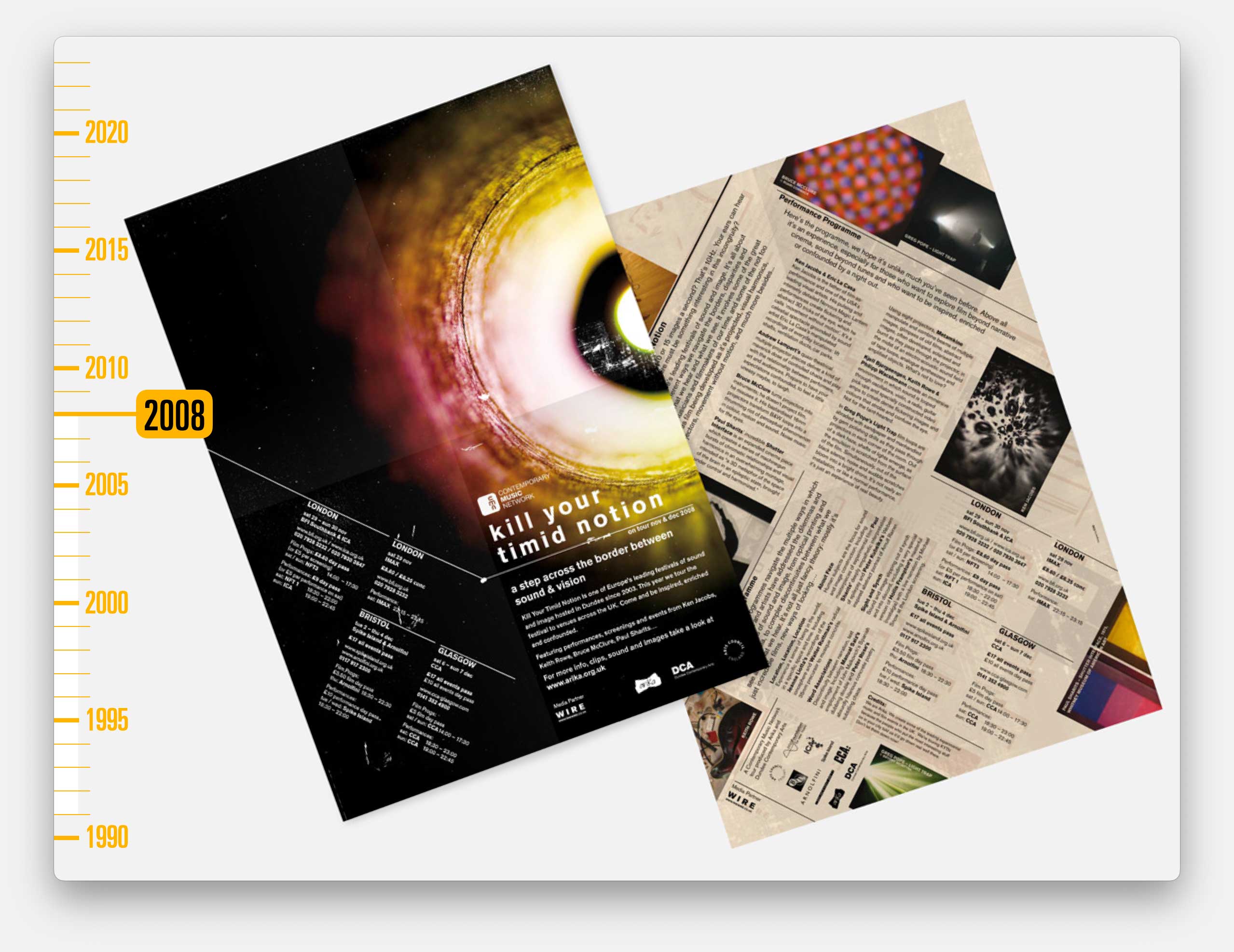
One of the direct introductions he made was to an organisation called the Contemporary Music Network or CMN.
They were part of the Arts Council (the body that distributes a lot of the Government’s spending on the arts in England). CMN produced UK tours by incredible, often quite experimental music from around the world.
This was the first job I did for them.

Again, all done by hand. Actually I can remember those concentric circles taking me bloody hours to draw.
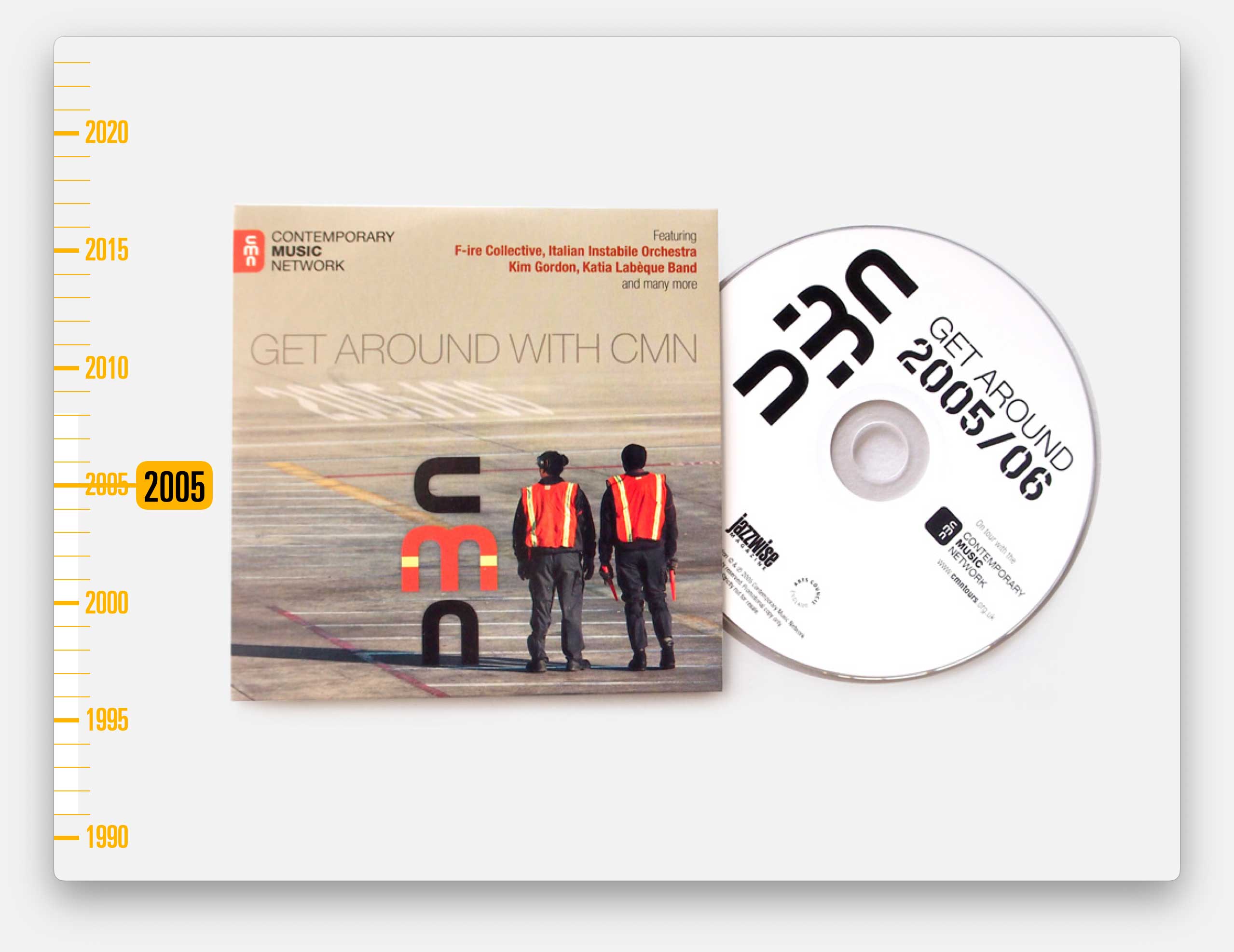
The very lovely people at CMN (all women) were impressed by the work and quite quickly we became their main design partners and crucially, print buyers for the next 17 years.
We worked on around a dozen tours a year. Each tour went to multiple venues and we managed all of the logistics of liaising with the venues, often overprinting specific event details for each one, arranging print and delivery throughout the UK.
Through our 200+ tours with them, we can trace the evolution in design and printing through the decades…
In the 90s we had the budget to print in just two colours so we became experts in understanding how to make the most impact from a limited palette.
And our in-house colour printer was pretty crap so our designs were dictated by what we could mock-up by hand, using Pantone paper and gouache paint.
Occasionally we’d get to use an image but our scanner wasn’t brilliant so we’d usually have to treat the image in some way to produce a more graphic feel.
In the late 90s, printing got more expensive so we had to stop overprinting each venue’s details and instead had to include all of the tour details on every leaflet and poster.
And still we were pushing to get the most out of a two colour palette.
But then we did have a better printer so we could propose designs with much more playful type.
By the turn of the century, commercial printing had automated and by then it was cheaper (and more expected by artists and their producers) to print in full colour.
So for a few years we worked on A6 full colour, folded cards for each tour.
As each of three successive CMN Directors arrived, they’d want to make their mark. So we got to redesign their logo and adapt the visual style.
This director also found budget for a swanky invite and a new season launch party at Tate Modern.
And we produced giveaway CDs to promote each season.
By now, full colour printing was so ubiquitous that it was considered boring. So we reverted to more interesting approaches.
For instance, this was the programme for a tour by Clogs and the Books which could be folded into a frog.
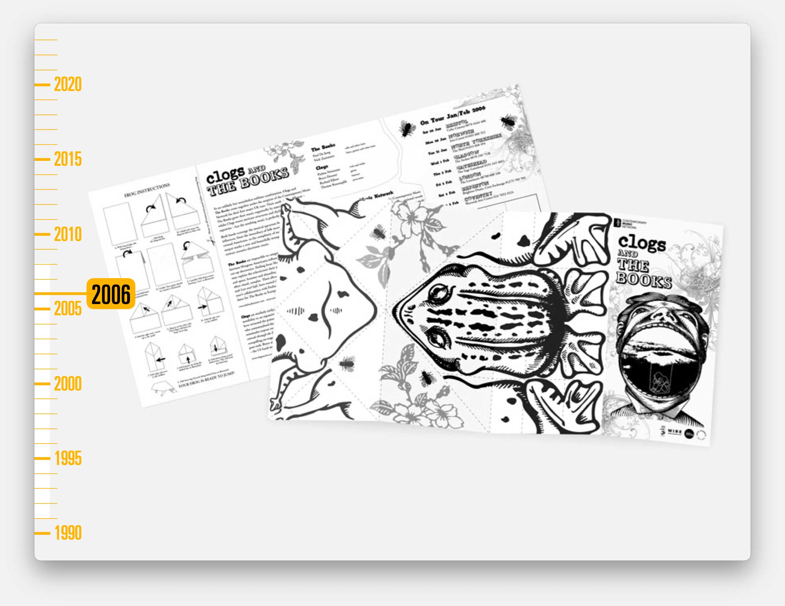
For reasons I never truly understood.
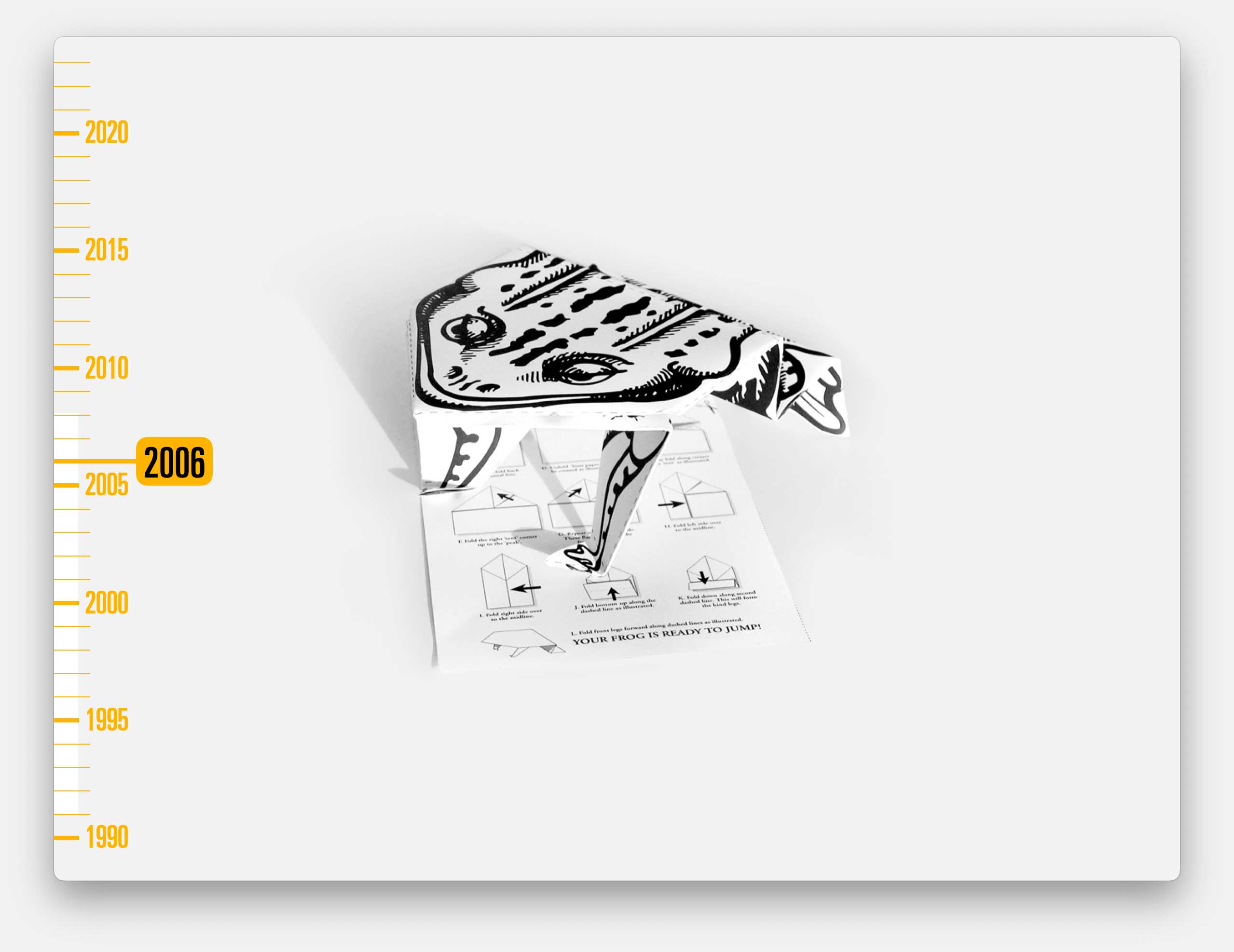
And we were back to having more fun with typography. And with illustration. And we played with interesting textured card. And format.
And by now we were also producing eflyers and microsites for every tour.
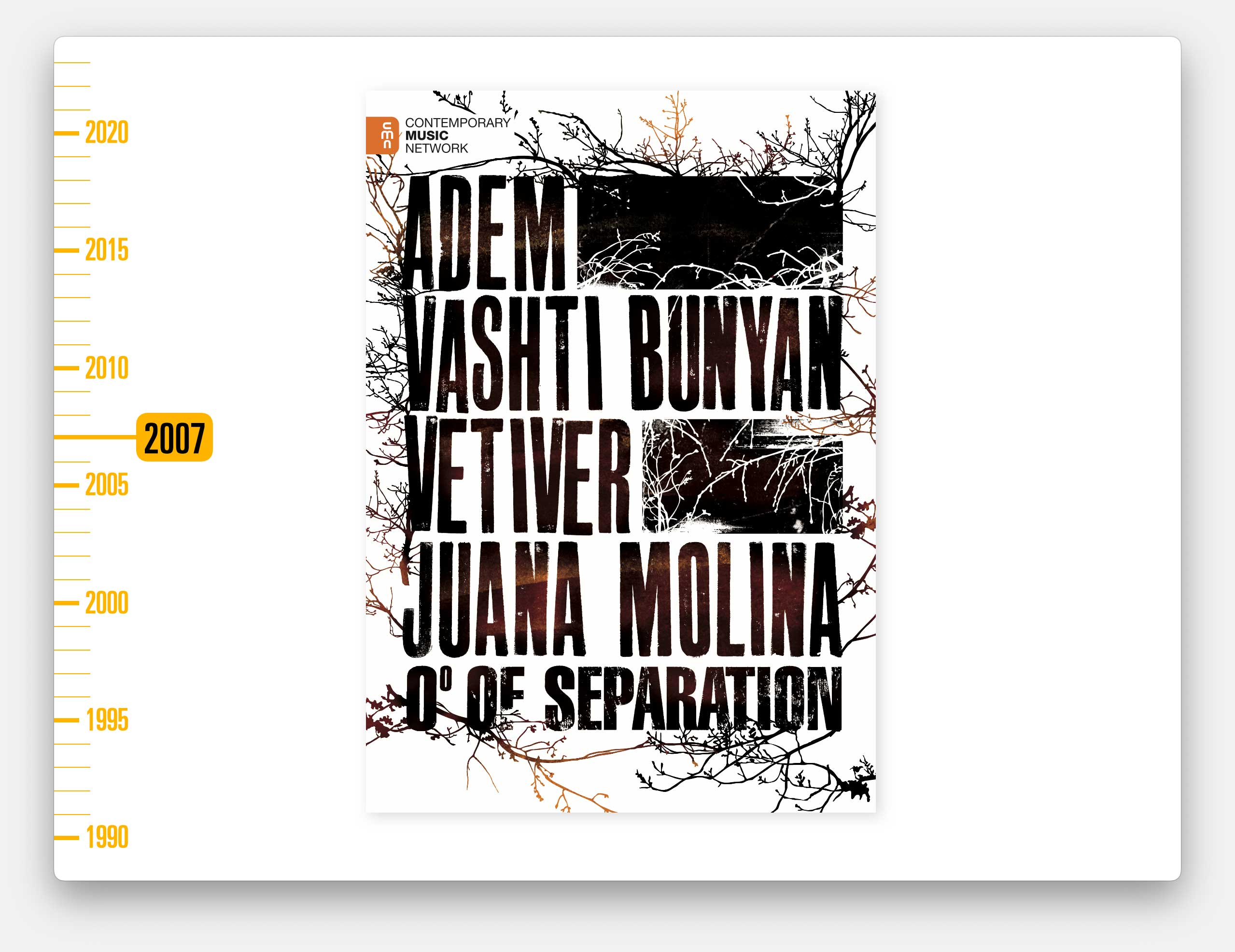
This was one of our final leaflets for CMN (an A3 poster that folded to an A5 leaflet).
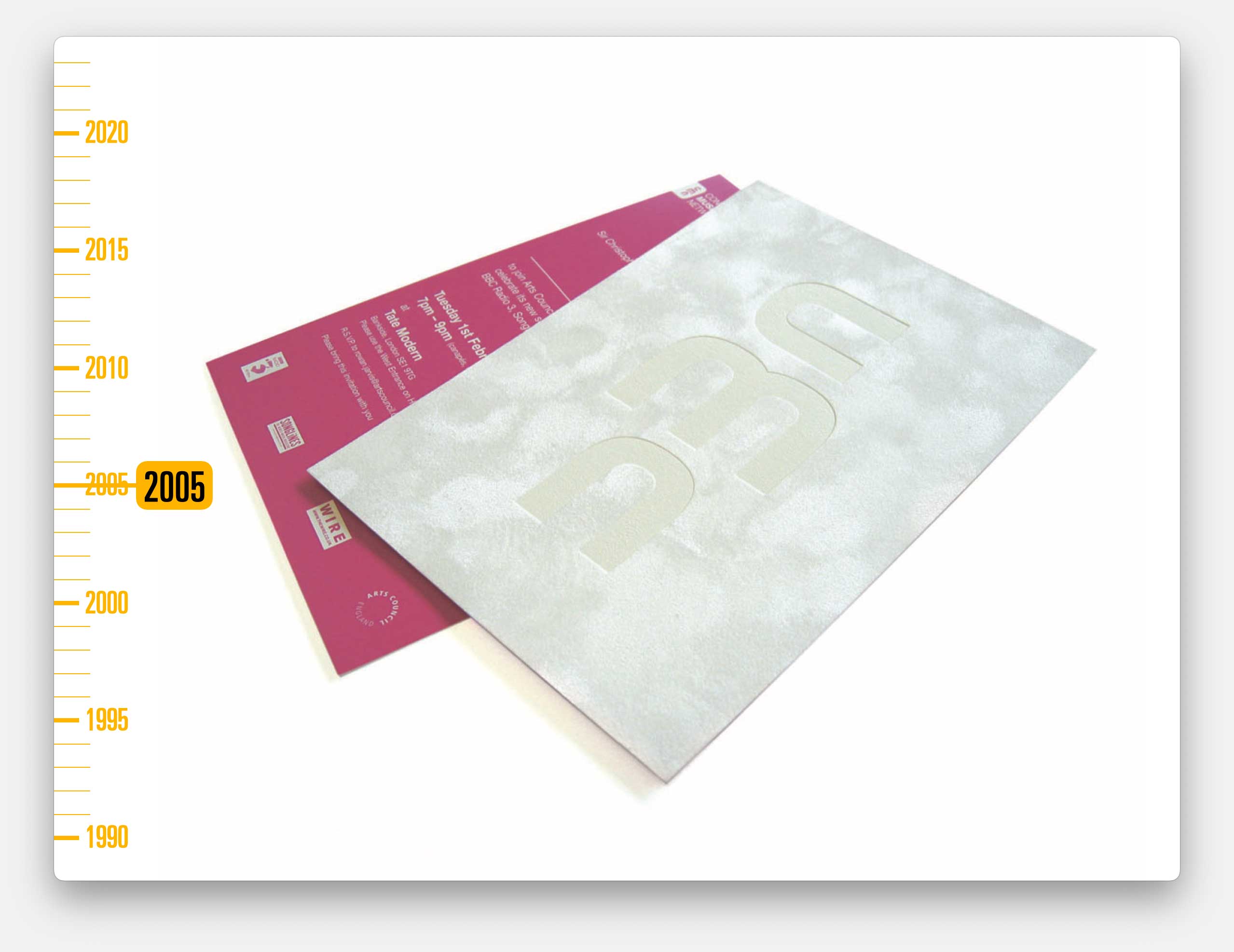
CMN was wound-down and was subsumed into a new charity called Sound & Music, and their design work was, at least initially, done by my hero Neville Brody’s studio.
A second great connection through Serious Speakout was the Barbican.
Until the mid 90s, the Barbican had been a rather stuffy classical music venue, plus the home of the Royal Shakespeare Company. But by the mid-nineties they were changing and expanding their music offering, including a lot of jazz and world music.
Serious Speakout were the partners who helped them programme their annual Barbican Jazz series and so they recommended that we produce the publicity material, which we did for many years.
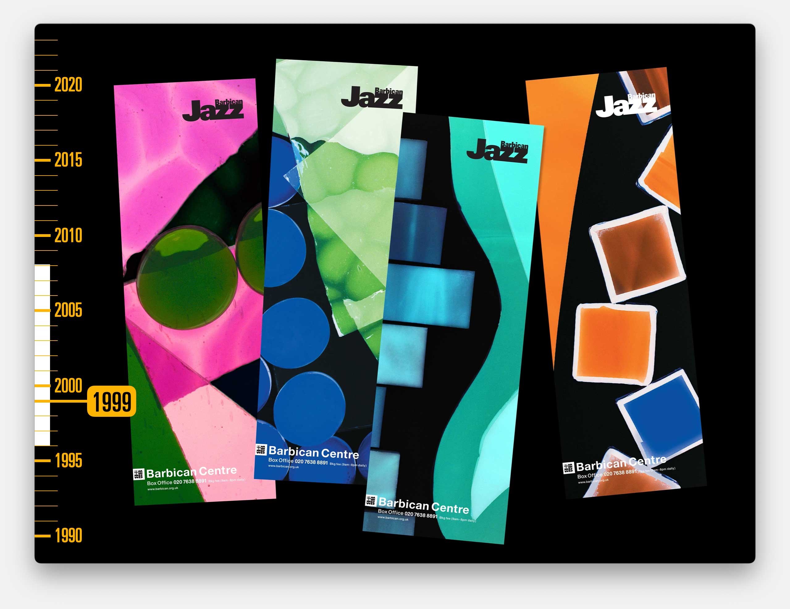
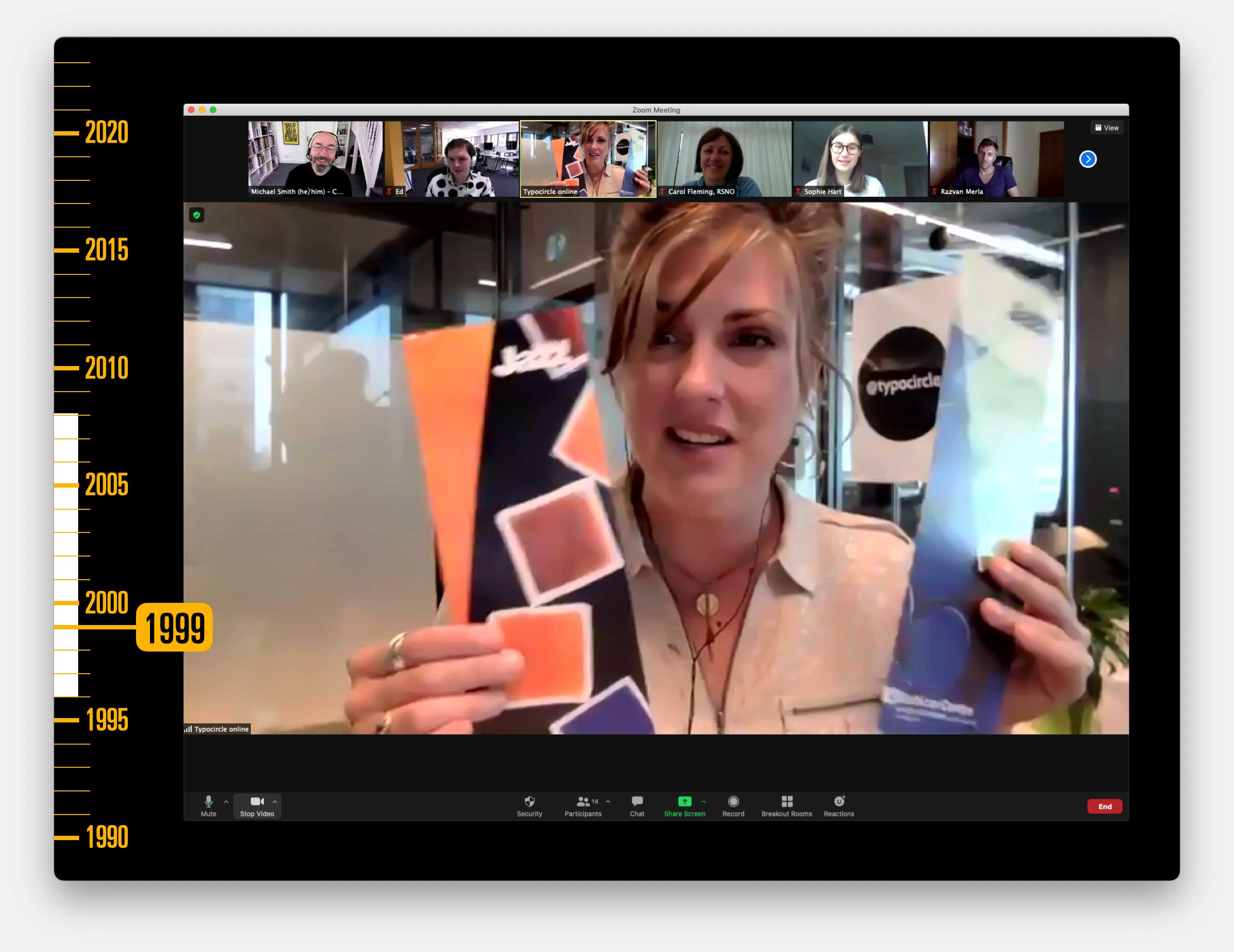
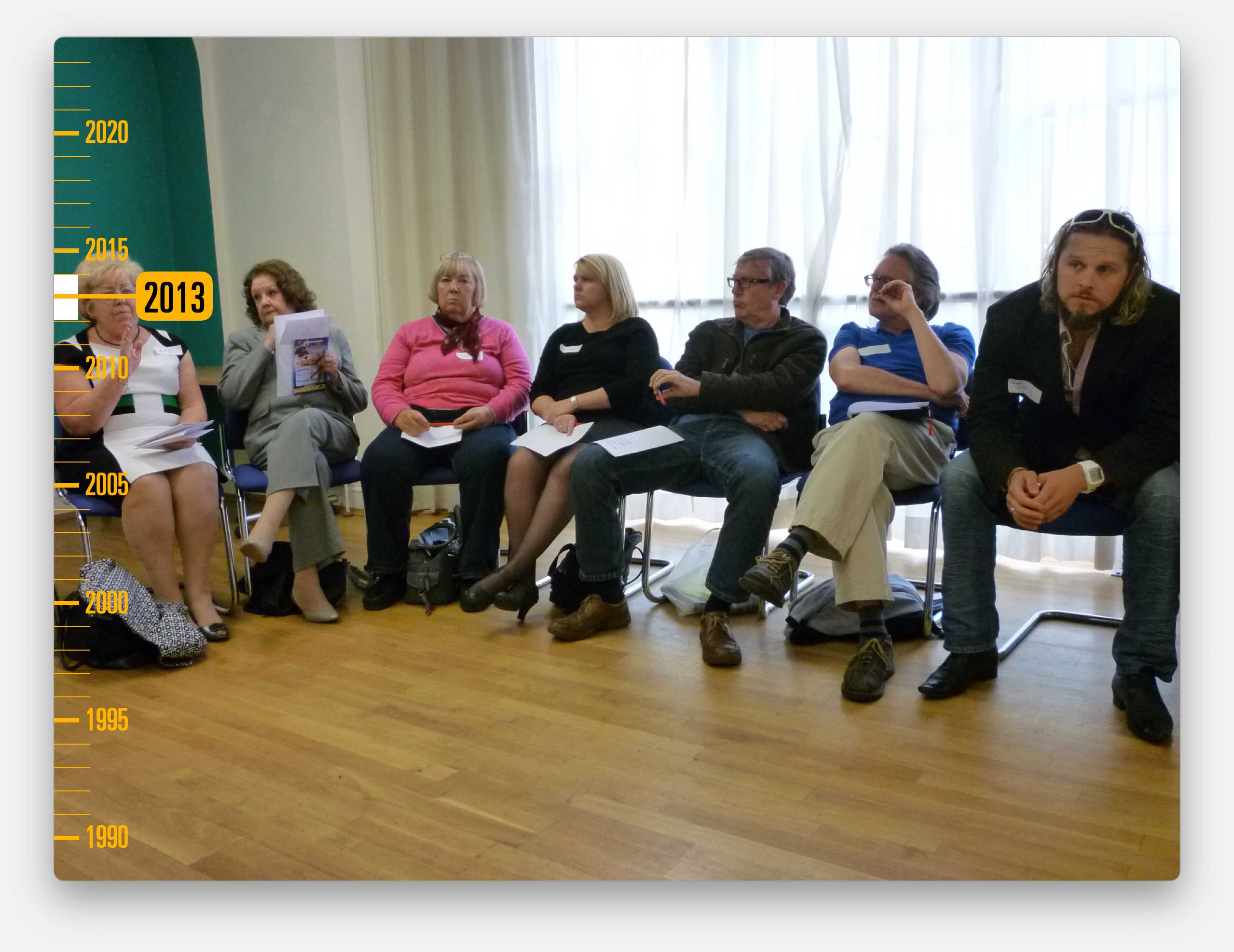
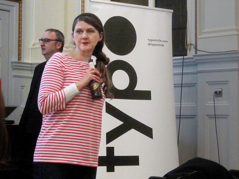
I’ve specifically included these because Typo Circle’s Chairwoman, Louise Sloper worked on them when she was an intern at Cog in 1999.
And here she is talking to the Cog team about that, 22 years later.
In 1998 our relationship with the Barbican changed.
That was the year that I started a marketing company called The Cogency, with the then head of marketing from Serious – Cathy Gallagher, and the marketing manager from Greenwich and Docklands Festival, Janice White. And one of our first clients was the Barbican.
Well, actually, our first client was Ronnie Scott’s jazz club.
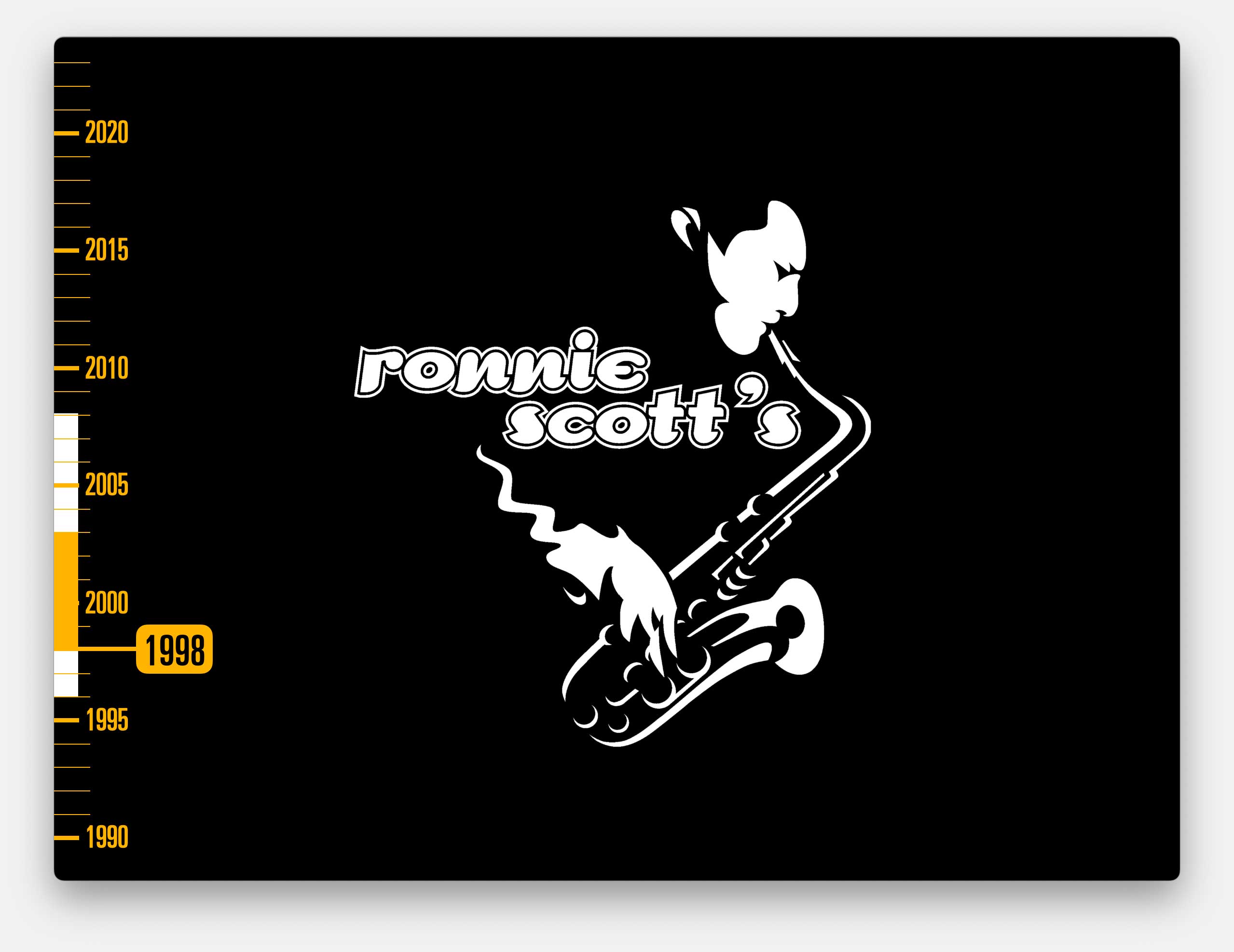
We worked on Ronnie Scott’s 40th anniversary celebrations and Cog got to redesign their logo, which was a thrill for me, but I thought you might have had enough jazz for now so back to the Barbican…
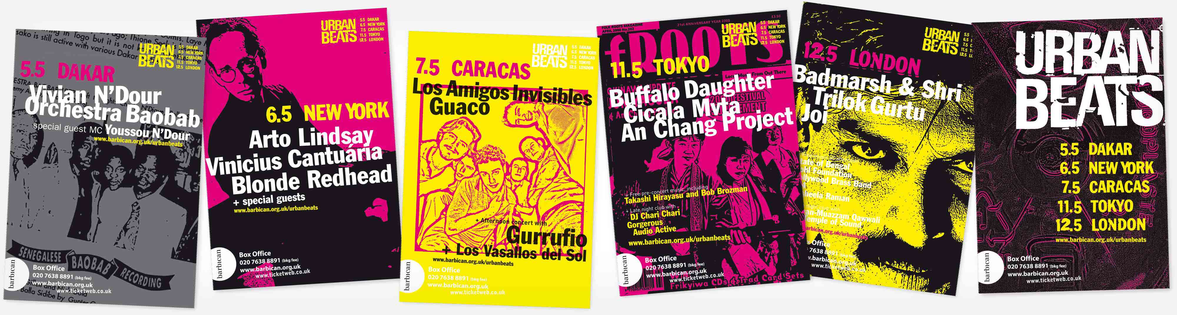
With The Cogency, Cog worked on a series of festivals of music, focused on specific genres or cultures from across the globe.
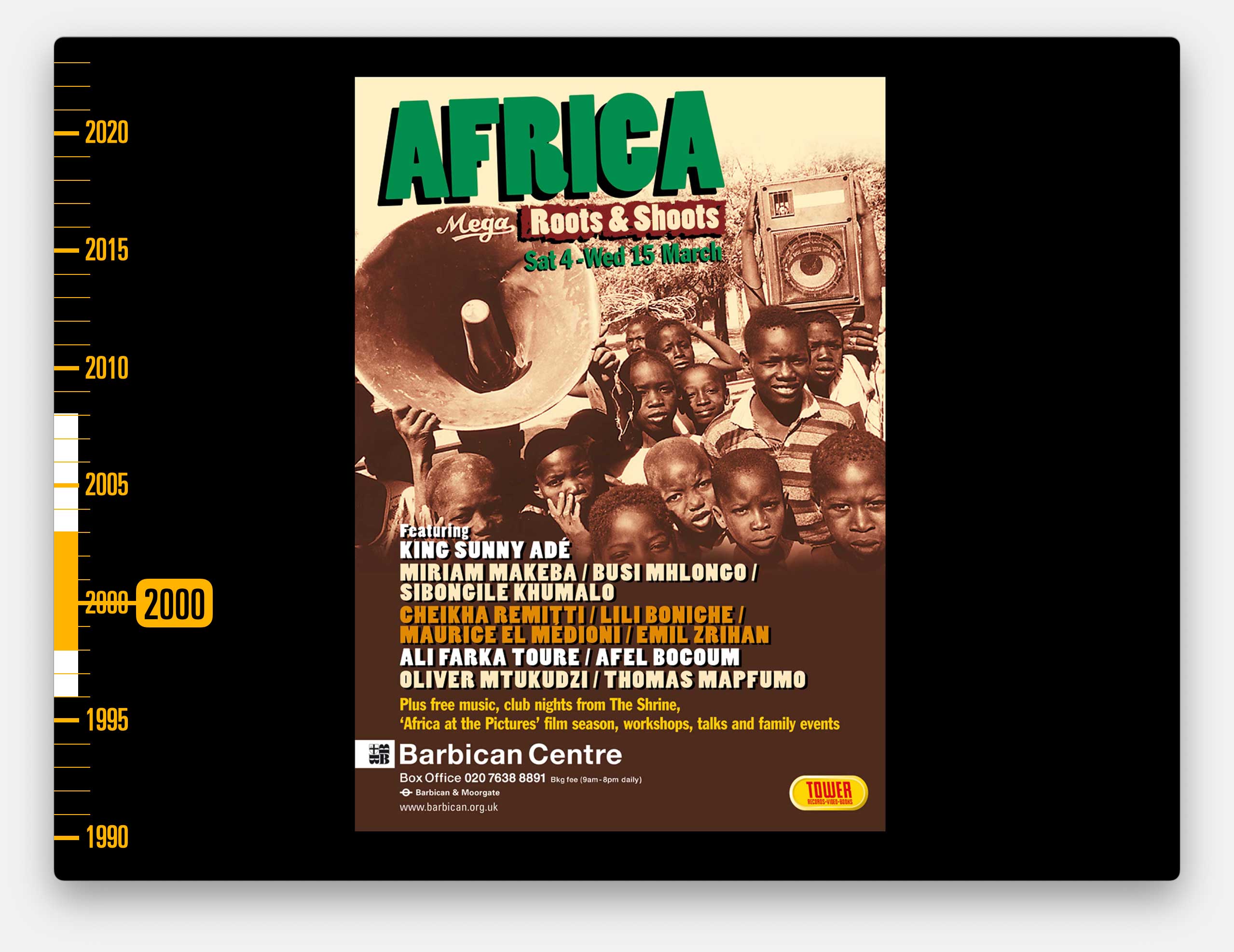
It was an incredible time with many of that country’s, or in this case continent’s, biggest musical acts playing in the UK for the first time.
Soon, The Cogency was doing all of the marketing and ad buying, and even publishing the programmes for these concerts.
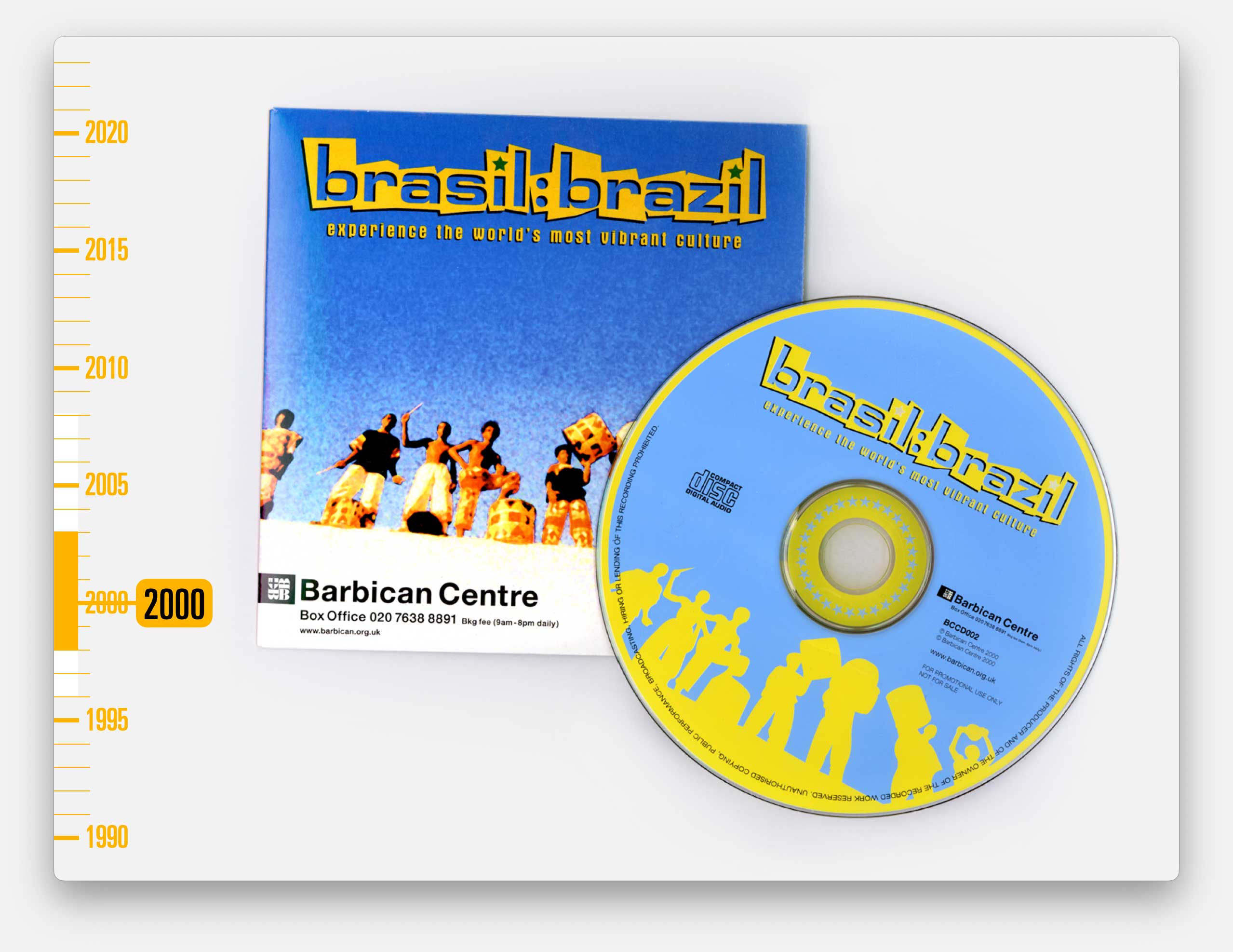
We found ourselves employing an ad sales team and I often used to write the programme notes and even compile the giveaway CDs. And Cog would usually do all of the designs.
It was an intense time.
We’d have to fully immerse ourselves in the culture and work out how to reach audiences from the diaspora of each country.
And I’d have to become an expert in each country’s musical history in order to write the programme notes. I loved it but it was bloody hard work.
Of the dozen or so festivals we worked on, this was my favourite design challenge because this was a festival without much of a theme.
The artists were wildly different in their musical styles and each had a very different type of audience that we needed to appeal to. We had to produce a piece of print that felt cohesive whilst giving each concert its own publicity image.
And of course it was all very last minute with widely varying supplied imagery for each artist. We produced this series of A6 cards, in one concertina–ed fold-out, but perforated so they could be used individually as well.
And, picking up on the urban theme, we used a hand-crafted aesthetic, using deliberately degraded Letraset type, left over from Cog’s early years.
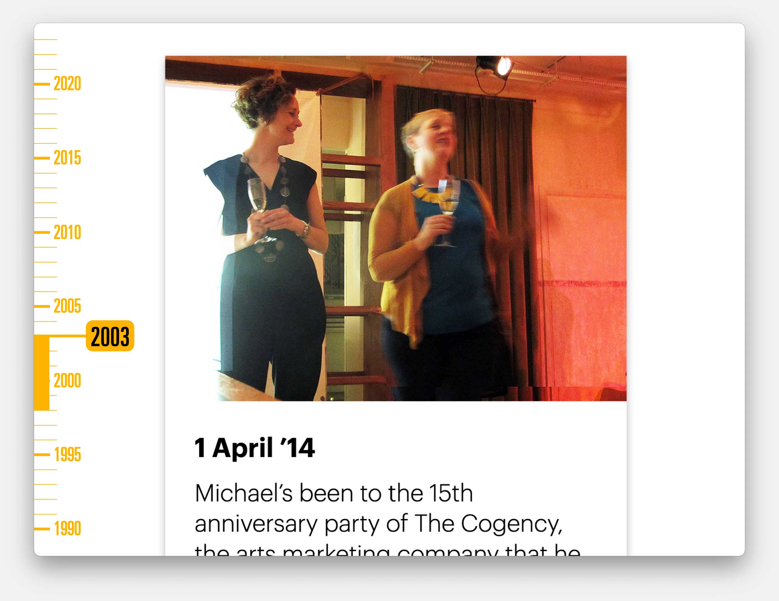
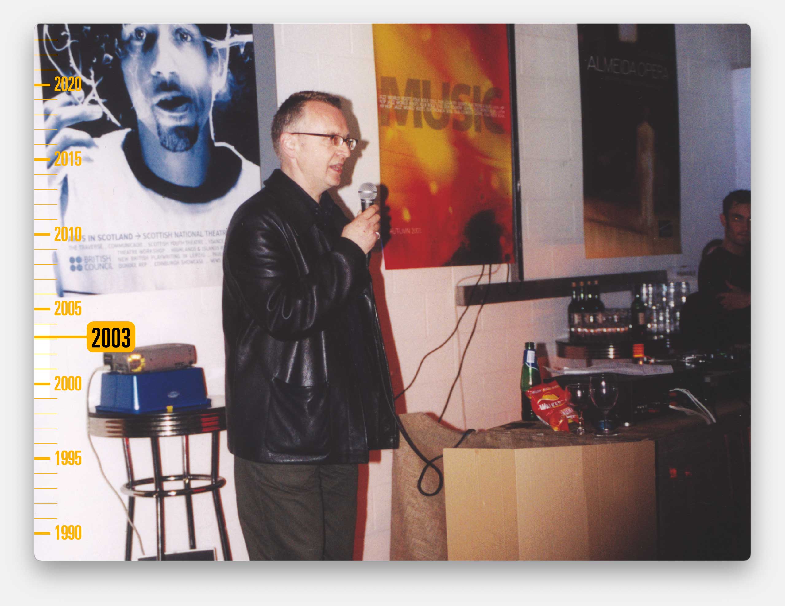
I had a great time with The Cogency but it was intense and I also wanted to focus on other things. So I resigned as a Director in 2003, and the company grew ever more successful after I left, with Cathy and Janice running it.
Here they are celebrating their 15th anniversary.
They won a D&AD Pencil (and many other plaudits) for their work on the incredible We’re Here Because We’re Here project in 2016.
If you’re not aware of it, please look it up it was an amazing piece of UK-wide situationist public art, from the artist Jeremy Deller, and the National Theatre’s Director Rufus Norris.
One of those other things I wanted to focus on was the digital side of Cog’s work. We’d taken on quite few digital projects and things called websites – although they were no more than single pages with click- throughs to other single pages.
But, by the turn of the century, I could see that websites were becoming more than gimmicks and more complex than our designers could knock-up themselves. And they were starting to be a channel where you could buy tickets, not just convey information.
I was also aware that, within arts organisations, the design and publicity budget sat with the marketing team, but the newly considered, tiny website budget sat with the box office and sales team.
The marketing team wanted to work with slightly aloof, cool designers.
The box office team wanted super-friendly partners who would take on the technical stuff that they didn’t understand.
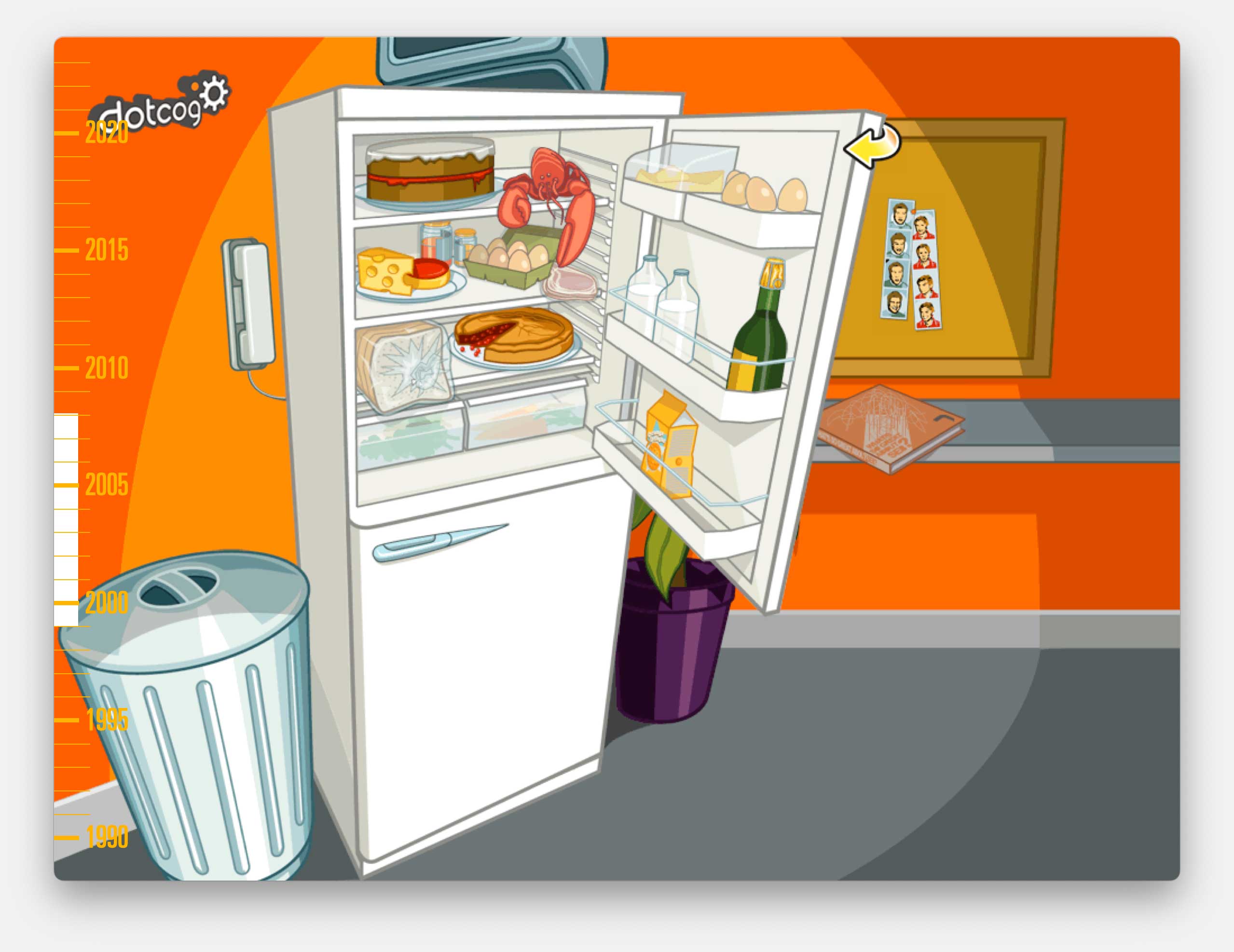
So I set up a separate company, Dotcog.
Dotcog’s brand was all about removing the technical and emphasising the fun.
This was our website. You could click on the objects in the fridge, which would animate and lead you to different sections of the site.
And, as part of our super-friendly offering, we developed our own content management system to allow our clients to manage their websites with no need for any knowledge of code or having to install software on their computers.
Of course that feels obvious now, but at the time it felt revolutionary.
This was probably the biggest single investment I’ve ever made. It cost more than my first house. And, by the time it was finally ready…
…it was already out of date.
Several newly launched commercial products had much better functionality, at a fraction of the price we would have had to charge.
I had to write the whole thing off to experience.
But the Dotcog experiment was still worthwhile. We now had a digital understanding which proved hugely useful and meant we were able to provide a much broader range of services.
A good example being our work with Dance Umbrella, which is an annual festival of the world’s best contemporary dance, across London.
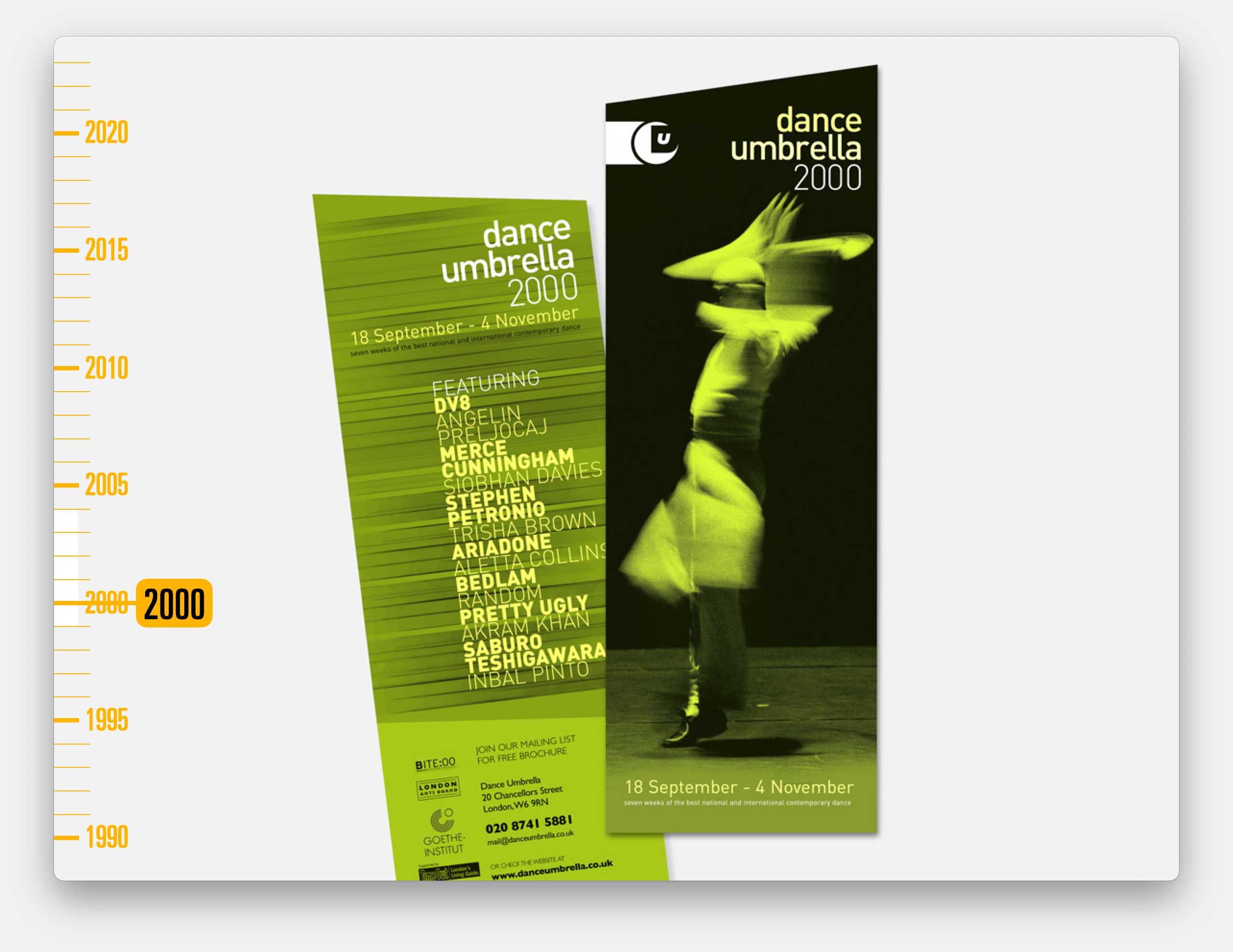
Cog would work on their campaign design, whilst Dotcog would design and develop their website
Although compared to the websites we work on today, these were very basic.
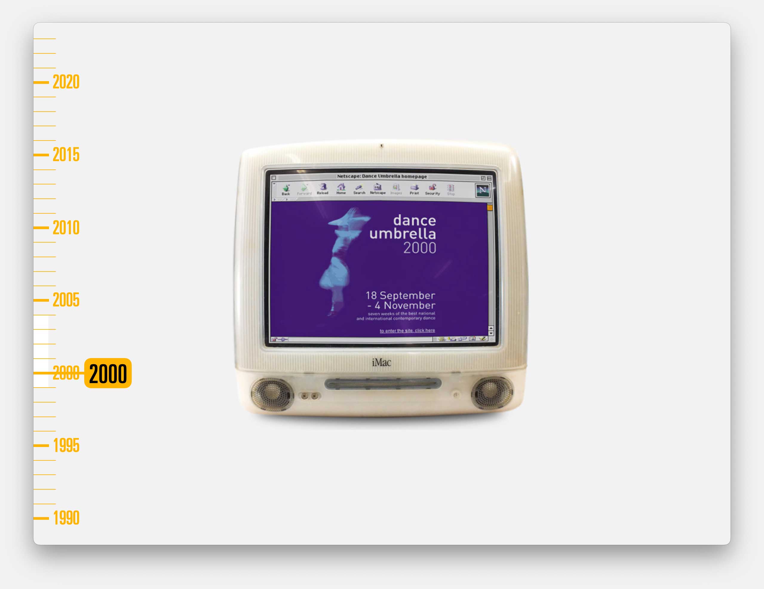
And Cog continued to work on lots of printed materials, brochures, leaflets, posters, programmes, press ads, wayfinding and anything else they needed.
2003 was probably our busiest time.
Cog, The Cogency and Dotcog were all generating work for each other. We employed close to 20 people across the three companies.
We had a big exhibition as part of the London Design Festival, in the arches in Deptford.
This is John Kieffer, then Director of Performing Arts & Head of Music at British Council, opening that exhibition and describing us as the Cog mafia because we seemed to control so many areas of work.
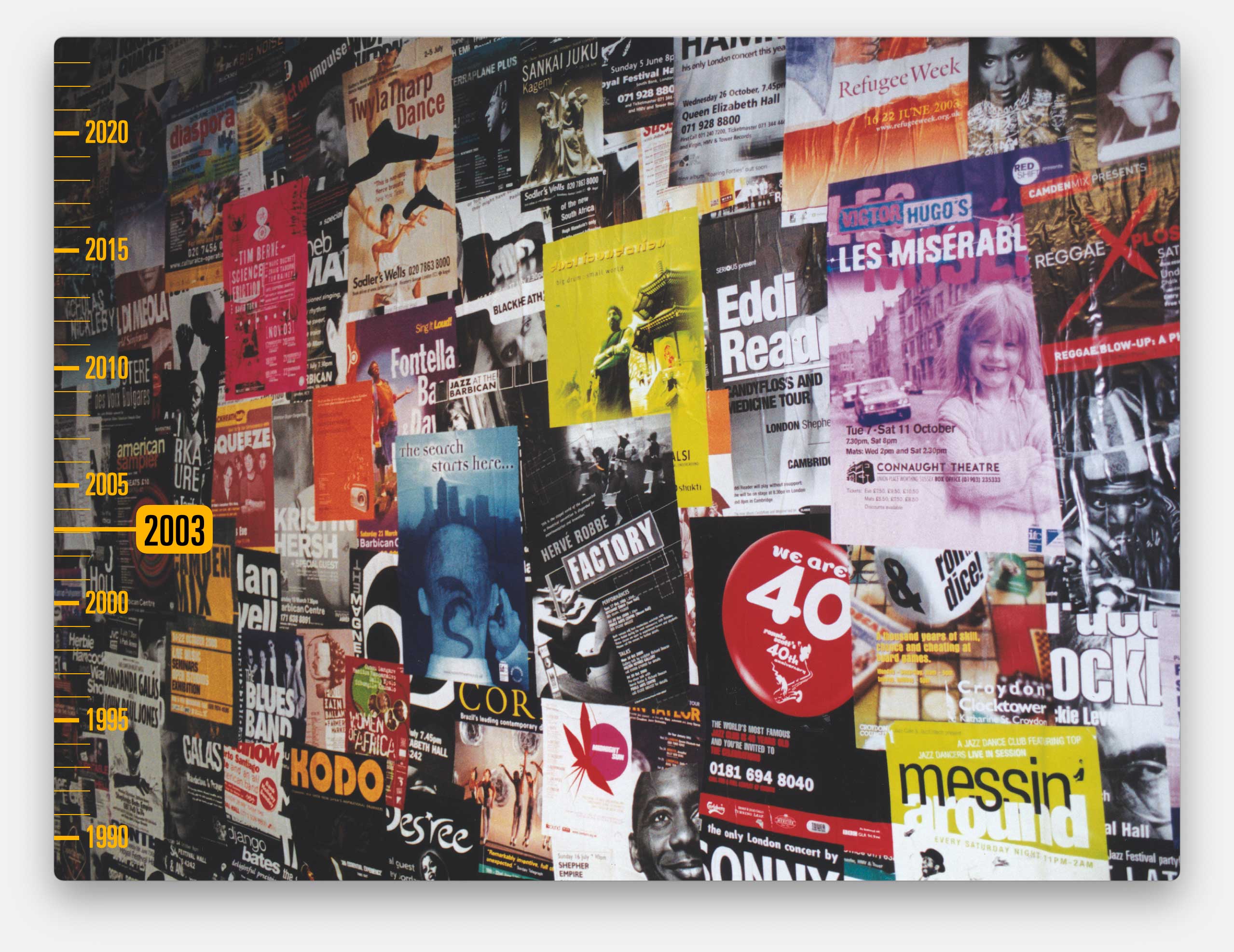
And this is just one wall of that exhibition, flyposted, floor to ceiling, with hundreds of posters, drawn from our recent archives.
The following year, riding on that success and having searched for a long time for a new studio, we bought a property on a business park, in Greenwich.
I had to set up yet another company – Cogalot, to borrow the money and manage the VAT. So now I was a landlord – which still sits very uncomfortably with my socialist tendancies.
It was only half a mile from our previous studio but a world apart. Back then, asking clients to visit you in Greenwich got a much more positive response than inviting them to Deptford.
For a while my focus had to shift to being a property developer, as we converted a warehouse space into a design studio, complete with all the things you’d expect and a couple you might not.
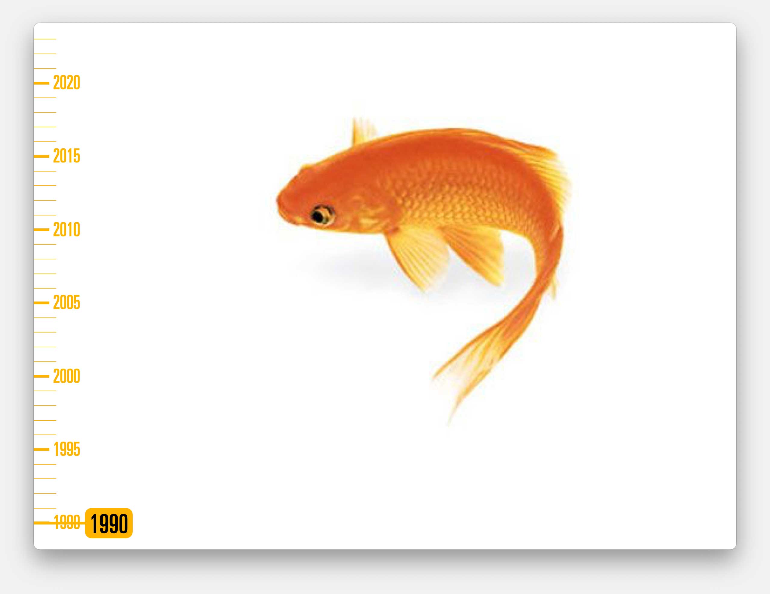
Like our indoor garden and fish pond with goldfish.
Maybe I’m trying to subconsciously recreate that Addison logo
By now Cog’s fast-paced production-based work was beginning to shift towards campaign designs. I suppose we were being paid more for our thinking as much as our doing.
In 2005 we were approached by a newly formed company called Artichoke. They told us they were putting on the biggest free outdoor performance there had ever been in the UK. We took that with a pinch of salt, we’d heard it all before.
They described it as a giant time-travelling elephant who would parade through London.
They told us it would be unforgettable, but the French company behind the show wouldn’t allow them to release any images in advance so we’d have to allude to how spectacular it would be.
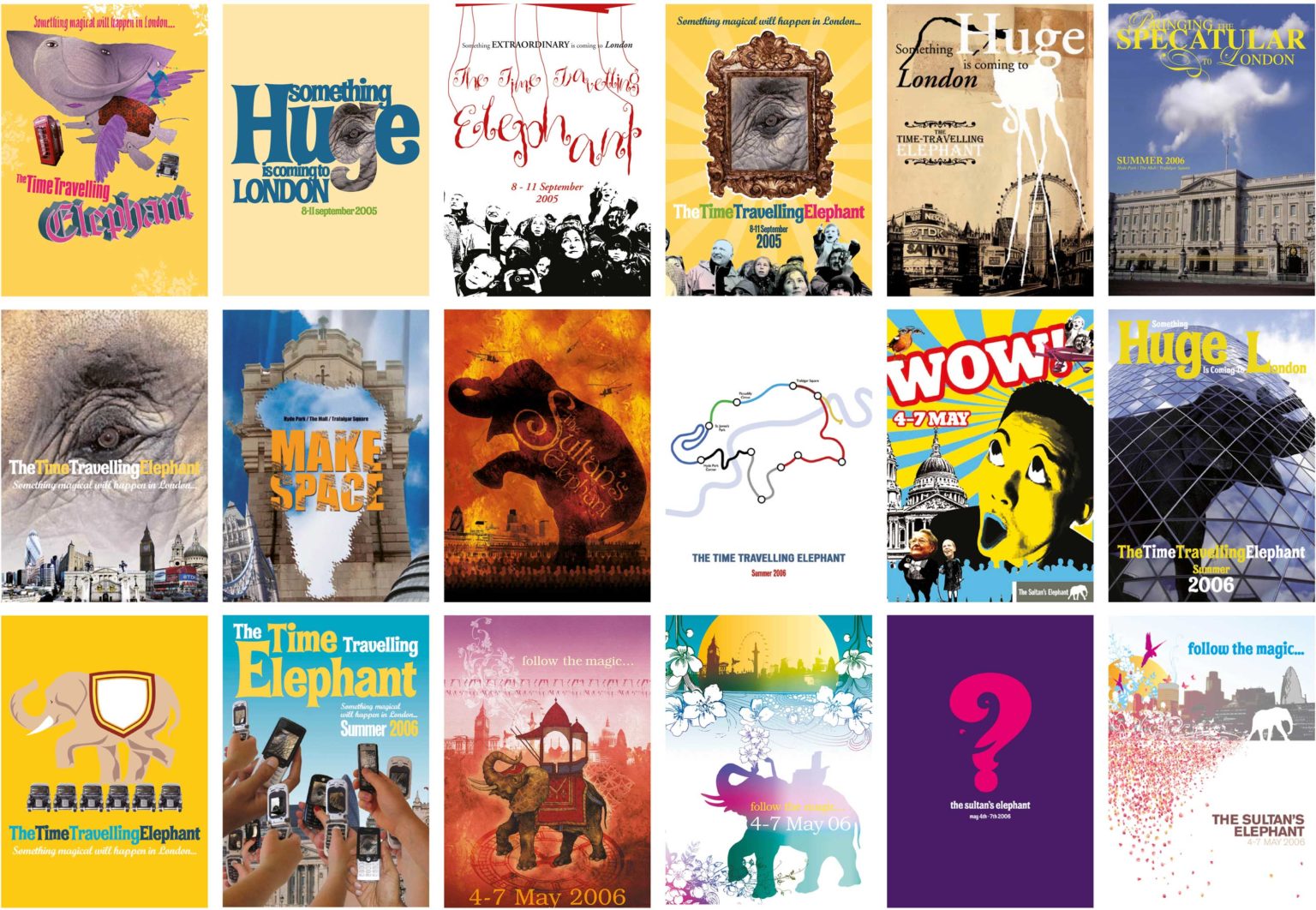
It was a tricky brief with high stakes. We worked through a lot of visuals.
Eventually we did agree a design. But the police wouldn’t allow us to reveal the route and we weren’t allowed to publicise the dates until the last minute. We couldn’t see how this could possibly be a success. But Artichoke were brilliant. They had a plan.
They arranged an industry briefing party for all of the key movers and shakers, months in advance, and told them to hold the date.
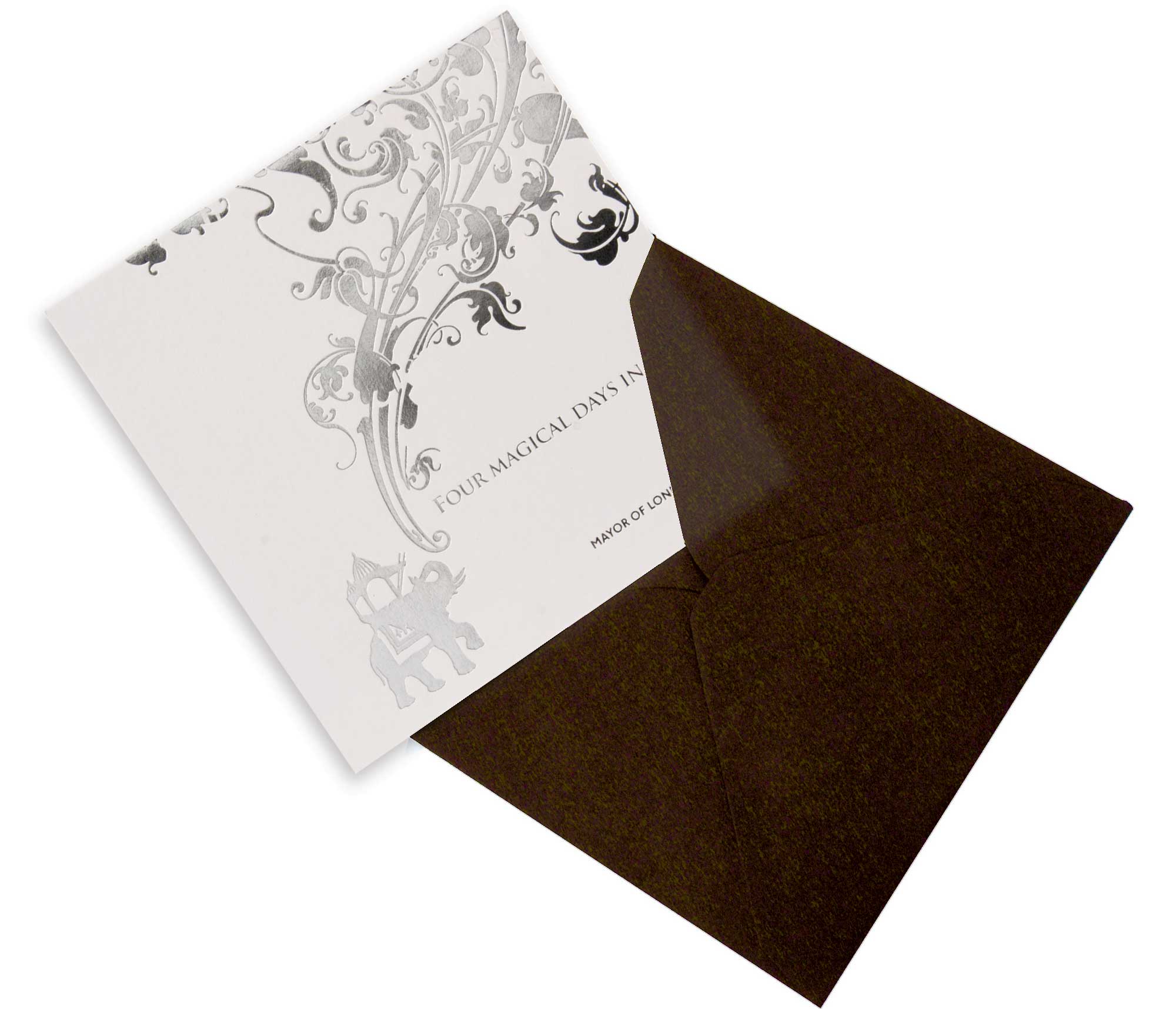
We produced this silver foiled invite and hold the date card. I still see these proudly on display in the offices of arts leaders because it was such a significant event.
A fortnight before the event we were allowed to release the dates and we did a tiny amount of awareness raising advertising.
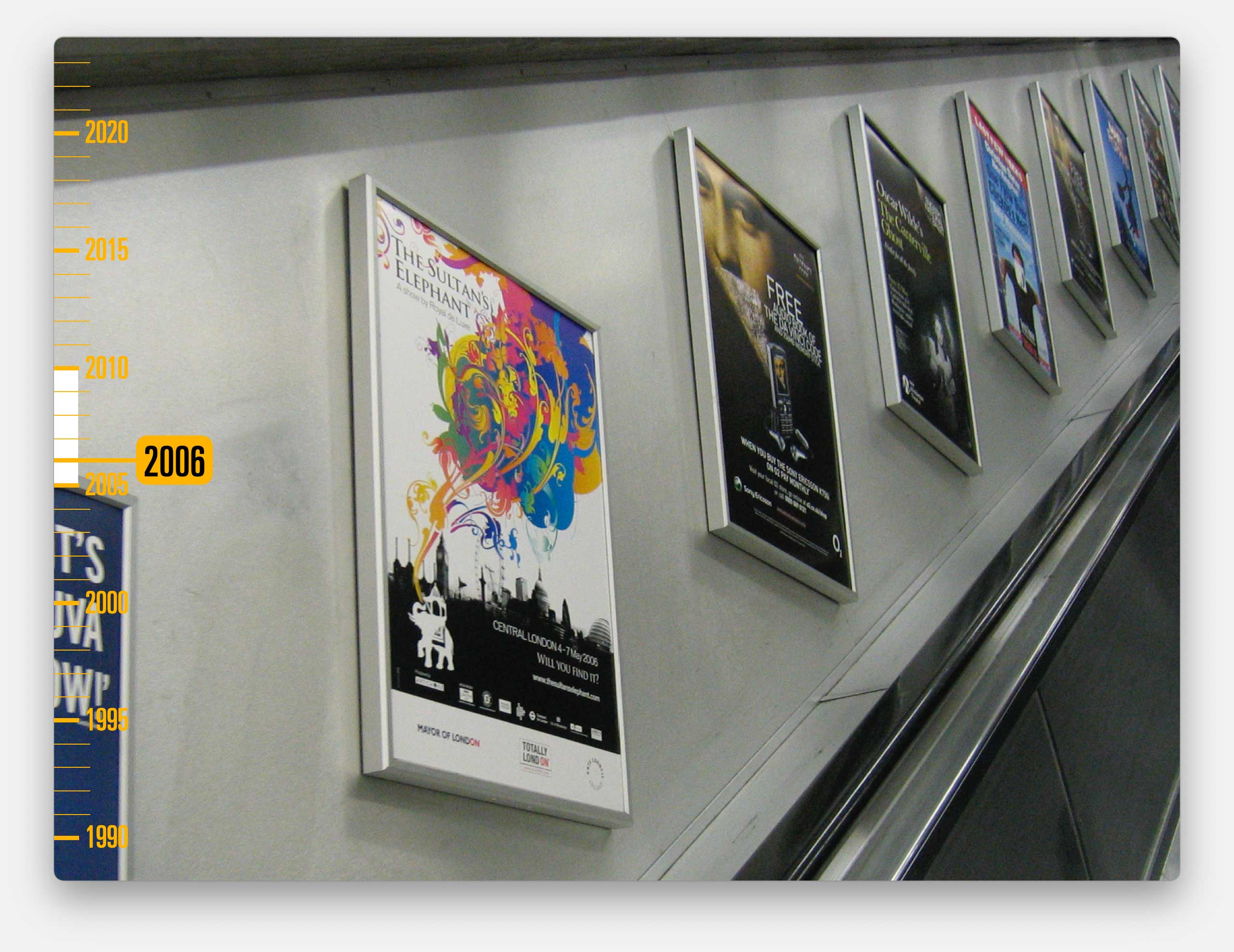
We found it funny because, in surveys after the event, almost everyone said they’d seen this poster. But in truth we only printed a couple of hundred and it only appeared on a couple of escalators.
We were allowed to launch a website in the week before, with images of other mechanical animals. But nothing prepared us for the event.
The elephant was the size of Marble Arch. It was controlled by shifts of puppeteers, drilled like soldiers, dressed in velvet suits like they’d stepped out of a Jules Verne novel.
The elephant met a ‘little girl’ astronaut who had arrived via a crash-landed rocket-ship, and they travelled all round the city together.
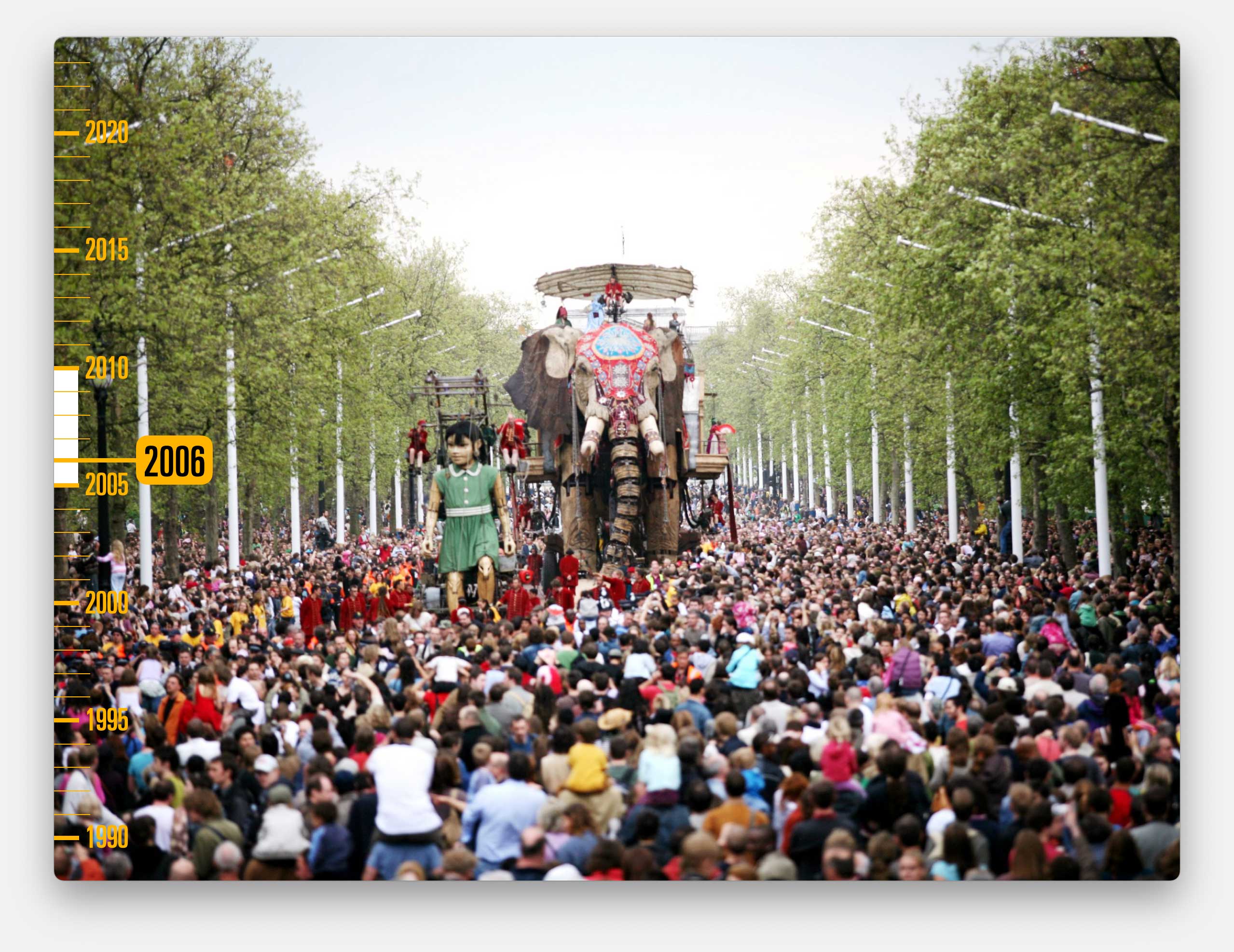
Hundreds of thousands of people came.
They closed the Mall and Trafalgar Square for three days.
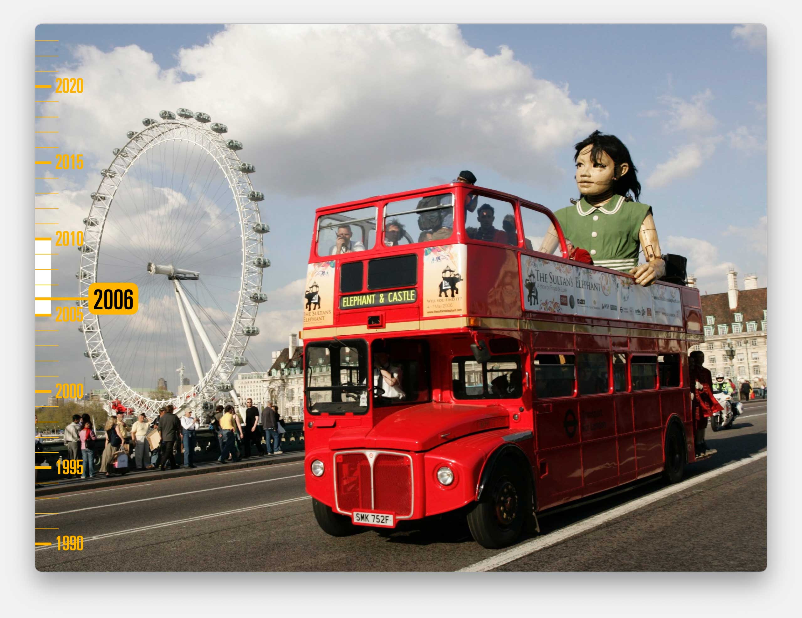
And while the elephant was asleep, the little girl went on solo adventures using a bus that we did the graphics for.
And when the little girl got back in her rocket to leave, three days later, and said goodbye to the elephant, the whole crowd were in tears, including me.
We went on to work on lots of spectacular projects with Artichoke, but none as huge as that.
If you’ve been paying attention to the timeline (and of course you have been, right?) you’ll have noticed that lots of the relationships ended around 2008 / 2009. The time of the banking crisis and the austerity that followed.
In a financial crash – both marketing and the arts get cut very quickly. Our phone had stopped ringing.
Our once long term clients found cheaper alternatives, brought the work in-house or just stopped producing print at all.
But by now, on the back of our work with Artichoke, Cog was being invited to work on lots of other campaign work. We had ongoing relationships with Museum of London and with the British Library. But it was probably our work with Wellcome Collection that kept us busiest.
As I’m sure you know, the Wellcome Collection is the exhibition space on Euston Road that provides a showcase to the work of the Wellcome Foundation, a global charity that exists to help people benefit from the potential of science to improve health and save lives.
One of my favourites of our campaigns was for The Identity Project. A year-long programme of events, talks and exhibitions on the subject of how we define the self.
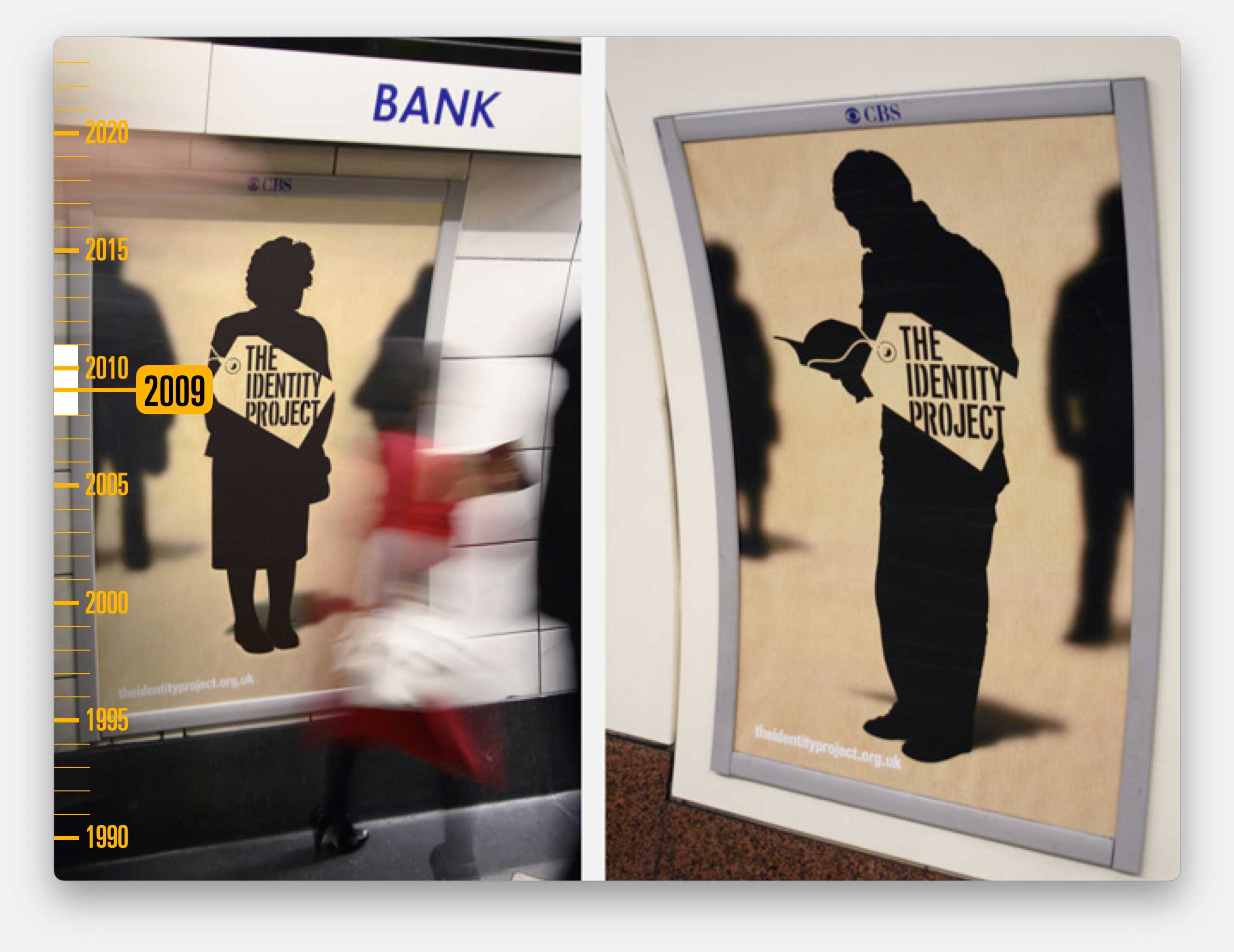
We kicked it off with a teaser campaign across the tube network. Posters had nothing more than a silhouette plus a web address.
And for speed we used ourselves as models. This was my silhouette.
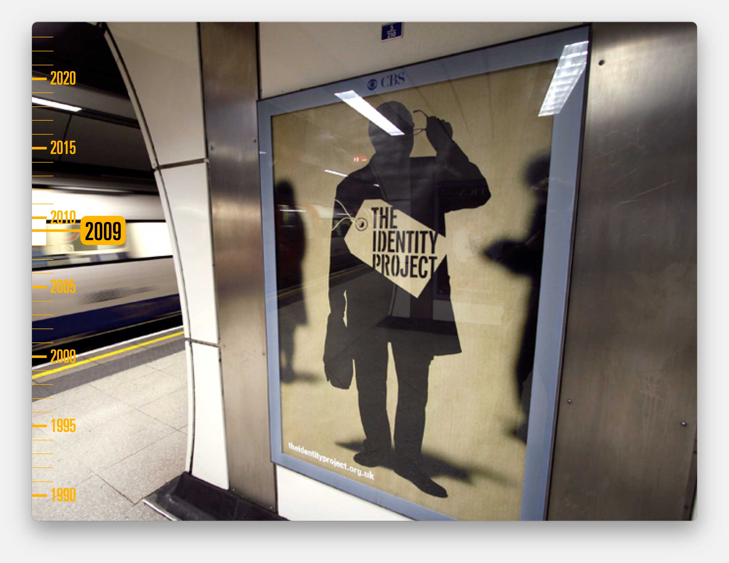
And we got to work with a team of actors, dressed as silhouettes, who staged scenes in London streets and gave out identity tags with the website address on them, generating intrigue and publicity via the newly emerging social media channels. Including a new platform called Twitter that everyone was raving about.
All the publicity pointed to the website we created to collect email sign-ups.
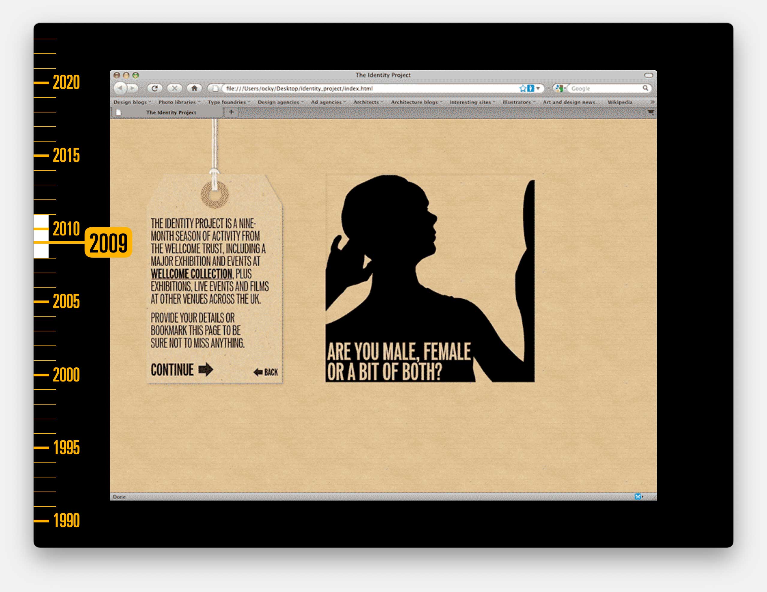
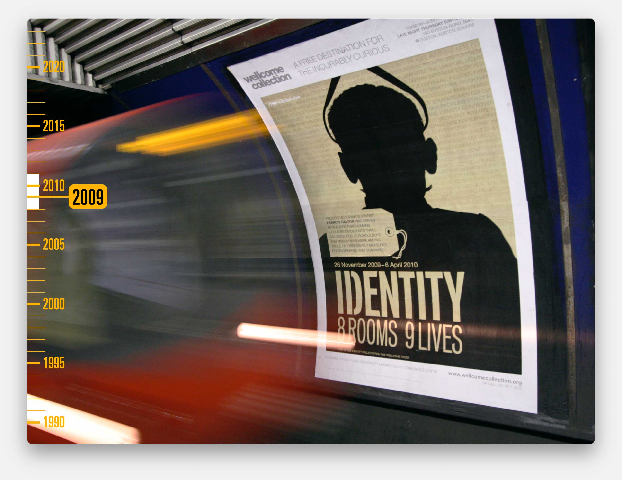
And eventually we revealed the content, directed traffic to the Wellcome Collection website and produced more direct promotions for a five month exhibition, with a series of stories from the main characters of the exhibition.
We were doing lots of fun projects but the lack of regular income caught up with us. We just weren’t generating the money to pay the bills.
We’d gradually wound-up most of our digital work and closed Dotcog through 2009 and 2010.
And Cog had to go through the awful process of redundancies, which was just terrible for everyone. Within a couple of years we went from a team of 15 down to just four.
But, through incredible fortune, 2010 was also the year of our first proper branding project.
We won the tender to create a new brand for a new build theatre, replacing the old Marlowe Theatre in Canterbury.
When we first got involved it was a building site with a Council-run design team and a management team who couldn’t work out why they should spend money with a London agency.
They told us later that they’d chosen us because our credentials pitch was ‘charmingly unprofessional’.
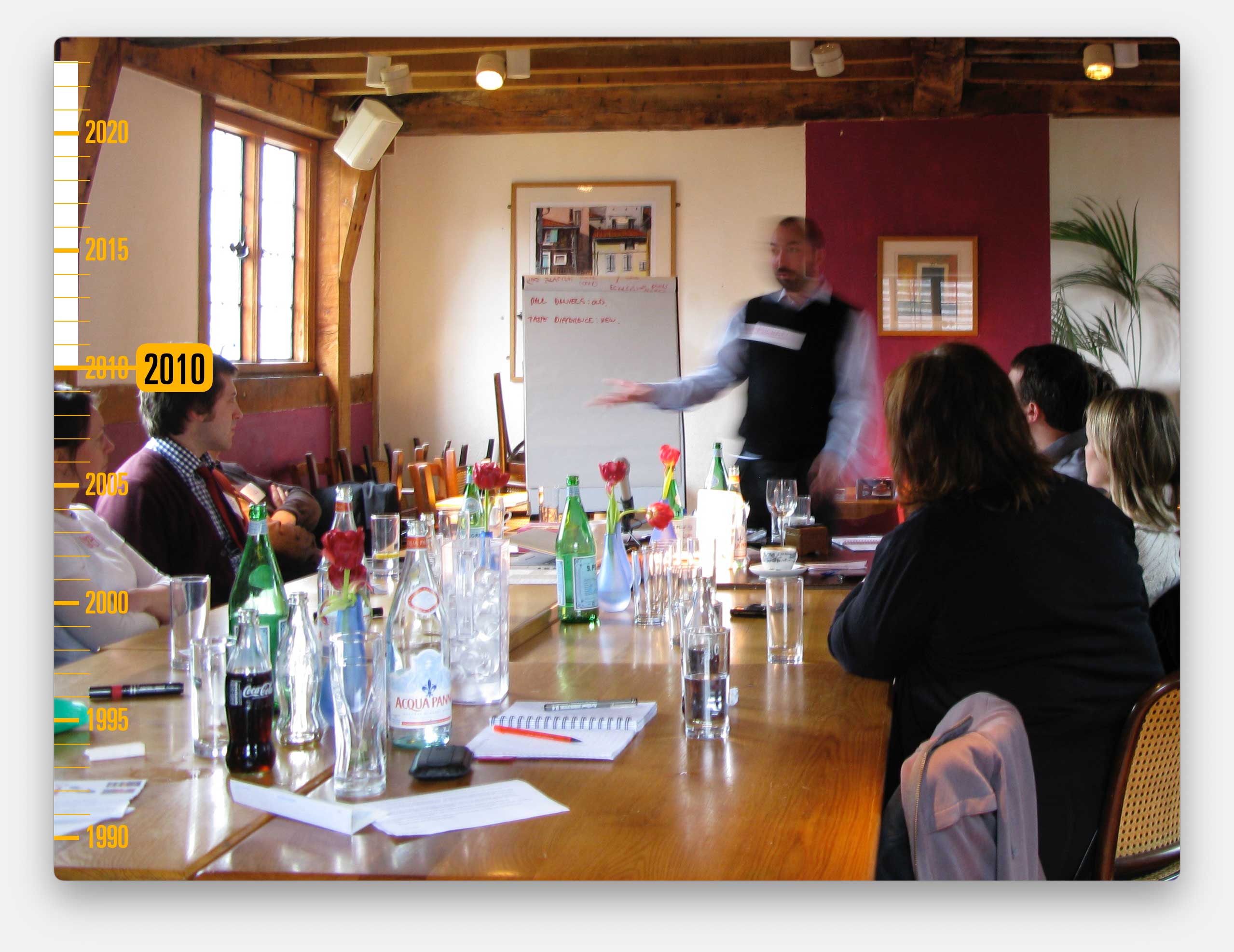
I embraced the opportunity.
We properly immersed ourselves in the project and devised a process of audience-focused Discovery workshops. We still use many of those techniques today.
![]()
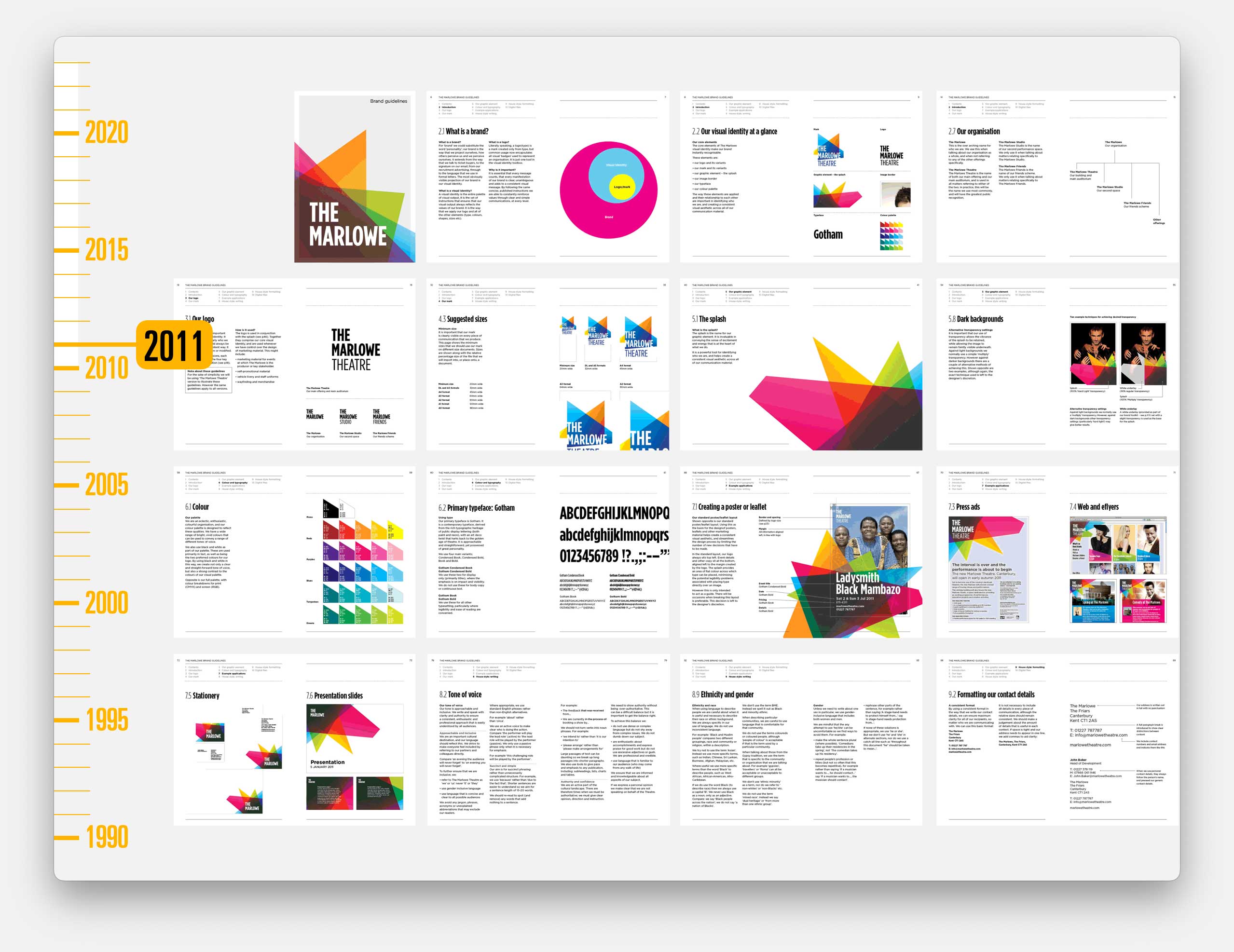
We won them around and created branding and a relationship that has already lasted for well over a decade.
They insisted that they had to have a logo so we gave them one, although I don’t remember them ever using it. We knew they’d be better served with a hugely flexible design system.
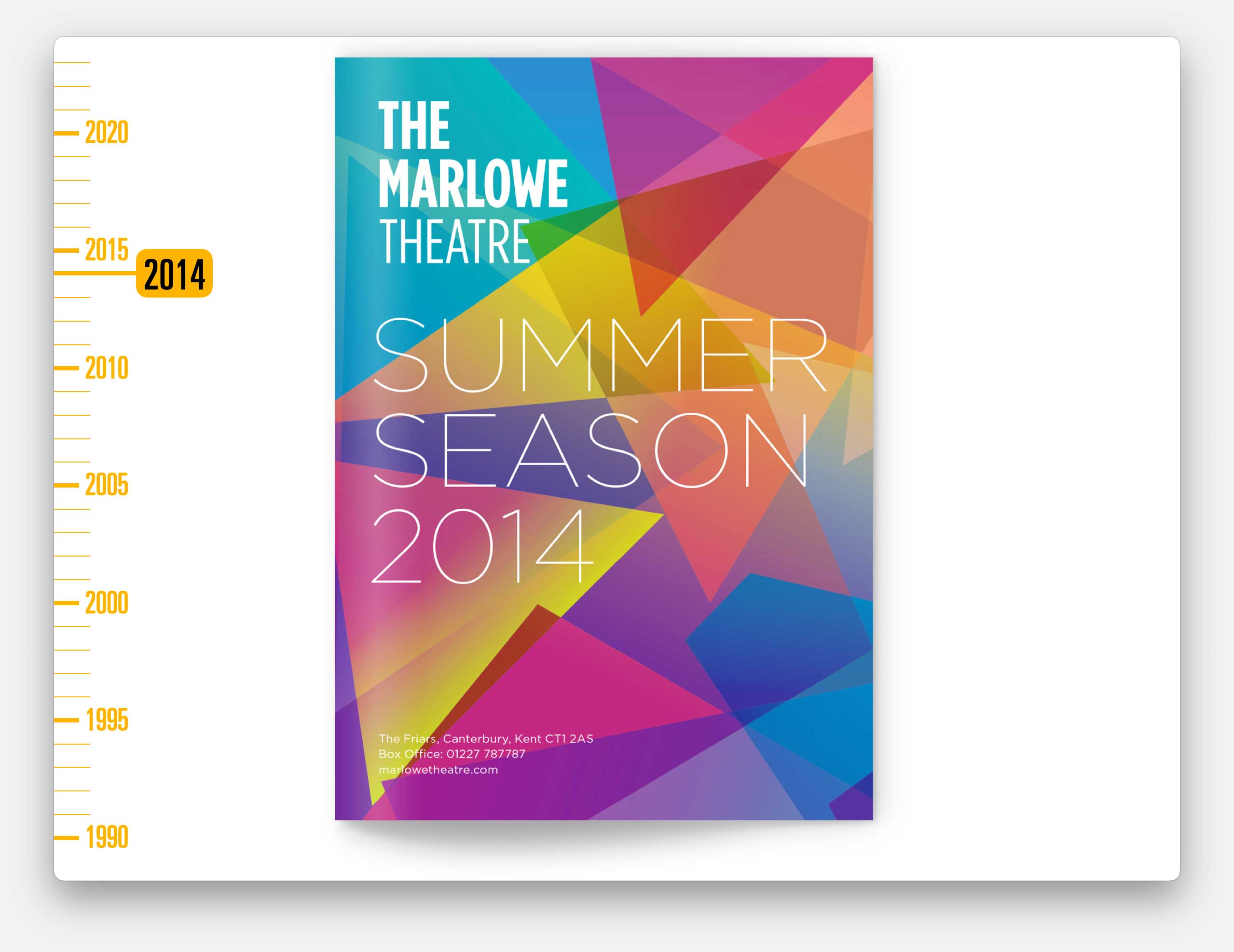
We assumed that our role would end with the branding but they also asked us to work on the reopening campaign.
And commissioned us to produce their brochures. Which we’ve continued to do ever since, demonstrating how flexible the brand can be with unique cover designs three times a year.
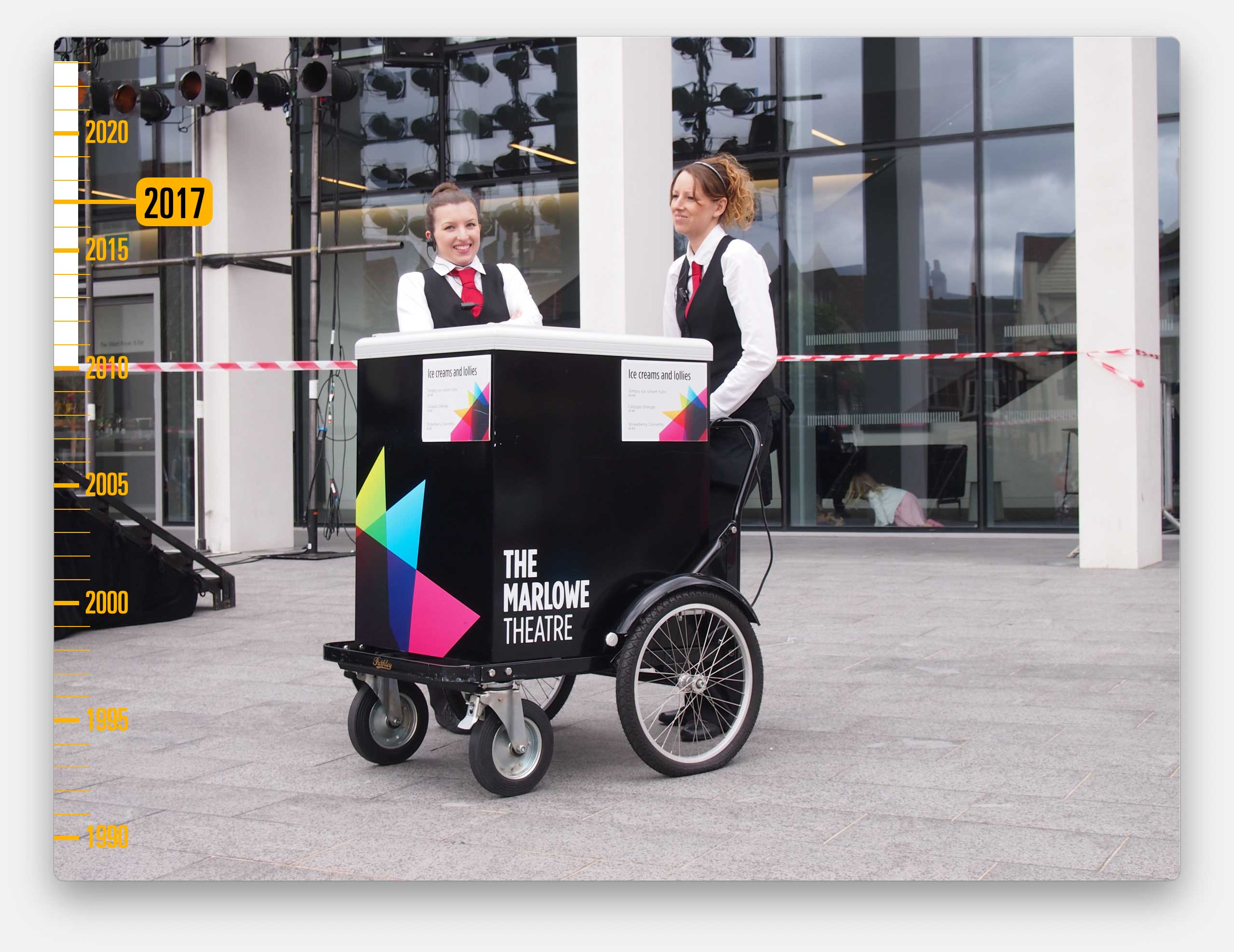
Plus separate print for their smaller studio space, and fundraising materials, and the branding for the cafe / bar. We even got to put our visuals on their ice-cream fridge.
The only disappointment was that because we didn’t have an in-house digital offering, the website tender was won by someone else.
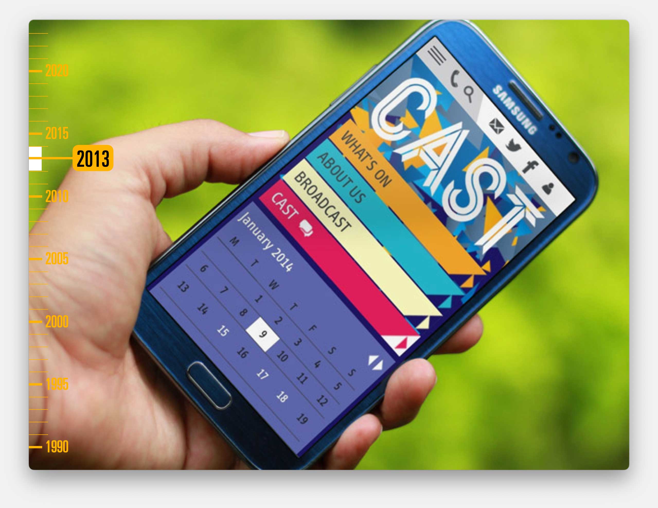
The Marlowe branding led to lots more interesting projects such as the naming and branding for a new venue in Doncaster.
Which again was a building site.
Our brief to produce something quickly so they could add the signage while they had the crane on site. We managed to persuade them that they had other issues to tackle first.
Such as a hostile local press and local arts community who thought the new venue would price them out of the area. And an elected right wing mayor who genuinely proposed calling it the Jeremy Clarkson Theatre.
Again, we worked hard to bring them all into the process and give them a sense of ownership.
![]()
So when we named it Cast, it felt entirely logical for the name to come from literally the centre of the town’s name. And they could take pride in taking the piss out of southerners, like me, who called it Cast.
Again we got to design all of the launch material and much more.
And we did get to design the website, although we had to work with an external partner to build it.
Which meant that once the site was launched and the venue was opened, they picked up the ongoing relationship.
That lack of ongoing relationship, and the fact that we’d missed out on the website with The Marlowe set me thinking. I got talking to the Director of one of the agencies we used to work with. She wanted to do other things with her life.
So in 2014, we bought her agency, Red Leader and brought all of that digital set-up into the Cog team.
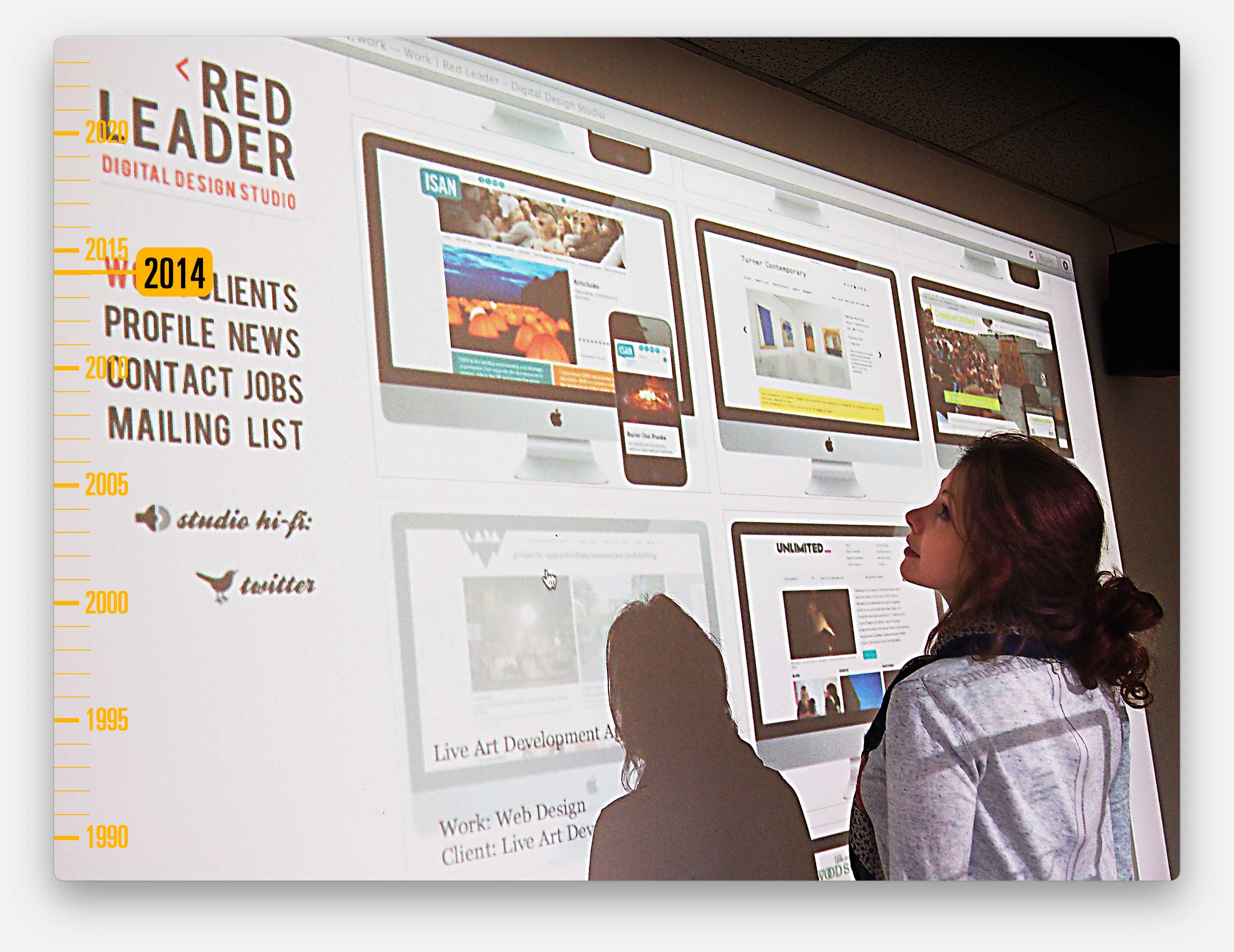
That change marked a huge shift in our thinking and the perspectives of our clients.
As a good example, we had already been working with English National Ballet.
They’d recently rebranded, and had a new artistic director.
We were brought in by someone who used to work at the Barbican, to produce publicity materials to promote shows,
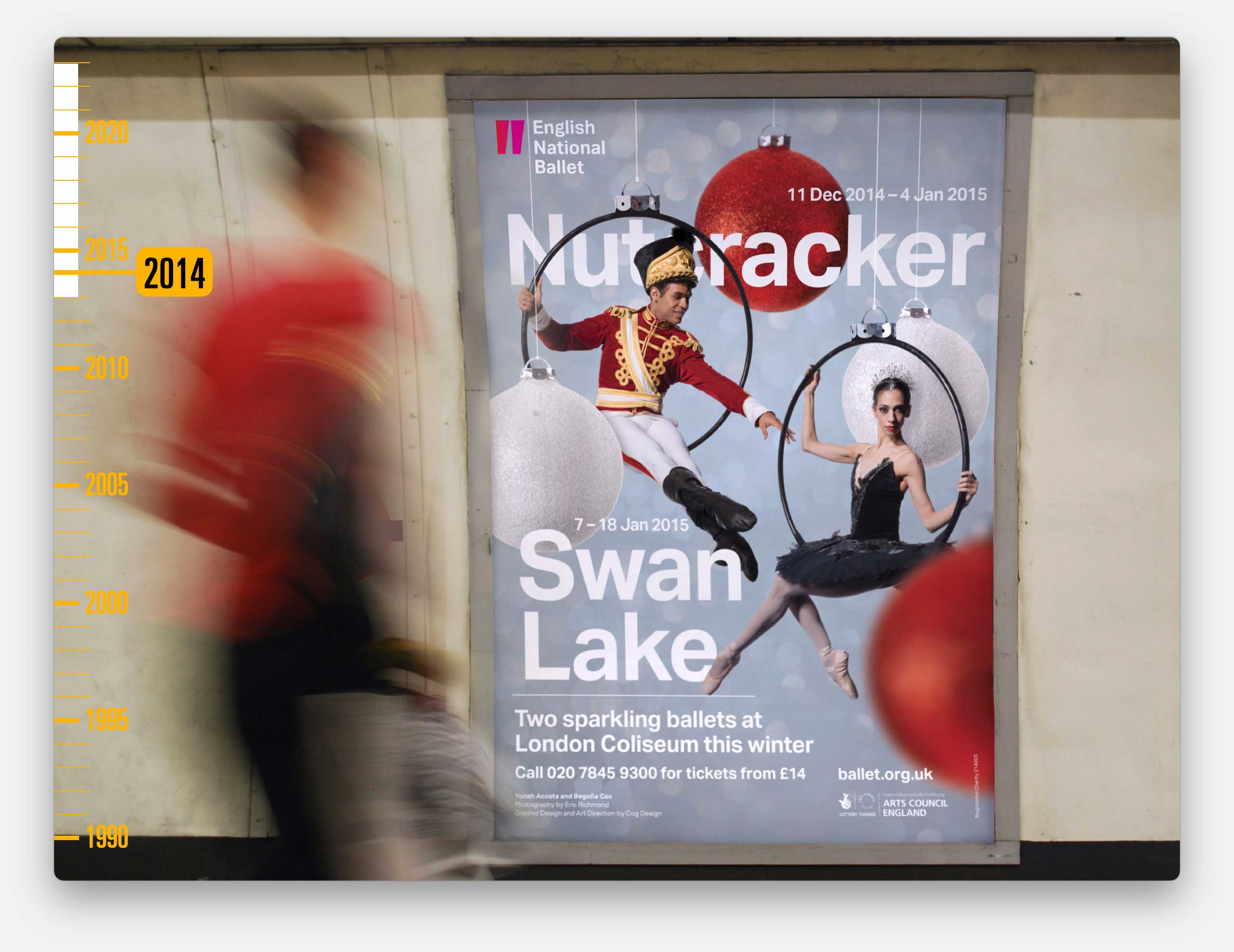
Including the big Xmas shows that were vital because those sales bank-roll the more challenging work through the year. So we already had a relationship when they tendered for a new website.
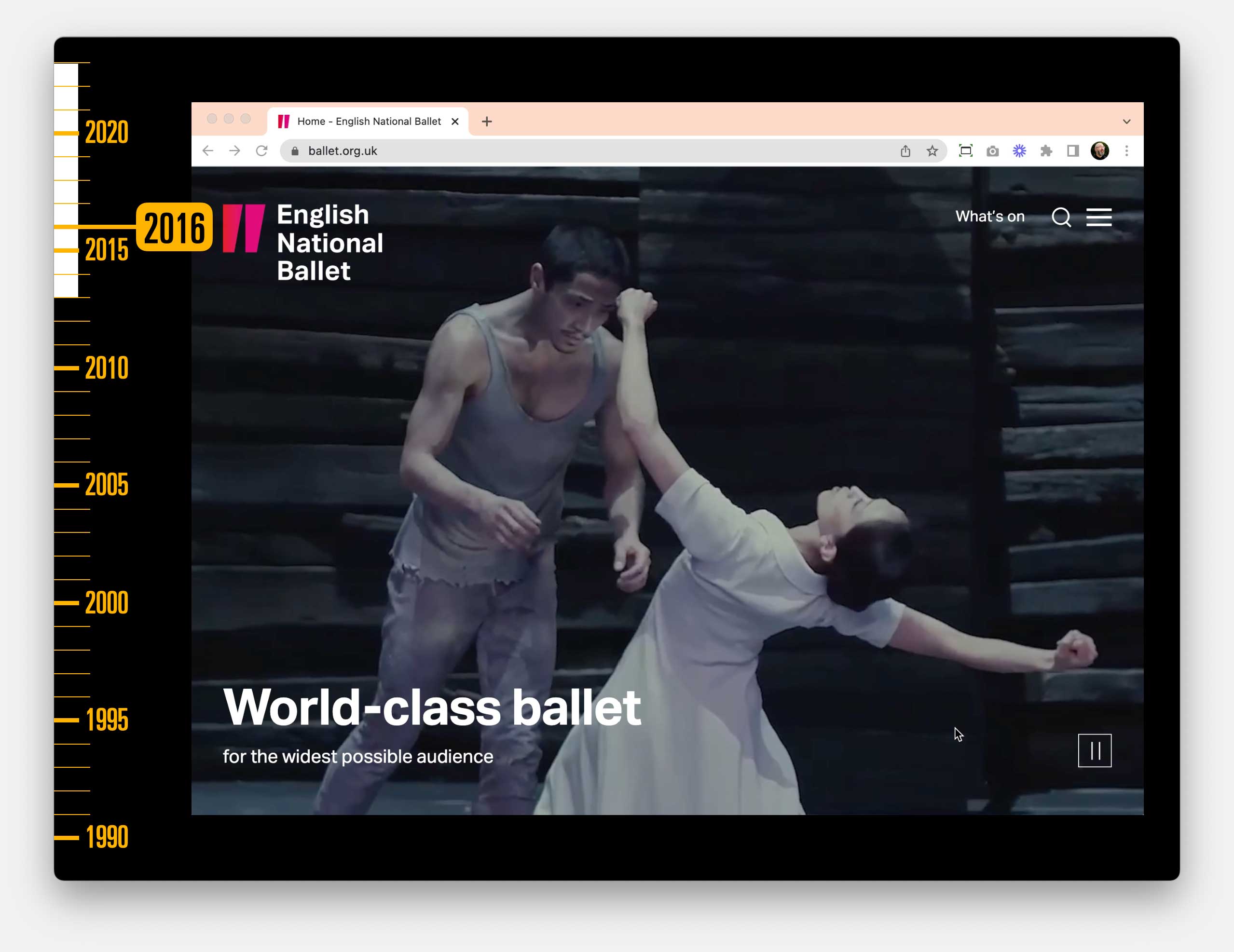
It was the biggest site we’d ever worked on and has acted as a calling card for new projects ever since. We continue to provide support and manage the hosting. And this year we rolled out a completely overhauled site, seven years after that original commission.
And… I was delighted when The Marlowe got fed up with the website they’d commissioned and tendered for a new one – and we won that work too
So we got to design and develop that, and now we manage their site as well as continuing to work on their brochures.
And currently, we are working with them on an updated visual identity and tone of voice to reflect the changes they’ve been through in the past thirteen years. 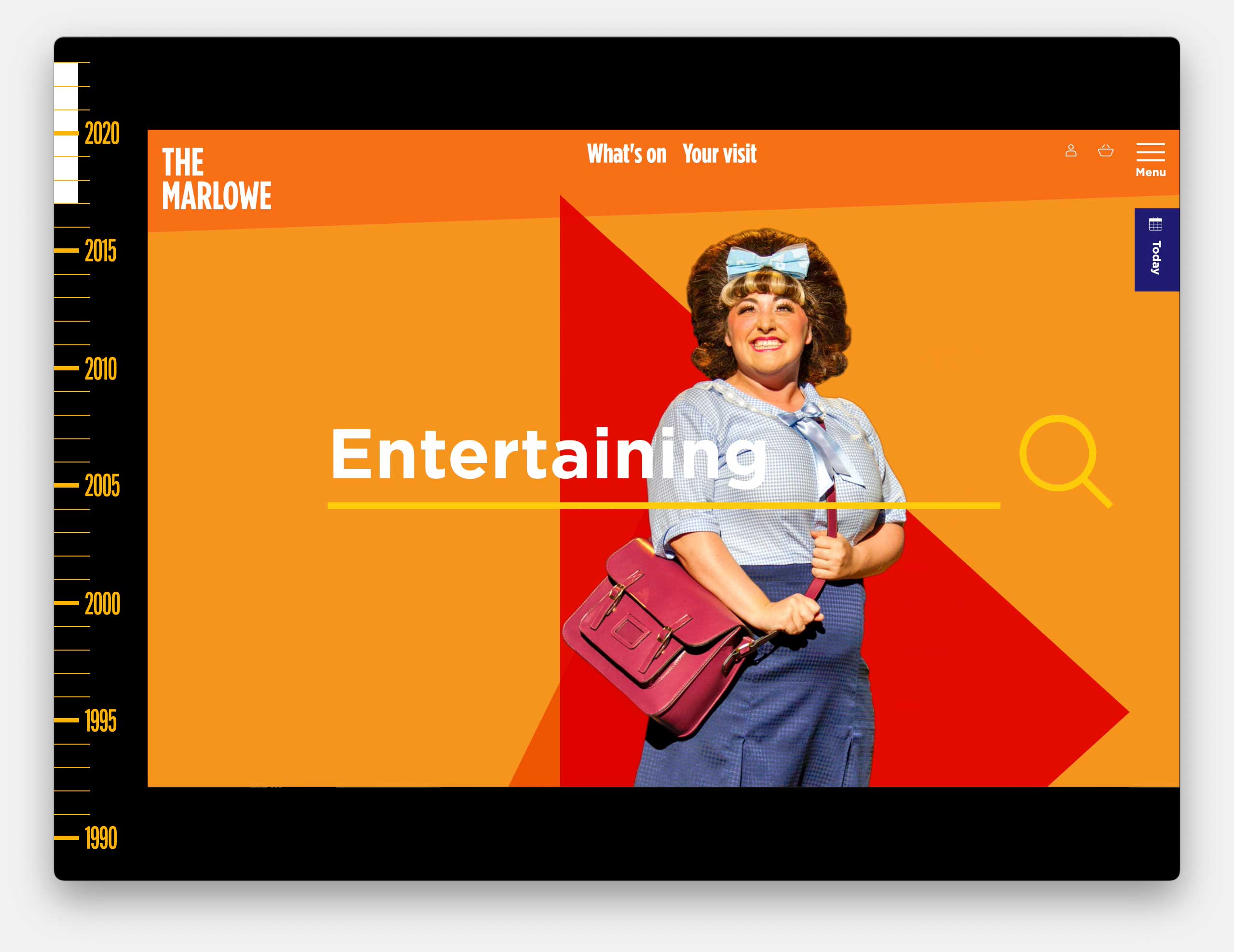
And when we do a great job of working on websites, we get more website work and so fairly rapidly we have turned into a digital agency.
And, noticeably our projects have expanded in length (and thankfully budgets).
In the early 90s each project probably took an average of a day to complete.
By the 00s that was probably more like one a week.
And by the 2010s the campaign work could be measured in weeks or a couple of months.
Now our digital projects average more like 7 or 8 months, sometimes much longer.
And, crucially, the relationships don’t end when we deliver the project – we continue to host and maintain nearly all of the websites we deliver. And most clients have a budget to keep adapting and improving them.
So we’ve have to employ a dedicated client management team in ways we’ve never done before.
The pace of the studio is completely different, the make-up and locations of our team are completely different, and everything requires a very different type of management.
And I’ve had to become an expert in all of the things that come with that, or at least surround myself with expertise.
Accessibility is a vital consideration in everything we do. So we need to understand lived-experience and legal compliance.
Sustainability becomes a key factor in every design and development decision – especially around video streaming and hosting (where we use a carbon positive hosting provider).
We need to think about security of data, longevity of software platforms, and compatibility with third party systems.
We all need to consider search engine optimisation, structured data and how the Google algorithm works, and we need to concern ourselves with the legalities of cookies and the capabilities of analytics and data.
And we need to have a language to describe all that complicated stuff, in plain English, to people who want results and don’t want to be bamboozled by jargon.
Perhaps our biggest learning curve was in the world of ticketing. Almost all of our clients sell tickets to events, so suddenly we need to know the intricacies of dozens of different platforms and how to push to get the most from their capabilities.
Since 2016 we’ve designed and built around 60 reasonably large-scale websites.
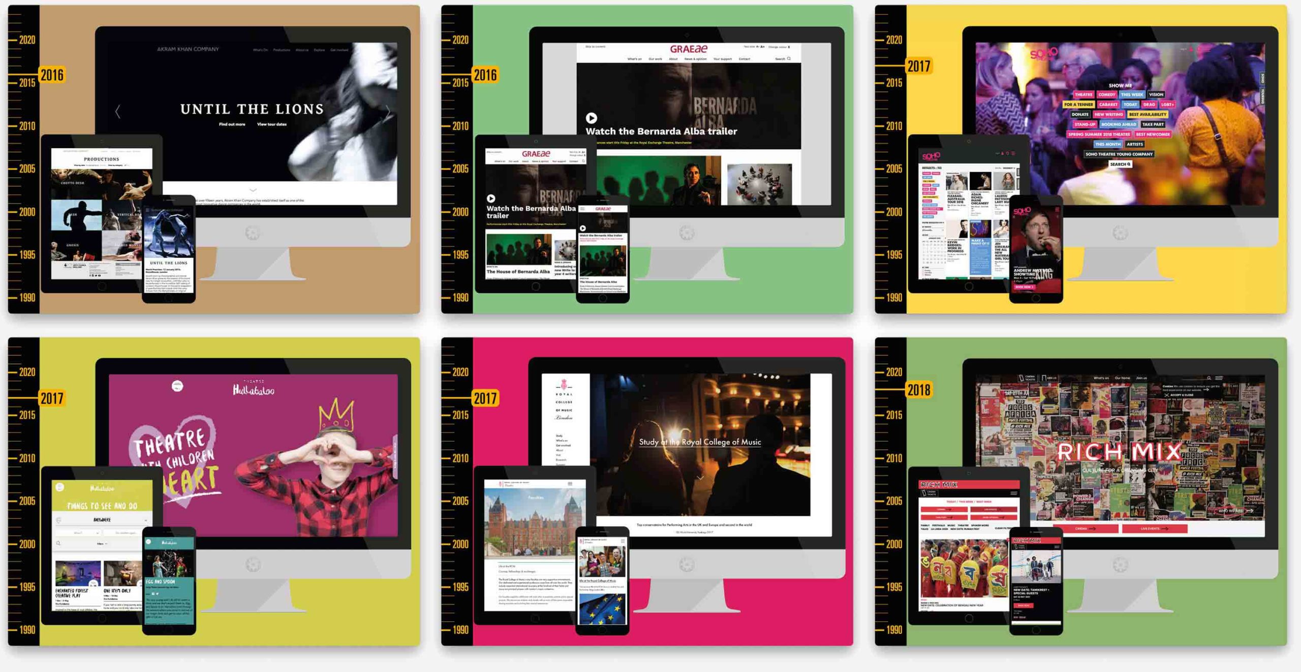
We’ve worked with internationally renowned choreographers, we’ve worked with disability arts champions, London’s busiest venue, a new theatre for children in Darlington, the world’s No.1 for performing arts institution, a community focused venue, a couple of streets from here…
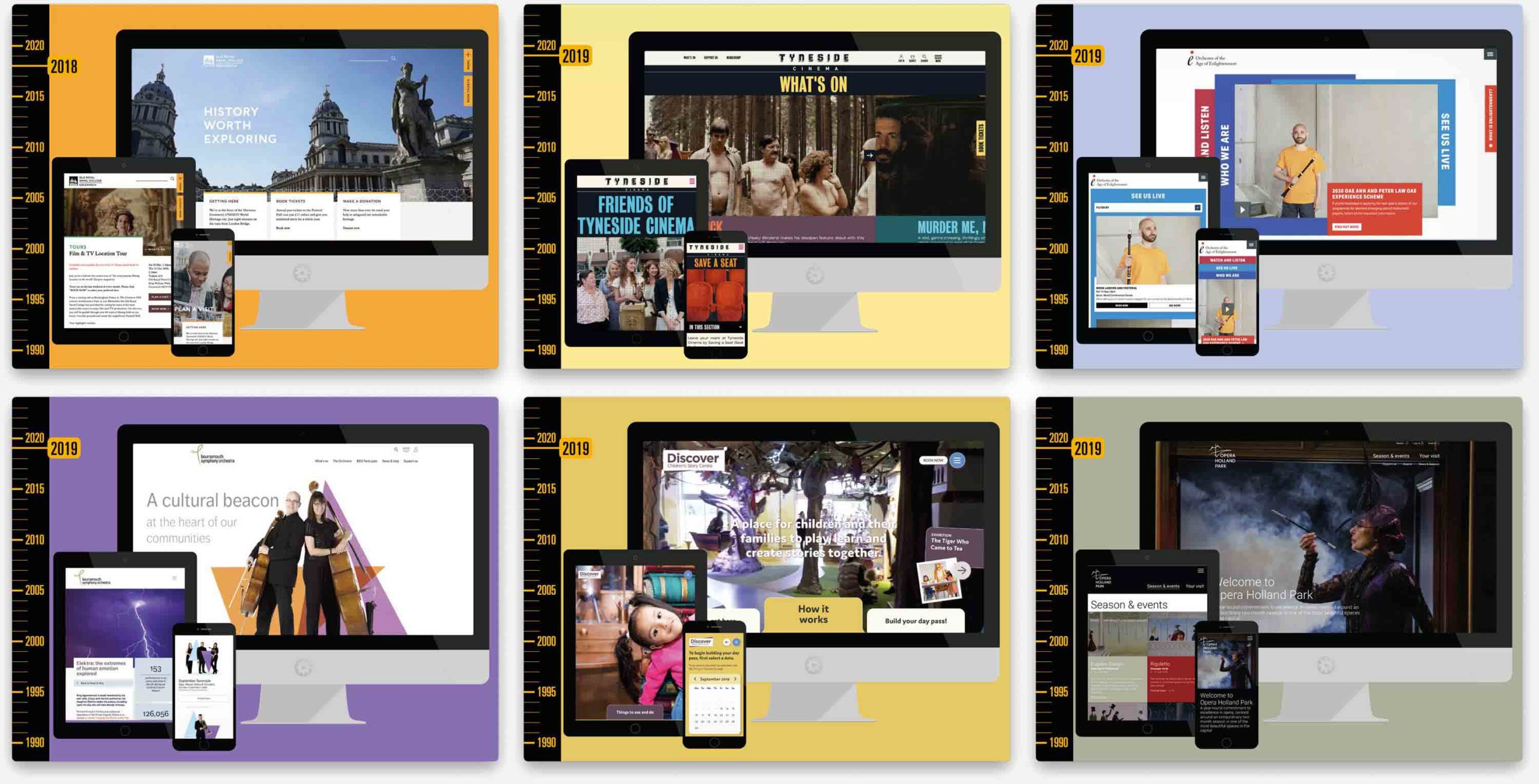
Visitor attractions, cinemas, Renaissance music specialists, internationally renowned orchestras, a children’s story centre, an annual opera festival…
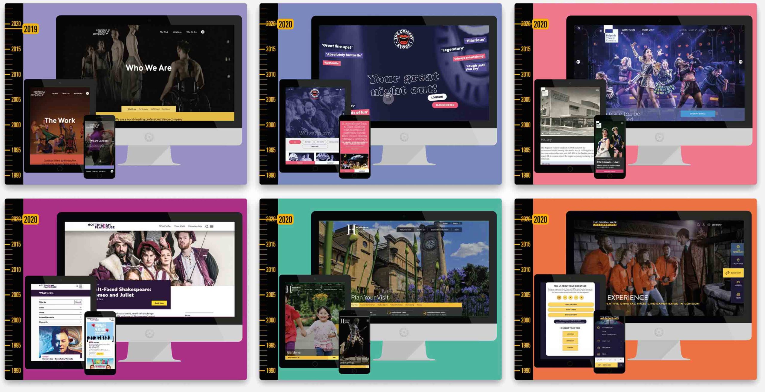
A dance company of disabled and able-bodies performers, the original home of UK stand-up, the most important theatre in Coventry, the most important theatre in Nottingham, this year’s museum of the year, and the physical game adapted from a TV classic.
All was going well until the COVID thing stopped all of our work for several months.
We used that time to support our clients, to reaffirm our commitment to the arts and to invent an online platform for our clients to stream and monetise filmed versions of their shows.
And so now we were producing our own digital products.
And the profile from that project helped us secure even more, bigger projects coming out of the pandemic. Such as HOME in Manchester, Sherman Theatre in Cardiff, Winchester Cathedral, Lighthouse in Poole, Theatre by teh Lake in Keswick, The Royal Scottish National Orchestra in Glasgow, Aerowaves, a Europe-wide festival of dance, London’s The Foundling Museum in partnership with Hat Trick, Shakespeare North Playhouse near Liverpool with branding from Pavement, the bi-annual London International Festival of Theatre, The London Philharmonic Orchestra, Leeds Playhouse, Bertha Dochouse cinema…
…and a dozen more already in the pipeline.
As my final project example, I thought I’d talk about our work with Lewisham Council, which bring together a lot of the strands of work I’ve been talking about.
As I’m sure you’ll know, for the past few years, the Mayor of London has thrown the cultural spotlight (and a little bit of money) on a different London Borough.
In 2022 that was Lewisham.
That felt like such an important moment that we really wanted to be part of it.
When we were in Deptford (within the London Borough of Lewisham) we had been part of a commission, chaired by the academic Charles Landry, looking into urban regeneration, with culture as the catalyst.
At the time, Lewisham was a cultural wasteland.
As well as taking part in the commission, we designed the published reports and all of the internal communications.
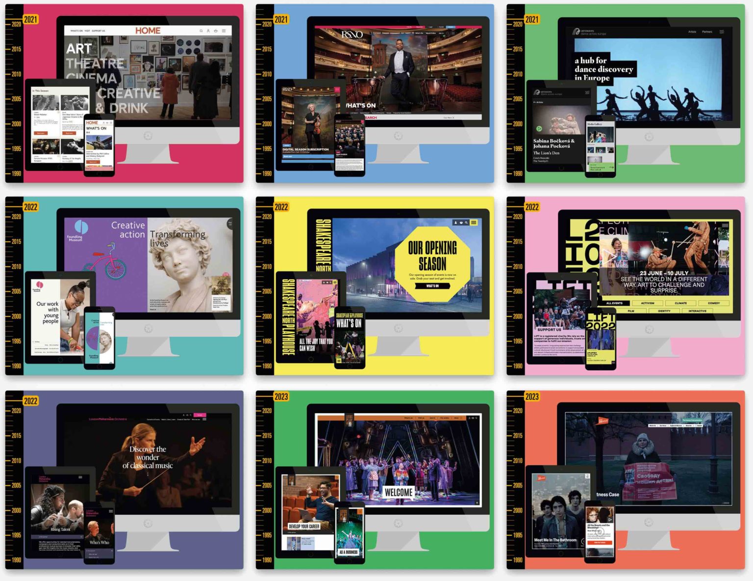
Two decades later we were able to bring our knowledge of the area to create branding that was grounded in the unique attributes of the borough.
The language is built around inclusion. Lewisham’s event was a year long celebration of residents and location, firmly rooted in community, rather than big events to attract in-bound visitors.
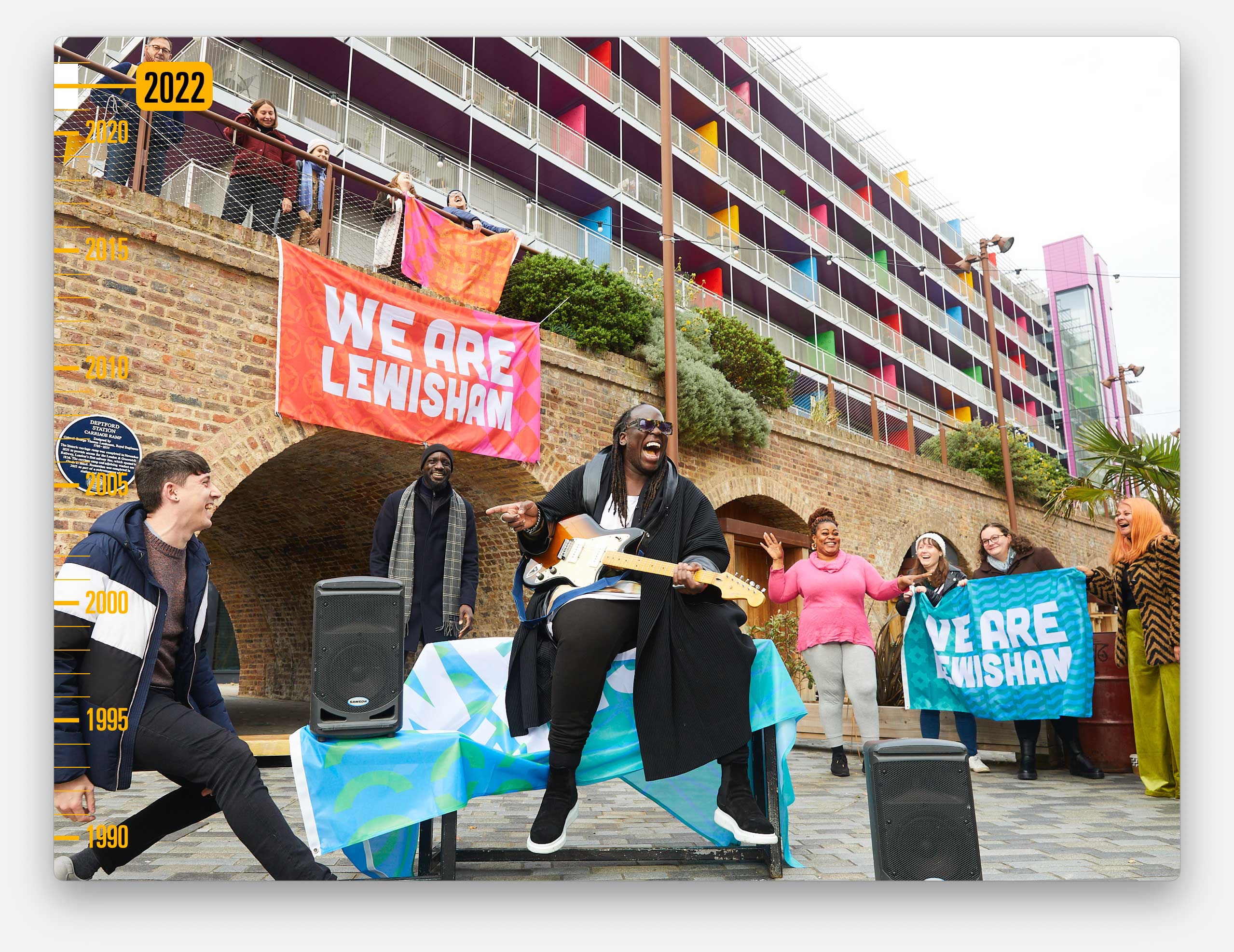
We hit upon the idea of using flags as a way to visually tie together the multitude of activities.
And we created four variations, with patterns that draw on the fabric, history and communities of Lewisham. For instance, this star is lifted from the Rock Against Racism movement.
And the other patterns are drawn from architectural features of faith buildings and culturally significant architecture.
The flags could then become physical objects, banners to be held aloft, and flown proudly over the Town Hall. And there were printed versions given to every school child.
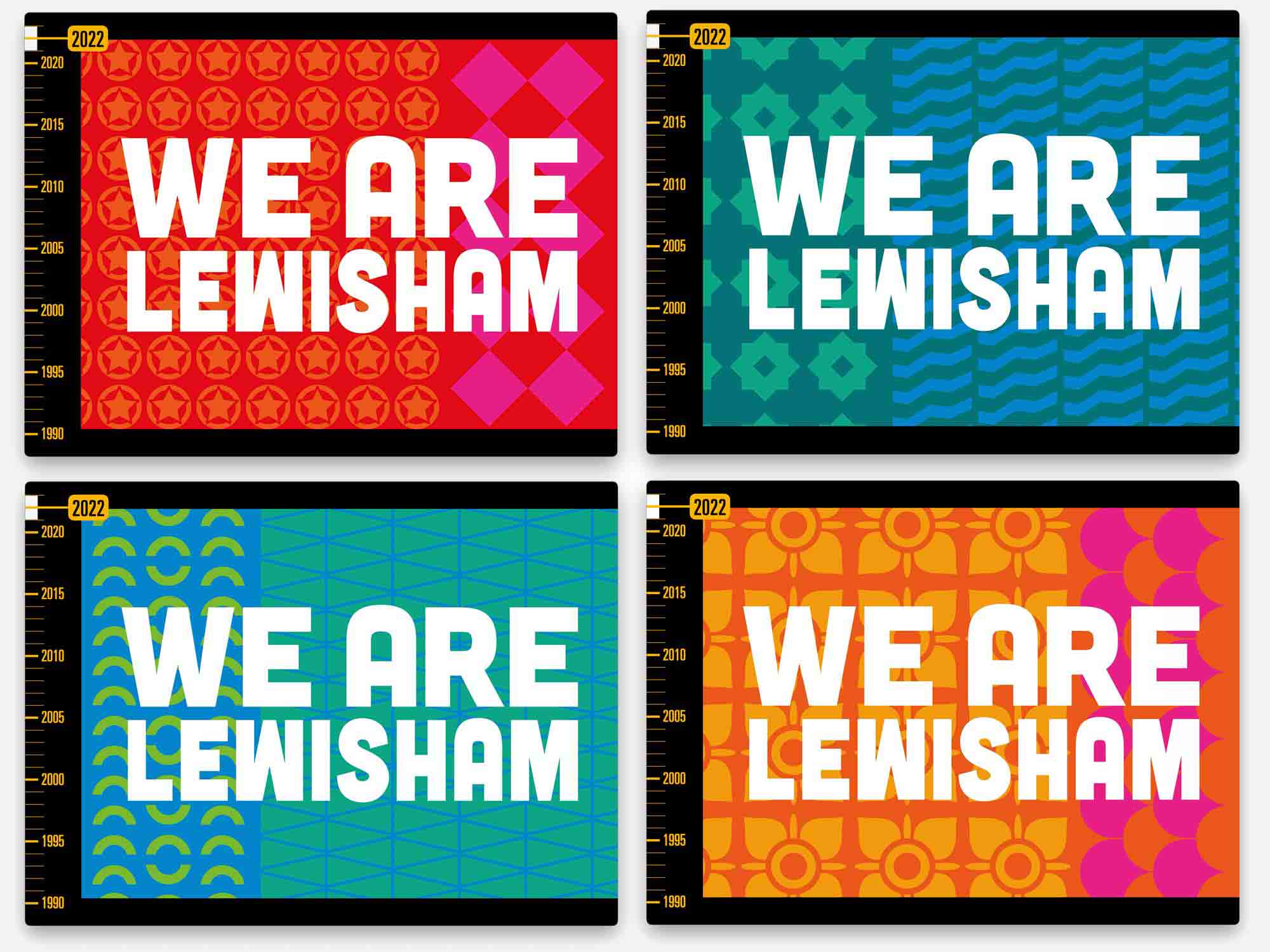
And, as we often do, we got involved in the production of lots of the additional materials. Including hi-vis tabards for staff, the all important face-masks, as modelled here by Sadiq Khan…
…Pop-up banner and bunting, digital advertising, stage backdrops…
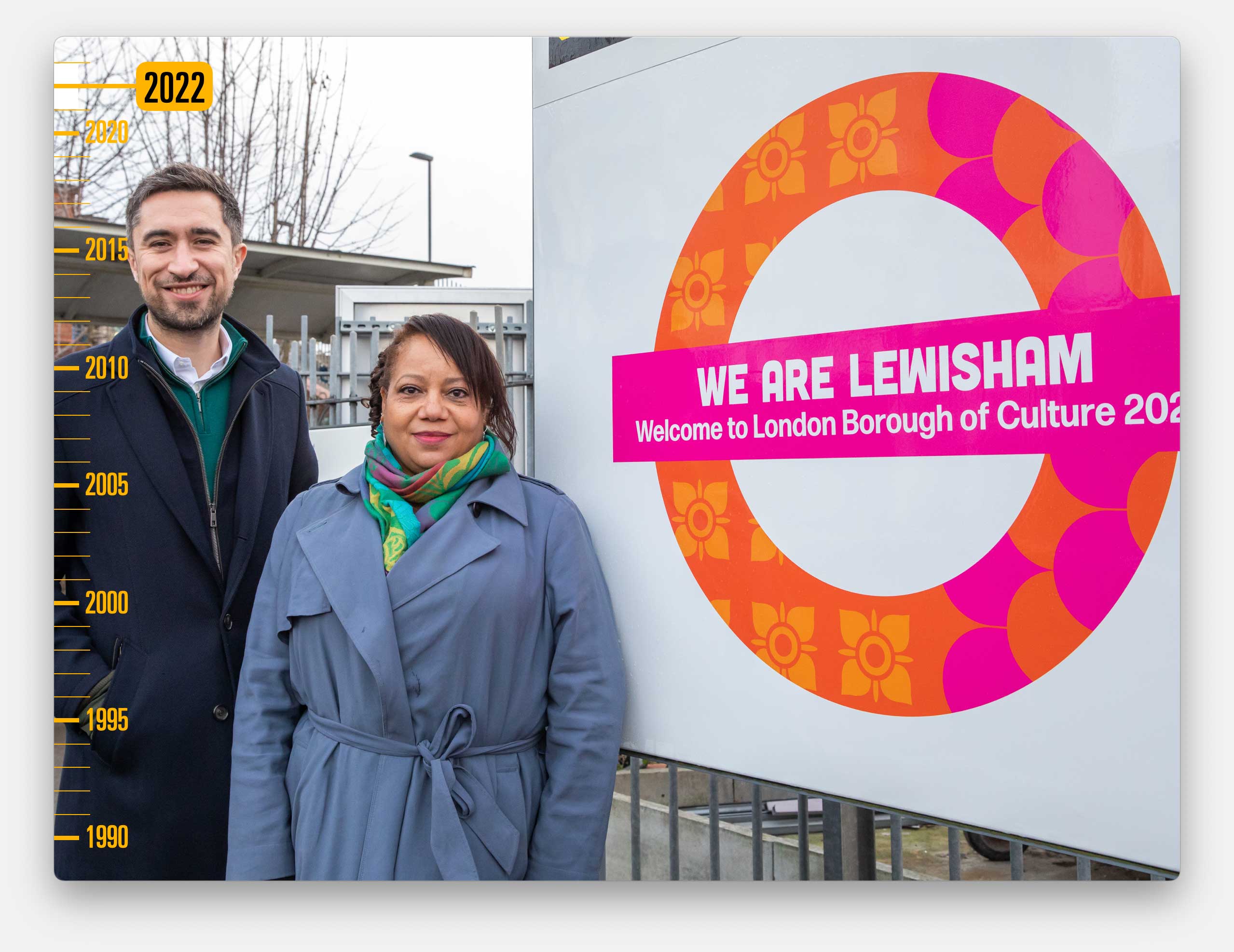
And, very excitingly, we got to design the Transport for London roundels on stations. Here’s the elected mayor and deputy mayor at Lewisham station.
And here’s Anna, who led the design project at Cog, on New Cross Gate station.
She’s also in this photo along with several others in the Cog team, because we were very short of people on the day of this photo-shoot.
And of course we also did the website, which allowed local people to upload their own events alongside the organised activities, and has now become an ongoing record of their year of activities.
And, definitely one thing ticked-off my bucket-list, we got to takeover the screens at Piccadilly Circus to show the faces of local artists, musicians and cultural creators.
And I’ll leave that playing in the background…
…as I wrap up and thank you all for listening to my story.
Thank you.
Well done for making it through that very long article.
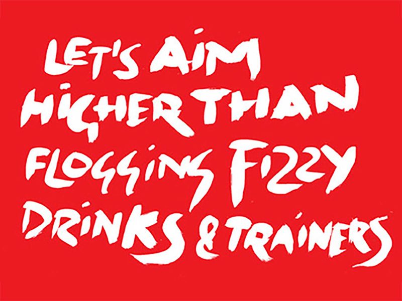
This is the poster from the talk. It was beautifully printed by Gavin Martin on G. F Smith Accent Recycled.
I have some spare copies. If you’d like one, as a reward for reading to the bottom, let me know and I’ll get one to you.
For his Typographic Circle talk, the outspoken typeface designer, Bruno Maag raced through a history of screen-based type design. Michael...
As a small design studio, Carter Wong have punched above their weight for three decades. In a talk, titled 60...
Talks about branding can sometimes be an unprepared monologue through the speaker’s portfolio. Thankfully, we were taken on a well-thought-out...
The Typographic Circle, a volunteer-led organisation that brings together anyone with an interest in design and typography, host monthly lectures...
This straight-talking Glaswegian set-up her eponymous studio in 2012, quickly establishing it as serious contender in the world of branding...
In his Typographic Circle talk, Michael Johnson argued that Design Can Make a Difference. Our Michael was there to listen...
"Recently we've been using some big type and we've also been using some smaller type for text". Michael was at...