The best conservatoire in Europe
Royal College of Music website
Our studio is filled with light and music.
There are multiple meeting rooms, a well stocked kitchen, and an indoor garden (with fishpond). Talk to us about access needs, environmental factors and any accommodations we might make to enhance your visit. Pop-in for tea and stay to use a spare desk for as long as you need.
11 Greenwich Centre Business Park,
53 Norman Road, Greenwich
London SE10 9QF
We’re next to Greenwich train and DLR station. We have a door right on the concourse but it’s different to our postal address. Find us via: what3words.com/hungry.means.author
This video shows the route to take from the train that will arrive at Greenwich rail station from London Bridge. There's a gentle slope next to the staircase.
If you have to come by car, we have a couple of parking spaces. We have a charging point that you are welcome to use if you have an electric car. Call ahead and we'll make sure the spaces are free. Use our postcode (SE10 9QF) to guide you in.
We’d love to hear from you. Use whichever medium works best for you.
11 Greenwich Centre Business Park,
53 Norman Road, Greenwich
London SE10 9QF
It's exciting to chat about potential new projects. We don't have a ‘sales’ team or a form to fill in. Call us or give us a little detail via email and we'll get straight back to you.
[email protected]If you're a client then you'll be best served by calling us or contacting us via ClickUp, otherwise you can use this dedicated email that reaches all of the digital team.
[email protected]This email hits the inboxes of the people who deal with our bookkeeping and finances.
[email protected]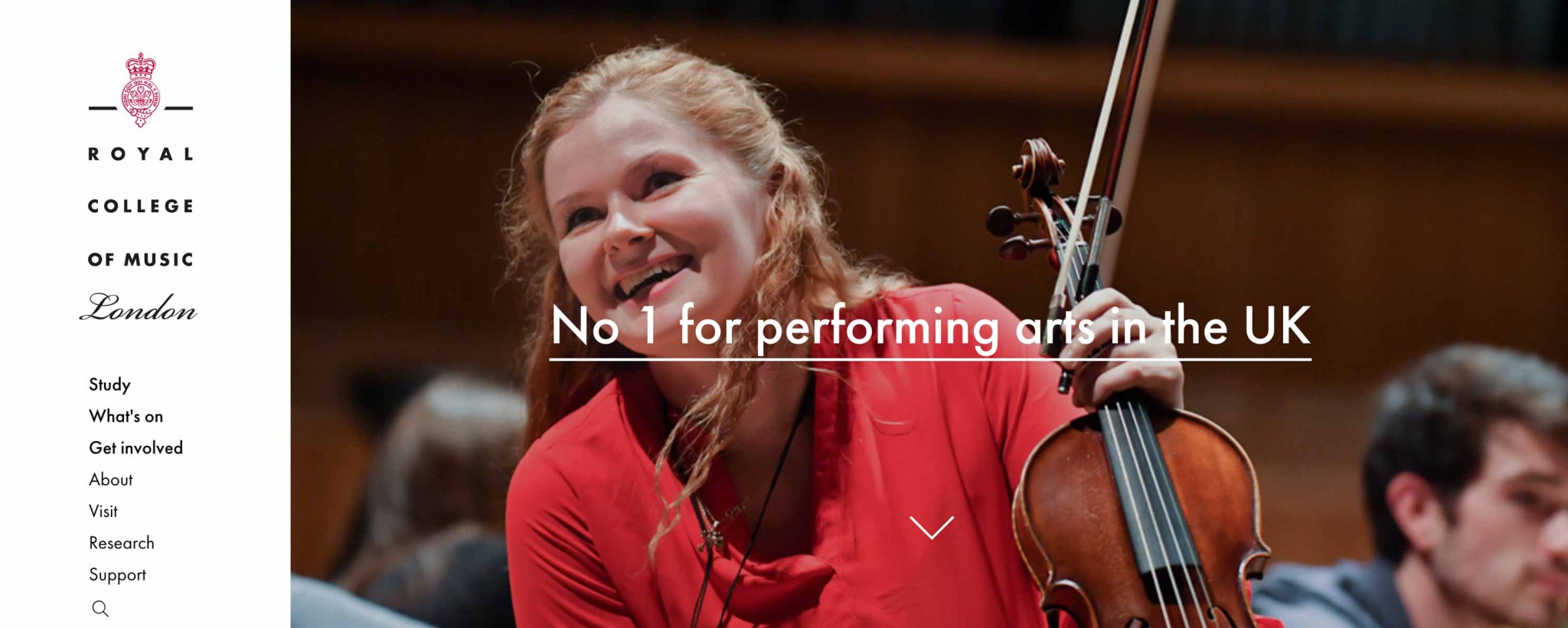
Royal College of Music website
The Royal College of Music is one of the world’s great conservatoires, training gifted musicians for international careers as performers, conductors and composers. But their online presence was clumsy and inward looking. It certainly didn’t reflect that world-class status.
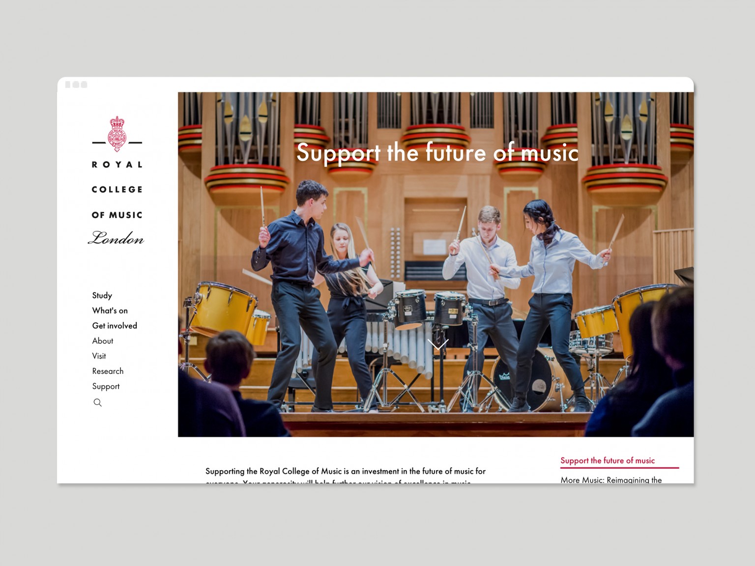
We began a process to understand more about who their audiences are and what they want to say to them. We started with workshops and involved key members of staff from across the whole organisation.
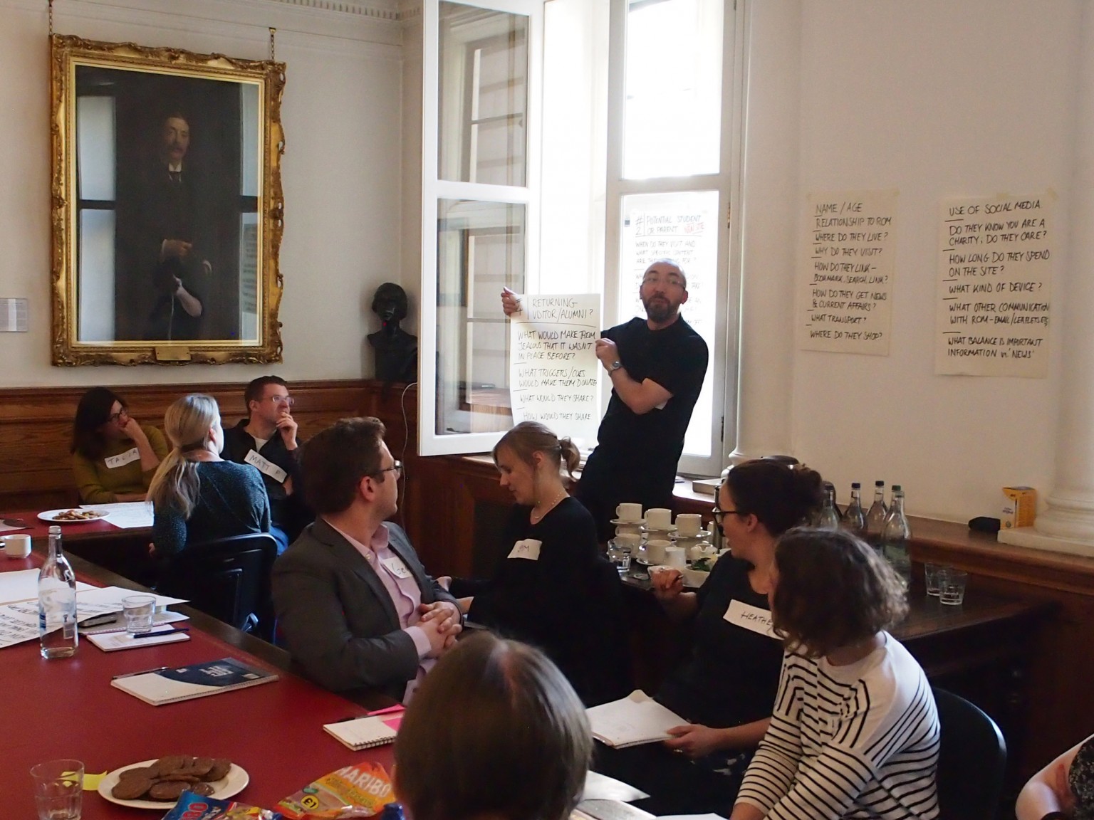 One of our workshops, in the historic setting of RCM’s South Kensington building.
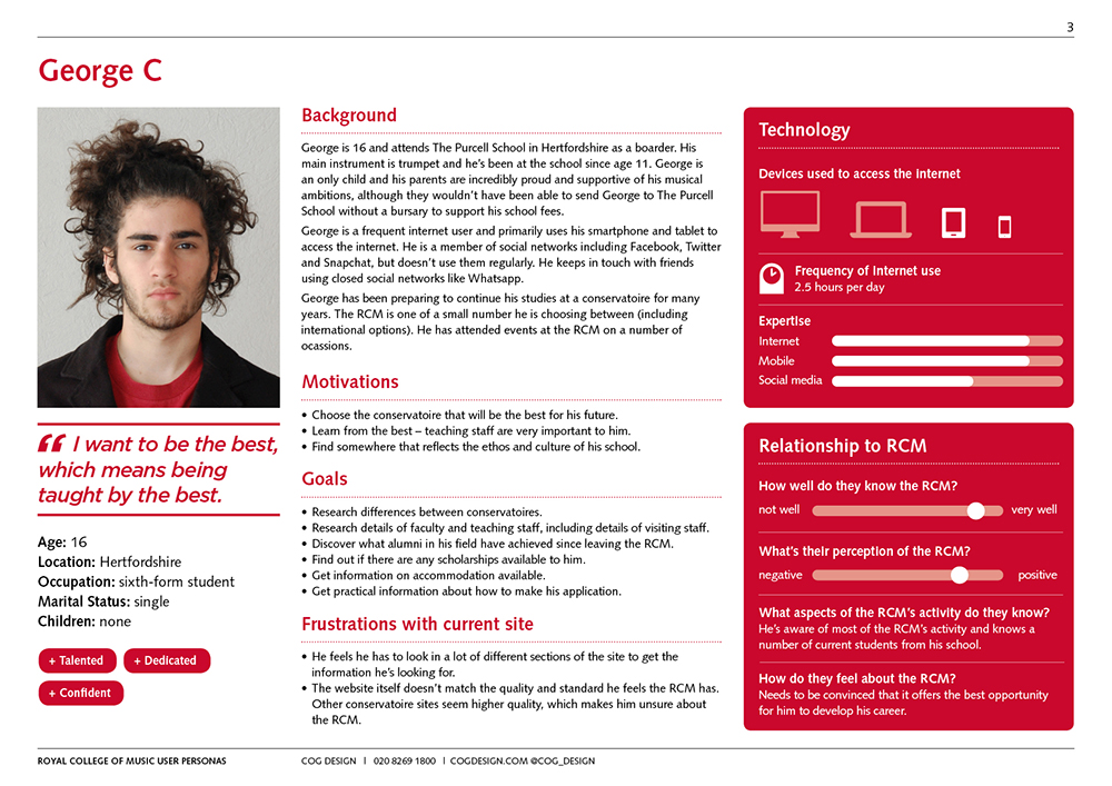
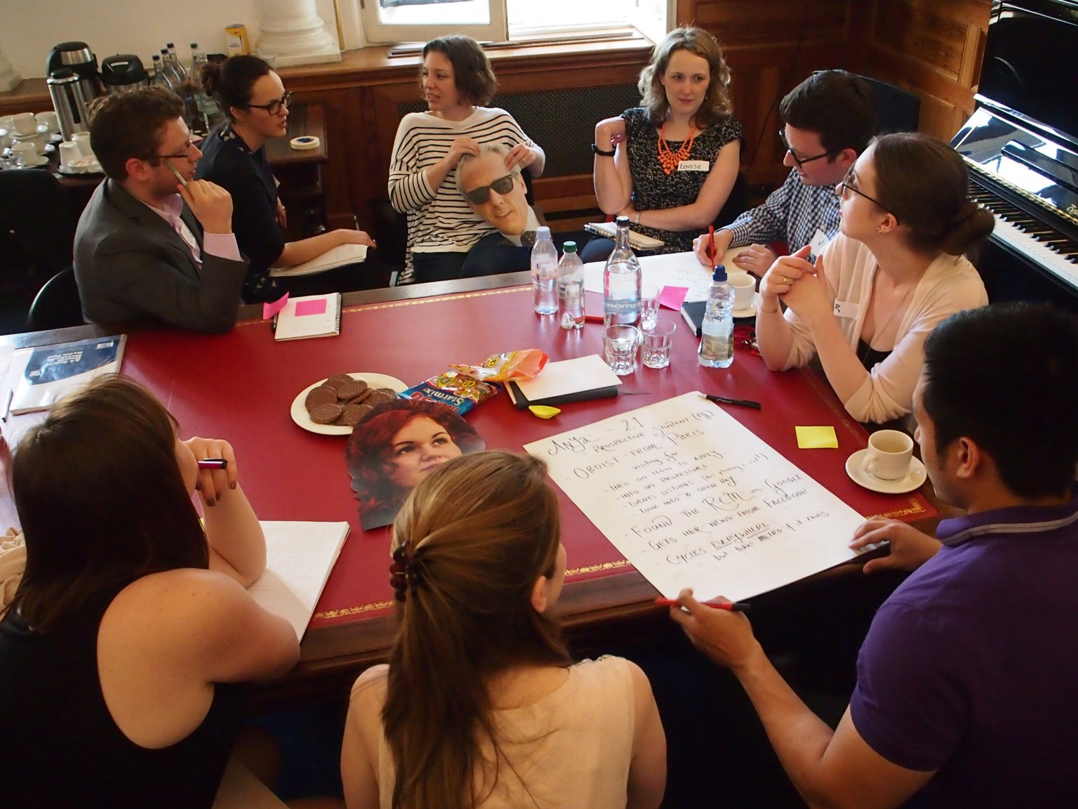 RCM teams discuss the personas of their website audiences.
We made it an engaging and interactive process so everyone felt they had contributed and had a sense of ownership over the project.
Our focus was on creating personas and user-journeys, getting different teams to reflect on the core messaging and information that would be relevant to different audiences.
We gathered feedback from prospective and current students, parents, staff across the RCM, website visitors, event attenders and other website users.
We were able to use that feedback, alongside various data sources, to produce a detailed snapshot of the kinds of users who would be visiting the site. Using ‘personas’ we looked at the messaging that they would respond to. And we turned all of that into a comprehensive report into user behaviour, attitudes and recommendations.
Cog’s new designs convey the creative, artistic and inspirational environment that you find when visiting the Royal College of Music. The team expertly led us through the research and discovery phase, helping us identify our key goals and objectives, and presented us with unique and distinctive designs. We’re delighted with the results and look forward to continuing our relationship.
We needed to present the case for change across every area, from the reception to the boardroom so we created a simple overview to summarise our vision for the project.
Design: Embody ‘the future of music’. Be bold. Be distinctive. Be clear. Be adaptable
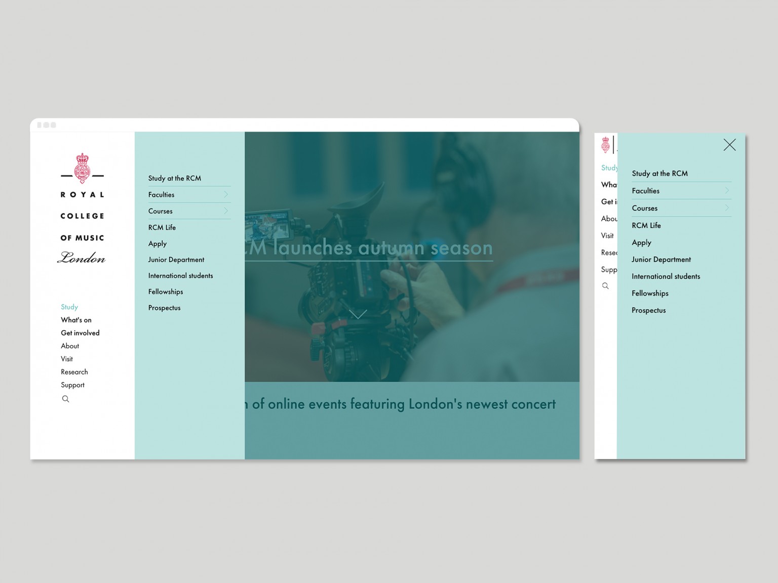
Structure: Simplify navigation. Focus on prospective students. Consolidate course & faculty areas. Highlight public engagement.
Functionality: Connect content intelligently. Improve user interactions.
Content: Show don’t tell. Let brilliant imagery set the scene and back it up with snappy copy.
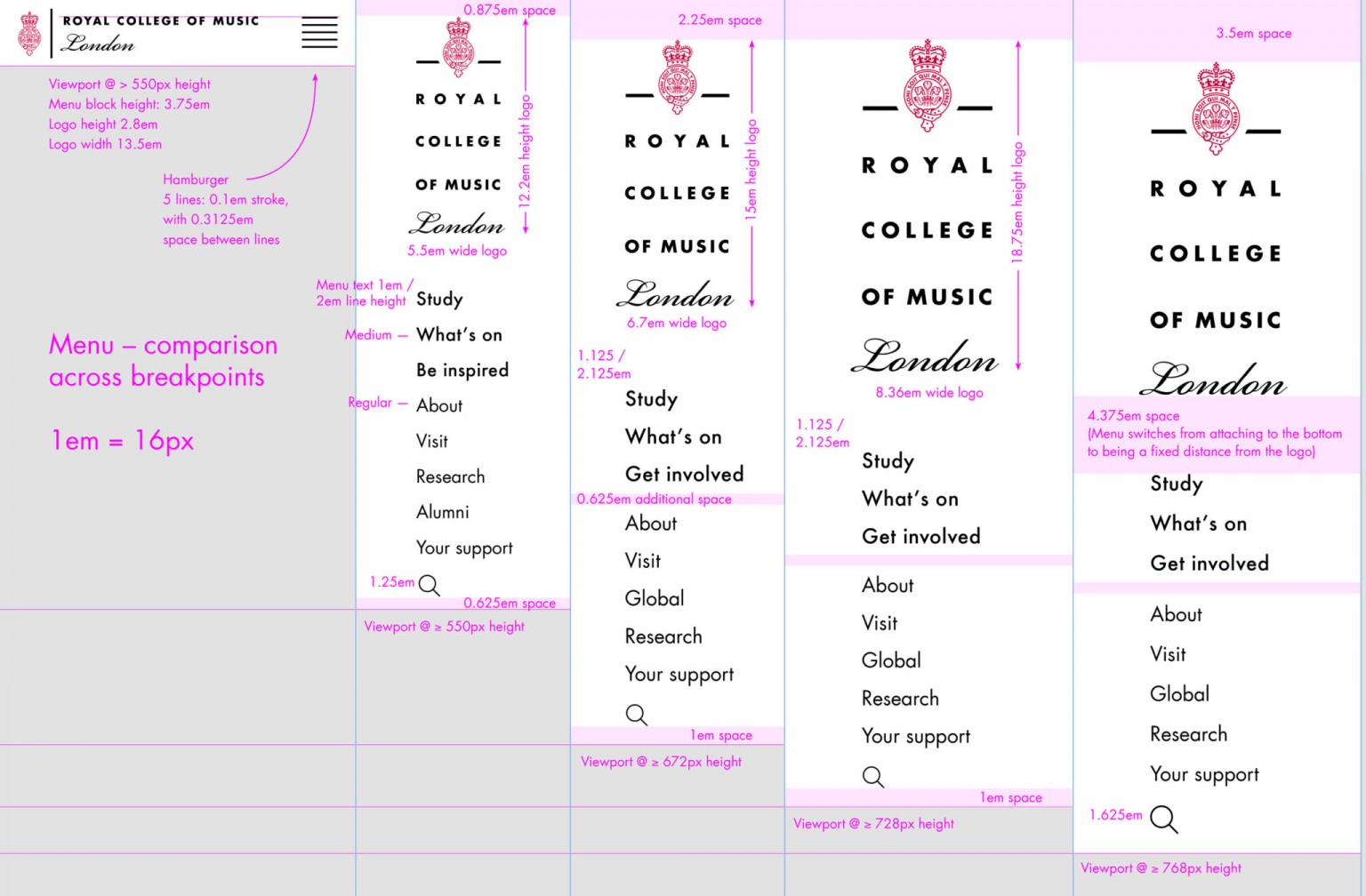
We knew that this project required a systematic and flexible approach. The designs needed to be able to accommodate huge amounts of constantly updating content and ever-shifting messaging (through the cycle of the academic year), whilst still feeling slick and coherent in its overall aesthetic.
We worked closely with our client team and met frequently to discuss progress.

Adam and Katherine, visiting the Cog studio to discuss the design of their website.
Key to the success of the project was attention to detail. We mapped out every scenario on a carefully plotted grid. Every screen size, viewport and breakpoint was carefully considered so we maintained the clarity of the design, no matter what device the site was viewed on (or what screen size and resolution).
We introduced specific colour-coding, typographic detailing and a managed hierarchy of menus and submenus that all combine to make this hugely complex site feel simple and clean to any user.
The scale and complexity of the site meant that we worked (and continue to work) with the RCM to roll-out sections and to tweak functionality in stages.
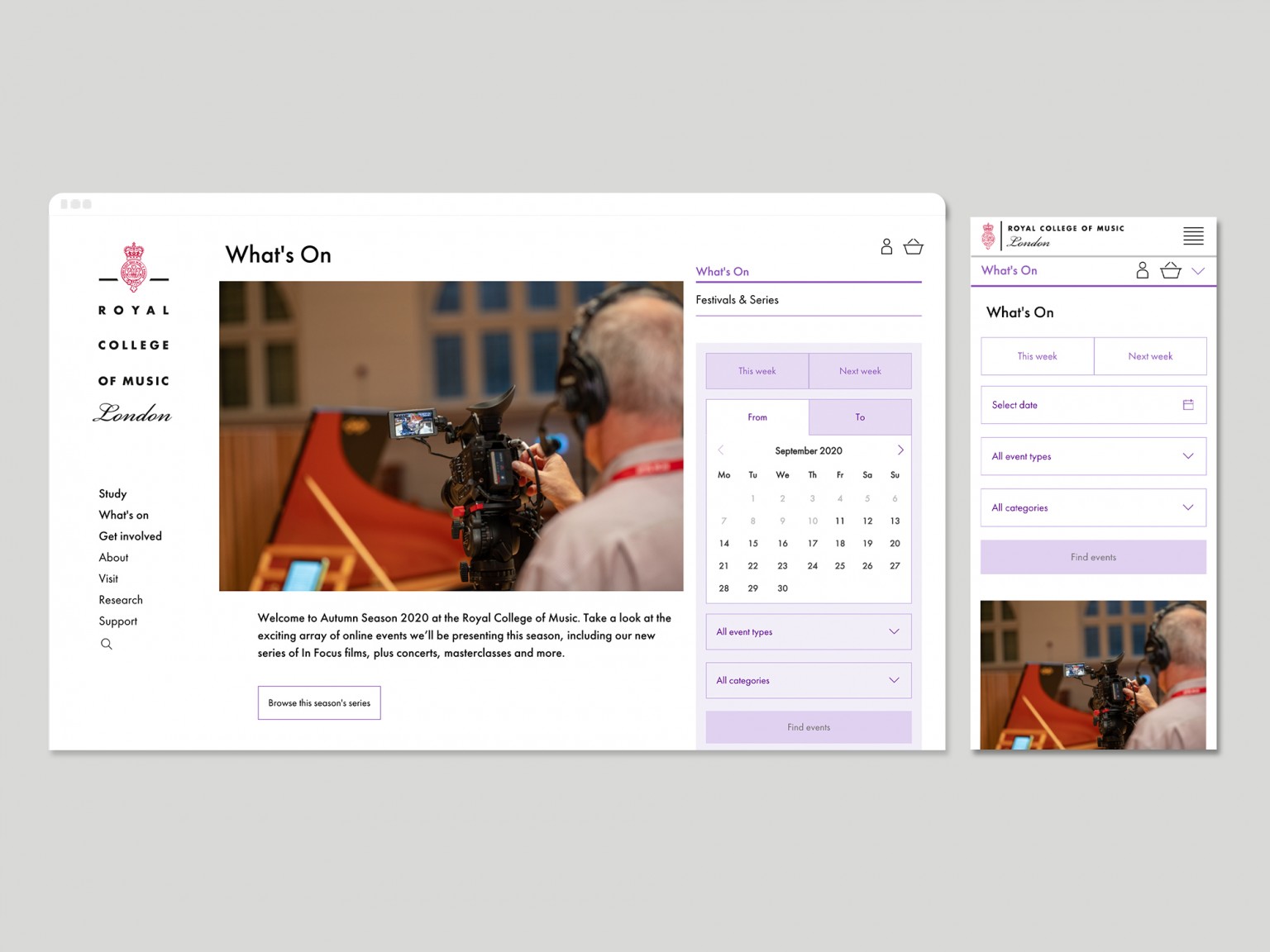
Our clients have been delighted with the results, and they’ve been kind enough to share the positive feedback they’ve received from across the organisation.
Amongst our favourites is this from a front-of-house team member.
The new look website is brilliant. For many years people must have struggled to find stuff like the Teaching Service, Junior Department and Events. I have had a number of convoluted telephone conversations at the Front Desk with people who were having difficulties and hopefully this won’t happen anymore. Whoever designed this needs to be congratulated