Ben has been interning at Cog since September, and gives some insights into moving from university to a real design studio.
An intern’s Cogspective

I joined Cog for a three-month long internship after graduating from Nottingham Trent University (which has a great Graphic Design course). I’m coming up to the two month mark, and I feel like I’ve learned a lot: both about efficiently streamlining my own working process as a designer, and the unique working environment of Cog itself.
Cog initially appealed to me because of its highly specific client base of arts organisations and theatres, an alternative to the world of corporate branding which is the mainstay of many studios. Since working here I’ve come to appreciate Cog’s tight structure of working frameworks, studio rituals and social events (see Cog Nights). It’s been quite far removed from the usually scattershot working/drinking approach that somehow propelled me through university. This is overwhelmingly a good thing, even if it is a bit jarring, as I imagine the jump from education to full time employment is for most people.
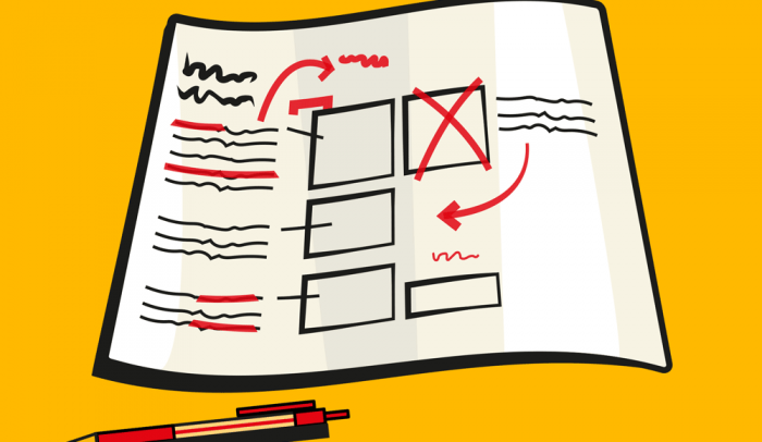
The studio’s creative output is largely informed by the philosophy that the job of a designer is to communicate clearly, with the prime directive being to work out how to do this quickly and effectively. A starting point is to throw out superfluous graphic devices and barely readable, if sometimes pleasing, typographic arrangements.
There is plenty of writing about the need for egoless, functional design, with this interview being an excellent place to start. This idea touches every aspect of Cog, from the actual designs produced, to critical feedback sessions, through to internal documents and interactions with clients. For me this was hammered home while putting together an instructional document for a client, during which I was constantly pushed to cut it down to the bare essentials.
I’d never really considered that I might veer more towards style than substance when it comes to design, although since starting at Cog I’ve released this is probably the case. I do feel that many prospective designers simply wish to create ‘beautiful work’ without properly thinking about how appropriate it might be for the client/target market. Cog’s working approach thrives on an awareness of a wider art and design culture, and the need to constantly explore and question what drives the creative industries. For an understanding of why a degree of critical awareness is needed, read Michael’s dissection of 2013’s AGI conference about the dangers of falling into the self-indulgent designer stereotype.
To keep their critical minds sharp, every few weeks the Cog team meets to talk about websites that they find in some way compelling or effective. These often turn into discussions about things like the usefulness of sideways scrolling, why single page websites often aren’t a good idea, and how the Swiss Army Man website manages to perfectly capture the spirit of the film.

Since being here I’ve been encouraged to work to my strengths and contribute to projects that best match my skill set: these being illustration and animation. Cog produces a monthly Cultural Calendar that charts the team members’ recent forays into artistic and cultural events. I was tasked with producing a header for the November edition, with the subject matter being the BFI London Film Festival. I found it challenging to compress the necessary visual information down into a small space. Again, this was an exercise in reduction for the sake of clarity, while also doing something that I find enjoyable (here’s a shameless plug for my own work).
It’s safe to say that one of best parts of being at Cog is the amount of hours that have (very kindly) been invested in me by other members of the team; explaining how to use software, preparing things for print and getting used to different clients having a certain way of doing things. From a practical perspective I’ve been learning to streamline my working process, mainly by removing steps that might result in cock-ups. This includes relatively common sense things, like placing all of the text in a document before trying to wrangle it into shape, and others, like paragraph styles being a life saver in big documents. Essentially I’m learning to apply a critical eye to the process as much as the outcome.
I’ve learned to love Indesign, as much as I tried to cling to Illustrator (a hangover from uni). In my experience when you work as an intern you need to be willing to learn (or sometimes unlearn) different creative processes. A lot of things just aren’t covered at university/college.
At this point I’ve partaken in internships at graphic agencies all across the UK, and I’m still amazed at the different creative specialisations and ways of working from one business to another. I think that the studios you tend to be attracted to probably say a lot about you as a person, and what sort of things you value. Some create high-concept brand experiences, replete with tailored copywriting where others create brand identities driven by beautifully illustrated outcomes. Some studios are creative playgrounds, with every square inch covered in posters, toys and books. The thing that stands out most about Cog is the focus on clear communication, and the way in which talking to people is emphasised, whether it is interacting with clients or talking with each other.
In terms of the physical space of Cog, I really like how open the studio is, and how large it is when considering how few people actually work here. It definitely helps you to think while working, and prevents any claustrophobic feelings in the studio. Everything is also nicely organised and it actually stays that way as well. Because any one project can be worked on by several different people, you can’t afford to mess around with the file naming. One thing I have learned is that it’s a good thing to be disciplined.
– Ben Alexander
ben-alexander-mzzy.squarespace.com
@ben_alexander_designer
