
Email sign-ups are vital to effective marketing and measurable engagement. But how do you persuade people to join a mailing list via your website?
Generating email sign-ups
Quantifying success is hard to do in the arts and cultural sector, but it is something that is becoming increasingly important when applying for funding. One of the key performance indicators, asked for as a demonstration of success, is the number of newsletter subscribers.
Combine that with the obvious marketing benefits of an engaged audience, who actively want to hear from you, and the needs for a growing email list are evident. But how do you persuade visitors to your site that they should trust you with their data? How do you turn browsers into subscribers.
One of the best ways to increase the number of subscribers is through the use of email sign-up forms.
The three key factors to consider, in trying to get people to subscribe are:
- Give people a reason to sign-up (access, rewards, insider-news or just a sense of belonging)
- Make sure the sign-up form is easy to find
- Make the form simple and clear in its purpose
The design, functionality, and placement of the form are also important. Language and design can be used to create a clear call to action (CTA) for the kind of audience you want to attract.
Using design and language as a CTA
Contrasting fonts, sizes, or colours can we used to draw the eye of the user; while simplicity means that there are few reasons not to fill in your details.
Our brains naturally group content when it is close together or neatly aligned. So it can be useful to leave extra space around your sign-up form, to distinguish it from other content on the page.
I’m stating the obvious here, but the subscribe button should look like a button. It needs to look like it should be clicked, and be big enough to easily do so, on any sized screen.
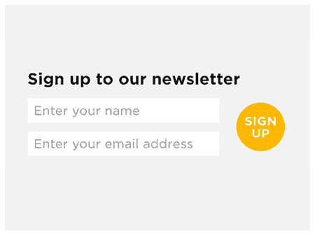
Green Man Festival’s sign-up
In web design, we use the expression “familiarity breeds usability”. If people are used to interacting in a certain way then they will be comfortable with it. So think hard before reinventing anything or using language that is unfamiliar (or decide to be revolutionary because you deliberately want to provoke a response in your users).
Adding a ‘rollover state’ (a visual change that happens when the user moves their cursor over an area of their screen) can help draw attention to a ‘submit’ button, marking it as an interactive element. It also acts as a reward for users (yes I know it seems silly but users really do respond to these types of micro-rewards). And you can add an extra level of polish with a ‘transition’ to the rollover state (so the change is smoother than just ‘on’ or ‘off’).
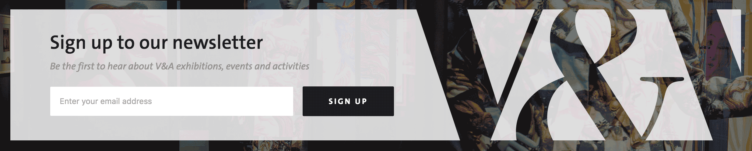
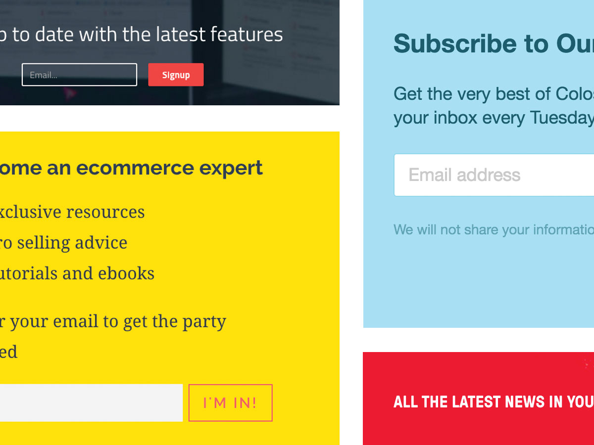
V&A’s sign-up
Make the form incredibly simple for people to sign-up – the shorter the form, the more likely subscribers are to fill it out. Research shows that the more form fields you add, the less likely people are to use it. That seems obvious but it’s easy to forget when you’re thinking about your needs.
Use compelling, active language and make it clear what people will receive when they do sign-up. The key is to make the positives obvious and to remove any niggling doubts. Remember, people make decisions in fractions of a second, it’s not usually a thought-through calculation.
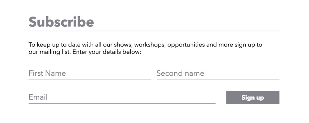
Akram Khan Company’s sign-up
Positioning for maximum reach
Now you have the design and language pinned down, here are a few suggestions on the best places to position your email sign-up:
- On your website home page
- In your site header so it’s present on all pages
- For a site with short pages, sign-up forms are often looked for in website footers
- On your site’s contact or about page
- Add a sign-up button or link to your email signature
- On your organisation’s Facebook page – many email systems (like Campaign Monitor or MailChimp) have an easy way to do this
- Embed your email sign-up in tweets so that followers can subscribe to your email list via Twitter – you can do this using Twitter lead generation cards, they’re easy to set up and well worth the effort
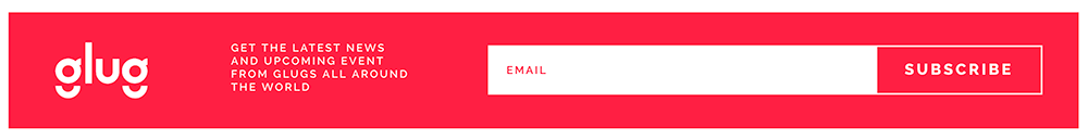
Glug’s sign-up
A word on pop-ups
Pop-ups are those boxes that appear in front of the content on a site. Although many people say that they find pop-ups irritating, they do produce results. Especially when used in relation to the offer of a free piece of relevant content, or the chance to enter a competition.
We use competition pop-ups on several sites, such as turnercontemporary.org, and we always see a huge spike in sign-ups.
Pop-ups don’t always have to be placed front and centre, they can sit as a top bar on a site, or slide in from the side.
They can be controlled by cookies (the data stored on a user’s computer that tells a website that they’ve visited before) so that they only appear on a first visit. Or they can be set to appear once a user has scrolled a certain distance down a page. You can also ensure that, if a visitor is coming via your e-newsletter, they never see the pop-up.
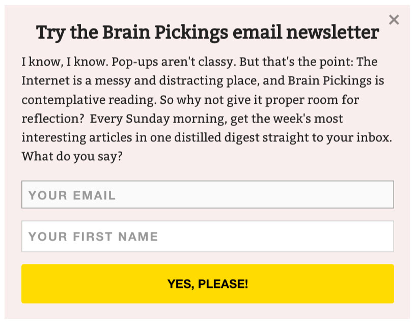
Brain Pickings’ pop-up
Are subscribers a useful measure for arts organisations?
Email sign-ups are easy to measure, but of course as anyone that works in the arts knows, the number of newsletter subscribers isn’t always an ideal or accurate indicator of your audience. The figures don’t tell you how engaged users are with what you do, or how loyal they are, or whether they have a long-term interest in your activities.
We shouldn’t just be trying to build subscriber numbers, but trying to connect with the people that will most enjoy and benefit from what we offer.
However with the right language, positioning, and design an email sign-up can try to do both.
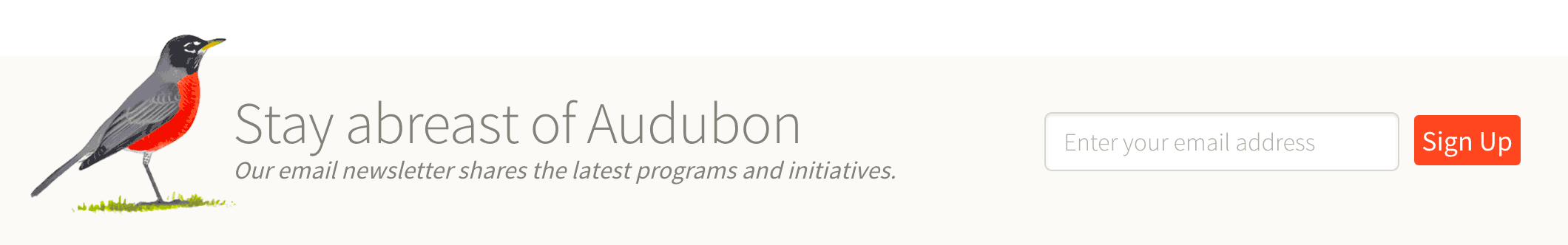
Audubon’s sign-up
Related

Email has changed, have you?
The way we read email has changed beyond recognition over the past few years, so what can we do to...

Your brand in a digital world
As part of Create Hub's Industry Experts panel, Sam writes about how cultural organisations can take a digital-first approach to...

SEO for arts & culture organisations
SEO (or search engine optimisation) can seem daunting, but if your site is well structured, your content well written and...
A year of our Cultural Calendar
Last August we sent out our first Cultural Calendar email, Anna looks back over the year and what we've learnt.
Digital Revolution at Barbican
For our September Cog Night out we visited the Digital Revolution event at The Barbican, an exhibition led by artists,...
Cog acquires digital agency Red Leader
We are delighted to announce that we have acquired the business of the digital design studio Red Leader.
Ten tech titbits – January 20
Our regular round-up from the world of digital technology (or at least the bits that seem relevant to our clients).
Ten tech titbits – November 19
A new, regular round-up from the constantly shifting world of digital technology (or at least the bits that seem relevant...

You and your agency: the perfect team
On 4 November Sam was at the Spektrix Conference talking to arts organisations about how to get the best from...