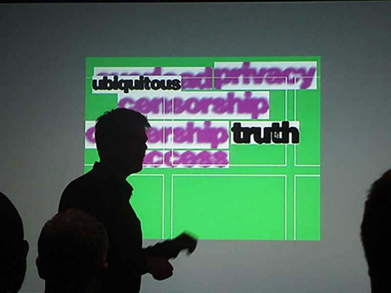
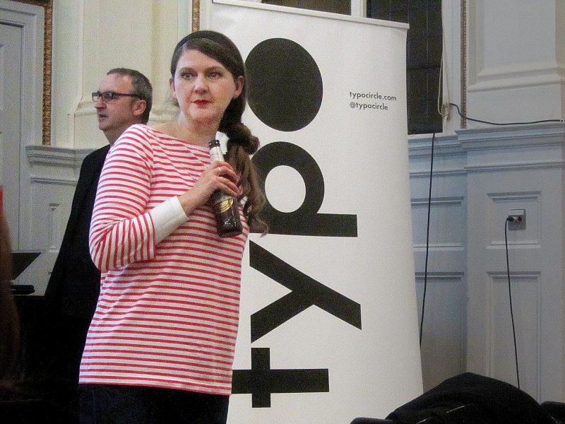
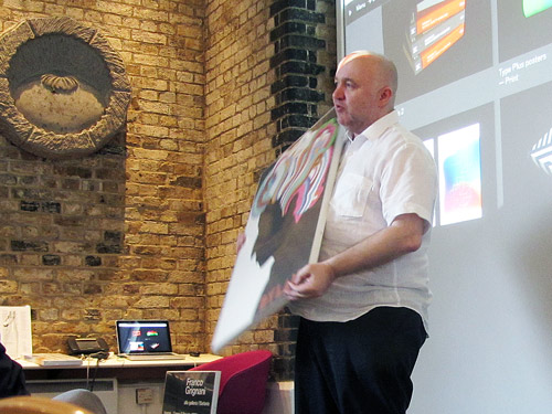
In his Typographic Circle talk, Michael Johnson argued that Design Can Make a Difference. Our Michael was there to listen and sometimes disagree (in his head).
Michael Johnson at Typo Circle
It seems almost inconceivable that a designer, as old as me, hasn’t ever been to a talk by the ubiquitous Michael Johnson. Tonight was also my first Typographic Circle event. I booked because NB Studio have done such a great job of repositioning the organisation to make it feel more like I’d want to go. Actually, I have heard him talk once before. At the height of his pencil-winning stardom, we pitched against him for a job at the Barbican. We did that awkward crossover introduction, in the corridor. Neither of us got the work, Peter Saville already had it sewn up.
He was at his most vociferous when talking about self-initiated work…“We really are disappearing up our own arse, aren’t we?”
If it matters, I think the man is a truly brilliant designer, a thinker with the tenacity to craft a simple idea and turn that into an outstanding solution. But there have been times when the name Michael Johnson has both infuriated and inspired me. Tonight was no different. His talk was a thesis, entitled ‘Design Can Make a Difference’. I loved that he’d properly prepared an actual talk with firm opinions. It felt like this was a rehearsal for something he was planning to take out on the lecture circuit but I enjoyed the rough edges and the half constructed, dead-end thoughts. It was a bit like a stand-up comic’s Edinburgh warm up.
Michael’s argument was that design can make a difference but he’d reached a point when he wants to think bigger than a charity poster or a clever graphic twist. He “wants to raise millions of pounds not hundreds of pounds”. “One poster cannot change the world,” he said. That line was also printed on the posters that were to be given away after the talk; he did seem a little embarrassed by that irony.

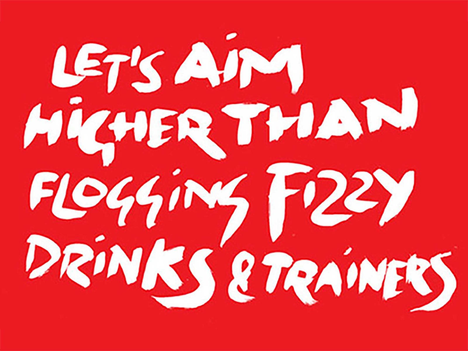
His talk began by pointing out the type of design that doesn’t seem to make a difference. He took side-swipes at David Carson, Neville Brody and (of course) Peter Saville. He went on to ask if the world really needs another chair design but he stopped himself asking if we need yet another typeface (this was a Typographic Circle event, after all). He was at his most vociferous when talking about self-initiated work and the awards’ categories where gongs are given to people who design to their own brief. “We really are disappearing up our own arse, aren’t we?”
The crux of his argument was that design can make a genuine difference if the client is able to take design seriously, as an investment. He cited the Dan Pallotta talk: The way we think about charity is dead wrong. In which Dan argues that charities should stop being embarrassed about spending money. Michael talked about the £1M rethinking by Macmillan Cancer Support (with the subsequent massive increase in awareness and donations) and his own work for Acumen, Anthony Nolan and Save the Children (all brilliantly realised design-based thinking).
I was completely with him, cheering (in my head, obviously) for his argument.But then, for me, his talk took a twist. He started lumping together different types of clients, specifically cultural sector clients and charities (good clients) and all the commercial clients (bad clients). He went on to explain that if he worked solely for good clients then he’d soon go bust because he over-delivers on all the detail. He has to fund that indulgence through work for bad clients. He said he wanted to turn the 80:20 rule around and spend 80% of his time on the good clients. ‘Why not just do that then?’ was the thought running in my head.
He went on to talk about his groundbreaking redesign of the Science museum as if his studio was on a crusade to reinvent science education. He intimated that this was a loss-leading charity case. Was he saying that one of the world’s best-funded museums cannot afford to pay properly for design? Or was he saying that he enjoyed the challenge and delivered far more than they were prepared to pay for? Did he genuinely set out to change the world of science education or did he just become excited by that possibility once he’d be appointed to one of the sector’s highest-profile branding projects? I would have loved to have heard more in-depth answers to those questions but I suppose that’s unlikely to happen in this sort of forum (even by someone as outspoken as Michael Johnson).
All of our work, at Cog, is done for the cultural and heritage sector so I’m in quite a good position to say that it’s not well paid. But we do make a living from it (and we have for more than two decades). I’m not pretending it’s a selfless act; we do it because we love it (and the clients are much nicer than those in other industries). It’s a constant struggle to convince some clients of the value of design when they know that some agencies are prepared to do the work for peanuts (stand up M&C Saatchi). Others completely understand that design is an investment; they just don’t have much money to invest. Michael Johnson seemed to be arguing that clients would benefit from reaising the value of a proper investment in design, whilst simultaneously telling us about projects where he’d not charged properly for design.
I came away from his talk (without a free poster) feeling as conflicted as ever about Michael Johnson. He is a brilliant designer. I love that he gets so involved in a project that commercial interests fly out the window and all he cares about is the work. But I do wish that designers wouldn’t dress that up as philanthropy because it’s unsustainable for designers or clients.
I definitely believe in the sentiment, design can make a difference. Maybe, by the time this talk has become a polished presentation, the contradictions will be resolved and Michael Johnson will have a singular path to making that more of a reality.
Related links:
An edited transcript of the talk is available on the Johnson Banks website.
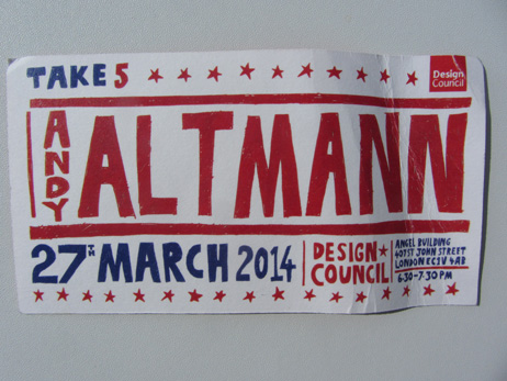
The Typographic circle talks each have a commissioned poster (and badge). There’s an archive on their site.
