We’re all pretty sure that graphic design is important but can it save your life? For our September Cog Night we were back at Wellcome Collection to try to find out.
Can graphic design save your life? at Wellcome Collection
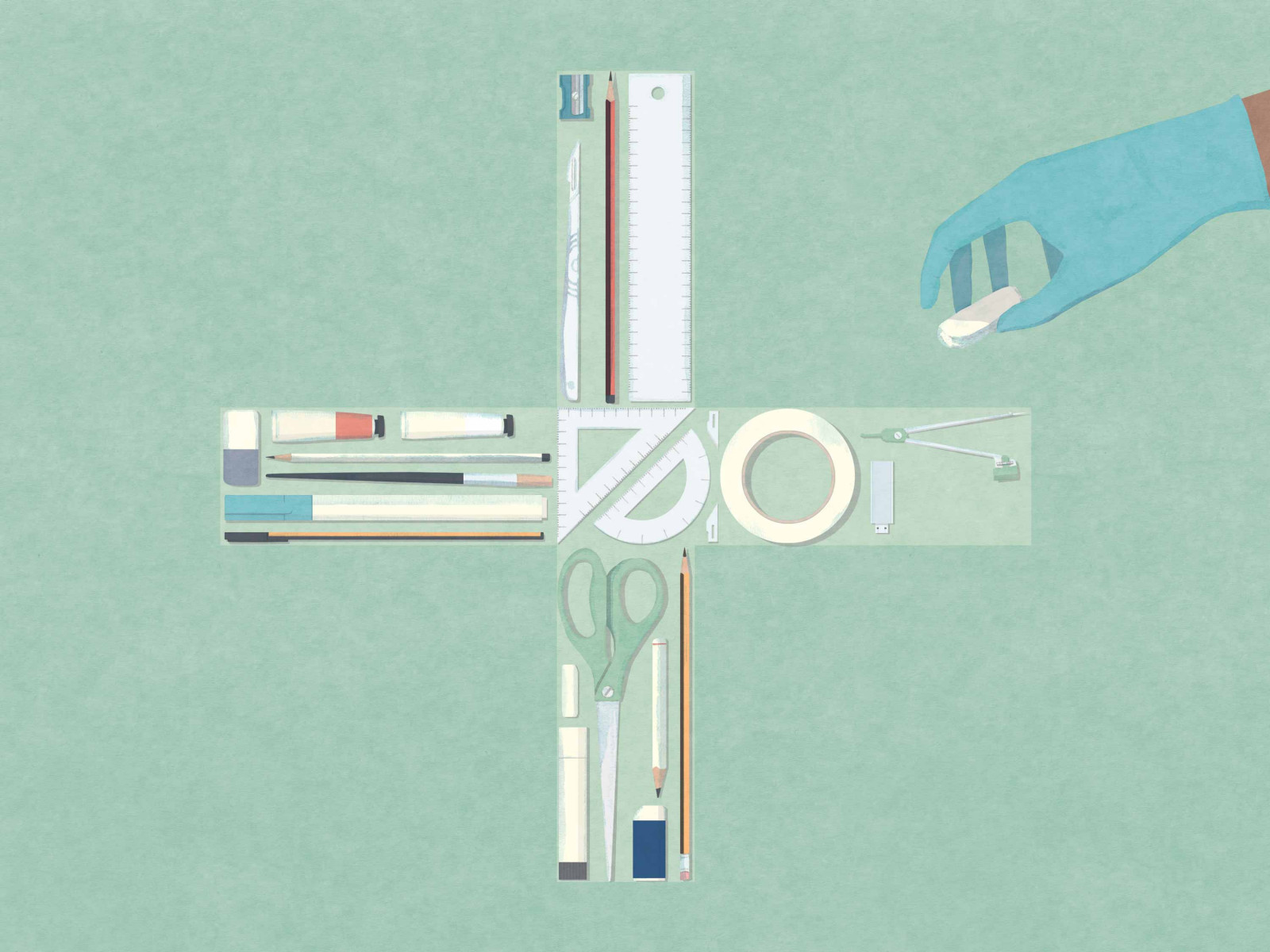

Wellcome Collection is one of our favourite venues. Their exhibitions are always fascinating. When they announced a graphic design-related show, to coincide with London Design Festival, we all voted for it as our September Cog Night.
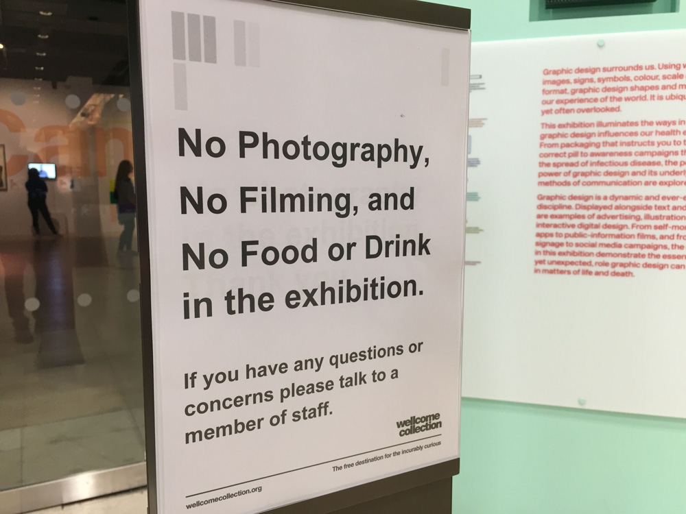
A sign outside the entrance to the exhibition.
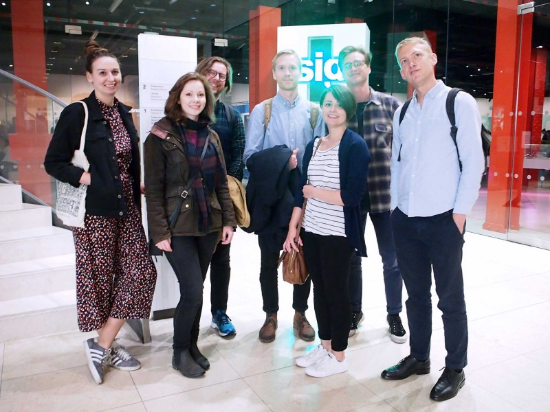
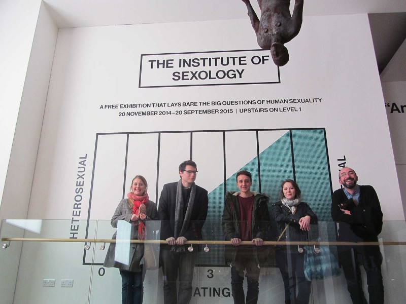
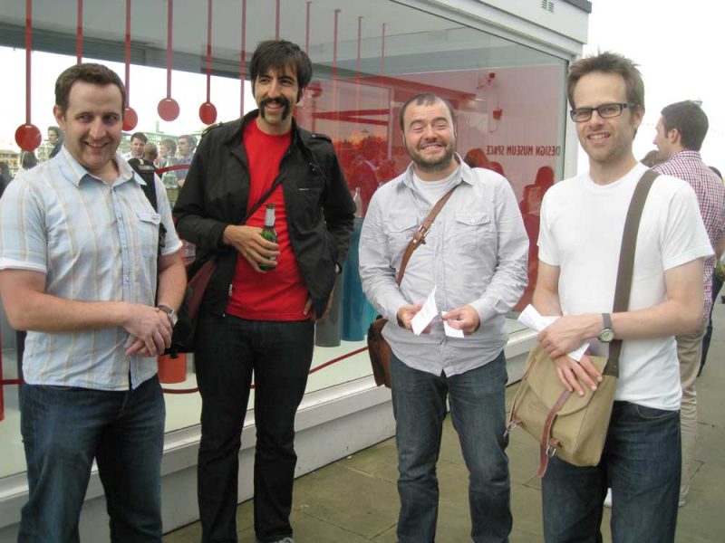
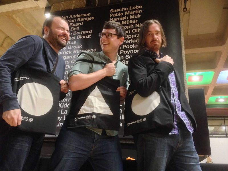
The bright lights and animated type, at the entrance to the exhibition, may have provided the perfect backdrop for our traditional Cog Night group photo, but that’s where the photography had to stop. A sign at the entrance (and several inside) told us so.
It’s probably a good idea I don’t curate exhibitions because I can’t understand why there would be a photography ban on work that is all in the public domain. With a lack of images, I thought it would be tricky to illustrate my entry, but the team at Wellcome Collection were very helpful and responsive, supplying images – thank you to them.
The exhibition is popular and, as this was one of their late night Thursday openings, it was busy. We joined the crowds in the first section, a long wall devoted to smoking-related design. Everything from stamps to cigarette packaging.
All these items created a visual timeline of 120 years, showing how designs have changed to reflect (or counter) public attitudes to smoking.
At the far end was the ultimate in minimal design, unbranded packaging, pioneered in Australia in the hope that removing brand name association will reduce smoking-related illness and death.
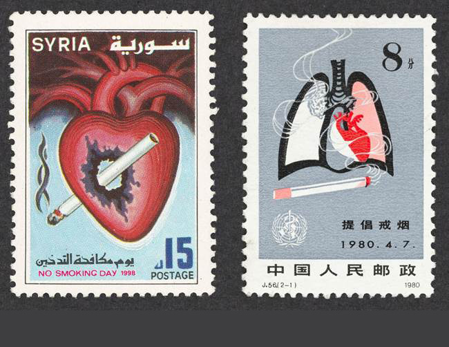
Part of a selection of anti-smoking stamps from around the world
As we dispersed into the exhibition, a section on graphic design in hospitals drew my eye. The work by Pearson Lloyd was engaging. Answering an open brief which aimed to reduce the violence in A and E they created a set of simple infographics that showed people what to expect while there. Perhaps this wasn’t graphic design saving lives, but it does show how clear communication can reduce a stressful environment by 50% to create a more harmonious and efficient health care system. And that theme was extended with examples of engaging hospital designs.
Onto the next section, we were transported to the Crimean war and the efforts of Florence Nightingale. It was a surprise to me to see the lady with the lamp in a design exhibition, although others in the Cog team seemed to know all about her reputation as the inventor of info-graphics. Her delicate graphs and diagrams helped to illustrate the causes of soldier deaths in Crimea’s war hospitals, and that in turn put the case for better investment and efficiencies that saved many lives and revolutionised nursing. I found the accompanying information a little sparse which is a shame as it was a fascinating area.
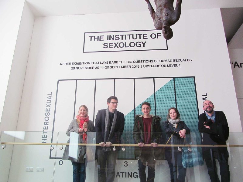
Sexual health was the next topic to be covered. Alongside the ever evolving designs of condom packaging, this area of the exhibition featured the huge public information campaign about the threat of a new disease, AIDS, including an awareness video, narrated by John Hurt that scared the nation into talking frankly about sexual health.
After half an hour we were heading towards the last sections of the exhibition, pandemics and global diseases.
We were all fascinated by the design of a poster frame that lures in and kills mosquitoes, using the odour of human sweat. Is it graphic design? Can it really be effective in the fight against the Zica virus? I’m not sure but it’s great to see innovative solutions being pioneered in the area.
And it was interesting to see some examples of hands-on information design, from street artists.
In almost the final panel, the exhibition looked at cancer and the taboos surrounding it. I was particularly struck by the example of this infamous social media illustration (shown below), highlighting the issue of Breast cancer.

Cancerfonden, breast cancer awareness campaign, 2016, Sweden
After the circle-based illustration was blocked, by Facebook, for its ‘explicit content’, the Swedish designers changed the breasts to square to be less provocative. The backlash that followed was huge and Facebook were forced to relent and change their definition of ‘explicit’. On the plus side all the commotion created positive publicity for breast cancer awareness.
All in all I enjoyed the exhibition. It’s a well thought-out space which took us on a journey through the ways design can alter attitudes and help simplify complex health information.
But did it answer the question? Can graphic design save your life? I’m not sure if it did. Personally, I felt that the small amounts of accompanying text, and the lack of an exhibition guide, limited my understanding of the many fascinating artefacts. Having said that, Wellcome Collection do always surround their exhibitions by lots of accompanying talks and contextual events so maybe they would give more insights. Maybe I should revisit, another time.
